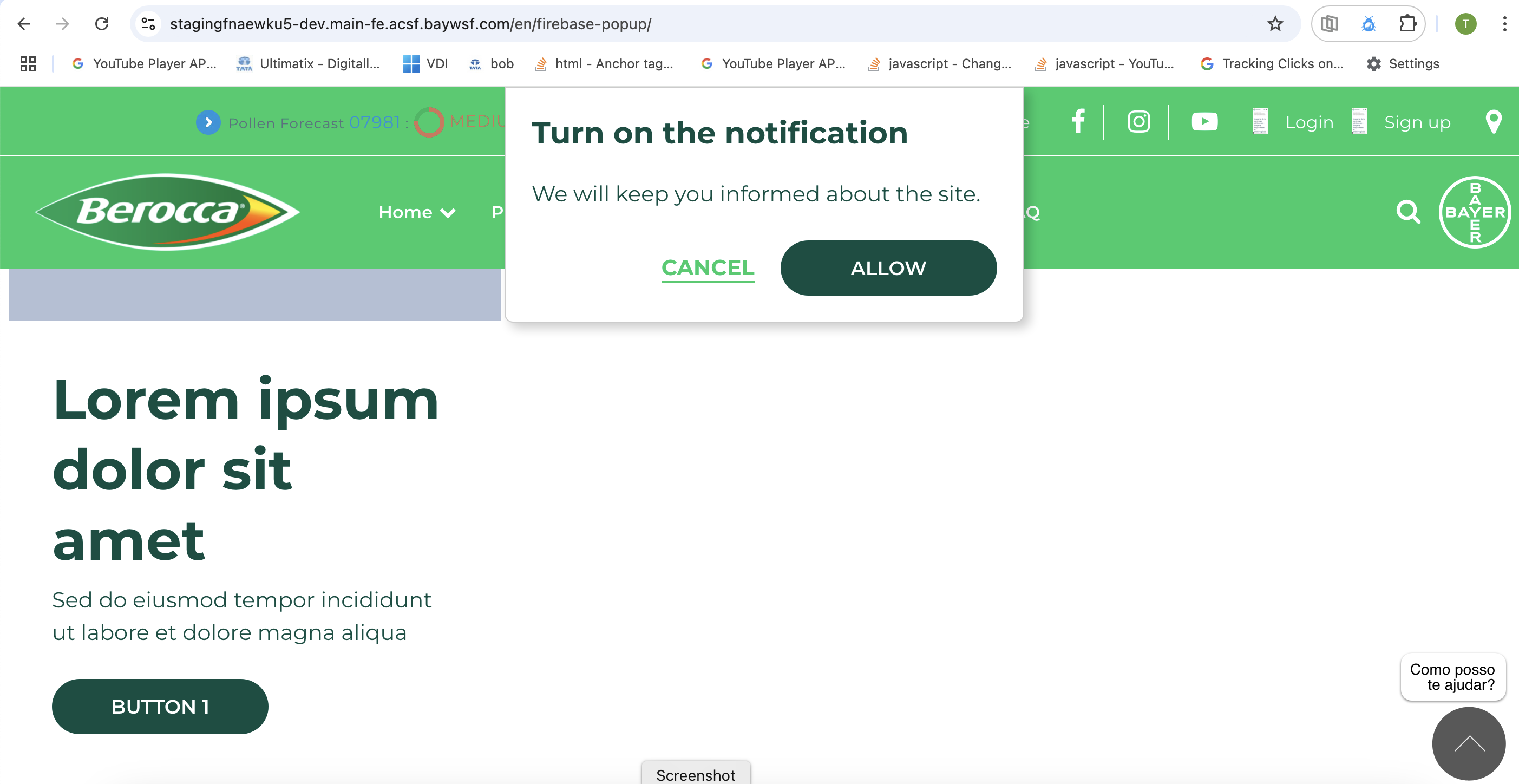
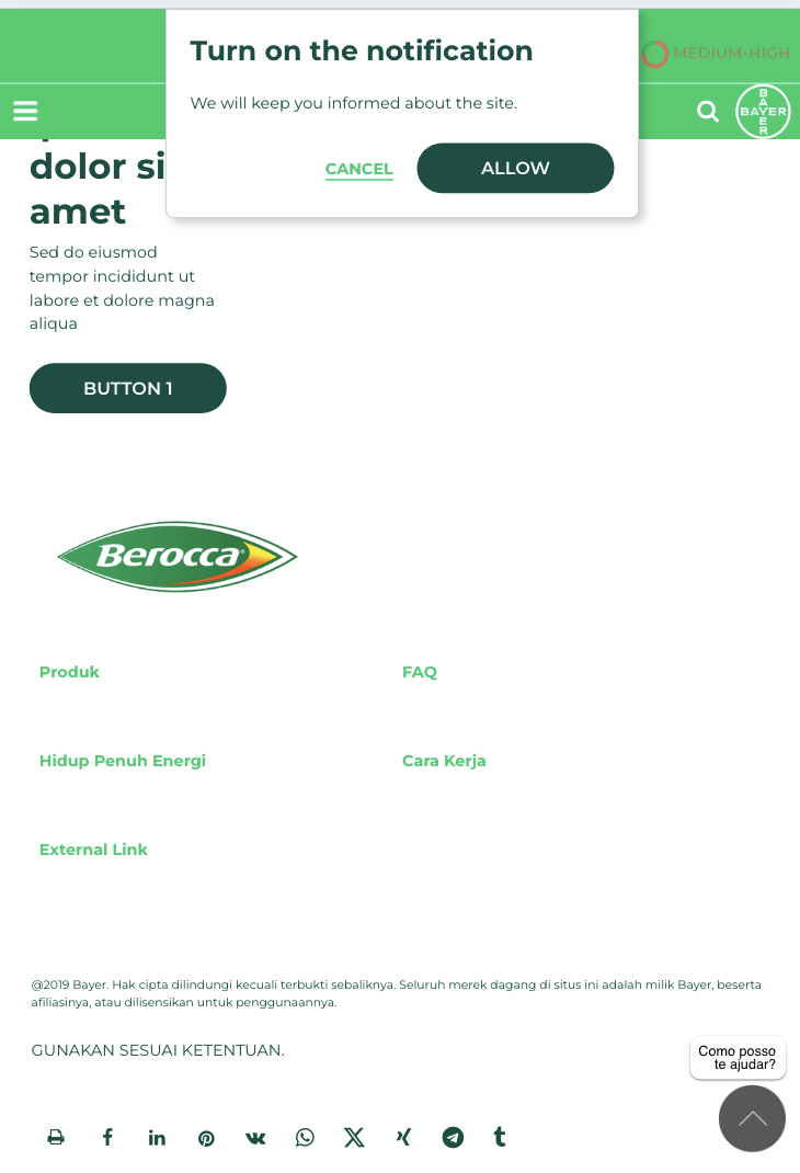
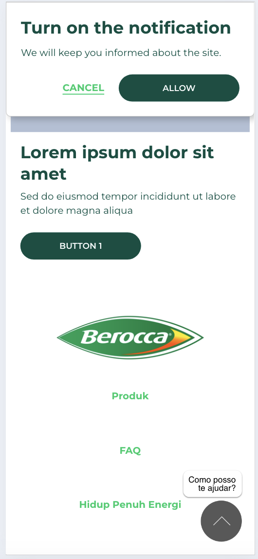
Firebase Popup
Firebase popup is a custom component which can be added in the firebase popup layout canvas area. The component has configurations to add pop up content in wysiwyg, Button text for allow and cancel, Button style configuration options, Text color, Background color, Pop up position.
- Overview
- Specification
- Style Guide Manager
- Example in-situ
- Usage
| Component item | Requirement & purpose | Optional or mandatory | CMS options |
|---|---|---|---|
| Popup Content | Wysiwyg area to add the firebase popup content | mandatory | WYSIWYG |
| Accept button text | Accept button text | mandatory | Text Input |
| Cancel button text | Accept button text | mandatory | Text Input |
| Popup vertical position | Allows positioning popup in the page vertically | mandatory | Vertically align top, centre or bottom. |
| Popup vertical position | Allows positioning popup in the page vertically | mandatory | Horizontally align left, centre or right. |
| Background color | Allows control of background color of popup. | Optional | Color picker |
| Accept button style | Allows user to select the accept button style from 20 available button/text styles. | Optional | Select box |
| Cancel button style | Allows user to select the cancel button style from 20 available button/text styles. | Optional | Select box |
There are no style guide settings for this component.
| ✅ Do's | ❌ Don'ts |
|---|---|
| Firebase popup should only be used for firebase modal configuration | Do not add the firebase popup component is normal page layout canvas. |
| Ensure the text is legible when the background and font color is selected. | |
| Read our guidance on the use of WYSIWYGs. |