Accordions
The Accordion component displays a list of sections that expand to reveal more content. Each Accordion item nested within the Accordion container, can contain a combination of images, text, buttons and videos. Other elements such as forms and surveys will require development.
- Overview
- Specification
- Style Guide Manager
- Examples in-situ
- Usage
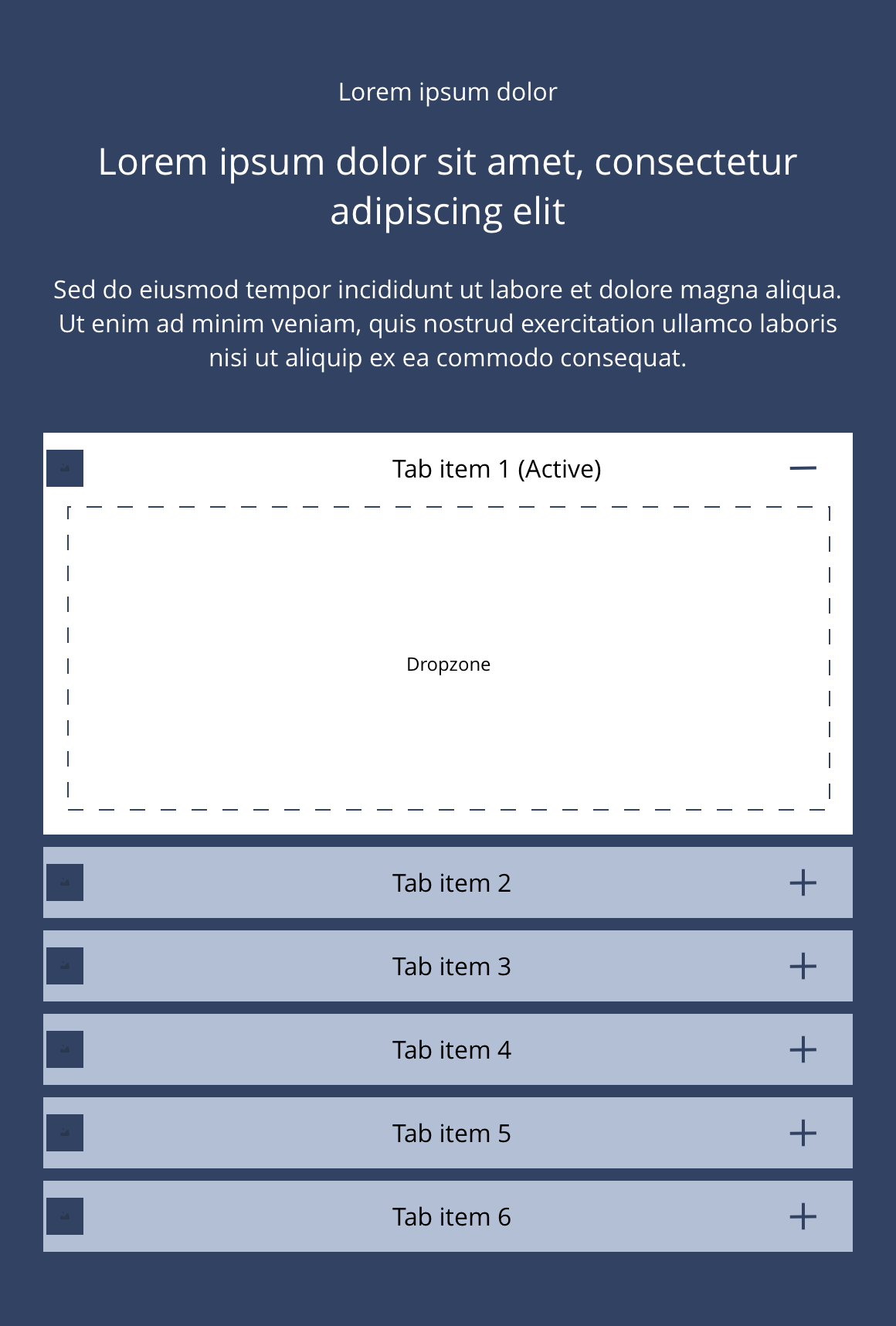
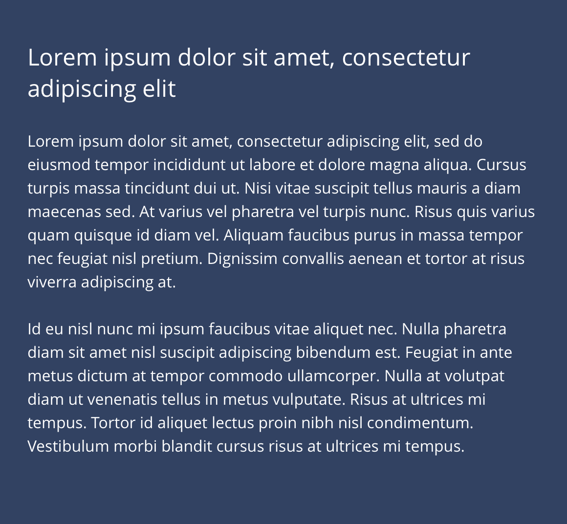
Accordion container
The Accordion container is used in conjunction with the Accordion item. It allows for the use of optional text and heading styles above the accordion item dropzone.
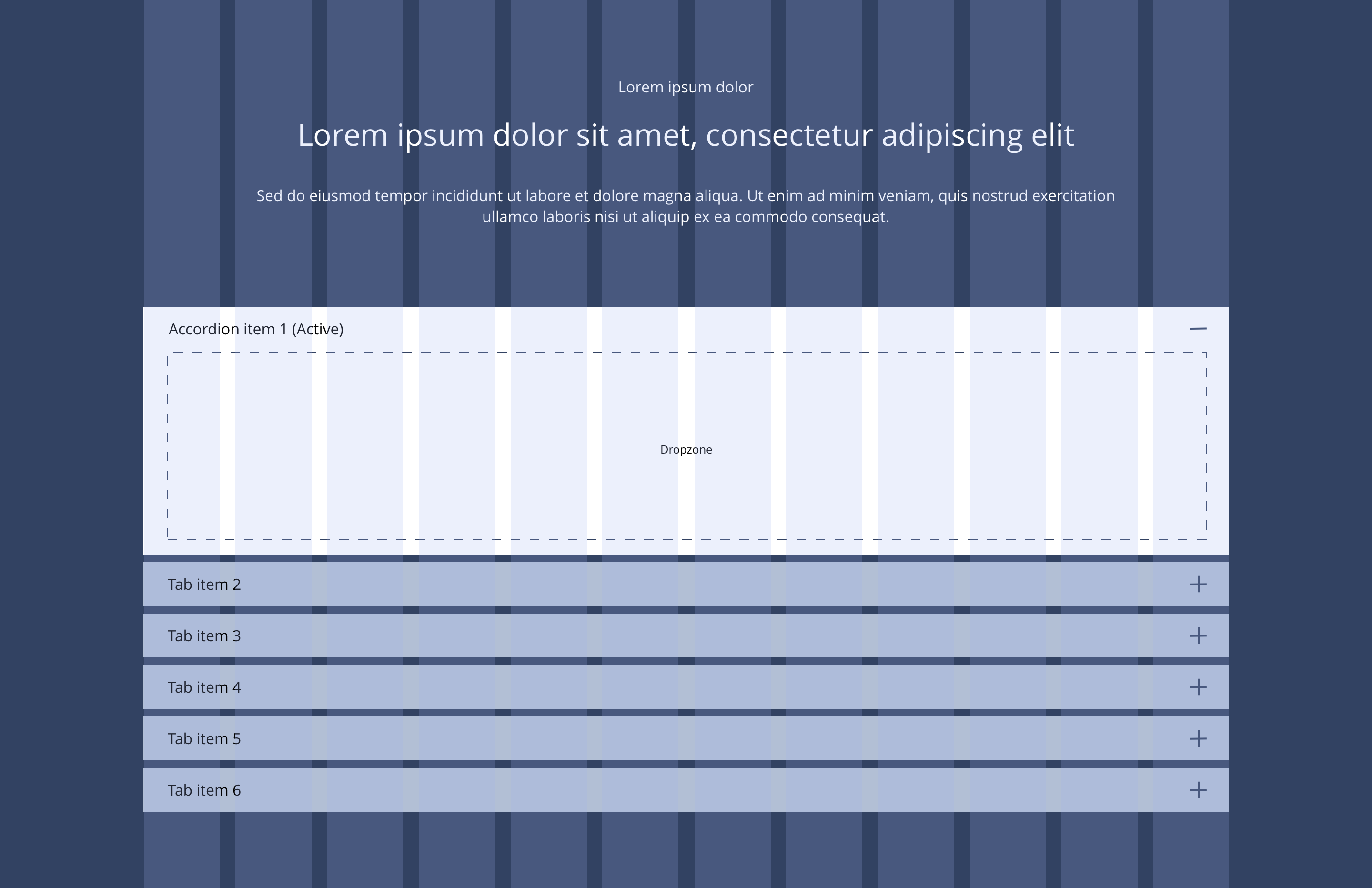
Overview
Example showing how Accordion items nest within the Accordion Container component

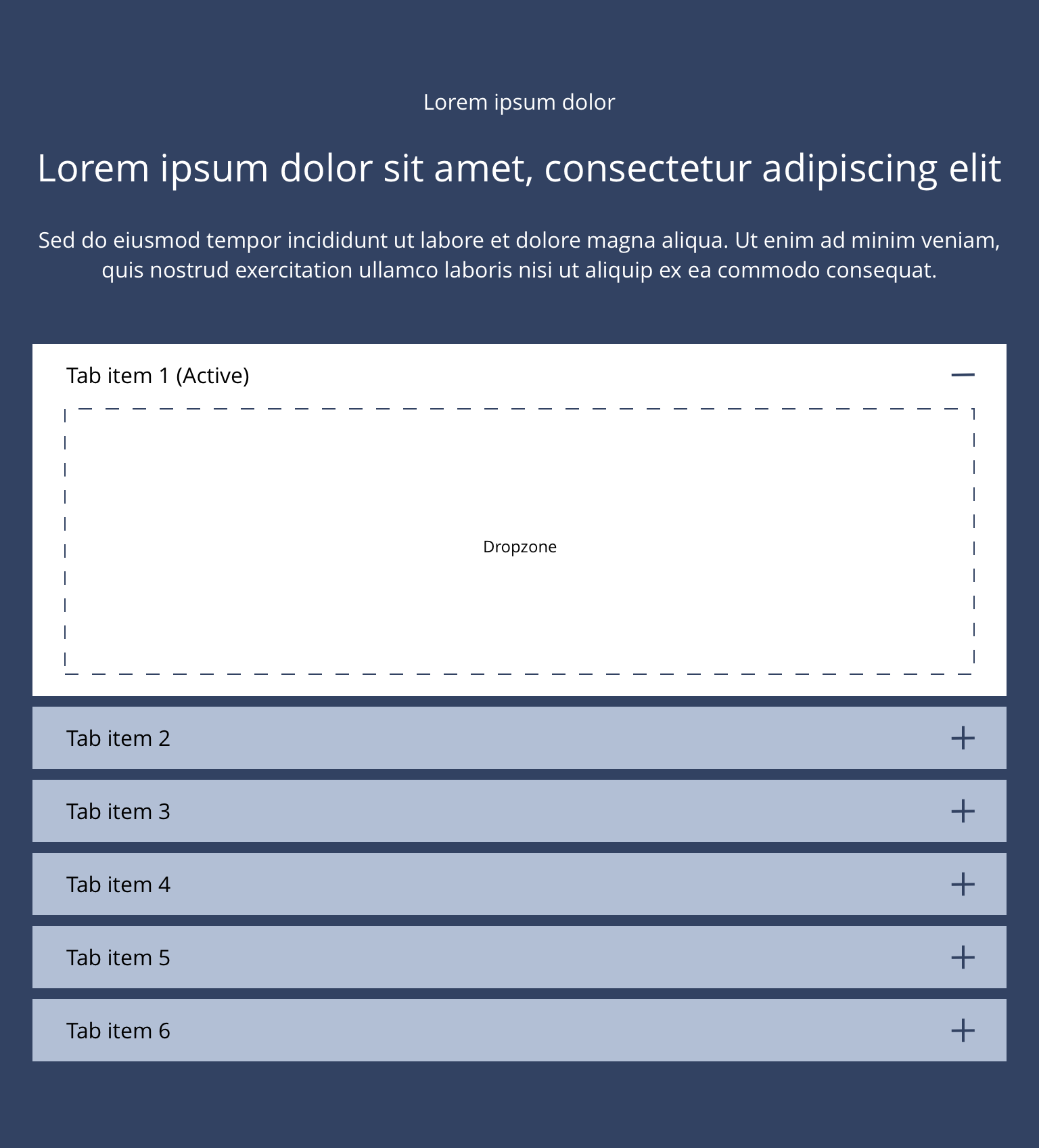
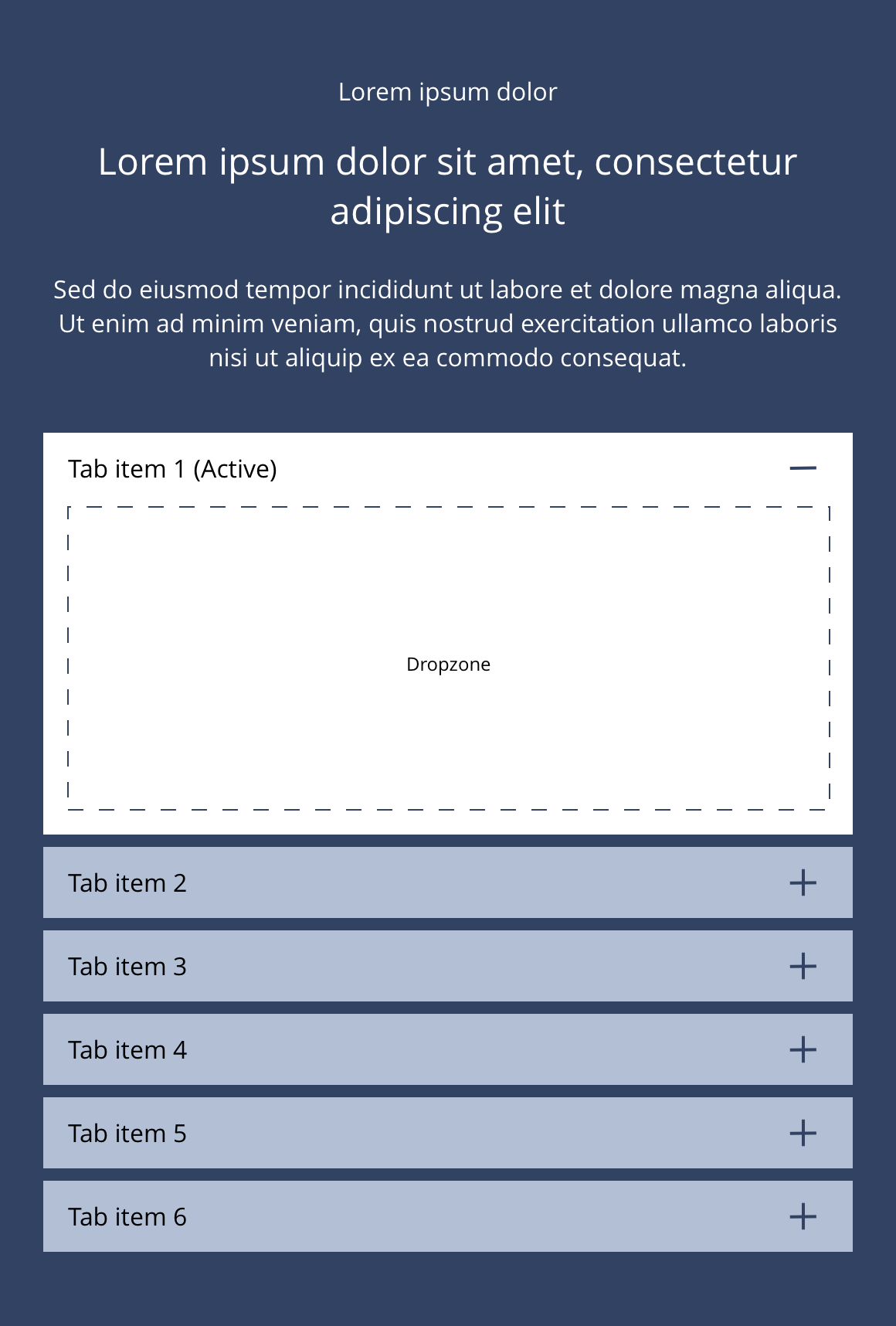
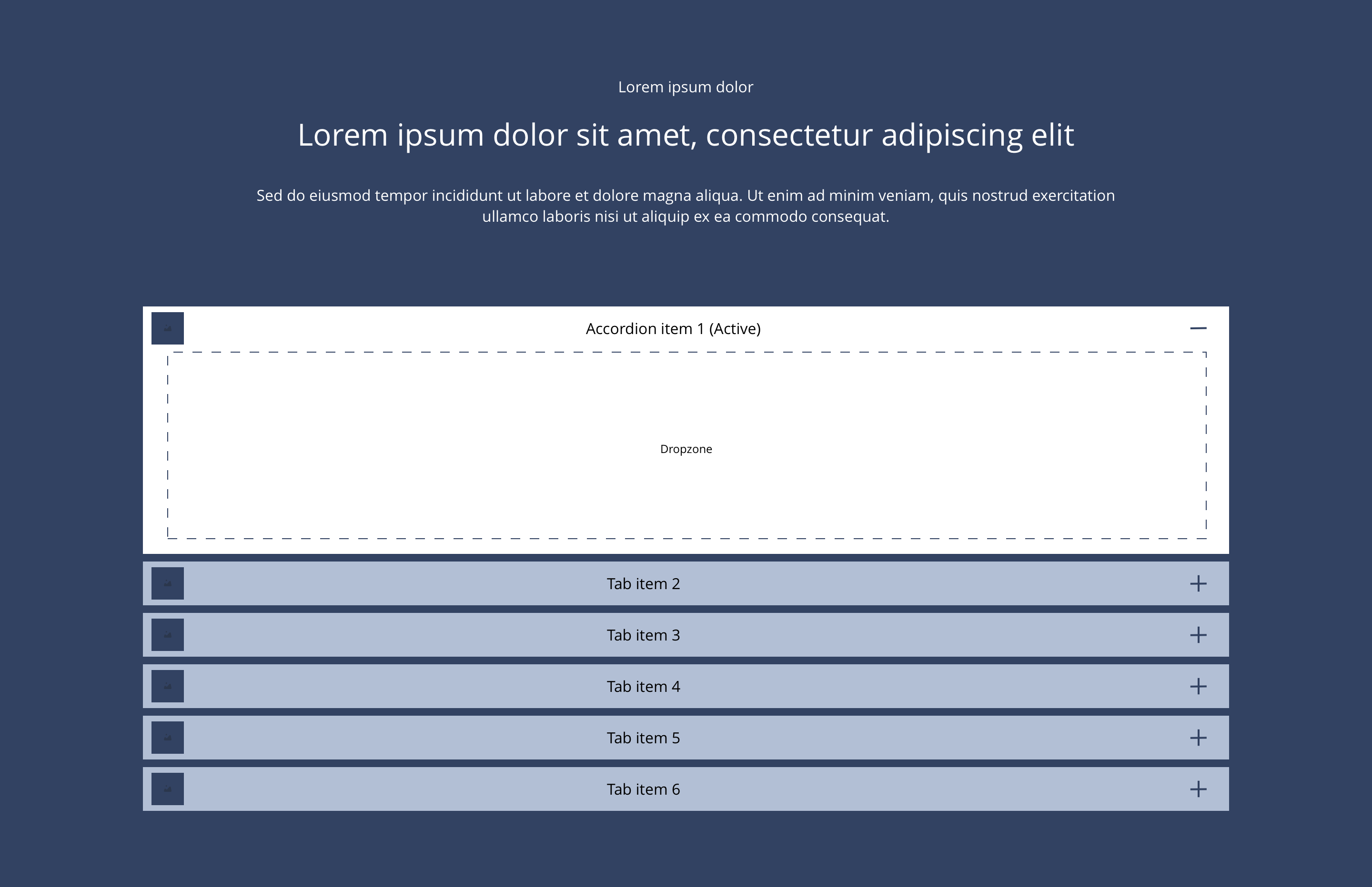
Accordion item
Accordion items are dragged into the accordion container as required.
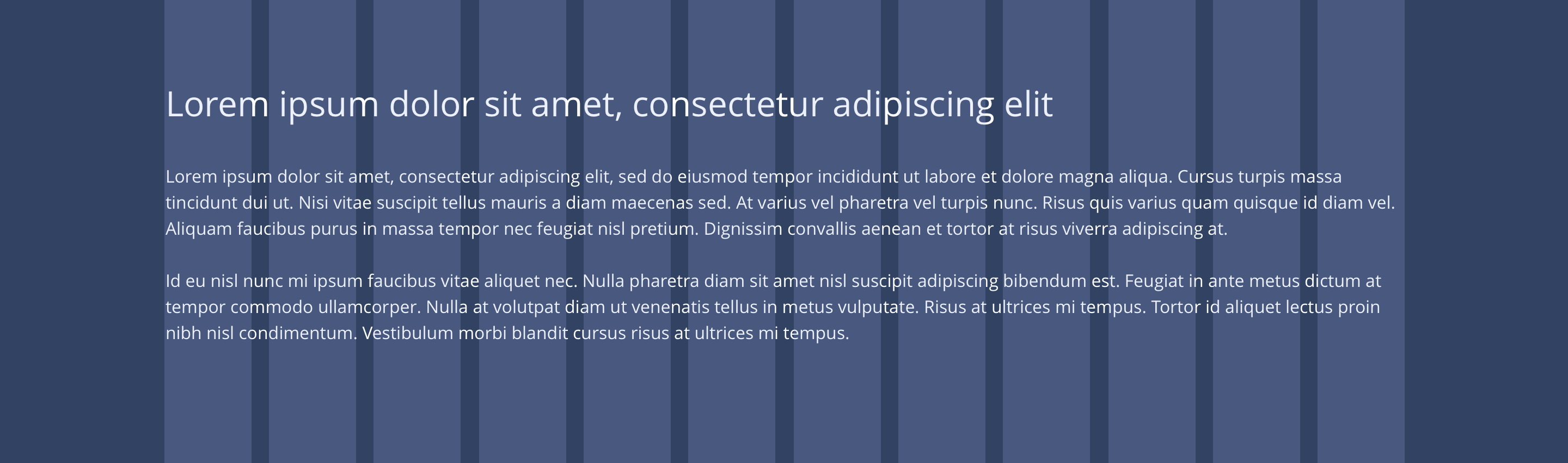
Overview
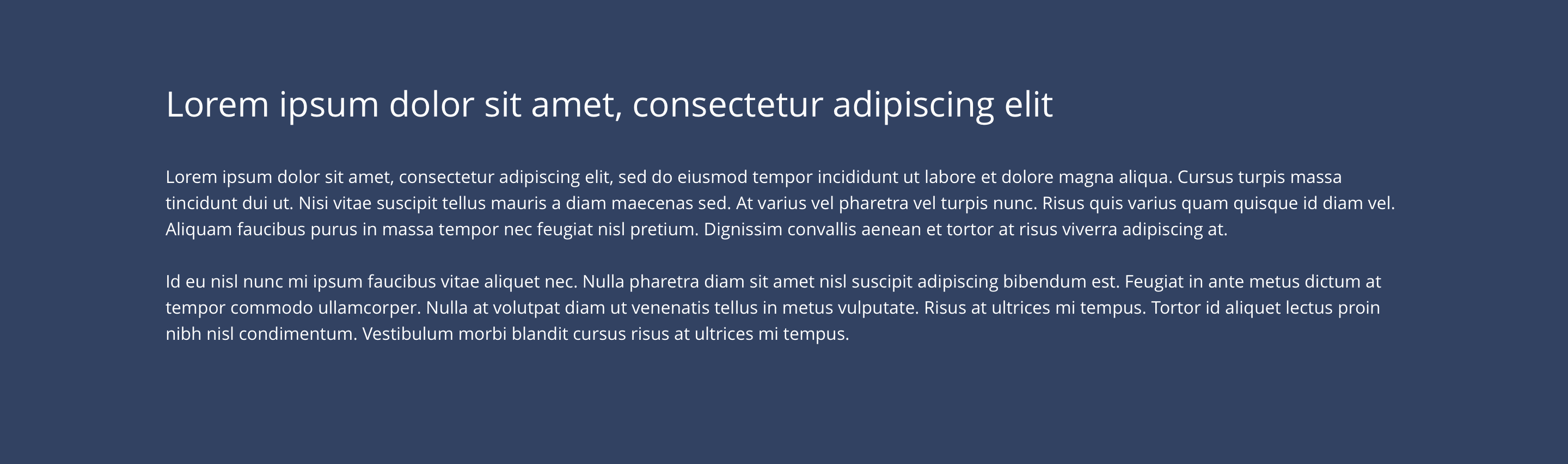
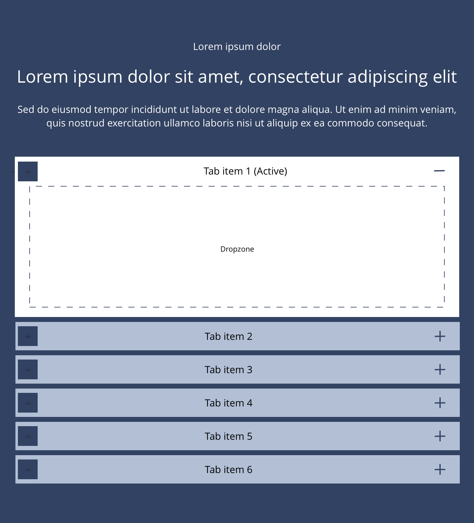
Accordion item Image Title
Accordion items are dragged into the accordion container as required.
Overview - Accordion item image title
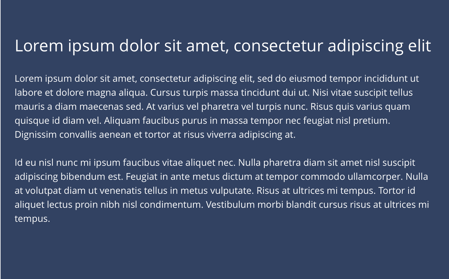
Accordion container
 Layout specification
| Component item | Requirement & purpose | Optional or mandatory | CMS options |
|---|---|---|---|
| Height | Component expands based on content. | n/a | n/a |
| Width | The container is set to full width.Content is constrained to the width of the grid. The content is full width by default but can be restricted to either 10 or 8 columns on desktop and tablet. The content is always full width on mobile. | Mandatory | 12, 10 or 8 column width. |
| Background image | Allows user to set background image. This is full width and set to cover. | Optional | Image uploader. |
| Background image alignment | Allows control of background image alignment. | Optional | Vertically align top, centre or bottom. Horizontally align left, centre or right. |
| Lazy Load Background | Allows users to switch On/Off the Lazy Load functionality for the background image. | Optional | On/Off |
| Show/hide background image on mobile | Allows editor to hide background image on the mobile breakpoint. | Optional | Show/hide. |
| Background image aria label | The aria-label allows us to specify a string to be used as the accessible label. | Optional | Text input field |
| Background colour | Allows the user to set a background colour on the component. | Optional | Choose from colour palette. |
| Content alignment | Controls content horizontal alignment. | Optional | Left, centre or right. |
| Accordion title alignment | Controls the alignment of the accordion title. | Optional | Left, centre or right. |
| Accordion title padding | Controls the padding to the left of the accordion title. | Optional | Padding or no padding. |
| Icon position | Allows the user to set the position of the icon | Optional | Left or right |
| Start state | Allows the user to set one accordion item to be open on load. | Optional | All closed or first open. |
| First item to open | Allows the user to set which accordion item should be open on load. | Optional | Text input (e.g 1, 2, 3, 4). |
| Enable expand-all or collapse-all | Allows the user to add expand-all or collapse all functionality | Optional | Toggle Button |
| Expand-all button text | Allow user to add text for the expand all button/link | Optional | Text input. Default value - Expand all |
| Collapse all button text | Allow user to add text for the collapse all button/link | Optional | Text input. Default value - Collapsed all |
| Button alignment | Allow user to select expand-all/collapse all text/button alignment | Optional | Drop-down field. Default value left - Left |
| Expand-all/Collapse-all Button style | Allow the user to select button or link style for the expand all or collapse all text | Optional | Drop-down field. |
| Padding top and bottom | Allows control of the top and bottom spacing within this component. Set globally via the SGM. | Mandatory | Large, medium, small or none. |
| Margin bottom | Allows control of the spacing below the component. Set globally via the SGM. | Mandatory | Large, medium, small or none. |
| Transition | Animation duration is 0.7 seconds with “ease-in-out” easing. Transition is set to slide down. | n/a | n/a |
| Pre-heading text | Allows user to set a pre-heading before H1. | Optional | Text input. |
| Pre-heading text colour | Sets pre-heading colour. | Optional | Choose from colour palette. |
| Heading text | Sets heading text. | Optional | Text input. |
| Heading element | Sets H2, H3 or H4 on component. | Optional | Select heading element. |
| Heading style | Allows user to choose where more then one type of heading style may be present (i.e. multiple H2's). | Optional | Select heading style. |
| Heading colour | Sets heading colour. | Optional | Choose from colour palette. |
| Paragraph text | Sets paragraph content. | Optional | Text input. |
| Paragraph style | Sets paragraph style. | Optional | Paragraph style select. |
| Paragraph colour | Sets paragraph colour. | Optional | Choose from colour palette. |
| WYSIWYG | Allows user to format text where additional styles may be required. | Optional | WYSIWYG. |
Accordion item
 Overview
| Component item | Requirement & purpose | Optional or mandatory | CMS options |
|---|---|---|---|
| Height | Component expands based on content. | n/a | n/a |
| Width | Content is constrained to the width of the grid. | n/a | n/a |
| Background colour | Allows user to set a background colour on the component. | Optional | Choose from colour palette. |
| Accordion styling | Allows users to select styling for the accordion from a list of six custom styles. | Mandatory | Choose from select options. |
| Content alignment | Controls content horizontal alignment. | Optional | Left, centre or right. |
| Padding top and bottom | Allows control of the top and bottom spacing within this component. Set globally via the SGM. | Mandatory | Large, medium or small. |
| Accordion title image (only available for 'Accordion item with image title' component) | Allows user to upload title image | Mandatory | Image Uploader. |
| Accordion title | Sets accordion title content. | Mandatory | Text input. |
| Heading text | Sets heading text. | Optional | Text input. |
| Heading element | Sets H2, H3 or H4 on component. | Optional | Select heading element. |
| Heading style | Allows user to choose where more then one type of heading style may be present (i.e. multiple H2's). | Optional | Select heading style. |
| Heading colour | Sets heading colour. | Optional | Choose from colour palette. |
| Paragraph text | Sets paragraph content. | Optional | Text input. |
| Paragraph style | Sets paragraph style. | Optional | Paragraph style select. |
| Paragraph colour | Sets paragraph colour. | Optional | Choose from colour palette. |
| WYSIWYG | Allows user to format text where additional styles may be required. | Optional | WYSIWYG. |
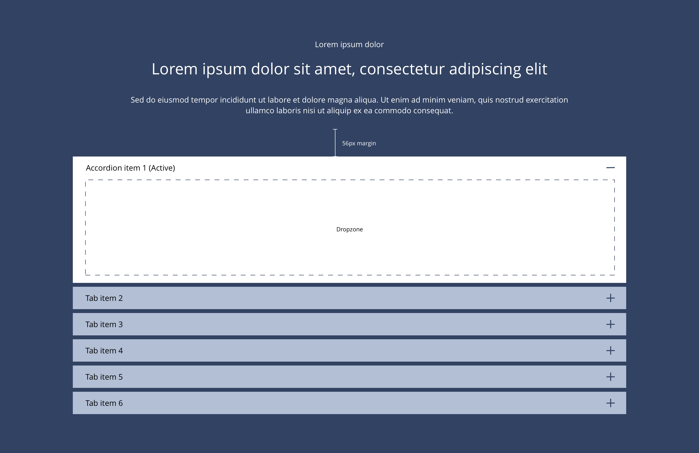
Accordion container
| Property | Requirement & purpose | Default | SGM override |
|---|---|---|---|
| Margin above drop zone | Sets the site wide margin above the drop zone. | Desktop - 56px Tablet - 40px Mobile - 32px | Desktop Tablet Mobile |
Accordion item
| Property | Requirement & purpose | Default | SGM override |
|---|---|---|---|
| Accordion title font select | Sets the font of the accordion titles. | Open Sans | Choose from font stacks. |
| Accordion title font weight | Sets the font weight of the accordion titles. Should only be used if a font has been imported. | n/a | Text input (e.g 300, 400, 600). |
| Accordion title font colour | Sets the font colour of the accordion titles. | Black | Choose from colour palette. |
| Accordion title background colour | Sets the background colour of the accordion titles. | Grey | Choose from colour palette. |
| Accordion title close icon | Sets the site wide close icon. | FontAwesome f068 | Choose from icon picker. |
| Accordion title close icon font size | Sets the site wide close icon font size. | 16px | Choose size within range slider. |
| Accordion title open icon | Sets the site wide open icon. | FontAwesome f067 | Choose from icon picker. |
| Accordion title open icon font size | Sets the site wide open icon font size. | 16px | Choose size within range slider. |
| Padding top and bottom | Allows control of the top and bottom spacing of the accordion title. | 8px | Choose size within range slider. |
| Padding left and right | Allows control of the left and right spacing of the accordion title. | 16px | Choose size within range slider. |
| Title border bottom | Allows control of the border bottom. | n/a | Text input e.g 1px. |
| Content border bottom | Allows control of the border bottom. | n/a | Text input e.g 1px. |
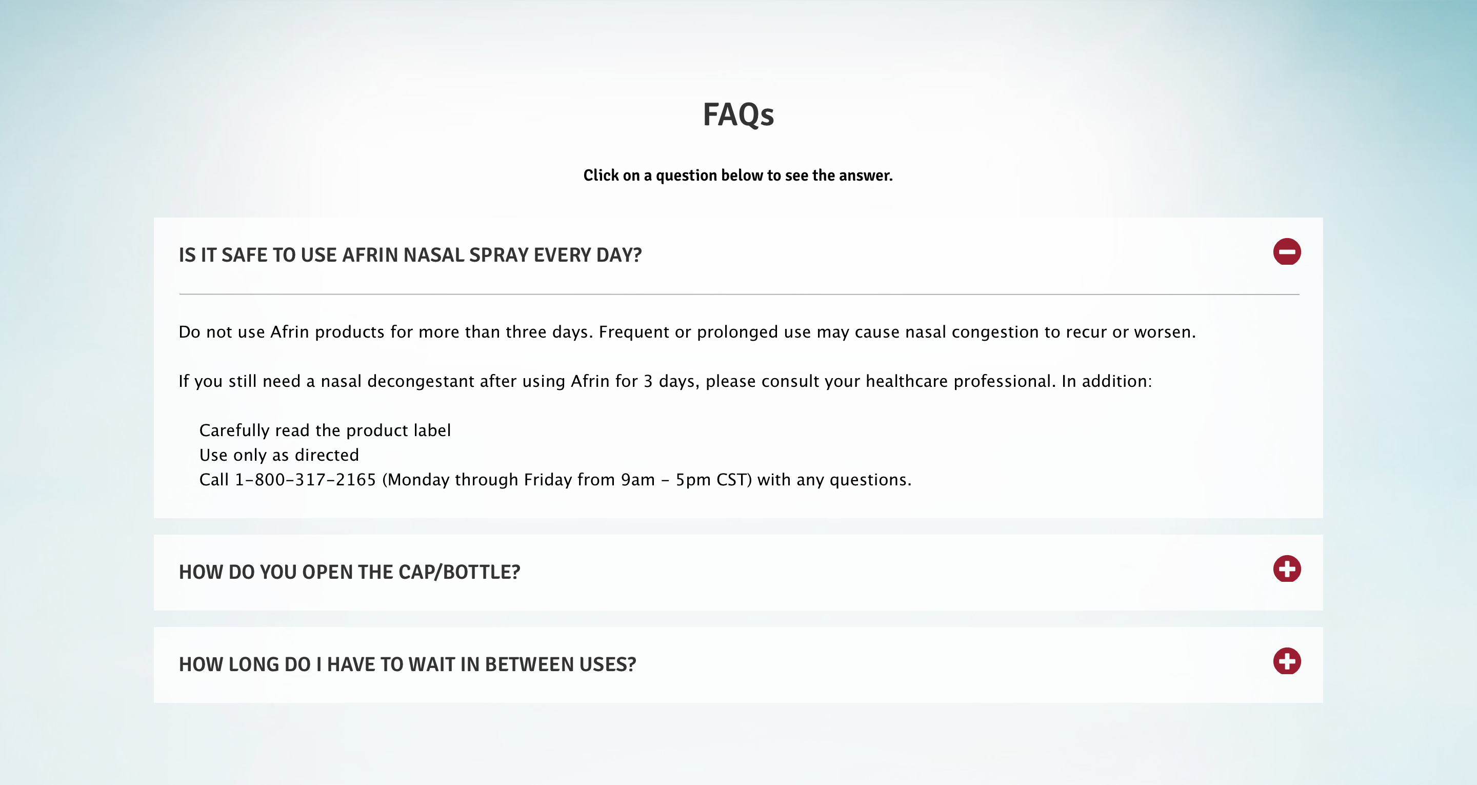 Afrin
Afrin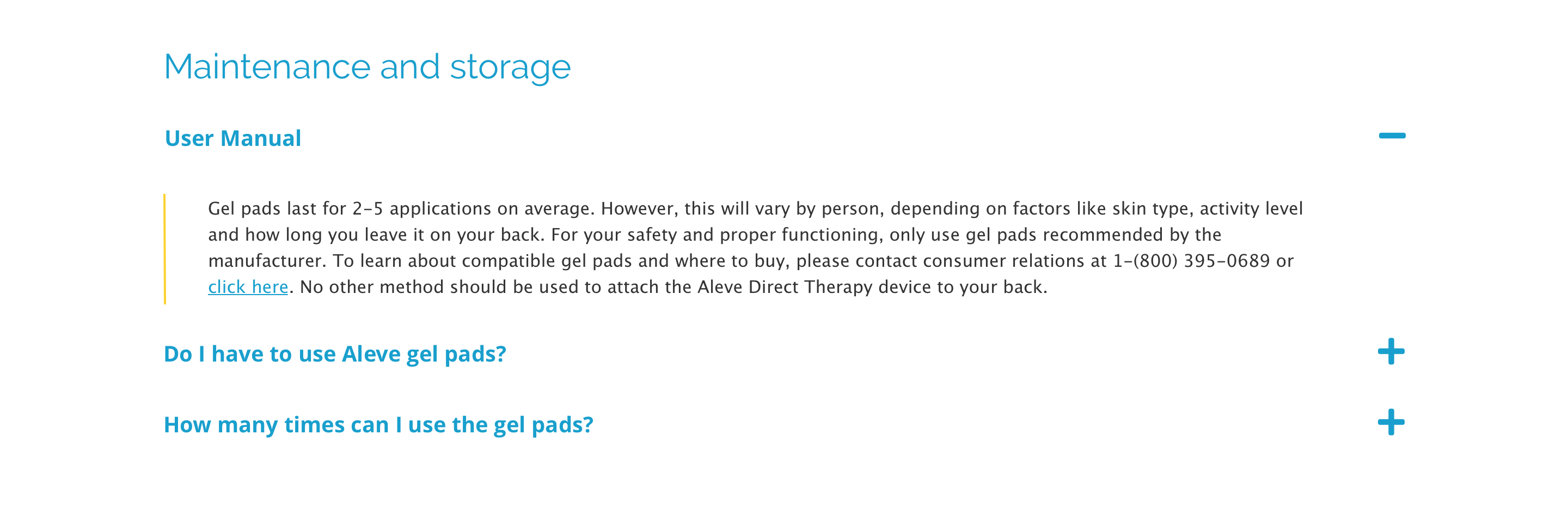 Aleve
Aleve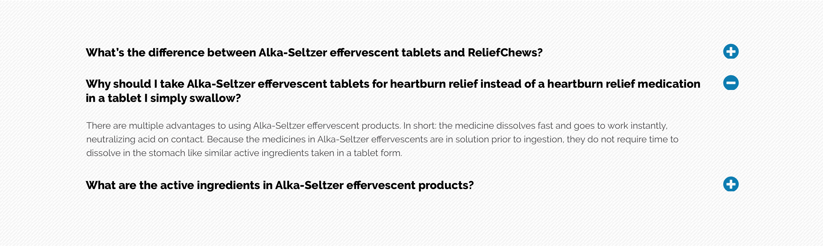 Alka-Seltzer
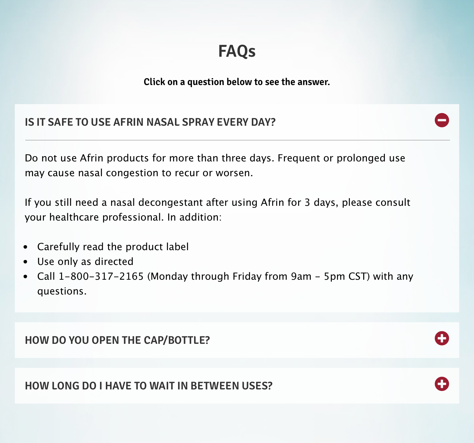 Afrin
Afrin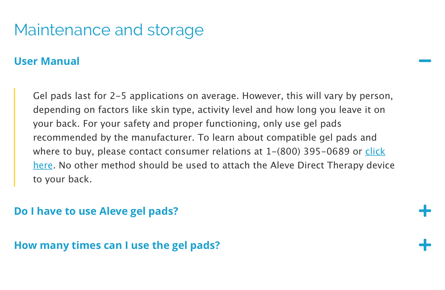 Aleve
Aleve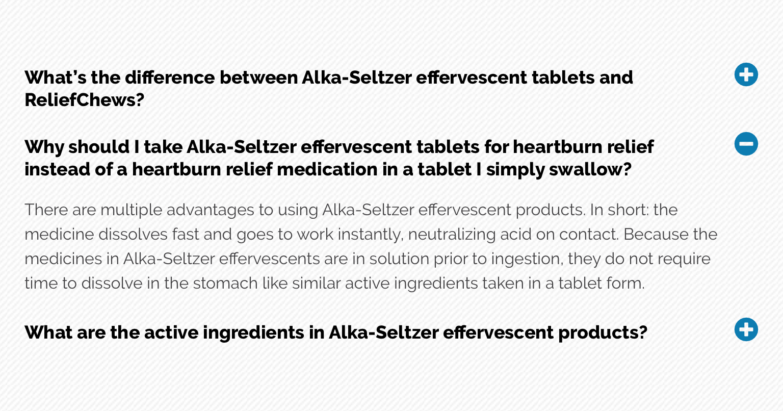 Alka-Seltzer
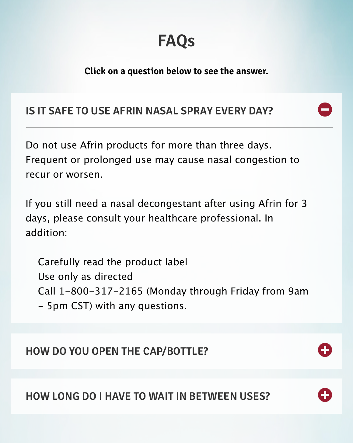 Afrin
Afrin Aleve
Aleve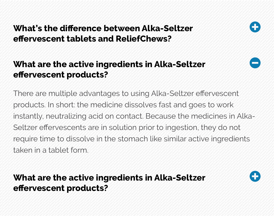 Alka-Seltzer
General usage dos and don'ts
| ✅ Dos | ❌ Don'ts |
|---|---|
| Ensure the text is legible. | Do not use a background image that makes the text hard to read. |
| Can include a clickable element to validate consumption or confirm if the content was helpful. This will require additional development. | |
| We advise to only have one unique FAQ per page as duplication will cause multiple Accordions opening at the same time. | Do not have multiple FAQs from the same page/ID as this will cause the accordions with the same ID to open at the same time or only the closest to the top of the page. |