Tabs
Tabs can be used to switch between different content groupings and are recommended to organise content at a high level. Each Tab item nested within the Tab container, features a drop zone where you can drop your component of choice. We recommend using Content panel components and limiting the number of tabs to six where possible.
- Overview
- Specification
- Style Guide Manager
- Examples in-situ
- Usage
Tab container
The Tab container is used in conjunction with Tab items. It allows for the use of optional text and heading styles above the Tab item dropzone.
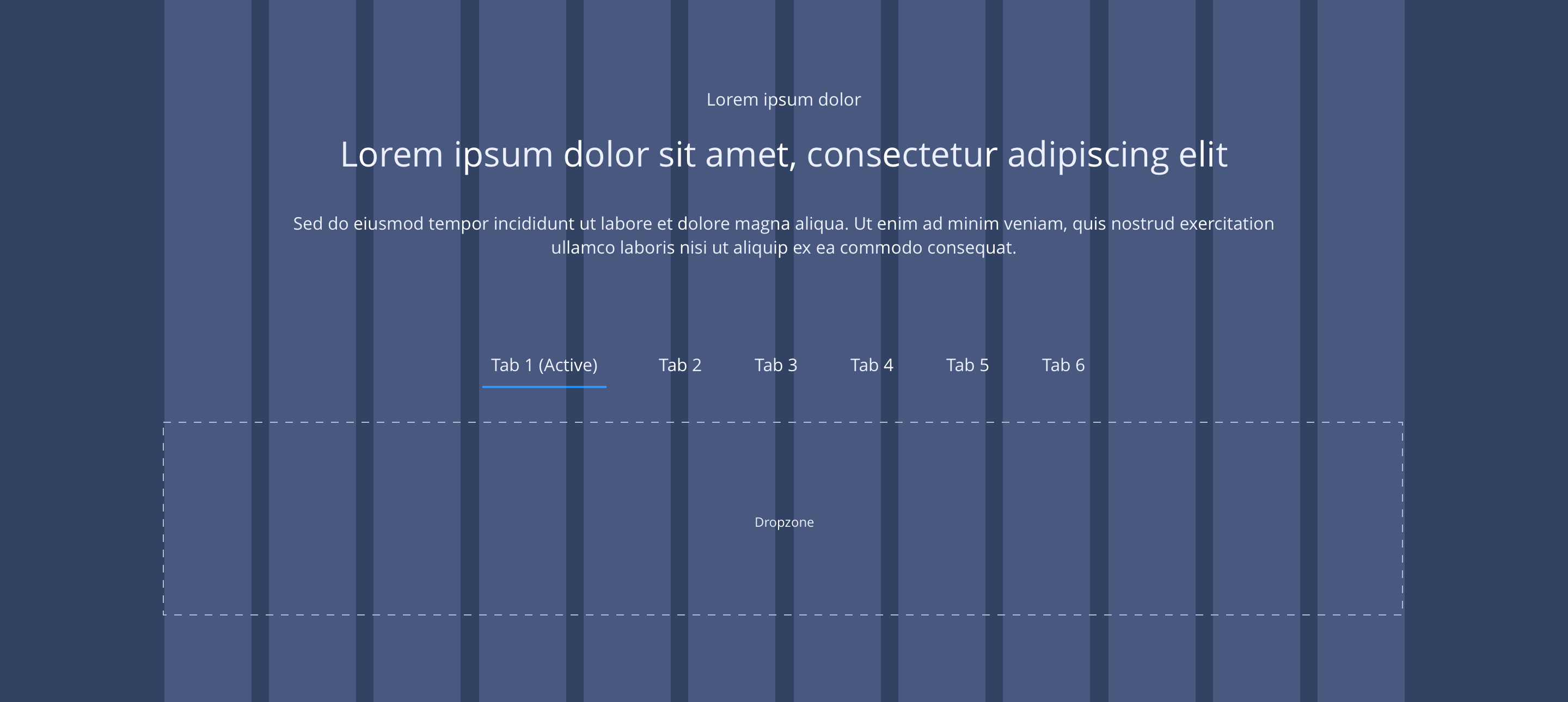
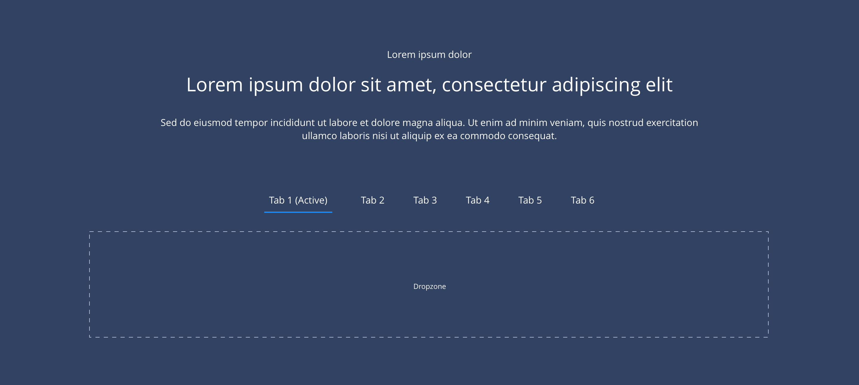
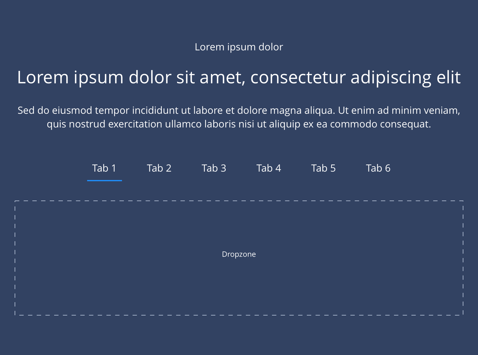
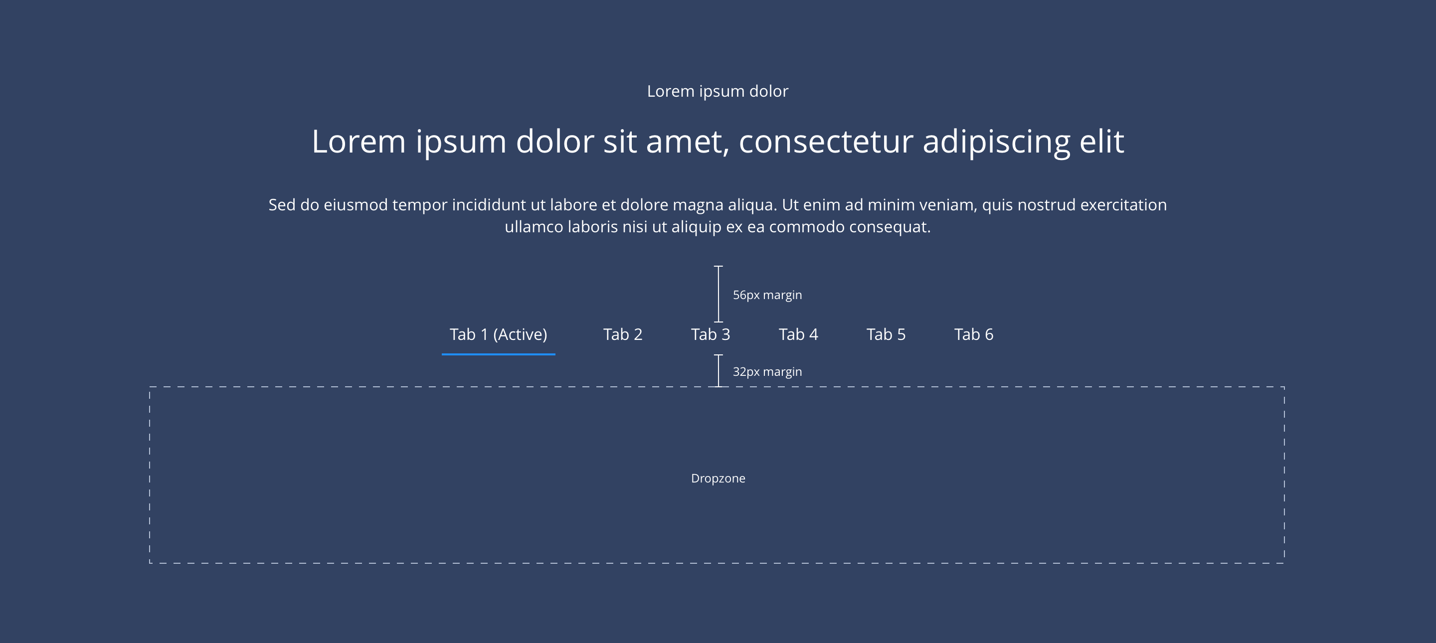
Overview
Example showing Tab container with Tab items and content centrally aligned.
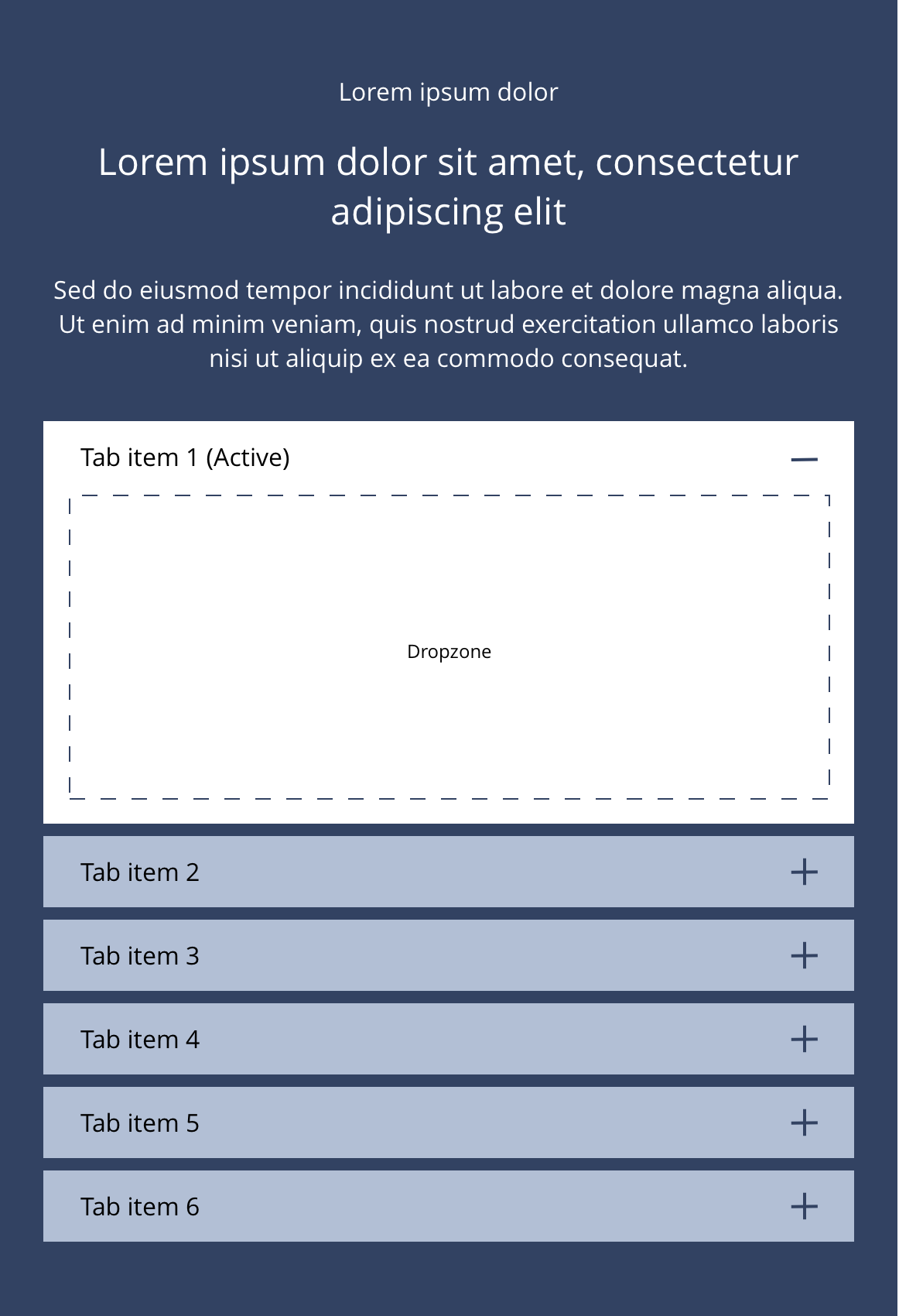
Tab item
Tab items are dragged into the accordion container as required. Any Content Panel components can be dropped inside the Tab item.

Tabs container
 Layout specification
| Component item | Requirement & purpose | Optional or mandatory | CMS options |
|---|---|---|---|
| Height | Expands based on size of content. | n/a | n/a |
| Width | The container is set to full width. Content is constrained to the width of the grid. The content is full width by default but can be restricted to either 10 or 8 columns on desktop and tablet. The content is always full width on mobile. | n/a | 12, 10 or 8 column width. |
| Background image | Allows user to set background image. This is full width and should be set to cover. | Optional | Image uploader. On/off at mobile breakpoint. |
| Background image aria label | The aria-label allows us to specify a string to be used as the accessible label. | Optional | Text input field |
| Background image alignment | Allows control of background image alignment. | Optional | Vertically align top, centre or bottom. Horizontally align left, centre or right. |
| Show/hide background image on mobile | Allows editor to hide background image on mobile breakpoint. | Optional | Show/hide. |
| Background colour | Allows user to set a background colour on the component. | Optional | Choose from colour palette. |
| Lazy Load Background | Allows user to lazy load the background image | Optional | On/Off |
| Tab alignment | Controls content horizontal alignment for desktop and mobile. | Optional | Left, centre or right. |
| Tab title padding | Controls the padding to the left of the tab title on mobile. | Optional | Padding or no padding. |
| First item to open | Allows the user to set which tab item should be open on load. | Optional | Text input (e.g 1, 2, 3, 4). |
| Border bottom | Allows a boxed width border to be added to the bottom of the component. | Optional | On/off. |
| Border bottom width | Sets the border width. | Optional | Add a px value. |
| Border bottom colour | Sets the border colour. | Optional | Choose from colour palette. |
| Padding top and bottom | Allows control of the top and bottom spacing within this component. Set globally via the SGM. | Mandatory | Large, medium, small or none. |
| Margin bottom | Allows control of the spacing below the component. Set globally via the SGM. | Mandatory | Large, medium, small or none. |
| Transition | Animation duration is 0.3 seconds with “ease-in-out” easing. Transition is set to fade. When the tabs change to accordions on mobile the transition should be set to slide down. | n/a | n/a |
| Pre-heading text | Allows user to set a pre-heading before H1. | Optional | Text input. |
| Pre-heading text colour | Sets pre-heading colour. | Optional | Choose from colour palette. |
| Heading text | Sets heading text. | Optional | Text input. |
| Heading element | Sets H2, H3 or H4 on component. | Optional | Select heading element. |
| Heading style | Allows user to choose where more then one type of heading style may be present (i.e. multiple H2's). | Optional | Select heading style. |
| Paragraph text | Sets paragraph content. | Optional | Text input. |
| Paragraph style | Sets paragraph style. | Optional | Paragraph style select. |
| Paragraph colour | Sets paragraph colour. | Optional | Choose from colour palette. |
| WYSIWYG | Allows user to format text where additional styles may be required. | Optional | WYSIWYG. |
Interaction
These are the interactive aspects of the component.
| Interaction |
|---|
| Clicking a tab reveals the content within the tab. |
Tab item
 Layout specification
| Component item | Requirement & purpose | Optional or mandatory | CMS options |
|---|---|---|---|
| Height | Expands based on size of content. | n/a | n/a |
| Width | The container is set full width. Content is constrained to the width of the grid. | n/a | n/a |
| Navigation title | Allows the user to add a title to the tab item. | Optional | Text field |
| Background image | Allows user to set background image. This is full width and should be set to cover. | Optional | Image uploader. On/off at mobile breakpoint. |
| Background image alignment | Allows control of background image alignment. | Optional | Vertically align top, centre or bottom. Horizontally align left, centre or right. |
| Show/hide background image on mobile | Allows editor to hide background image on mobile breakpoint. | Optional | Show/hide. |
| Background colour | Allows user to set a background colour on the component. | Optional | Choose from colour palette. |
| Lazy Load Background | Allows user to lazy load the background image | Optional | On/Off |
| Content alignment | Controls content horizontal alignment. | Optional | Left, centre or right. |
| Padding top and bottom | Allows control of the top and bottom spacing within this component. Set globally via the SGM. | Mandatory | Large, medium or small. |
Tab container
These are the Style Guide Manager settings that are specific to this component. For global settings see the Style Guide Manager section.
| Property | Requirement & purpose | Default | SGM override |
|---|---|---|---|
| Margin above drop zone | Sets the site wide margin above the drop zone. | Desktop - 56px Tablet - 40px Mobile - 32px | Desktop Tablet Mobile |
Tab item
| Property | Requirement & purpose | Default | SGM override |
|---|---|---|---|
| Default tab navigation font select | Sets the font of the tab navigation. | Open Sans | Choose from font stacks. |
| Default tab navigation font weight | Sets the font weight of the tab navigation. Should only be used if a font has been imported. | n/a | Text input (e.g 300, 400, 600). |
| Default tab navigation font colour | Sets the font colour of the tab navigation. | Grey | Choose from colour palette. |
| Active tab navigation font colour | Sets the active font colour of the tab navigation. | Black | Choose from colour palette. |
| Active tab navigation border bottom colour | Sets the colour of the tab navigation border bottom. | Black | Choose from icon picker. |
| Active tab navigation border bottom width | Sets the width of the tab navigation border bottom. | 4px | Choose size within range slider. |
There are currently no designs available for this.
General usage dos and don'ts
| ✅ Dos | ❌ Don'ts |
|---|---|
| Ensure the text is legible. | Do not use a background image that makes the text hard to read. |
| Do use tabs with Content Panel components. | Don't use Accordions within Tabs as Tabs turn into Accordions on mobile which will result in Accordions within Accordions. This can be a confusing experience for the user. |
| ACCESSIBILITY: Tab text should clearly describe the content of the Tab for accessibility. Any components included in the Tab should follow the recommendations for accessibility of that component. |