Shallow hero
The Shallow hero is a full width section to be used at the top of pages. It is primarily for inner page headers and can be used with or without a background image.
- Overview
- Specification
- Style Guide Manager
- Examples in-situ
- Usage
Specification
This provides guidance on the build, layout and content options for this component.
Layout specification
| Component item | Requirement & purpose | Optional or mandatory | CMS options |
|---|---|---|---|
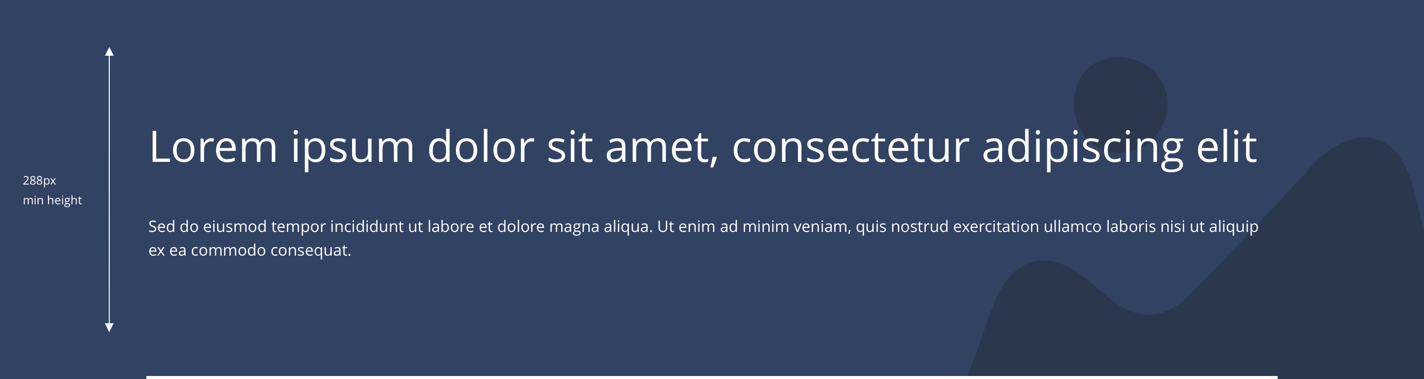
| Minimum height | Sets minimum height of component for each breakpoint. Component expands based on content. | n/a | Set globally via SGM and affects all instances of the component on the site. |
| Content width | The content is contained by the grid width. | n/a | n/a |
| Desktop background image | Allows user to set a background image. This is full width and set to cover. | Optional | Image uploader. |
| Expand Image Height on Desktop | Allows user to turn ON a configuration to set the image height on desktop | Optional | On/Off |
| Image Height | Allows user to set the image height on desktop breakpoint | Optional | Range slider |
| Desktop background image alignment | Allows control of background image alignment. | Optional | Vertically align top, centre or bottom. Horizontally align left, centre or right. |
| Image style | Allows user to be able to turn off applied image styling to the background image for desktop. | Optional | On/Off |
| Mobile background image | Allows user to set a background image. This is full width and set to cover. | Optional | Image uploader. |
| Expand Image Height on Mobile | Allows user to turn ON a configuration to set the image height on mobile | Optional | On/Off |
| Image Height | Allows user to set the image height on mobile breakpoint | Optional | Range slider |
| Mobile background image alignment | Allows control of background image alignment. | Optional | Vertically align top, center or bottom. Horizontally align left, center or right. |
| Background image aria label | The aria-label allows us to specify a string to be used as the accessible label. | Optional | Text input field |
| Show/hide background image on mobile | Allows editor to hide background image on mobile breakpoint. | Optional | Show/hide. |
| Background colour | Allows user to set a background colour on the component. | Optional | Choose from colour palette. |
| Content alignment on desktop and mobile | Controls alignment. | Optional | Vertically align top or centre. Horizontally align left, centre or right. |
| Match height top container | To match the height with the main container So the content could be aligned with respectively. | Optional | On/off. |
| Text position | Controls position of text. | Optional | Left, centre or right. |
| Border bottom | Allows a boxed width border to be added to the bottom of the component. | Optional | On/off. |
| Border bottom width | Sets the border width. | Optional | Add a px value. |
| Border bottom colour | Sets the border colour. | Optional | Choose from colour palette. |
| Padding top and bottom | Allows control of the top and bottom spacing within this component. Set globally via the SGM. | Mandatory | Large, medium or small. |
| Margin bottom | Allows control of the spacing below the component. set globally via the SGM. | Mandatory | Large, medium, small or none. |
| Pre-heading text | Sets a pre-heading on the component. | Optional | Text input. |
| Pre-heading text colour | Sets pre-heading colour. | Optional | Choose from colour palette. |
| Heading text | Sets heading content. | Optional | Text input. |
| Heading style | Sets heading style | Optional | Select from dropdown |
| Heading colour | Sets heading colour. | Optional | Choose from colour palette. |
| Paragraph text | Sets paragraph content. | Optional | Text input. |
| Paragraph style | Sets paragraph style. | Optional | Paragraph style select. |
| Paragraph colour | Sets paragraph colour. | Optional | Choose from colour palette. |
| WYSIWYG | Allows user to format text where additional styles may be required. | Optional | WYSWIYG. |
| Activate link | Allow user to add the link to the hero banner | Optional | Toggle button |
| URL | To add the link url | Mandatory | input field |
| Target | To set link target | mandatory | same window / New window - Drop down list |
Interaction
These are the interactive aspects of the component.
| Interaction |
|---|
| None |
These are the Style Guide Manager settings that are specific to this component. For global settings see the Style Guide Manager section.
| Property | Default values | SGM override |
|---|---|---|
| Minimum height | Desktop - 288px Tablet - 240px Mobile - 240px | Desktop Tablet Mobile |


General usage dos and don'ts
| ✅ Dos | ❌ Don'ts |
|---|---|
| This component contains a H1 and should only be used at the top of a page. | Do not use this component anywhere else on a page. |
| Only use one hero component per page. | Do not use multiple hero components on a page. |
| Ensure the text is legible. | Do not use a background image that makes the text hard to read. |
| Read our guidance on imagery. |