Slider hero
The Slider hero is a full width section to be used exclusively at the top of a page. The slider hero is made up of a Slider hero container and multiple Slider hero items. The recommended max amount of slides is 6. The slider container can be can be customised as described in the layout specification tab below.
- Overview
- Specification
- Style Guide Manager
- Examples in-situ
- Usage
Specification
This provides guidance on the build, layout and content options for this component.
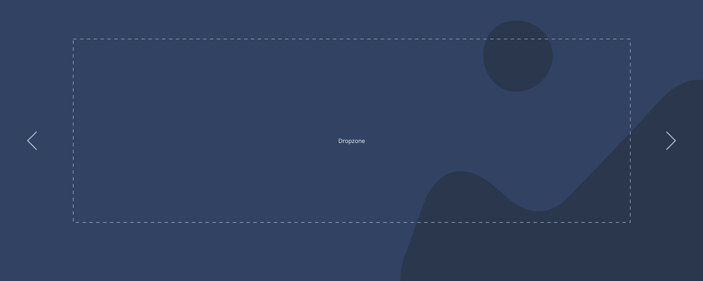
Layout Specification
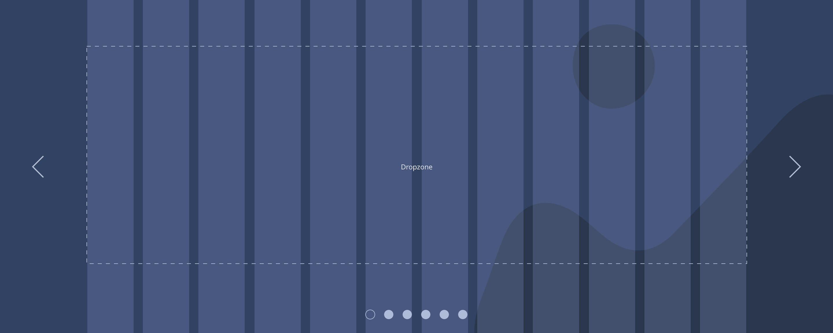
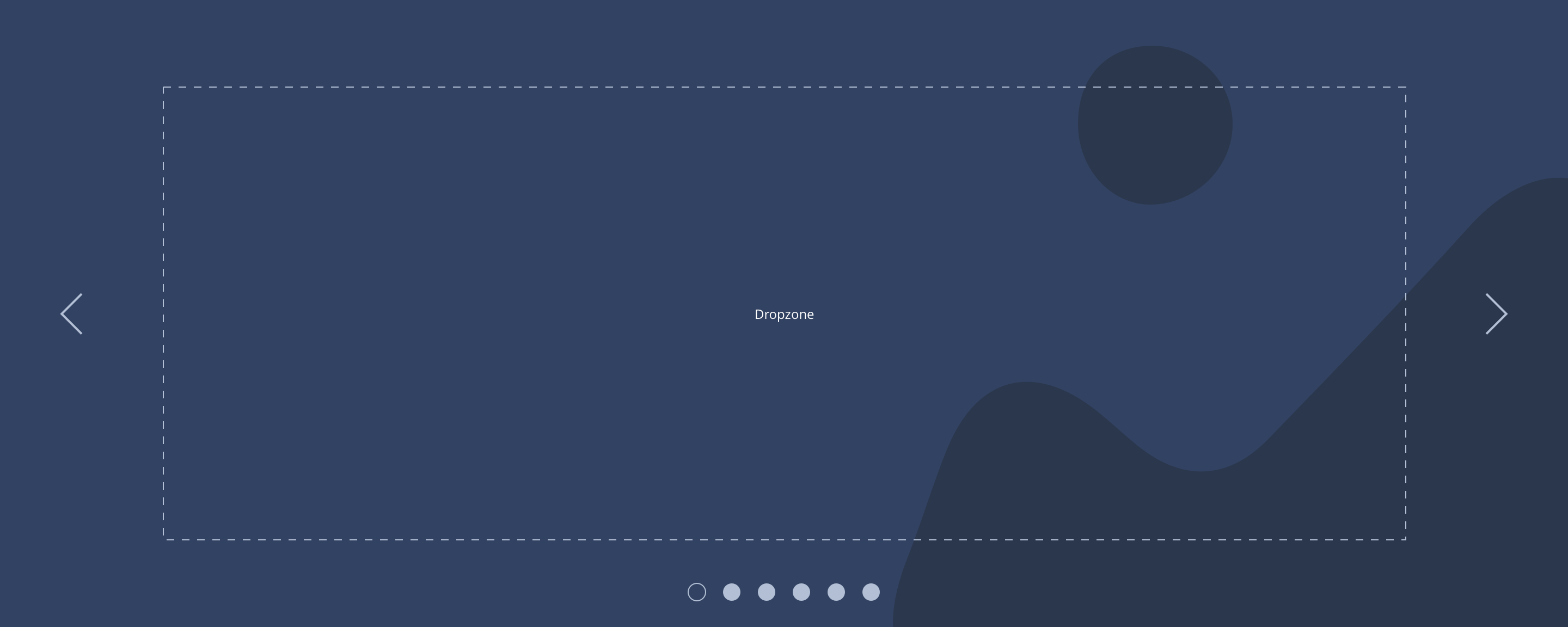
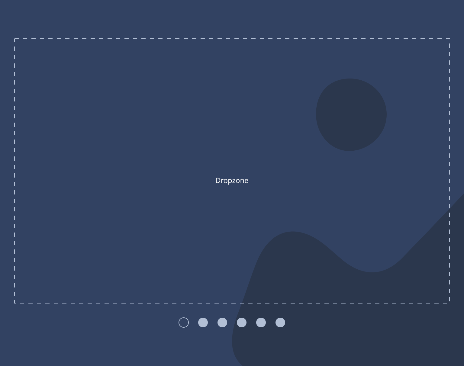
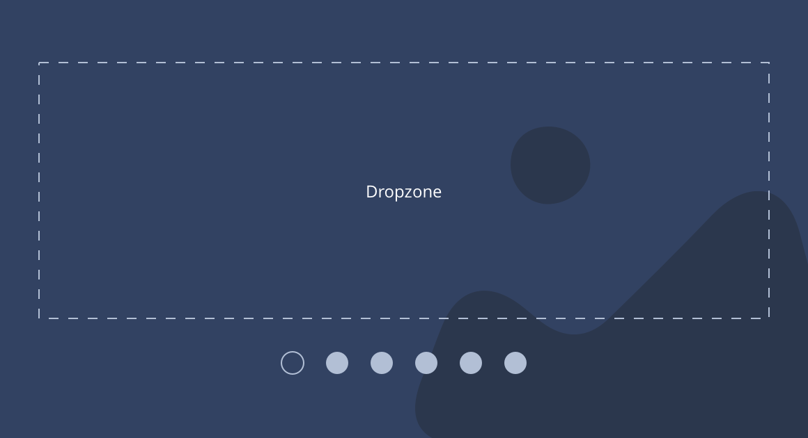
Slider hero container
| Component item | Requirement & purpose | Optional or mandatory | CMS options |
|---|---|---|---|
| Slider container padding top and bottom | Allows control of the top and bottom spacing within this component. This can be configured at brand level. | n/a | Large, medium or small. |
| Slider container margin bottom | Allows control of spacing below component. This can be configured at brand level. | Mandatory | Large, medium, small or none. |
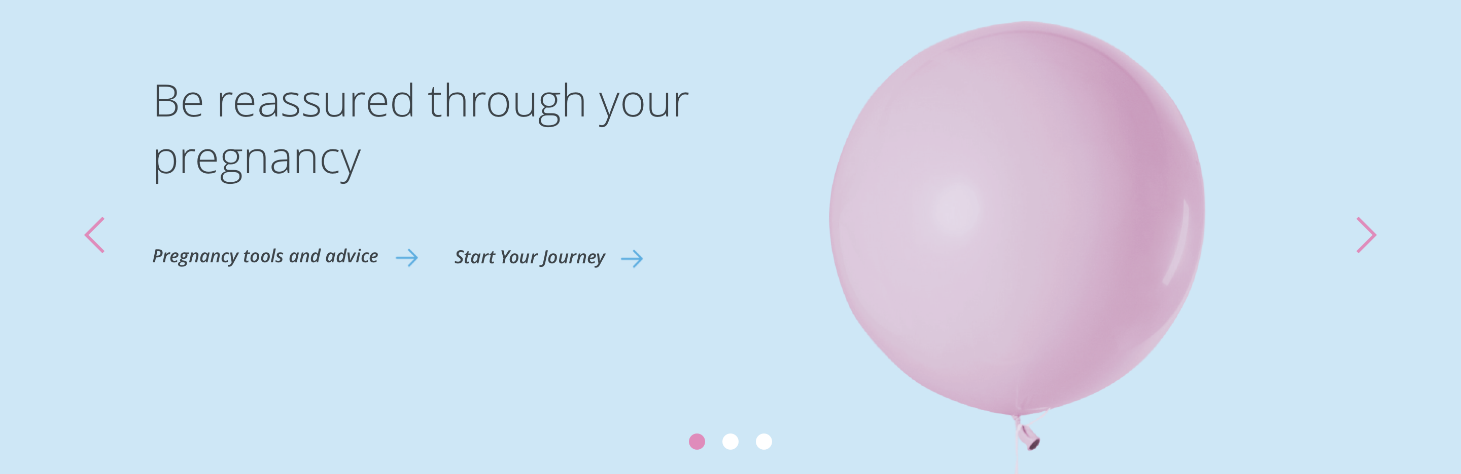
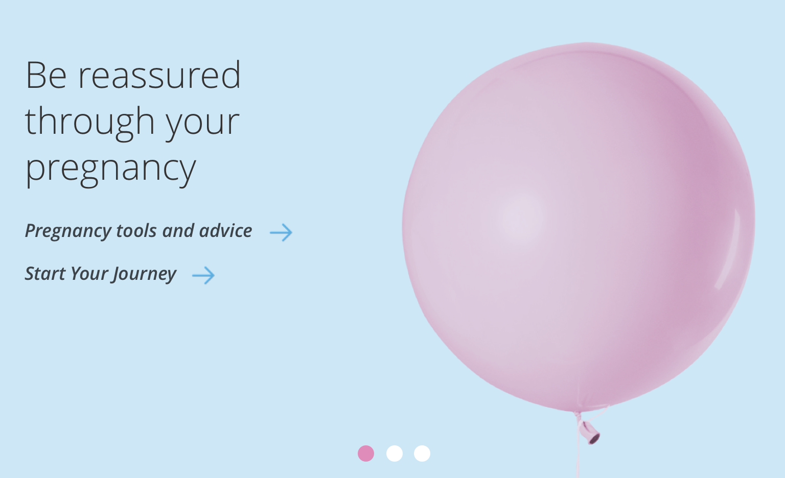
| Slider navigation | Allows user to navigate through slides. Icons size 32x32px. Vertically aligned to centre of the slide 40px outside boxed grid. Navigation hides on tablet and below. | Mandatory | Icon colour and icon set by SGM. |
| Slider navigation colour | Allows user to overwrite the colour set for slider navigation in the Style Guide Manager. | Optional | Choose from colour palette. |
| Slider pagination | Indicates number of slides. Dot size 16x16px positioned inside container centrally aligned 24px from bottom on desktop and tablet, 16px from bottom on mobile. Active slide is indicated by different colour. | Mandatory | Colours set by SGM. |
| Slider pagination active colour | Allows user to overwrite the colour set for the active pagination in the Style Guide Manager. | Optional | Choose from colour palette. |
| Slider pagination inactive colour | Allows user to overwrite the colour set for the inactive pagination in the Style Guide Manager. | Optional | Choose from colour palette. |
| Slider play button | Allows user to overwrite the colour set for the inactive pagination in the Style Guide Manager. | Optional | Hex code |
| Slider pause button | Allows user to overwrite the colour set for the inactive pagination in the Style Guide Manager. | Optional | Hex code |
| Slider easing | Animation duration is 0.5 seconds with “ease-in-out” easing. Transition is set to slide. | n/a | n/a |
| Auto slide function | Auto slide set to 4 seconds and pauses on hover. | Mandatory | n/a |
| Drag enabled | On all breakpoints. | n/a | n/a |
| Swipe enabled | On all touch devices. | n/a | n/a |
| Minimum height | Sets minimum height of component for each breakpoint. Component expands based on content. | n/a | Set globally via SGM and affects all instances of the component on the site. |
| Content width | The content is contained by the grid width. Text spans 6 columns on desktop and tablet. 12 columns on mobile. | n/a | n/a |
| Desktop background image | Allows user to set a background image. This is full width and should be set to cover. | Optional | Image uploader. |
| Background image aria label | The aria-label allows us to specify a string to be used as the accessible label. | Optional | Text input field |
| Image style | Allows user to be able to turn off applied image styling to the background image for desktop. | Optional | On/Off |
| Desktop background image alignment | Allows control of background image alignment. | Optional | Vertically align top, centre or bottom. Horizontally align left, centre or right. |
| Background colour | Allows user to set a background colour on the component. | Optional | Choose from colour palette. |
| Auto-play setting | Allow user to turn-off or turn-on auto-play to slider | Mandatory | Choose from the drop-down. On/Off. By default value will be on. |
| Lazy Load Foreground | Allows users to switch On/Off the Lazy Load functionality for the foreground image. | Optional | On/Off |
Slider hero item
| Component item | Requirement & purpose | Optional or mandatory | CMS options |
|---|---|---|---|
| n/a | n/a | n/a | n/a |
Interaction
These are the interactive aspects of the component.
| Interaction |
|---|
| Slider navigation switches between slides. |
| Slider pagination switches between slides. |
| Swipe/drag on hero switches between slides. |
| On mouseover/ hover the slider pauses if set to auto slide. |
These are the Style Guide Manager settings that are specific to this component. For global settings see the Style Guide Manager section.
| Property | Global | Default | SGM override |
|---|---|---|---|
| Font picker | Yes | Open Sans | Choose from font stacks. |
| Font weight | Yes | n/a | Text input (e.g 300, 400, 600) |
| Colour picker | Yes | White | Choose from colour palette. |
| Font size | Yes | Desktop: 44px Tablet: 36px Mobile: 32px | Choose width within range slider. |
| Margin bottom | Yes | Desktop: 40px Tablet: 32px Mobile: 24px | Choose width within range slider. |


General usage dos and don'ts
| ✅ Do's | ❌ Don'ts |
|---|---|
| This component will contain hero components that utilise a H1 and should only be used at the top of a page. | Do not use this component anywhere else on a page. |
| Ensure the text is legible. | Do not use a background image that makes the text hard to read. |
| Although you can add up to 6 slides, we recommend a maximum of 3 wherever possible. | |
| Read our guidance on imagery. |