Slider hero (Deprecated)
Please note that this component is deprecated and will not be available for newer builds. It will continue to be available on sites where it has already been implemented. For new builds, please use the updated Slider hero instead.
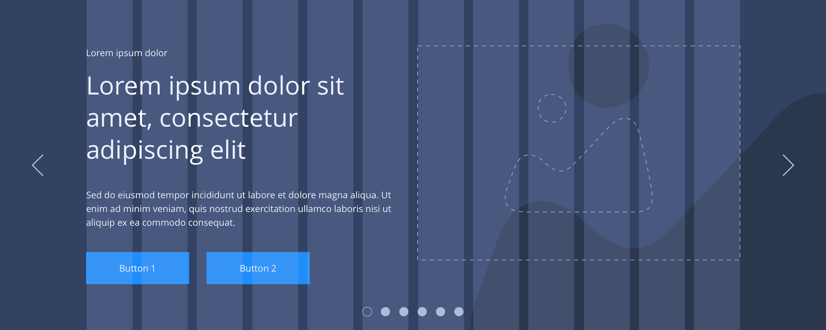
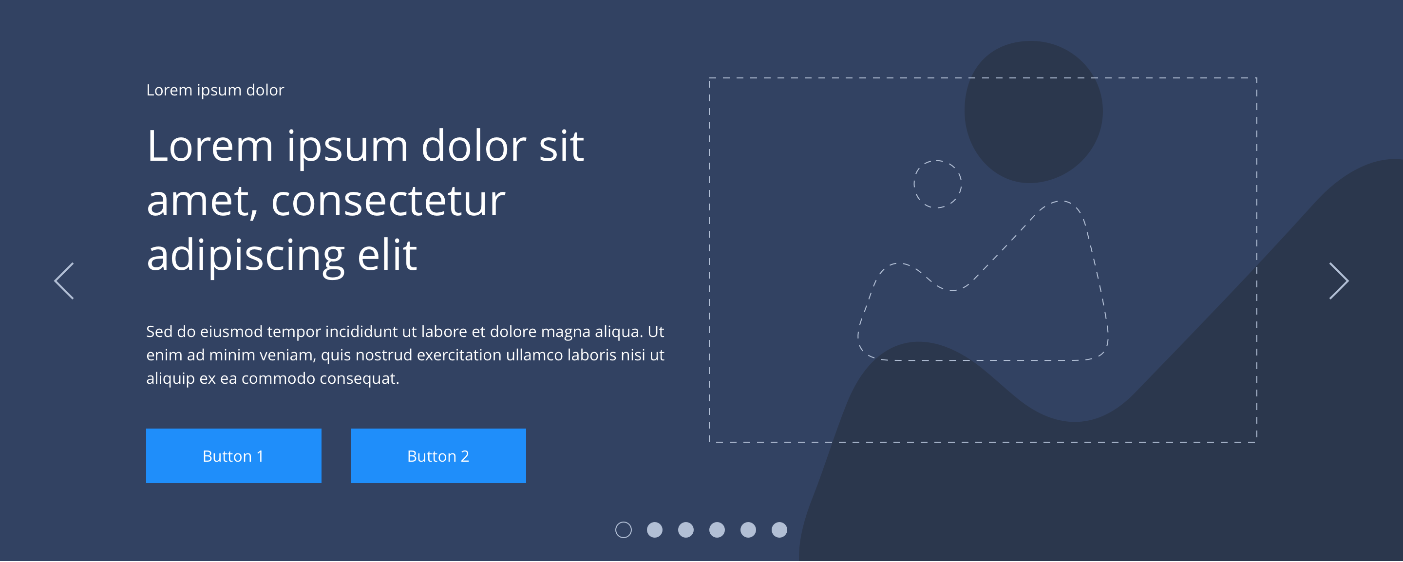
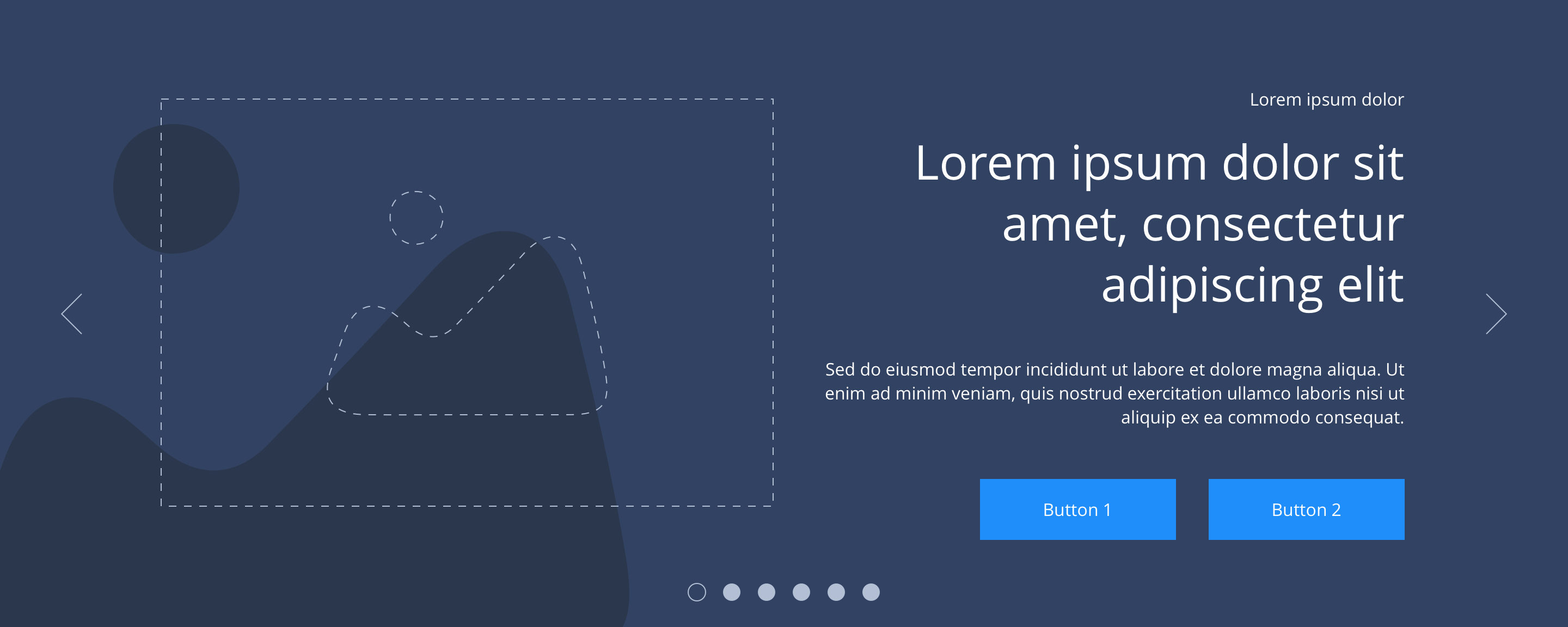
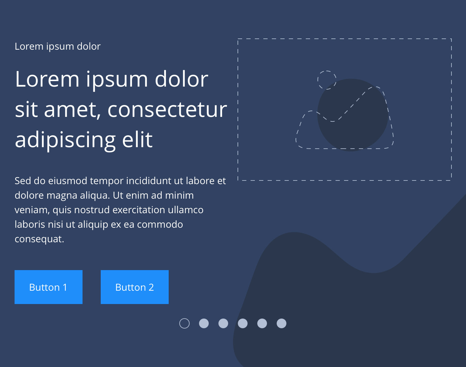
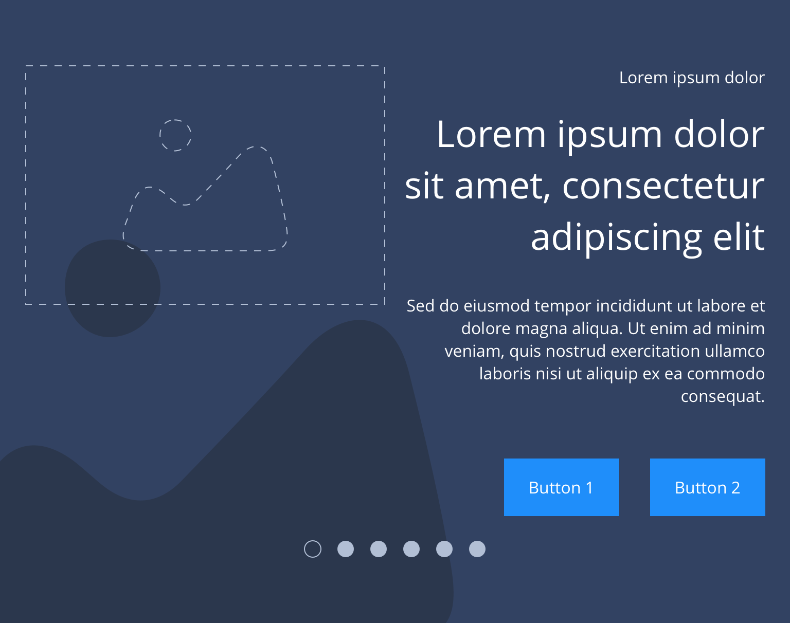
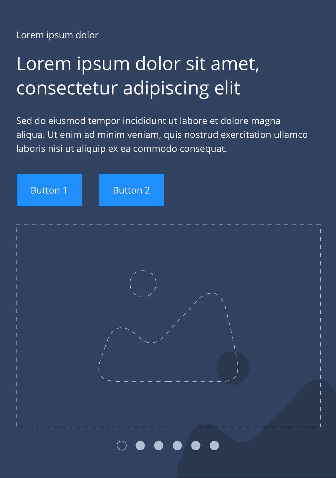
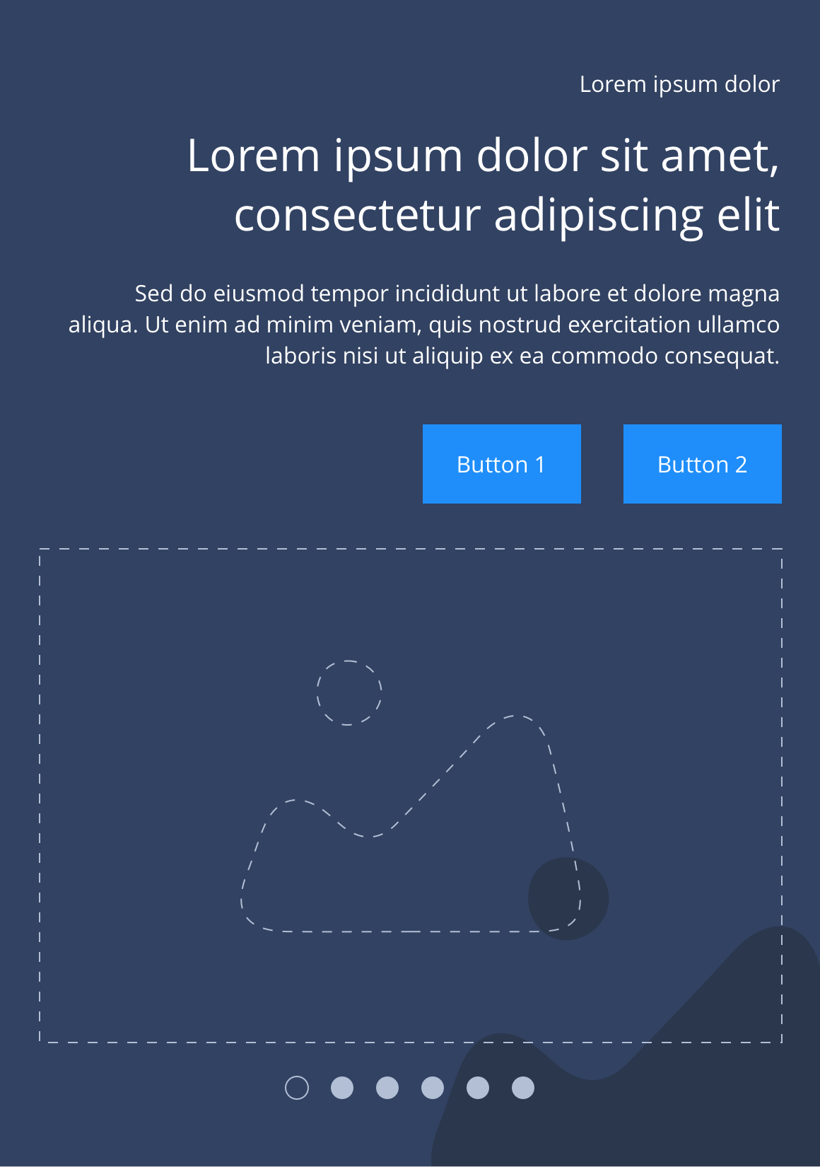
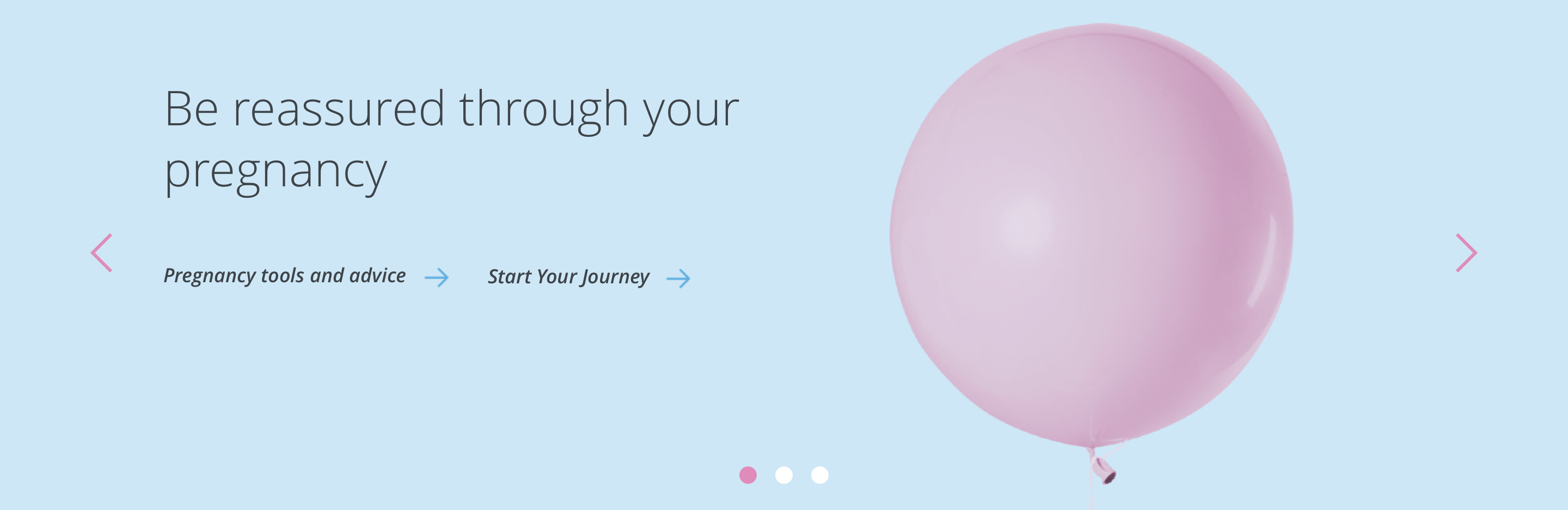
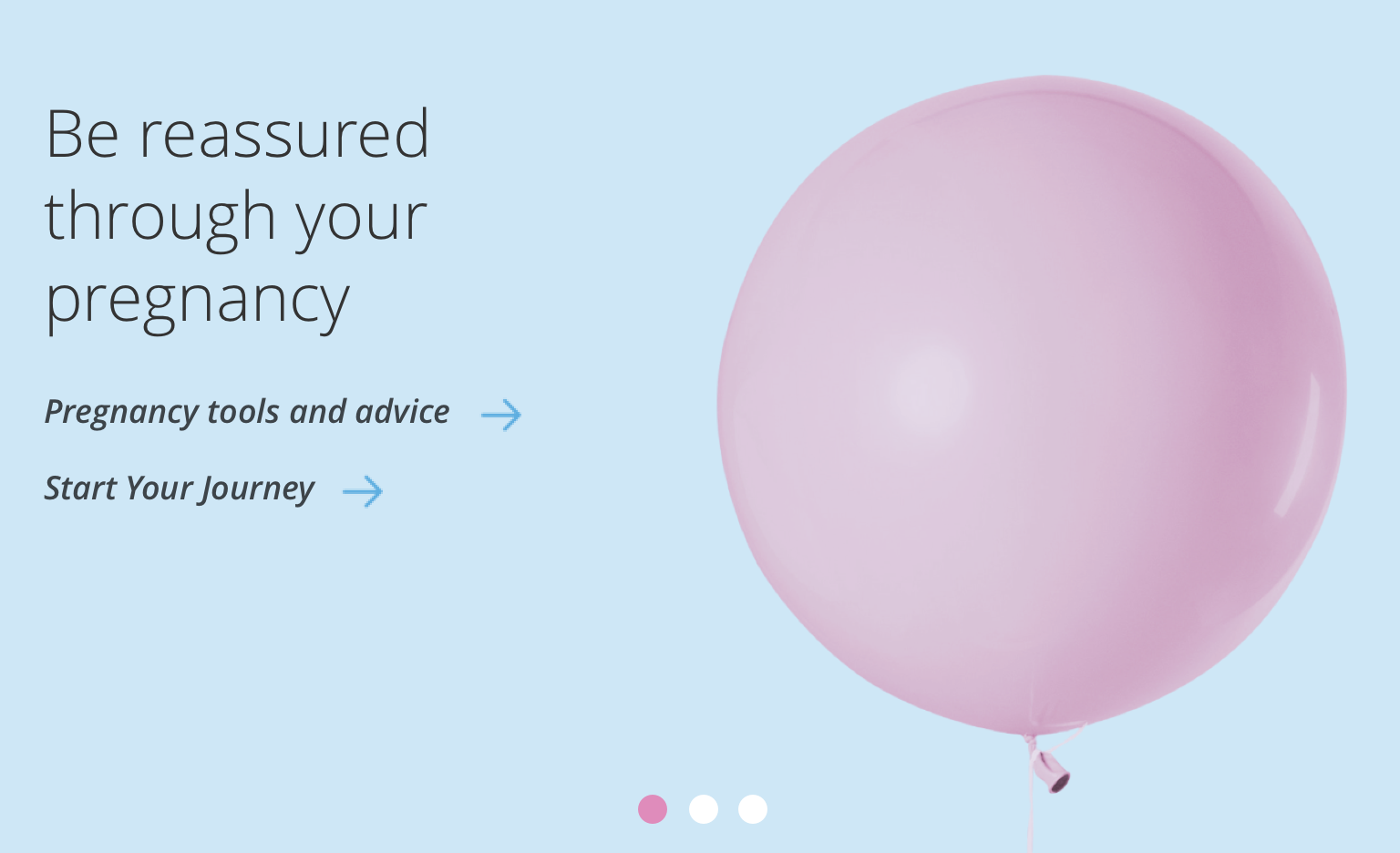
The Slider hero is a full width section to be used exclusively at the top of a page, as it utilises a H1 headline. It can accommodate a minimum of 2 slides and a maximum of 6 slides. The first 2 slides are populated with default content. Each slide can be can be customised as described in the layout specification tab below.
- Overview
- Specification
- Style Guide Manager
- Examples in-situ
- Usage
Specification
This provides guidance on the build, layout and content options for this component.
Layout specification
| Component item | Requirement & purpose | Optional or mandatory | CMS options |
|---|---|---|---|
| Slider container padding top and bottom | Allows control of the top and bottom spacing within this component. This can be configured at brand level. | n/a | Large, medium or small. |
| Slider container margin bottom | Allows control of spacing below component. This can be configured at brand level. | Mandatory | Large, medium, small or none. |
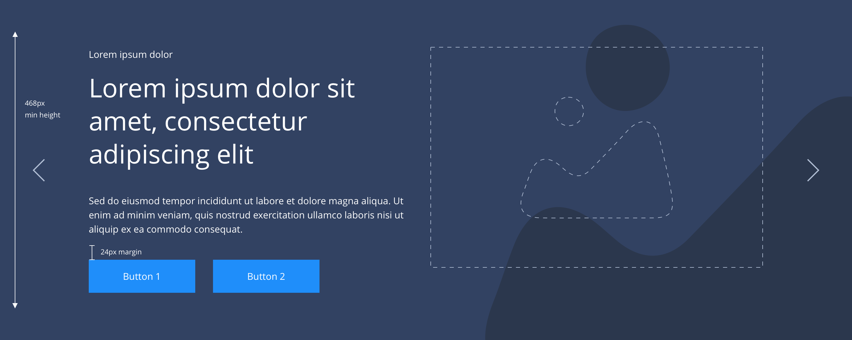
| Slider navigation | Allows user to navigate through slides. Icons size 32x32px. Vertically aligned to centre of the slide 40px outside boxed grid. Navigation hides on tablet and below. | Mandatory | Icon colour and icon set by SGM. |
| Slider navigation colour | Allows user to overwrite the colour set for slider navigation in the Style Guide Manager. | Optional | Choose from colour palette. |
| Slider pagination | Indicates number of slides. Dot size 16x16px positioned inside container centrally aligned 24px from bottom on desktop and tablet, 16px from bottom on mobile. Active slide is indicated by different colour. | Mandatory | Colours set by SGM. |
| Slider pagination active colour | Allows user to overwrite the colour set for the active pagination in the Style Guide Manager. | Optional | Choose from colour palette. |
| Slider pagination inactive colour | Allows user to overwrite the colour set for the inactive pagination in the Style Guide Manager. | Optional | Choose from colour palette. |
| Slider play/pause colour | Allows user to overwrite the colour set for the play/paise icons in the Style Guide Manager. | Optional | Choose from colour palette. |
| Slider easing | Animation duration is 0.5 seconds with “ease-in-out” easing. Transition is set to slide. | n/a | n/a |
| Auto slide function | Auto slide set to 4 seconds and pauses on hover. | Mandatory | n/a |
| Drag enabled | On all breakpoints. | n/a | n/a |
| Swipe enabled | On all touch devices. | n/a | n/a |
| Minimum height | Sets minimum height of component for each breakpoint. Component expands based on content. | n/a | Set globally via SGM and affects all instances of the component on the site. |
| Content width | The content is contained by the grid width. Text spans 6 columns on desktop and tablet. 12 columns on mobile. | n/a | n/a |
| Desktop background image | Allows user to set a background image. This is full width and should be set to cover. | Optional | Image uploader. |
| Image style | Allows user to be able to turn off applied image styling to the background image for desktop. | Optional | On/Off |
| Desktop background image alignment | Allows control of background image alignment. | Optional | Vertically align top, centre or bottom. Horizontally align left, centre or right. |
| Mobile background image | Allows user to set a background image. This is full width and should be set to cover. | Optional | Image uploader. |
| Mobile background image alignment | Allows control of background image alignment. | Optional | Vertically align top, centre or bottom. Horizontally align left, centre or right. |
| Background colour | Allows user to set a background colour on the component. | Optional | Choose from colour palette. |
| Text alignment on desktop and tablet | Controls text alignment. | Optional | Vertically align top, centre or bottom. Horizontally align left or right. |
| Text alignment on mobile | Controls text alignment. | Optional | Horizontally align left, centre or right. |
| Text position | Controls position of text. | Optional | Left, centre or right. |
| Foreground image | Allows user to set a foreground image. On mobile, the foreground image always appears below the text. | Optional | Image uploader. |
| Image alt text | Adds alt text to an image. | Mandatory where foreground image is used. | Text input. |
| Pre-heading text | Allows user to set a pre-heading before H1. | Optional | Text input. |
| Pre-heading text colour | Sets pre-heading colour. | Optional | Choose from colour palette. |
| Heading text | Sets heading content. | Optional | Text input. |
| Heading colour | Sets heading colour. | Optional | Choose from colour palette. |
| Paragraph text | Sets paragraph content. | Optional | Text input. |
| Paragraph style | Sets paragraph style | Optional | Paragraph style select. |
| Paragraph colour | Sets paragraph colour. | Optional | Choose from colour palette. |
| WYSIWYG | Allows user to format text where additional styles may be required. | Optional | WYSIWYG. |
| Link 1 | Allows user to link to a URL or launch a modal. | Optional | Link text input. Link style select. Link URL input. Target select: Same window or open in new. Modal ID input. |
| Link 2 | Allows user to link to a URL or launch a modal. | Optional | Link text input. Link style select. Link URL input. Target select: Same window or open in new. Modal ID input. |
Interaction
These are the interactive aspects of the component.
| Interaction |
|---|
| Link 1 links to either a defined page or can launch a modal. |
| Link 2 links to either a defined page or can launch a modal. |
| Slider navigation switches between slides. |
| Slider pagination switches between slides. |
| Swipe/drag on hero switches between slides. |
| On mouseover/ hover the slider pauses if set to auto slide. |
The 'Slider hero' component inherits the same minimum height as the 'Text and foreground image hero'.


General usage dos and don'ts
| ✅ Dos | ❌ Don'ts |
|---|---|
| This component contains a H1 and should only be used at the top of a page. | Do not use this component anywhere else on a page. |
| Only use one hero component per page. | Do not use multiple hero components on a page. |
| Ensure the text is legible. | Do not use a background image that makes the text hard to read. |
| Although you can add up to 6 slides, we recommend a maximum of 3 wherever possible. | |
| Read our guidance on imagery. |