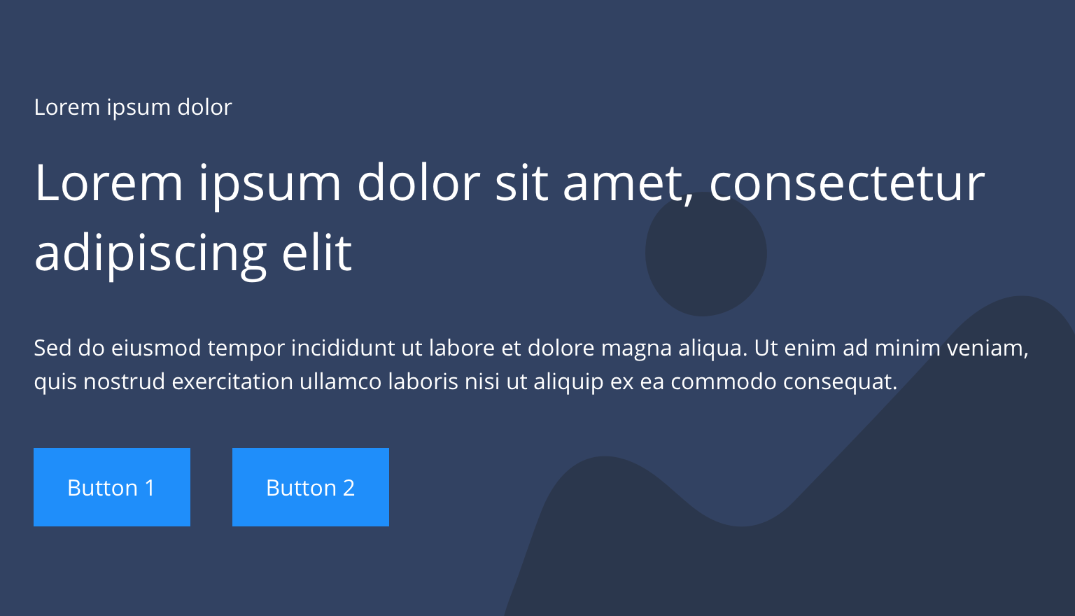
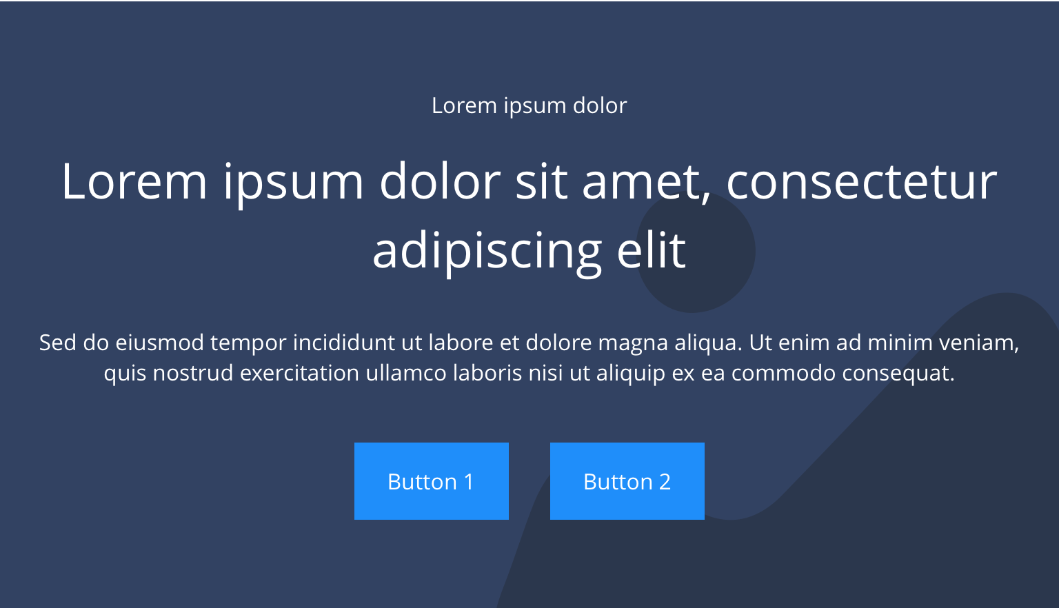
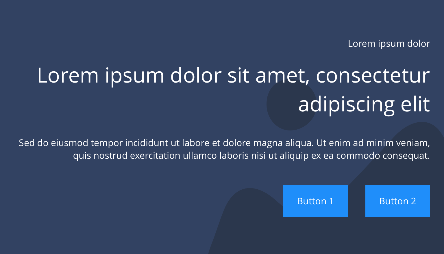
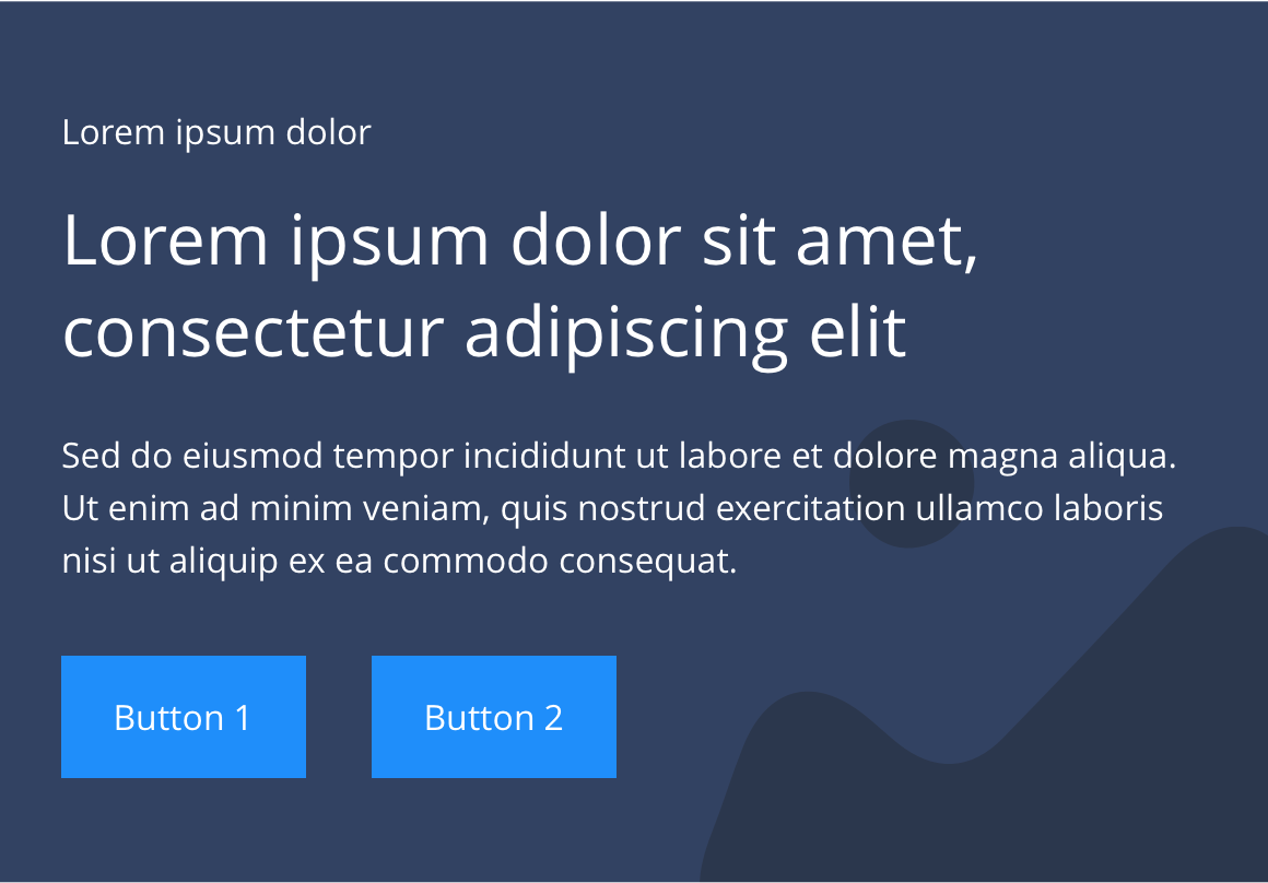
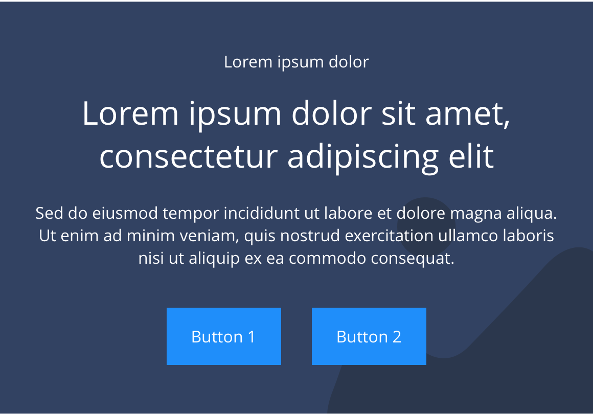
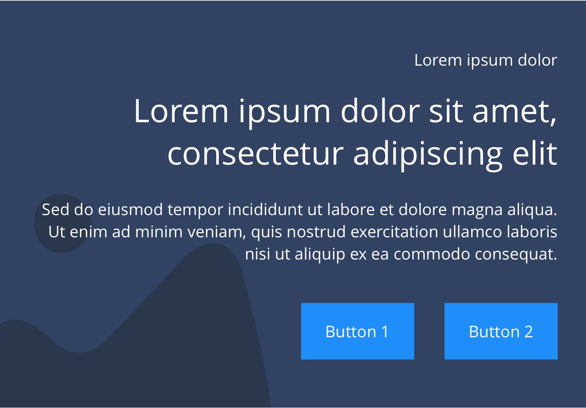
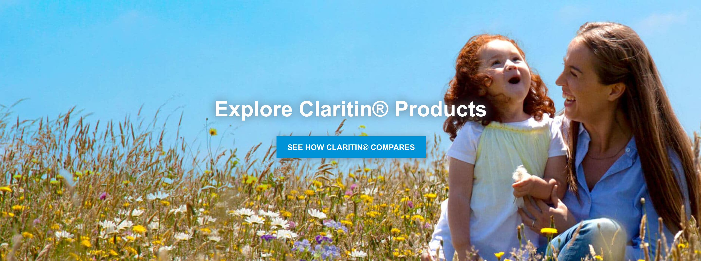
Text and background image
The Text and background image component is a full width section, to be used exclusively at the top of a page, as it utilises a H1 headline. It consists of text and a background image or colour. There are a number of options that can be customised as described in the specification tab below.
- Overview
- Specification
- Style Guide Manager
- Examples in-situ
- Usage
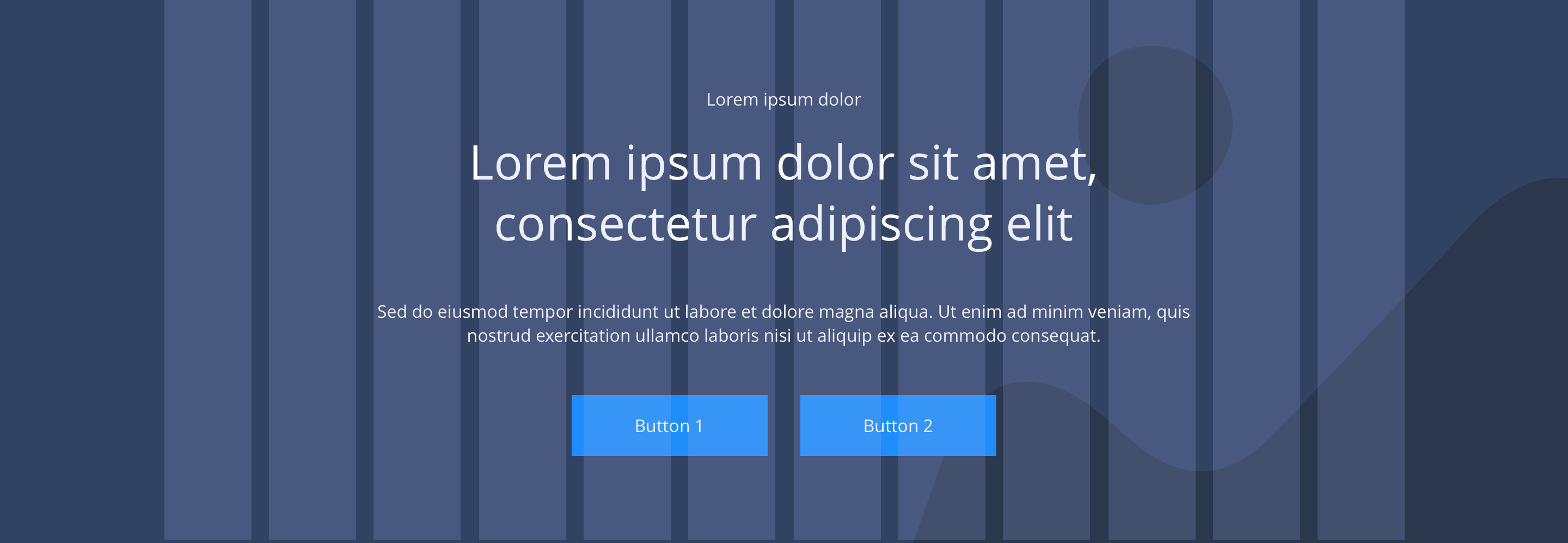
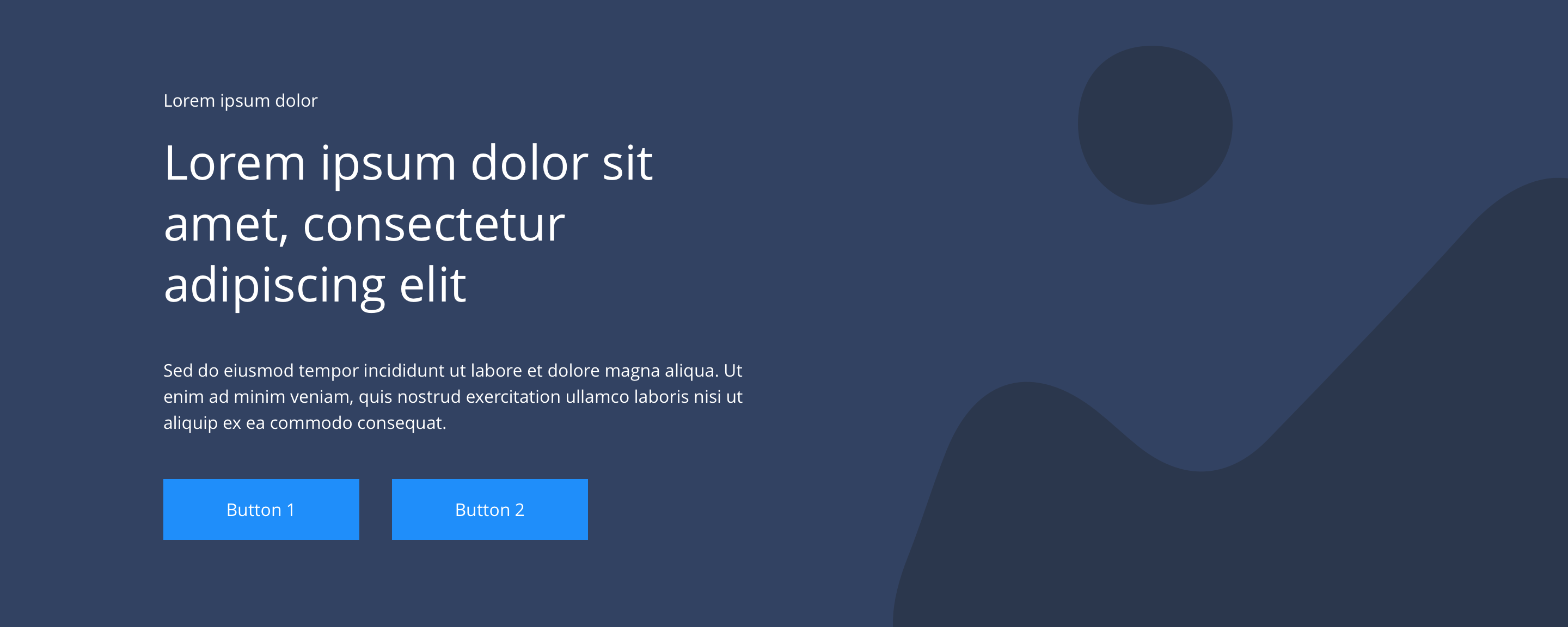
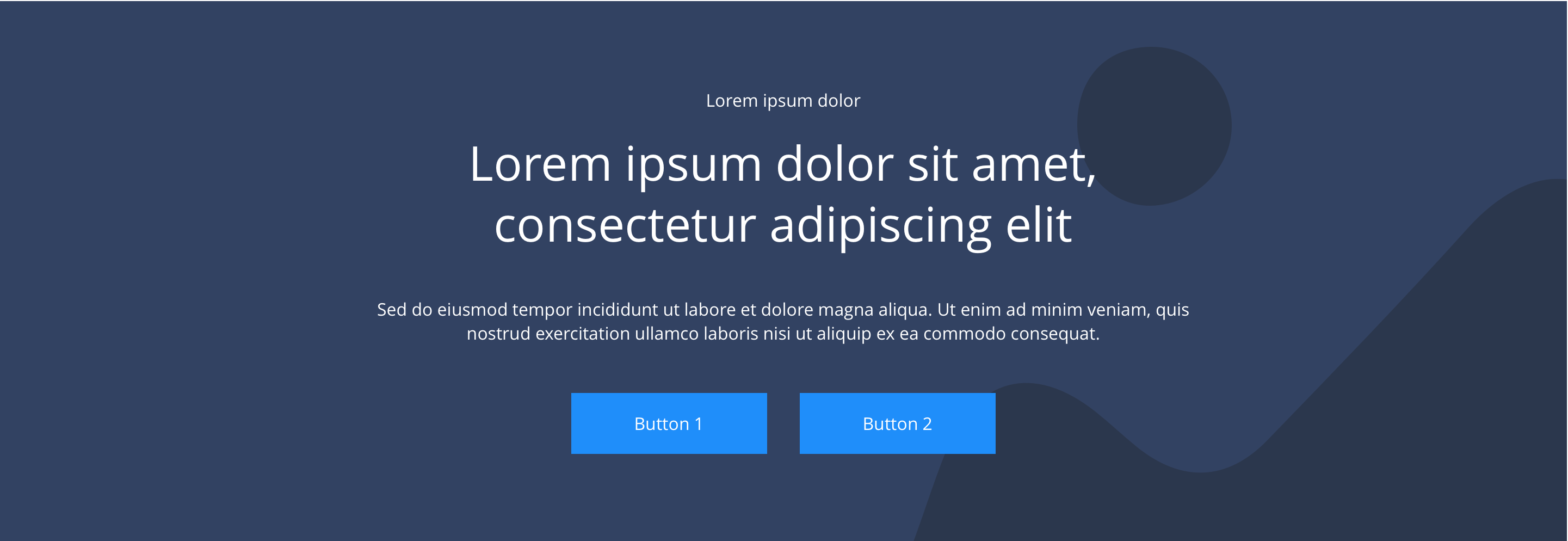
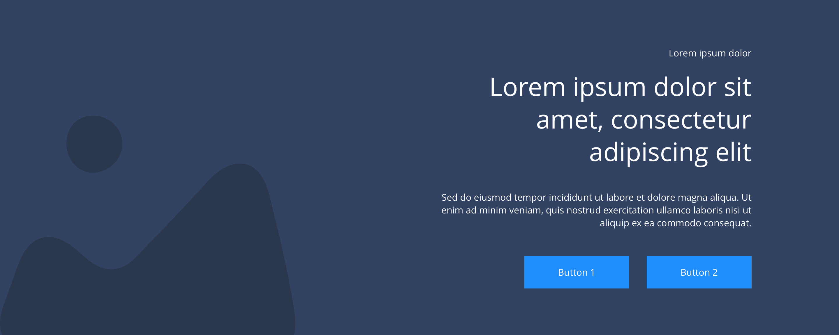
Specification
This provides guidance on the build, layout and content options for this component.
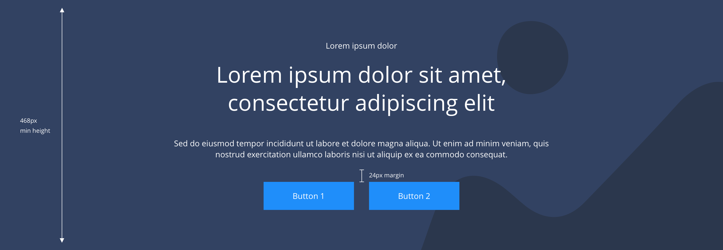
Layout specification
| Component item | Requirement & purpose | Optional or mandatory | CMS options |
|---|---|---|---|
| Minimum height | Sets minimum height of component for each breakpoint. Component expands based on content. | n/a | Set globally via SGM and affects all instances of the component on the site. |
| Content width | The content is contained by the grid width. Text spans 6 columns on desktop. 12 columns tablet on mobile. | n/a | n/a |
| Desktop background image | Allows user to set a background image. This is full width and should be set to cover. | Optional | Image uploader. |
| Expand Image Height on Desktop | Allows user to turn ON a configuration to set the image height on desktop | Optional | On/Off |
| Image Height | Allows user to set the image height on desktop breakpoint | Optional | Range slider |
| Image style | Allows user to be able to turn off applied image styling to the background image for desktop. | Optional | On/Off |
| Desktop background image alignment | Allows control of background image alignment. | Optional | Vertically align top, centre or bottom. Horizontally align left, centre or right. |
| Mobile background image | Allows user to set background image. This is full width and should be set to cover. | Optional | Image uploader. |
| Expand Image Height on Mobile | Allows user to turn ON a configuration to set the image height on mobile | Optional | On/Off |
| Image Height | Allows user to set the image height on mobile breakpoint | Optional | Range slider |
| Mobile background image alignment | Allows control of background image alignment. | Optional | Vertically align top, centre or bottom. Horizontally align left, centre or right. Horizontal position offset |
| Background image aria label | The aria-label allows us to specify a string to be used as the accessible label. | Optional | Text input field |
| Background colour | Allows user to set a background colour on the component. | Optional | Choose from a defined colour palette. |
| Content alignment on desktop and mobile | Controls text alignment. | Optional | Vertically align top, centre or bottom. Horizontally align left, centre or right. |
| Text position | Controls position of text. | Optional | Left, centre or right. |
| Padding top and bottom | Allows control of the top and bottom spacing within this component. This can be configured at brand level. | n/a | Large, medium or small. |
| Margin bottom | Allows control of spacing below component. This can be configured at brand level. | Mandatory | Large, medium, small or none. |
| Pre-heading text | Allows user to set a pre-heading before H1. | Optional | Text input. |
| Pre-heading text colour | Sets pre-heading colour. | Optional | Choose from colour palette. |
| Heading text | Sets heading content. | Optional | Text input. |
| Heading colour | Sets heading colour. | Optional | Choose from colour palette. |
| Heading style | Sets heading style | Optional | Select from dropdown |
| Paragraph text | Sets paragraph content. | Optional | Text input. |
| Paragraph style | Sets paragraph style. | Optional | Paragraph style select. |
| Paragraph colour | Sets paragraph colour. | Optional | Choose from colour palette. |
| WYSIWYG | Allows user to format text where additional styles may be required. | Optional | WYSIWYG. |
| PWA | To enable PWA CTA | Optional | Toggle button |
| Link 1 | Allows user to link to a URL or launch a modal. | Optional | Link text input. Link style select. Link URL input. Target select: Same window or open in new. Modal ID input. |
| Link 2 | Allows user to link to a URL or launch a modal. | Optional | Link text input. Link style select. Link URL input. Target select: Same window or open in new. Modal ID input. |
| Button Shapes | Allows user to select different button shapes. | Optional | Select from dropdown |
| Background gradient | Allows user to select various gradient properties for background color | Optional | Select from dropdown |
Interaction
These are the interactive aspects of the component.
| Interaction |
|---|
| Link 1 links to either a defined page or can launch a modal. |
| Link 2 links to either a defined page or can launch a modal. |
Animation
For each link there will be option to add button animation. Animation configuration option will be following
| Foreground image animate | Allows users to switch On/Off the animation functionality for the foreground image. | Optional | On/off. |
|---|---|---|---|
| Select animation | Allow user to select animation from the drop-down list. | Optional | Select list |
| Duration | Set how long in seconds the animation will take to run | Required | Numeric Input |
| Delay | Set a start delay on the animation in seconds | Optional | Numeric Input |
| Iteration | Set the number of times the animation should run | Optional | Numeric Input (Maximum two) |
| offset | Set the animation to start at a specific offset before or after the element has entered the view port | Optional | Numeric Input (Pixel) |
Gradient
For the components there will be three gradient options and their corresponding configurations.
| Background Gradient | Allows users to switch On/Off the gradient functionality for the background. | Optional | On/off |
|---|---|---|---|
| Gradient Style | Allows users to select various gradient styles | Required | Select from dropdown |
| Linear Gradient Direction | Allows user to select the direction of the linear gradient style. | Required | Select from dropdown |
| Radial Gradient Option | Allows user to select the options of the radial gradient style. | Required | Select from dropdown |
| Color | There are three color options which allows the user to select the color combinations | Required | Select from the color palette |
| Linear color distribution percentage | Allows the user to set the color distribution | Optional | Range slider |
| Radial Color distribution percentage | Allows the user to set the color distribution | Optional | Range slider |
| Angle | Allows the user to rotate the gradient color in a specific angle | Optional | Range slider |
Background Overlay
Option for a transparent layer over background image to improve contrast when there is text on top of the image.
| Enable background overlay | Allows users to switch On/Off the background overlay functionality. | Optional | On/off |
|---|---|---|---|
| Use color or gradient | Allows users to select between color or gradient to be used in the overlay | Required | Select from dropdown |
| Opacity | Allows user to select the opacity for the background overlay | Required | Input field |
These are the Style Guide Manager settings that are specific to this component. For global settings see the Style Guide Manager section.
| Property | Global | Default | SGM override |
|---|---|---|---|
| Minimum height | No | Desktop - 464px Tablet - 280px Mobile - 360px | Desktop Tablet Mobile |


General usage dos and don'ts
| ✅ Dos | ❌ Don'ts |
|---|---|
| This component contains a H1 and should only be used at the top of a page. | Do not use this component anywhere else on a page. |
| Only use one hero component per page. | Do not use multiple hero components on a page. |
| Ensure the text is legible. | Do not use a background image that makes the text hard to read. |
| Read our guidance on imagery. |