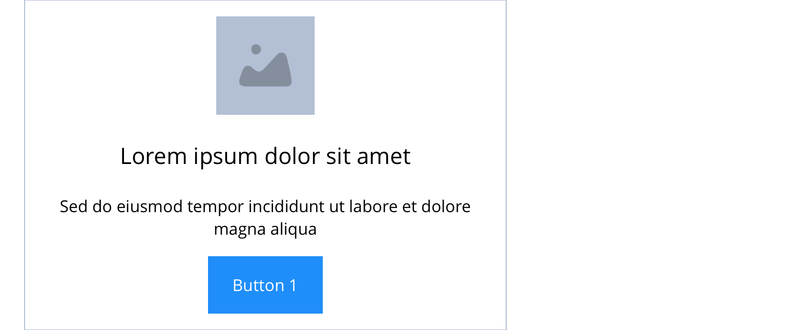
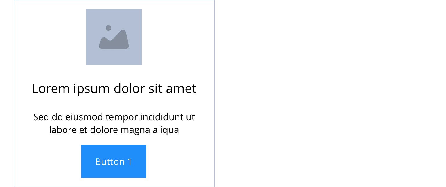
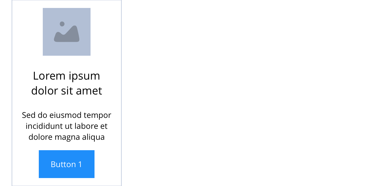
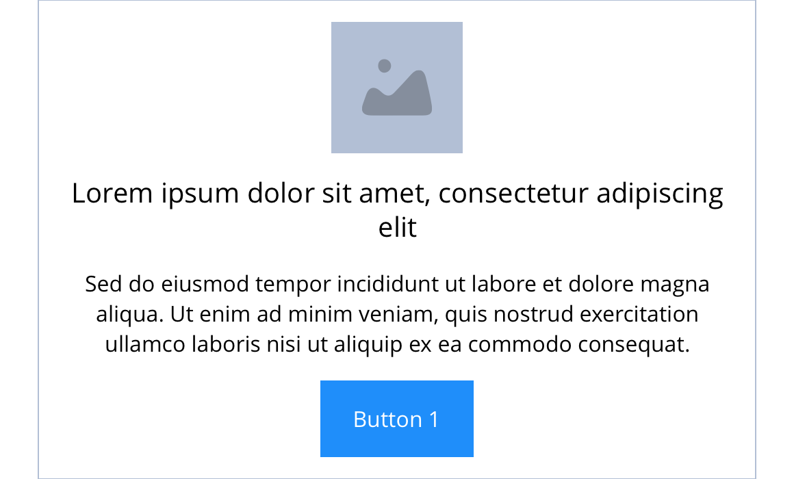
Link - Slide item 3 - Icon & text
"Link - Slide item 3 - Icon & text is recommended for use where 2 or 3 slide items are visible on screen. It can be customised as described in the specification tab below."
- Overview
- Specification
- Style Guide Manager
- Examples in-situ
- Usage


Specification
This provides guidance on the build, layout and content options for this component.
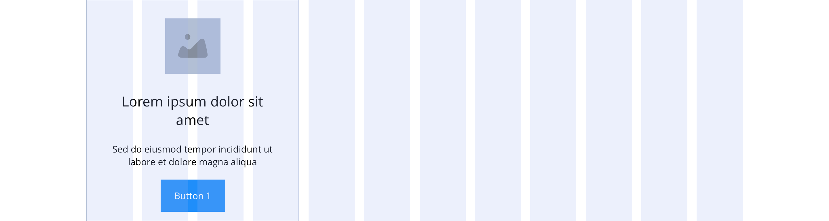
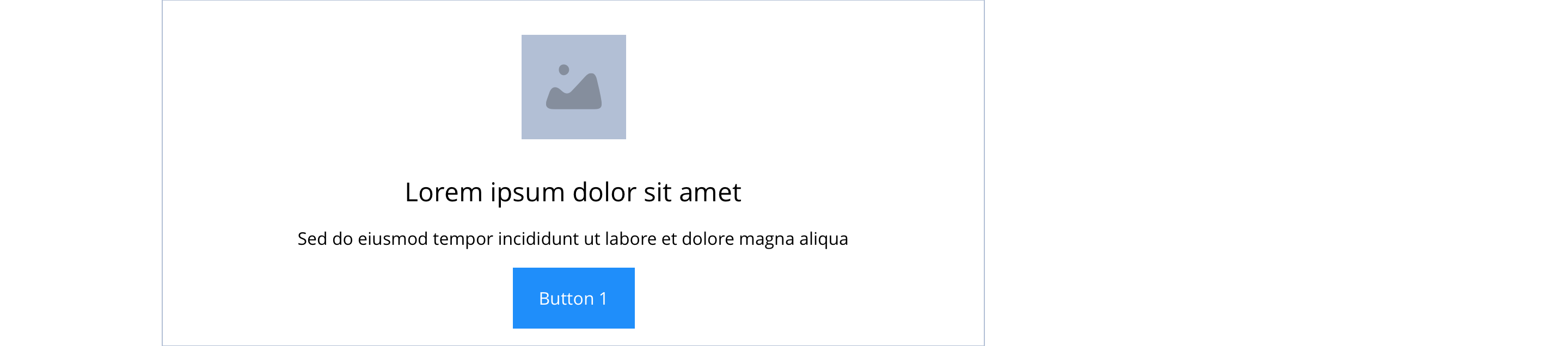
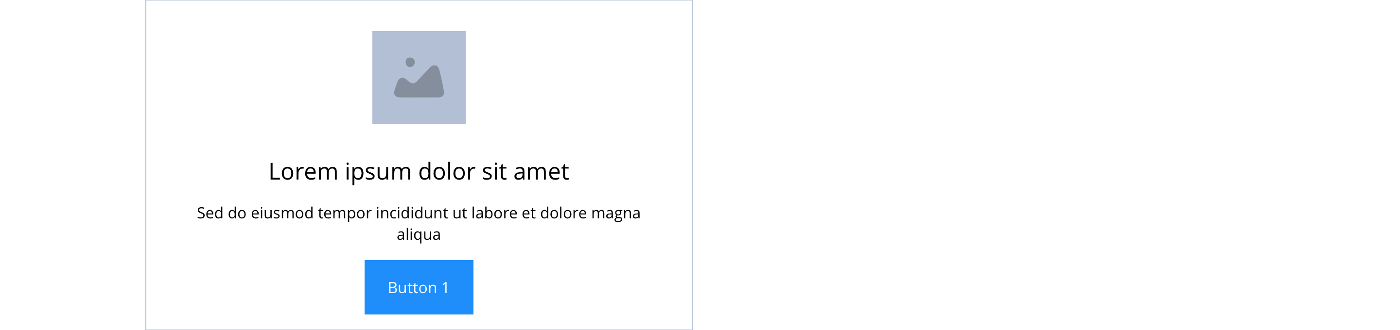
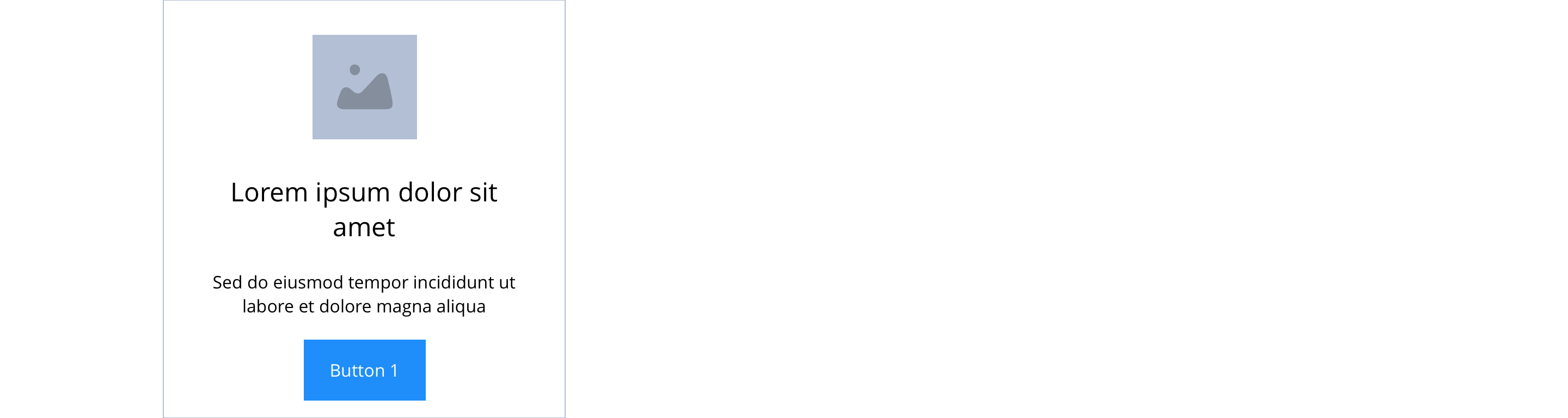
 Layout specification
Same as No link - Block 3 - Icon & text with the addition of linking and sliding properties.
| Component item | Requirement & purpose | Optional or mandatory | CMS options |
|---|---|---|---|
| PWA | to pwa cta button | Optional | Toggle button |
| Link text | Entire block (image and text panel) is a link. 'Call-to-action' is superficial but allows users to see the area is clickable. 'Call-to-action' does not render if link text not entered. | Optional | Link text input. |
| Link style | Sets link style (Link should align to bottom of block.) | Optional | Link style select. |
| Button Shapes | Allows user to select various button shapes | Optional | Dropdown |
| Link URL | Sets link on the block. | Mandatory | Set link URL for block. |
| Target | Sets link to open in the same or a new window. | Mandatory | Target select: Same window or open in new. |
Interaction
These are the interactive aspects of the component.
| Interaction |
|---|
| Block when clicked links to a defined page. |
Animation
For Image and each link there will be option to add animation. Animation configuration option will be following
| Foreground Image animate | On/Off the animation functionality for the button link. | Optional | Optional |
| Button animate | Allows users to switch On/Off the animation functionality for the button link. | Optional | On/off. |
| Select animation | Allow user to select animation from the dropdown list. | Optional | Select list |
| Duration | Set how long in seconds the animation will take to run | Required | Numeric Input |
| Delay | Delay Set a start delay on the animation in seconds | Optional | Numeric Input |
| Iteration | Set the number of times the animation should run | Optional | Numeric Input (Maximum two) |
| offset | Set the animation to start at a specific offset before or after the element has entered the view port | Optional | Numeric Input (Pixel) |
See No link - Block 3 - Icon & text for settings.


General usage dos and don'ts
| ✅ Dos | ❌ Don'ts |
|---|---|
| Slide items can only be used with the Slider container. | |
| Ensure the text is legible. | Do not use a background colour that makes the text hard to read. |
| Add a URL in the 'URL' field. | Do not add a link in the WYSIWYG. Adding a link within a link will break the layout of the component. |
| Read our guidance on imagery. | |
| Read our guidance on videos. | |
| Read our guidance on the use of WYSIWYGs. |