Slider container
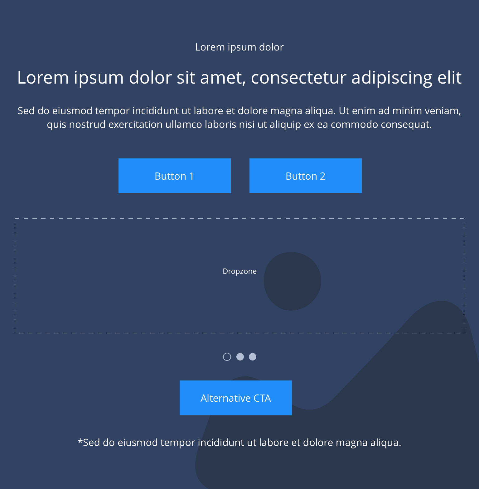
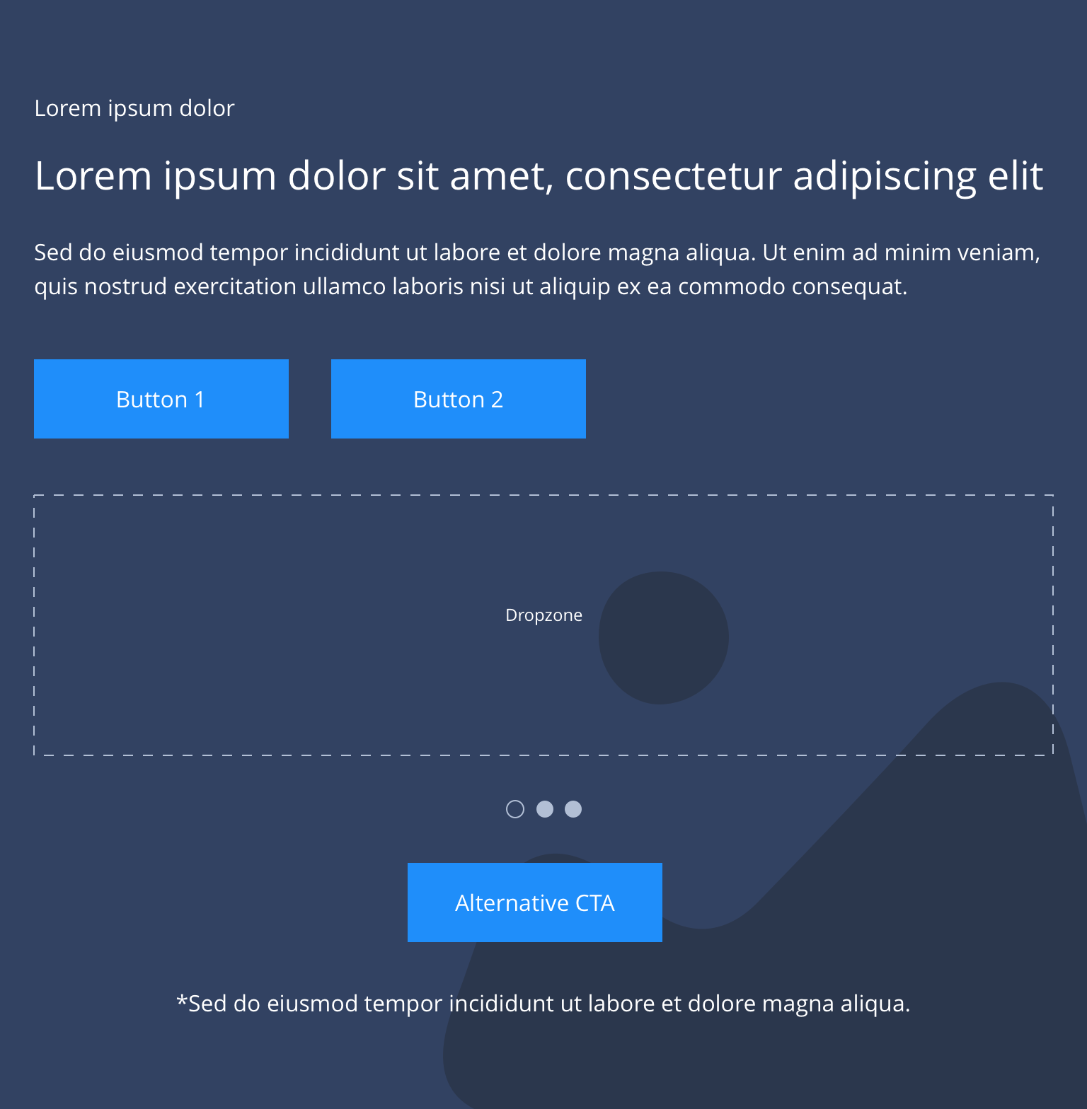
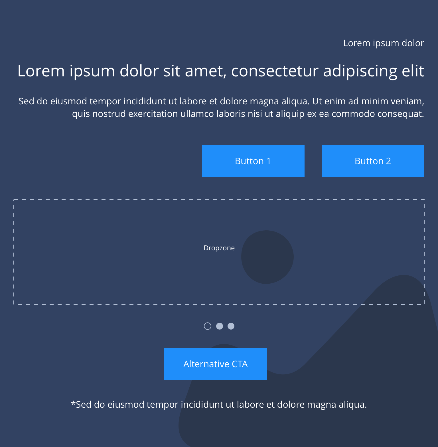
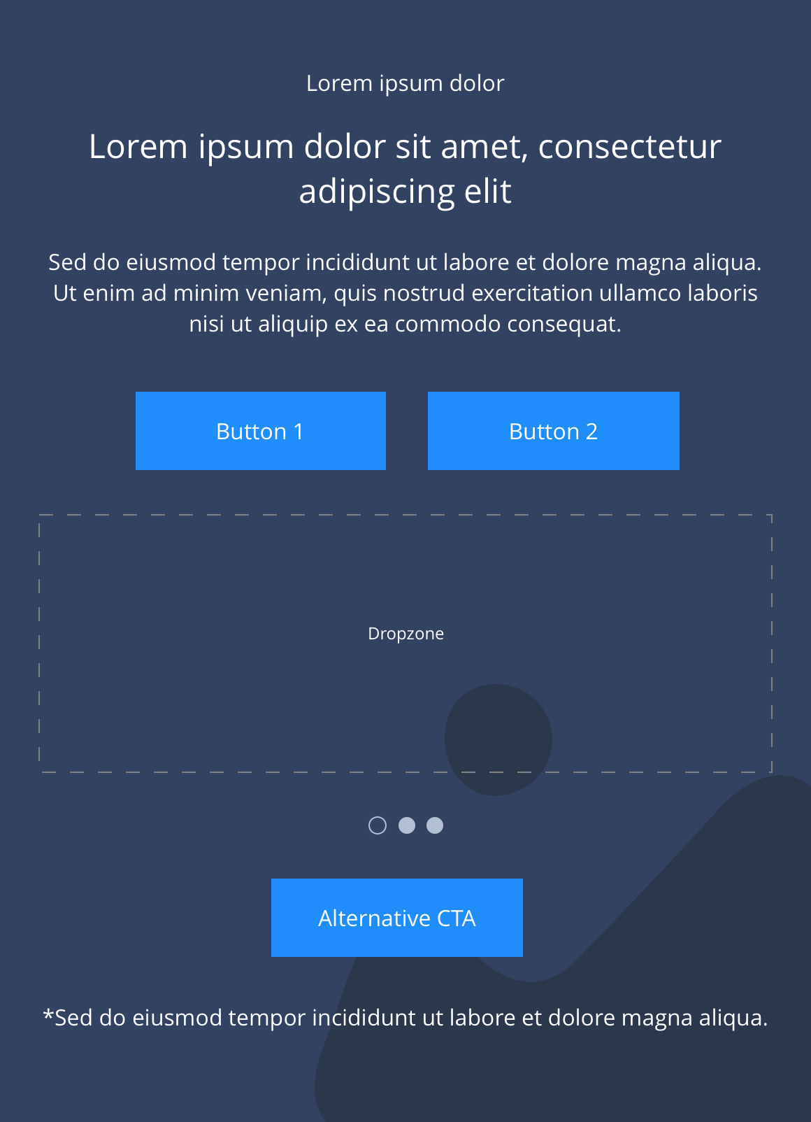
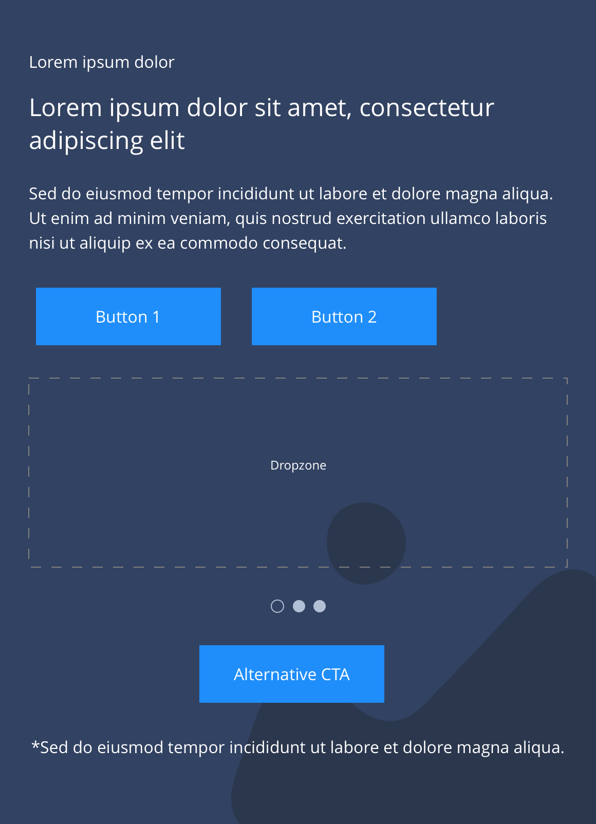
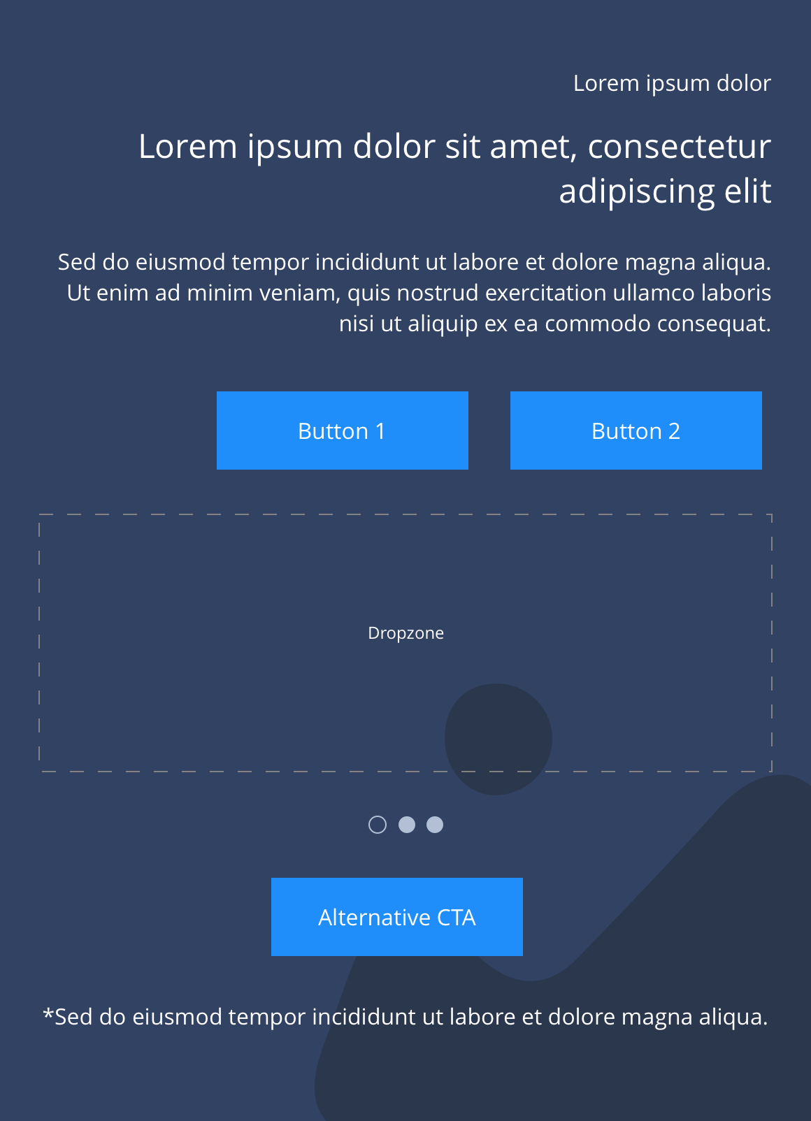
"The Slider container is made up of several configurable elements, which allows for a range of customisable layouts. Text, button positioning and background colour/image settings can all be configured to create a number of layout variations."
Drop your slide items into the dropzone and specify on the container the number of columns you want your slide items to span. This is editable by breakpoint with the exception of mobile, where it will show one slide.
- Overview
- Specification
- Style Guide Manager
- Examples in-situ
- Usage
Specification
This provides guidance on the build, layout and content options for this component.
 Layout specification
| Component item | Requirement & purpose | Optional or mandatory | CMS options |
|---|---|---|---|
| Height | Expands based on size of content. | n/a | n/a |
| Width | Text spans 10 columns max on desktop. 12 columns on tablet and below.The container is set to full width. Content is constrained to the width of the grid. The content is full width by default but can be restricted to either 10 or 8 columns on desktop and tablet. The content is always full width on mobile. | Mandatory | 12, 10 or 8 column width. |
| Mobile Width | Option to have media width for mobile break-point. | Optional | Full Width / Boxed Width |
| Lazy Load toggle | Allows the user to switch On/Off the Lazy Load functionality for the background image. | Optional | On/Off |
| Background image | Allows user to set a background image. This is full width and set to cover. | Optional | Image uploader. |
| Background image aria label | The aria-label allows us to specify a string to be used as the accessible label. | Optional | Text input field |
| Background image alignment | Allows control of background image alignment. | Optional | Vertically align top, centre or bottom. Horizontally align left, centre or right. |
| Show/hide background image on mobile | Allows editor to hide background image on mobile breakpoint. | Optional | Show/hide. |
| Background colour | Allows user to set a background colour on the component. | Optional | Choose from colour palette. |
| Auto-play setting | Allow user to turn-off or tun-on auto-play to slider | Mandatory | Choose from the drop-down. On/Off. By default value will be on |
| Content alignment | Controls content horizontal alignment. | Optional | Left, centre or right. |
| Text position | Controls position of text. | Mandatory | Left, centre or right. |
| Slides to show | 1-6 slides can be shown at any one time. | n/a | Desktop: Show 1-6. Tablet: Show 1-6. Mobile: Set to 1 slide. |
| Slides to scroll | Selects how many slides to scroll. By default set to same number as 'slides to show'. | n/a | n/a |
| Card view type | To select view type | Mandatory | Drop-down |
| Slider navigation colour | Allows user to overwrite the colour set for slider navigation in the Style Guide Manager. | ||
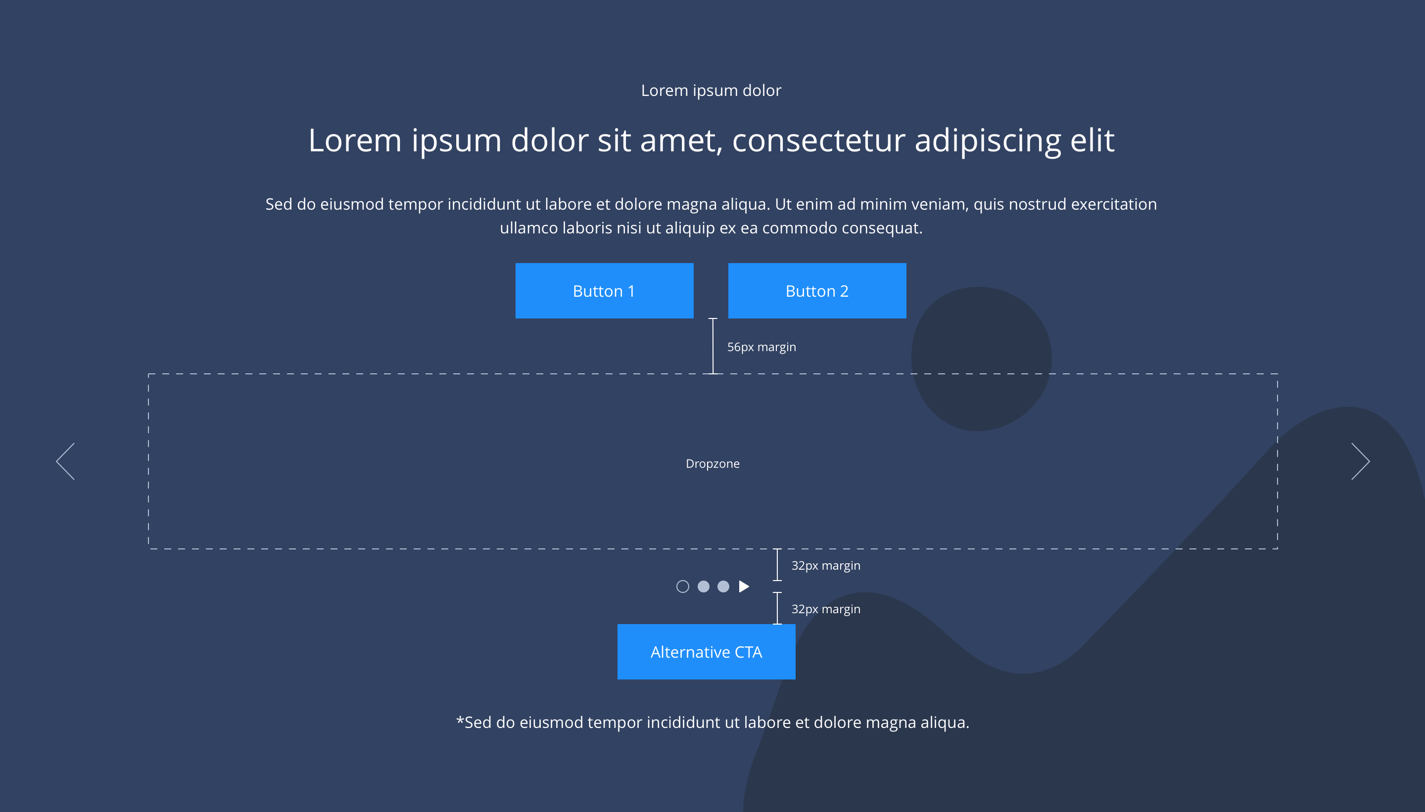
| Slider pagination | Indicates number of slides. Dot size 16x16px positioned inside container centrally aligned 24px from bottom on desktop and tablet, 16px from bottom on mobile. Active slide is indicated by different colour. | Mandatory | Colours set by SGM. |
| Slider pagination active colour | Allows user to overwrite the colour set for the active pagination in the Style Guide Manager. | Optional | Choose from colour palette. |
| Slider pagination inactive colour | Allows user to overwrite the colour set for the inactive pagination in the Style Guide Manager. | Optional | Choose from colour palette. |
| Slider play button | Allows user to overwrite the colour set for the play icon in the Style Guide Manager. | Optional | Choose from colour palette. |
| Slider pause button | Allows user to overwrite the colour set for the pause icon in the Style Guide Manager. | Optional | Choose from colour palette. |
| Show navigation on mobile | Allow user to turn on mobile navigation arrows for mobile break-point | Optional | Toggle button |
| Navigation Position in Mobile | Allow user to select navigation arrow position on mobile breakpoint | Optional | Drop-down to choose. 1 Bottom Left. 2 Bottom right |
| Slider easing | Animation duration is 0.5 seconds with “ease-in-out” easing. Transition is set to slide. | n/a | n/a |
| Auto slide function | Auto slide set to 4 seconds and pauses on hover. | n/a | n/a |
| Drag enabled | On all breakpoints. | n/a | n/a |
| Swipe enabled | On all touch devices. | n/a | n/a |
| Show/hide gutters | Allows control of spacing between blocks. NB - where gutters are turned off, drop shadows should not be used. | Mandatory | On/off. |
| Padding top and bottom | Allows control of the top and bottom spacing within this component. Set globally via the SGM. | Mandatory | Large, medium, small or none. |
| Margin bottom | Allows control of the spacing below the component. Set globally via the SGM. | Mandatory | Large, medium, small or none. |
| Pre-heading text | Allows user to set a pre-heading before H1. | Optional | Text input. |
| Pre-heading text colour | Sets pre-heading colour. | Optional | Choose from colour palette. |
| Heading text | Sets heading text. | Optional | Text input. |
| Heading element | Sets H2, H3, H4 or H5 on component. | Optional | Select heading element. |
| Heading style | Allows user to choose where more then one type of heading style may be present (i.e. multiple H2's). | Optional | Select heading style. |
| Heading colour | Sets heading colour. | Optional | Choose from colour palette. |
| Paragraph text | Sets paragraph content. | Optional | Text input. |
| Paragraph style | Sets paragraph style. | Optional | Paragraph style select. |
| Paragraph colour | Sets paragraph colour. | Optional | Choose from colour palette. |
| WYSIWYG | Allows user to format text where additional styles may be required. | Optional | WYSIWYG. |
| Link 1 (above dropzone & below dropzone) | Allows user to link to a URL or launch a modal. | Optional | Link text input. Link style select. Link URL input. Target select: Same window or open in new. Modal ID input. |
| Link 2 (above dropzone & below dropzone) | Allows user to link to a URL or launch a modal. | Optional | Link text input. Link style select. Link URL input. Target select: Same window or open in new. Modal ID input. |
| Button Shapes | Allows user to select various button shapes | Optional | Dropdown |
| WYSIWYG | Allows user to format text where additional styles may be required. | Optional | WYSIWYG. |
| Footnote text and colour | Sets footnote content and colour. | Optional | Text input. Choose from colour palette. |
Interaction
These are the interactive aspects of the component.
| Interaction |
|---|
| Link 1 links to either a defined page or can launch a modal. |
| Link 2 links to either a defined page or can launch a modal. |
| Alternative CTA links to either a defined page or can launch a modal. |
| Slider navigation switches between slides. |
| Slider pagination switches between slides. |
| Swipe/drag on hero switches between slides. |
| On mouseover/ hover the slider pauses if set to auto slide. |
Animation
For each link there will be option to add button animation. Animation configuration option will be following
| Button animate | Allows users to switch On/Off the animation functionality for the button link. |
| Select animation | Allow user to select animation from the drop-down list. |
| Duration | Set how long in seconds the animation will take to run |
| Delay | Set a start delay on the animation in seconds |
| Iteration | Set the number of times the animation should run |
| offset | Set the animation to start at a specific offset before or after the element has entered the view port |
The 'Slider container' component inherits the same style Guide Manager settings as the 'Responsive Block Container' component.


General usage dos and don'ts
| ✅ Dos | ❌ Don'ts |
|---|---|
| Give consideration to how many Slide items are visible at any one time. We recommend that using more than 3 should be limited to Slide items containing an image/icon and a short line of text. | Text in slide items will wrap as the screen width reduces, so do not show too many if you have text heavy content as this result in tall panels with orphaned text. |
| Ensure the text is legible. | Do not use a background image that makes the text hard to read. |
| Read our guidance on imagery. | |
| Read our guidance on videos. | |
| Read our guidance on the use of WYSIWYGs. |