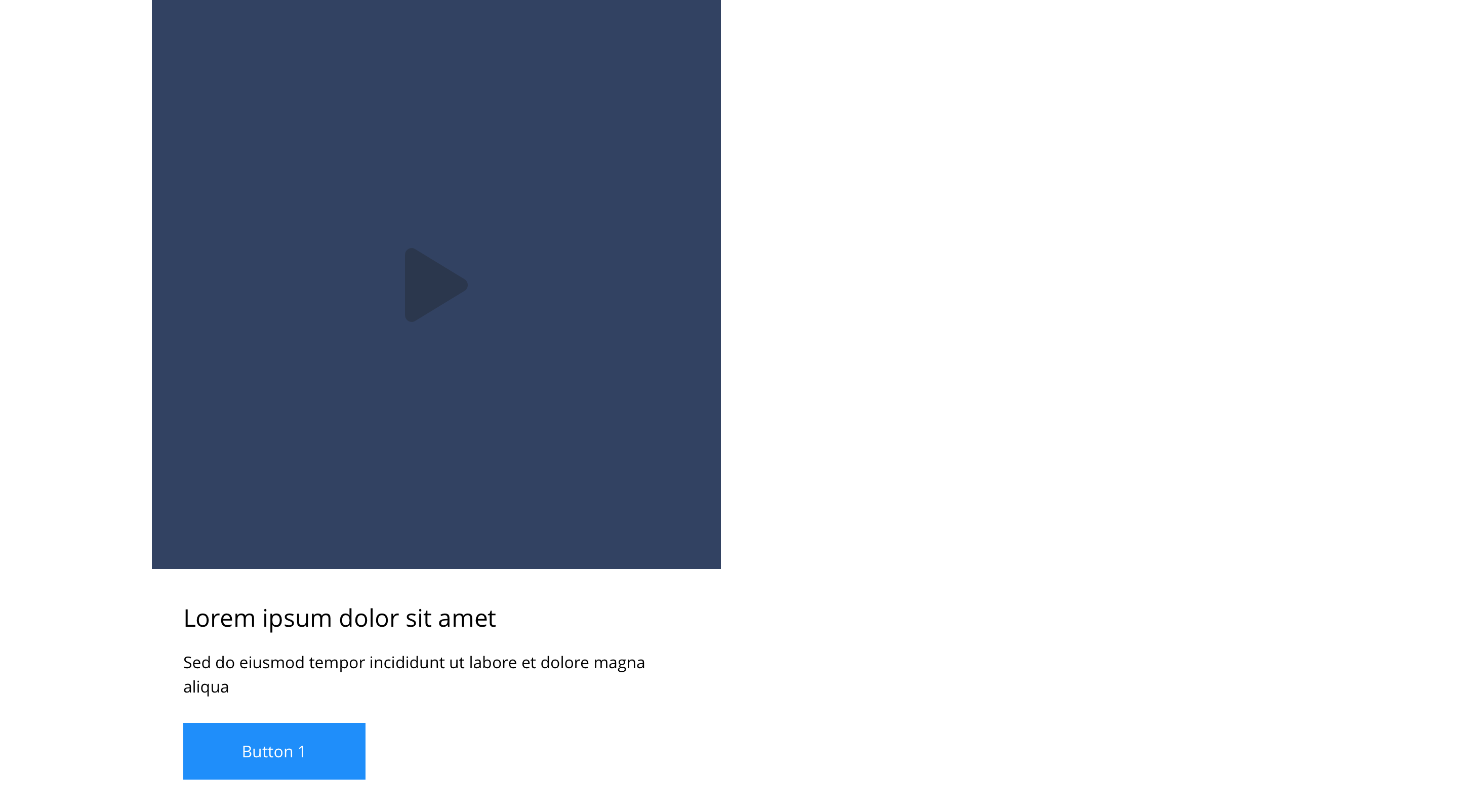
Link - Slide item 6 - Video
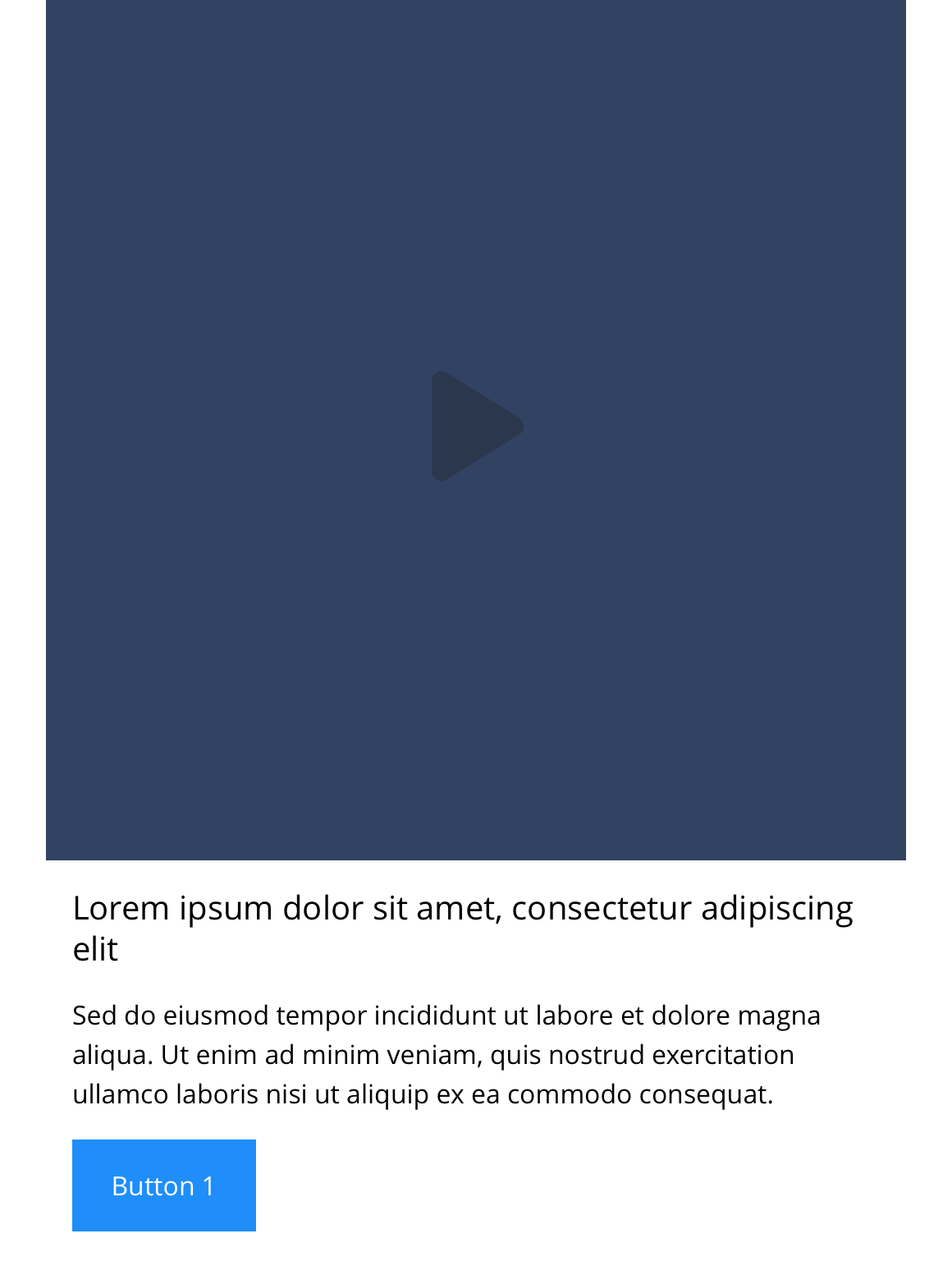
"Link - Slide item 6 - Video only is recommended for use where 2 or 3 slide items are visible on screen. You can upload a poster image to the block, that when clicked will launch the video in a modal. It can be customised as described in the specification tab below."
You also have the option to add additional text and a link to turn the component into a video card.
- Overview
- Specification
- Style Guide Manager
- Examples in-situ
- Usage


Specification
This provides guidance on the build, layout and content options for this component.
 Layout specification
Same as Link - Block 7 - Video only with the addition of linking and sliding properties.
| Component item | Requirement & purpose | Optional or mandatory | CMS options |
|---|---|---|---|
| Video type | Sets the process of how the video will display when the play icon has been triggered. | Optional | Modal/Play in place. |
| Block link | Entire block is a clickable link. | Optional | Set Modal ID for block. |
| Button Shapes | Allows user to select various button shapes | Optional | Dropdown |
| Lazy Load Video Poster | To improve the performance. | Optional | On/Off |
Interaction
These are the interactive aspects of the component.
| Interaction |
|---|
| On click block opens modal containing video. |
There are no style guide settings for this component.


General usage dos and don'ts
| ✅ Dos | ❌ Don'ts |
|---|---|
| Slide items can only be used with the Slider container. | |
| Ensure the text is legible. | Do not use a background colour that makes the text hard to read. |
| Use a superficial button and add the link to the entire block. | Do not add a separate link within the block itself. This will break the block. |
| Read our guidance on imagery. | |
| Read our guidance on videos. | |
| Read our guidance on the use of WYSIWYGs. |