Sliders - Overview
Slider components share many similarities with the responsive block components, but are structurally different.
The slider components again come in two parts, the 'Slider container' and 'Slide items'. You must first add the Slider container and then drop the Slide items into this as required.
When configuring the slide container, you need to specify the number of slides items that show at any one time. i.e. if you select to show 3 slide items at a time, then clicking the navigation arrow, would show the next 3.
On the specification for each slide item, we have specified a 'recommended number of slides to show'.
To keep the rows aesthetically tidy, each block will take on the height of the tallest block within that same container. Guidance on creating these layouts can be found on the following pages.
Slide items come in two versions, links and no links. The whole slide item on the link version is clickable. No links should be added in the WYSIWYG area of the slide items. Adding a link within a link will break the layout of the component.
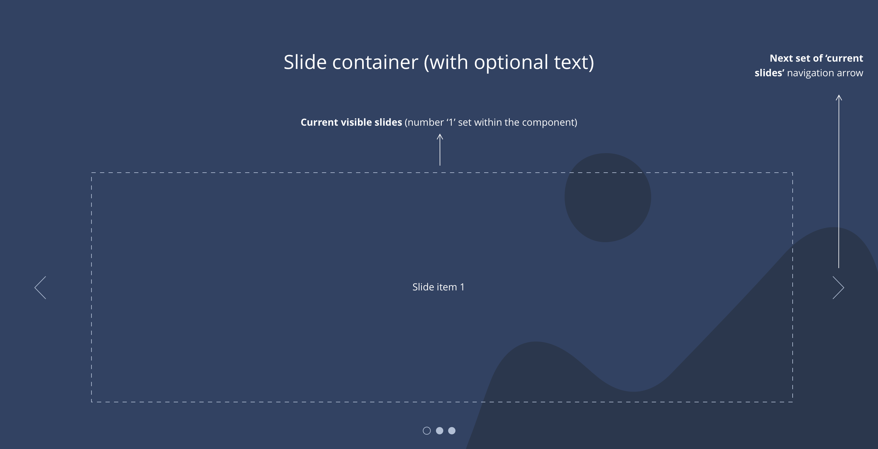
1 slide layout
Example showing 1 slide layout.
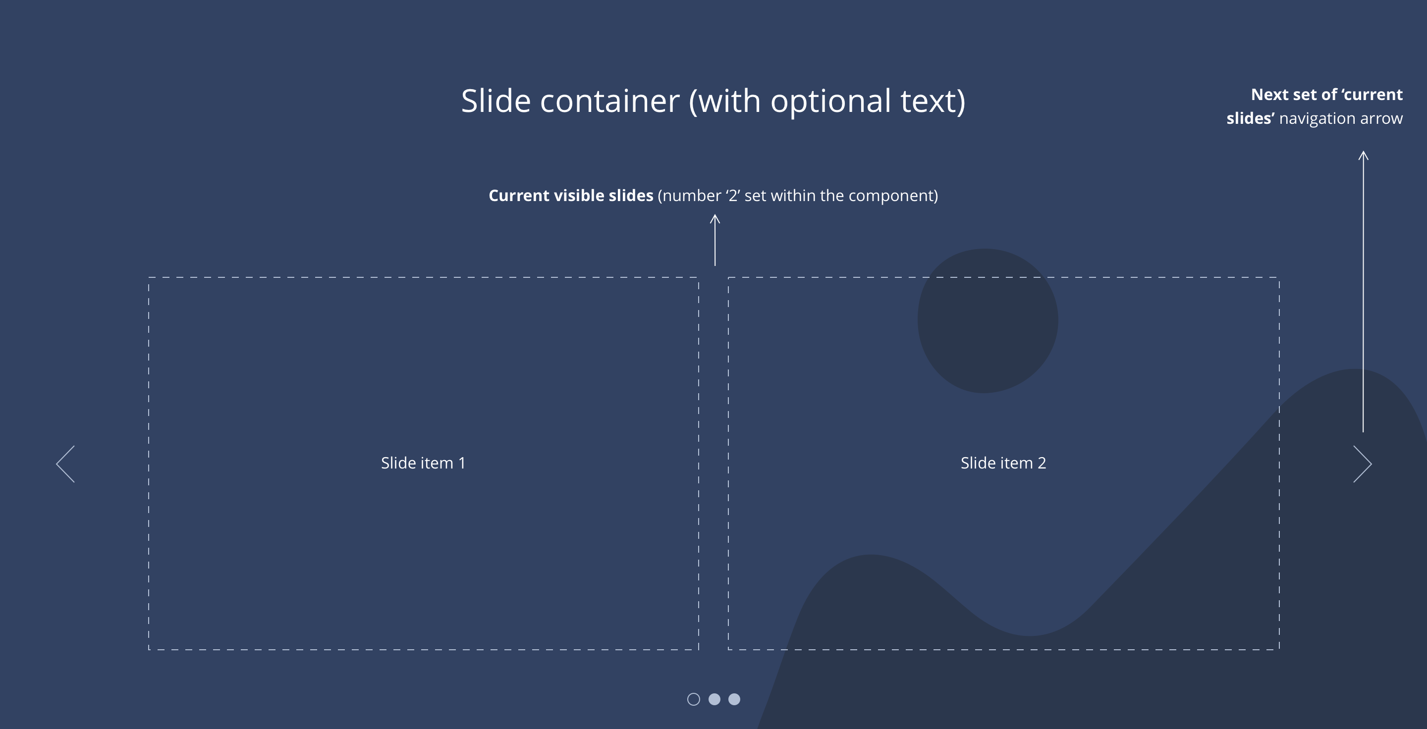
2 slide layout
Example showing 2 slide layout.
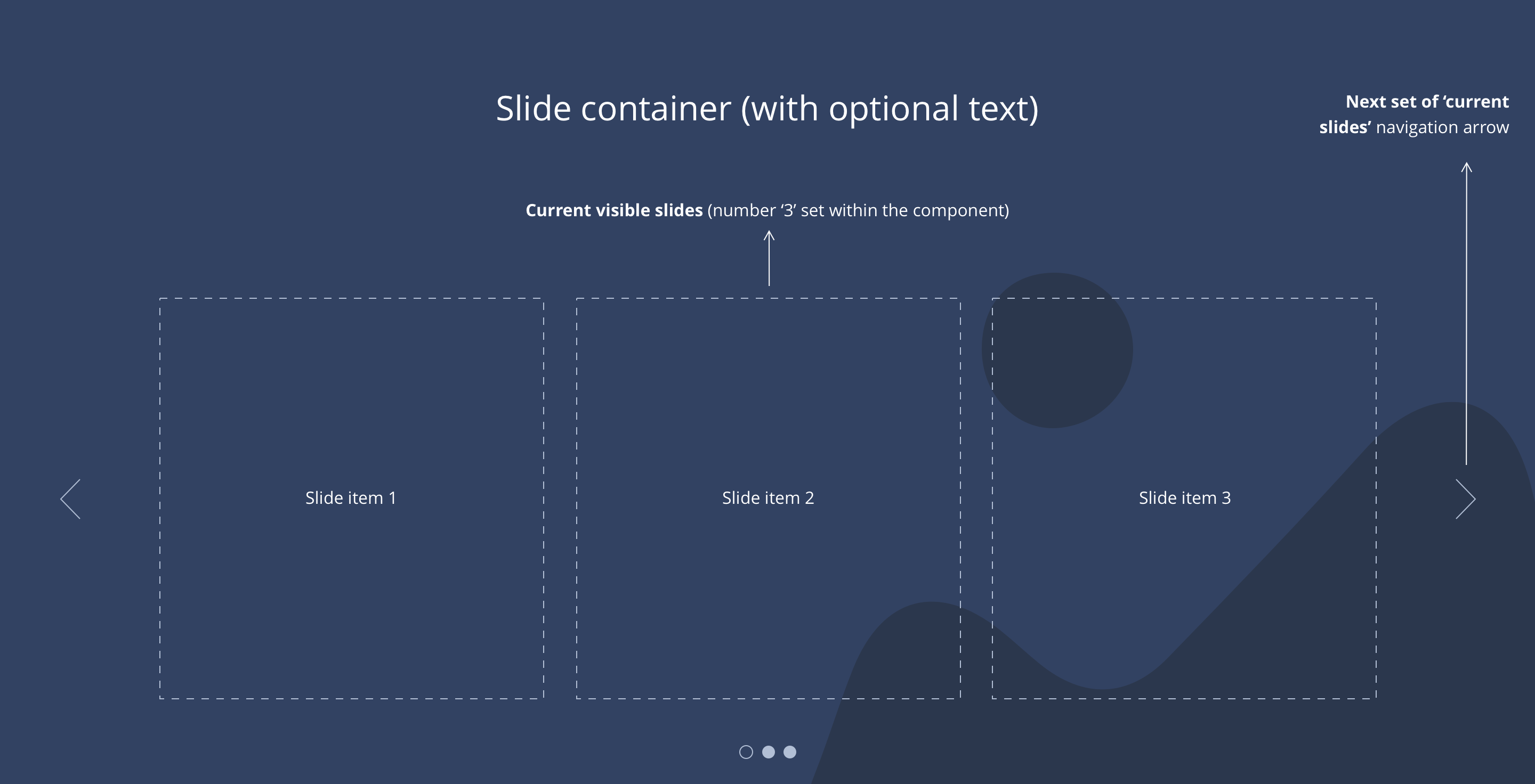
3 slide layout
Example showing 3 slide layout.