Footer
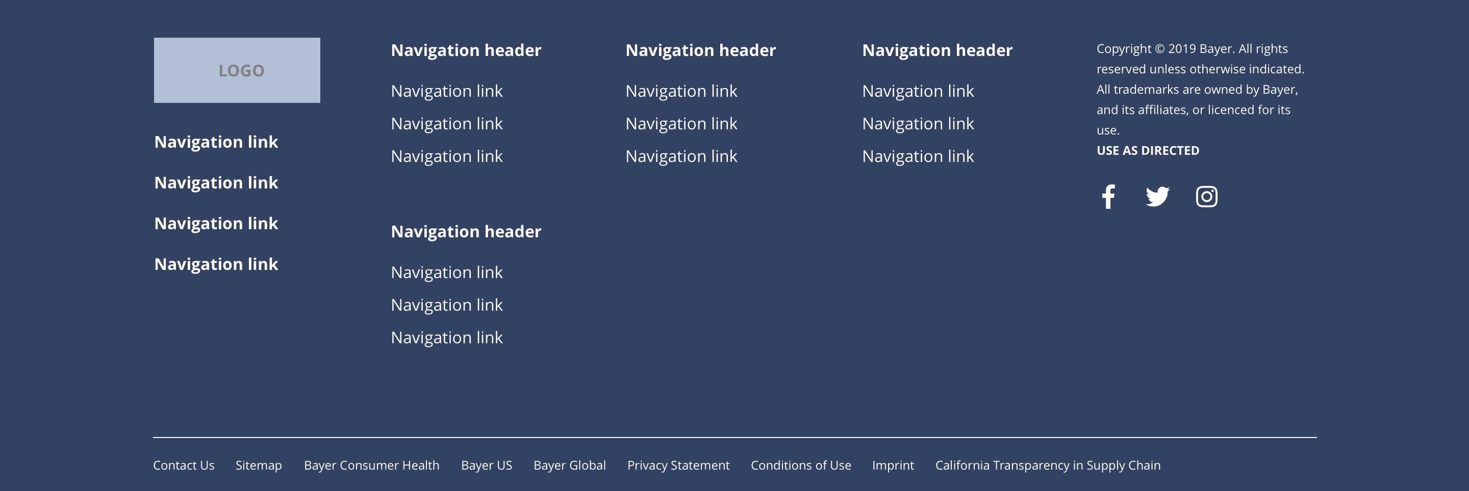
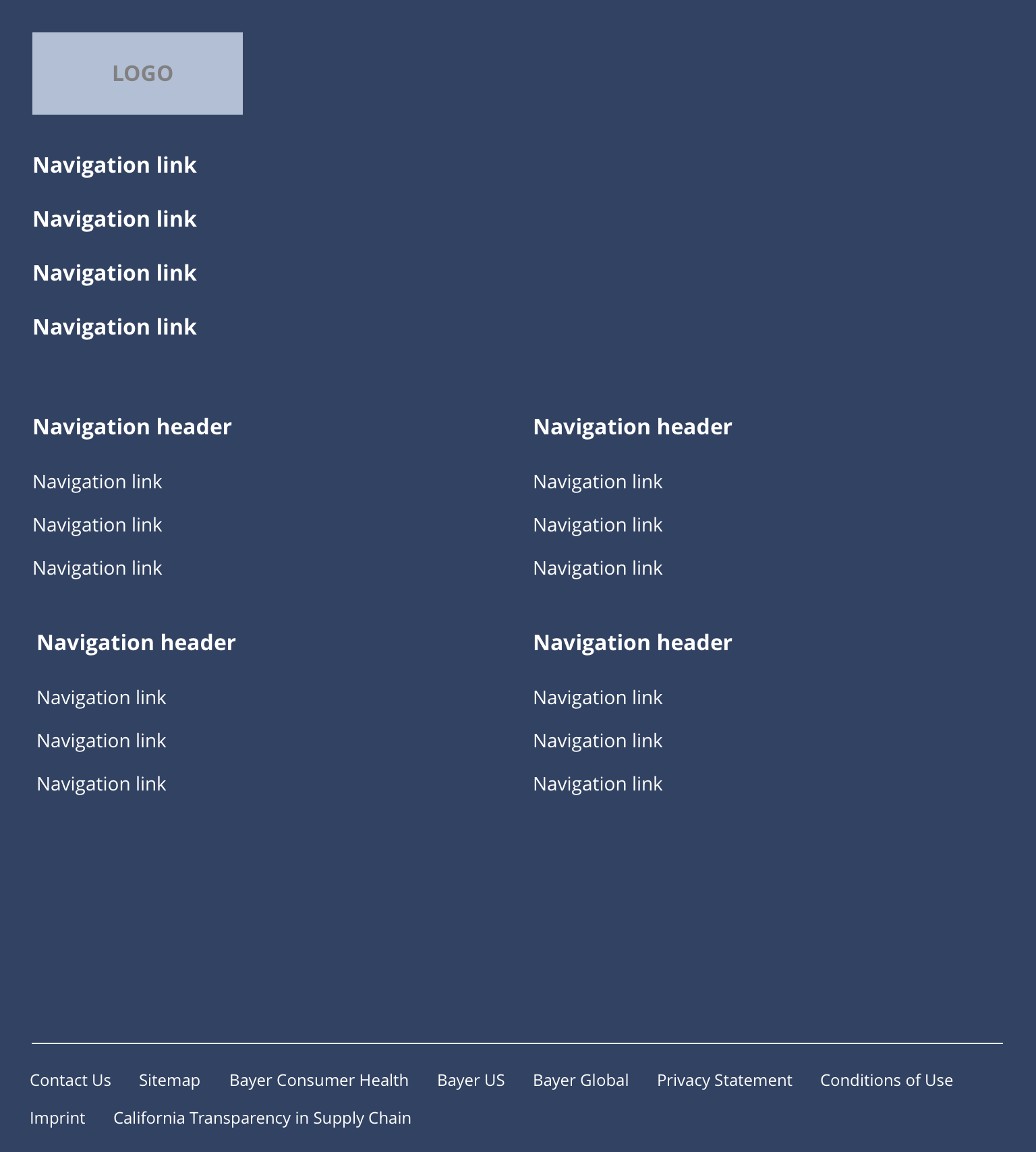
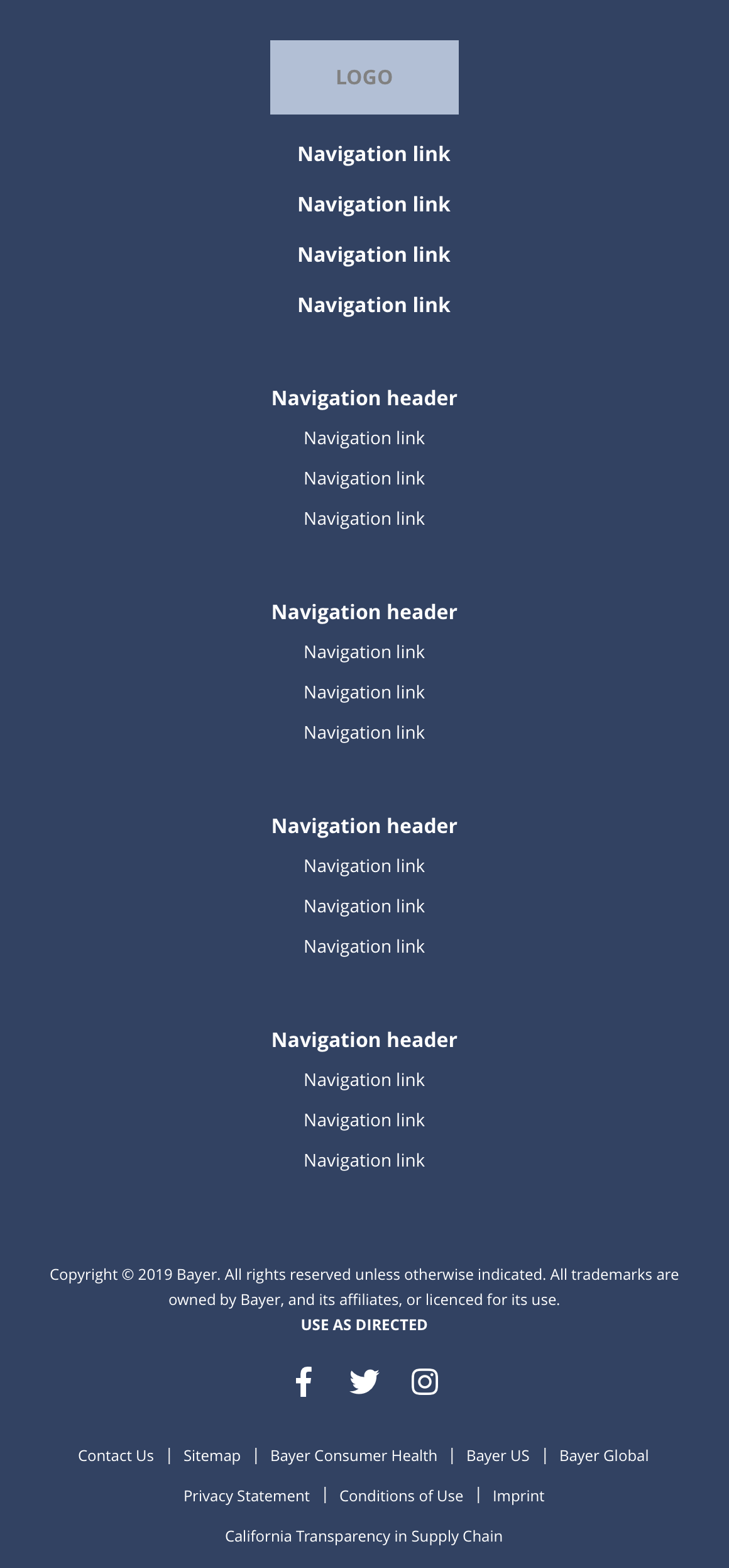
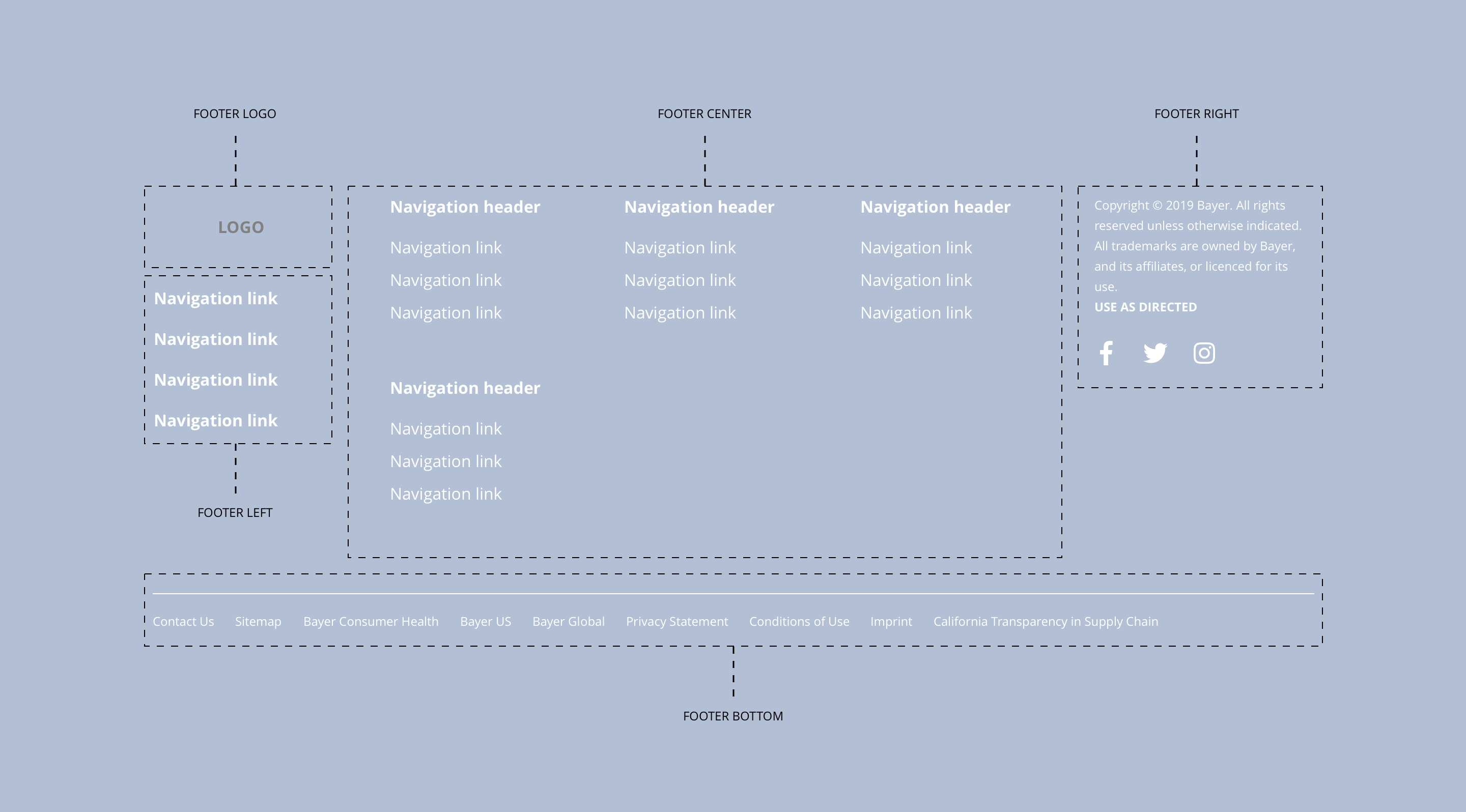
The Footer component consists of five regions, which are; footer logo, footer left, footer centre, footer right and footer bottom. Each area can be configured at a site level. This component should not be accessible to site builders. See the specification for more details.
- Overview
- Specification
- Style Guide Manager
- Examples in-situ
- Usage
Specification
Layout specification
| Component item | Requirement or purpose | Optional or mandatory | CMS options |
|---|---|---|---|
| Height | Expands based on size of content. | n/a | n/a |
| Width | The content within the menu is full width with default padding set on the left and right. | n/a | n/a |
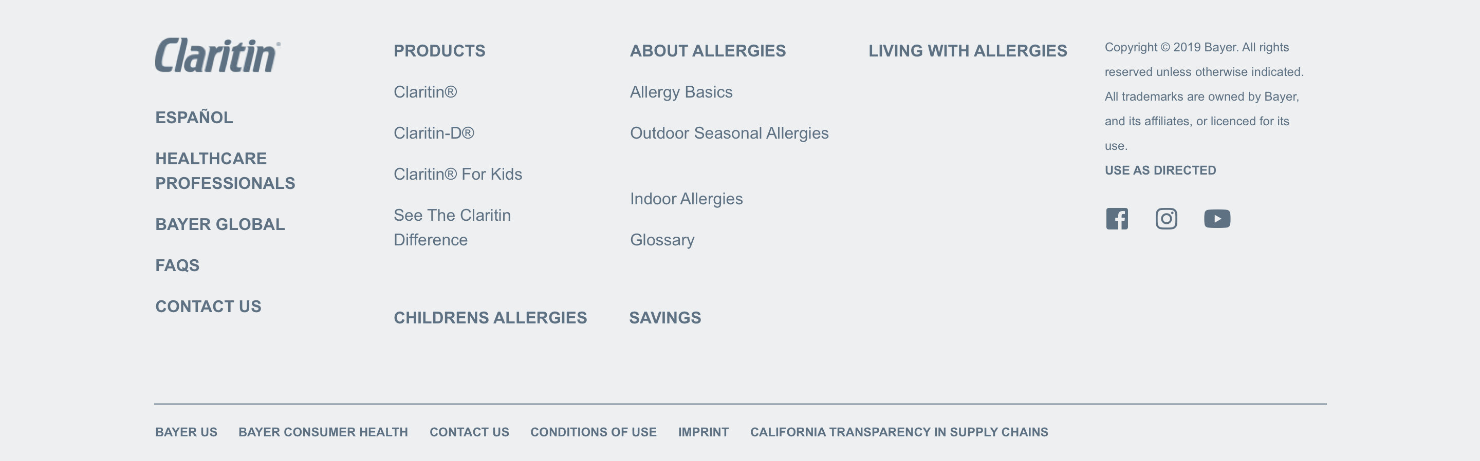
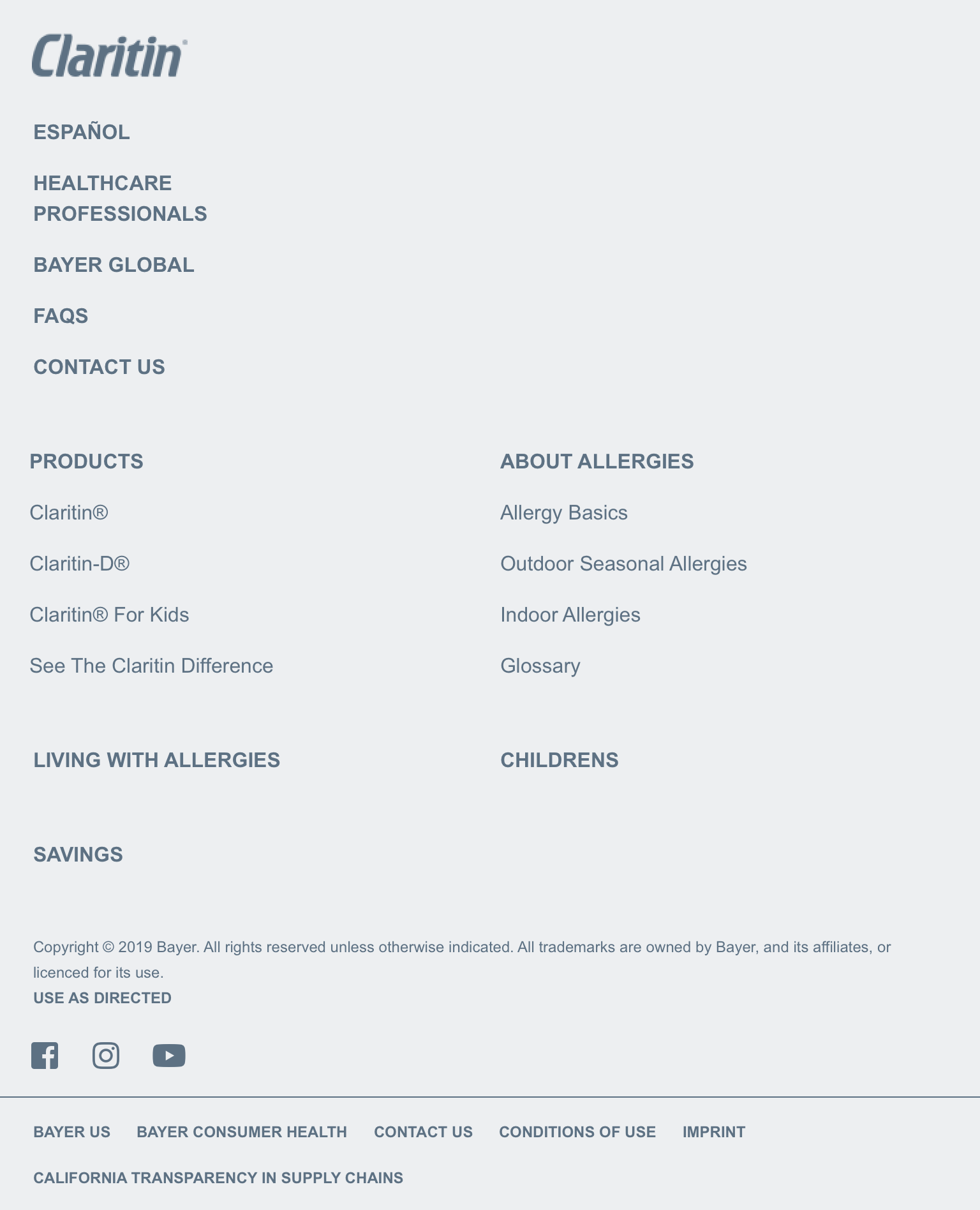
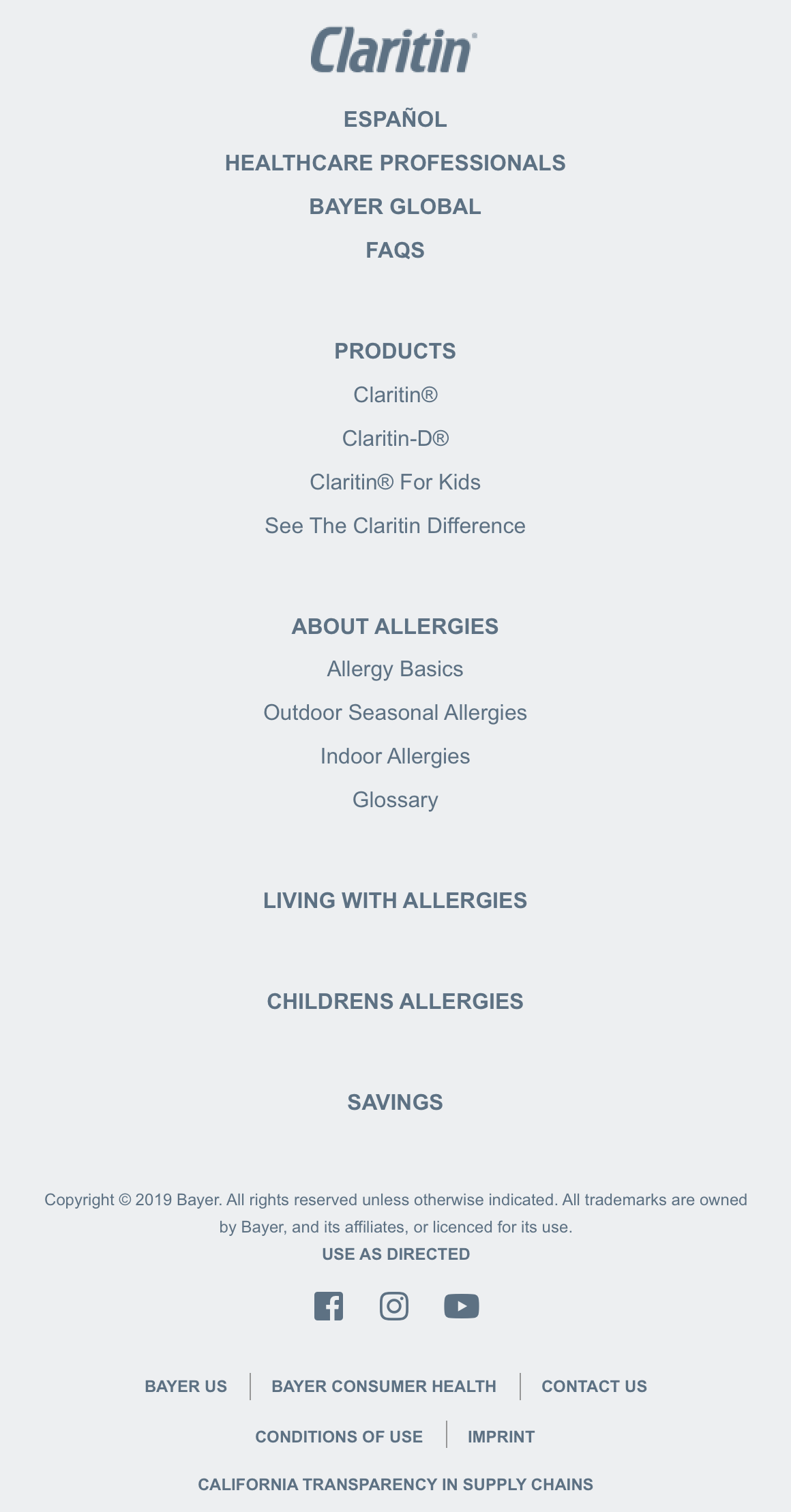
| Footer logo | Footer logo is populated with a Drupal Block in the Block layout area. The Drupal blocks should be placed in the Footer logo region. The block can be configured once dropped into the correct region. | n/a | Place block. |
| Footer left | This is a Drupal menu and can be configured under Footer Left. The Drupal block Footer Left needs to be added to the Footer left region in the Block layout area. | n/a | Add menu items. |
| Footer center | This is a Drupal menu and can be configured under Footer Center. The Drupal block Footer Center needs to be added to the Footer center region in the Block layout area. | n/a | Add menu items. |
| Footer right | Footer right is populated with Drupal Blocks in the Block layout area. The Drupal blocks should be placed in the Footer right region. The blocks can be configured once dropped into the correct region. | n/a | Place block. |
| Footer bottom | This is a Drupal menu and can be configured under Footer Bottom. The Drupal block Footer Bottom needs to be added to the Footer center region in the Block layout area. | n/a | Add menu items. |
Interaction
These are the interactive aspects of the component.
| Interaction |
|---|
| Parent navigation menu items link to a defined page when clicked. |
| Child navigation menu items link to a defined page when clicked. |
| Social media icons link through to the brand specific social media accounts. |
| Footer menu lower items link to a defined page or external URL. |
These are the Style Guide Manager settings that are specific to this component. For global settings see the Style Guide Manager section.
Footer global
| Component item | Requirement or purpose | Default | CMS options |
|---|---|---|---|
| Background colour | Sets the background colour of the footer. | White | Choose from colour palette. |
| Border top colour | Sets the border top colour and the search bar colour. | Grey | Choose from colour palette. |
| Border top width | Sets the border top width for the header. | 0px | Choose size within range slider. |
| Font colour | Sets the font colour of the footer (including icons). | Black | Choose from colour palette. |
Footer left
| Component item | Requirement or purpose | Default | CMS options |
|---|---|---|---|
| Font size | Sets the font size of the menu items in the footer left region. | 16px | Choose size within range slider. |
| Font colour | Sets the font colour in the footer left region. | Black | Choose from colour palette. |
| Font select | Sets the font of the footer left region. | Open sans | Choose from font stacks. |
| Font weight | Sets the font weight of the footer left region. Should only be used if a font has been imported. | 700 | Text input (e.g 300, 400, 600). |
| Uppercase | Allows user to make text in the footer left region uppercase. | On | On/off. |
Footer center
| Component item | Requirement or purpose | Default | CMS options |
|---|---|---|---|
| Parent font size | Sets the font size of the parent menu items in the footer centre region. | 16px | Choose size within range slider. |
| Parent font colour | Sets the font colour of the parent menu items in the footer centre region. | Black | Choose from colour palette. |
| Parent font select | Sets the font of the of the parent menu items in the footer centre region. | Open sans | Choose from font stacks. |
| Parent font weight | Sets the font of the parent menu items in the footer centre region. | 700 | Text input (e.g 300, 400, 600). |
| Parent uppercase | Allows user to make the parent menu items in the footer left region uppercase. | On | On/off. |
| Child font size | Sets the font size of the child menu items in the footer centre region. | 16px | Choose size within range slider. |
| Child font colour | Sets the font colour of the child menu items in the footer centre region. | Black | Choose from colour palette. |
| Child font select | Sets the font of the of the child menu items in the footer centre region. | Open sans | Choose from font stacks. |
| Child font weight | Sets the font of the child menu items in the footer centre region. | 300 | Text input (e.g 300, 400, 600). |
| Child uppercase | Allows user to make the child menu items in the footer left region uppercase. | Off | On/off. |
Footer right
Footer right is populated with Drupal Blocks in the Block layout area. The Drupal blocks should be placed in the Footer right region.
The blocks can be configured once dropped into the correct region.
| Component item | Requirement or purpose | Default | CMS options |
|---|---|---|---|
| n/a | n/a | n/a | n/a |
Footer bottom
| Component item | Requirement or purpose | Default | CMS options |
|---|---|---|---|
| Border top colour | Sets the border top colour. | Grey | Choose from colour palette. |
| Border top width | Sets the border top width. | 1px | Choose size within range slider. |
| Font size | Sets the font size of the menu items. | 12px | Choose size within range slider. |
| Font colour | Sets the font colour of menu items. | Black | Choose from colour palette. |
| Font select | Sets the font of the of menu items. | Open Sans | Choose from font stacks. |
| Font weight | Sets the font weight of the child menu items in. | 300 | Text input (e.g 300, 400, 600). |
| Uppercase | Allows user to make the menu items uppercase. | Off | On/off. |