Sub-Navigation
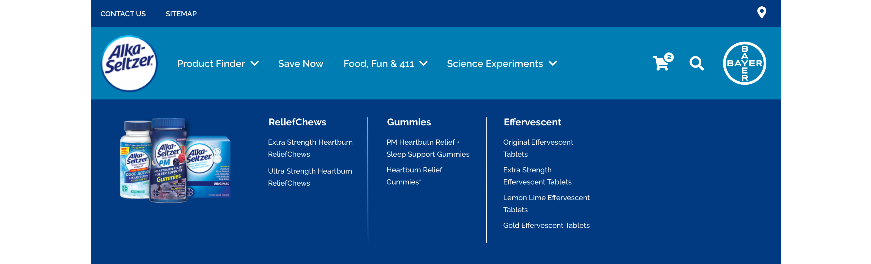
The Sub-Navigation also known as a dropdown menu is revealed on hover. It will render up to four parent categories with child items listed out below. There is also an optional image to the far left of the menu.
- Overview
- Specification desktop
- Specification tablet & mobile
- Style Guide Manager
- Examples in-situ
- Usage
Specification desktop
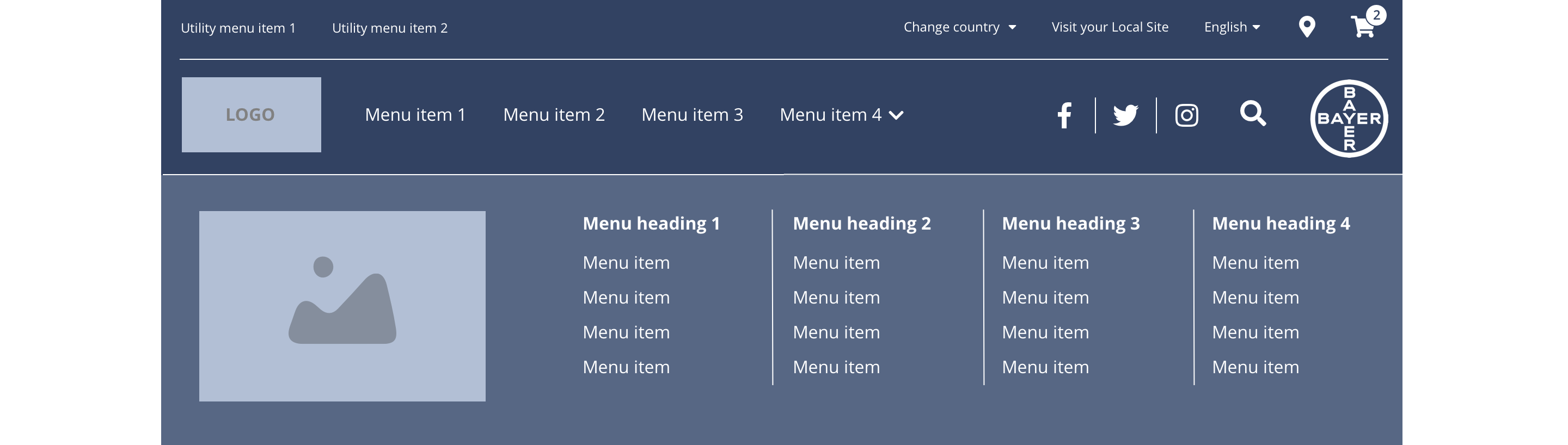
This provides guidance on the build, layout and content options for this component.

Layout
| Component item | Requirement or purpose | Optional or mandatory | CMS options |
|---|---|---|---|
| Height | Expands based on size of content. For example, where a multiple child menu items are added. | n/a | n/a |
| Width | The content within the menu is full width with default padding set on the left and right. | n/a | n/a |
| Foreground image | Allows user to upload a foreground image to a menu item. | Optional | Image upload. Text input for image alt text. |
| Menu items | This is a part of the primary menu and can be configured under CH Main menu. | Optional | Add menu items. |
Interaction
These are the interactive aspects of the component.
| Interaction |
|---|
| Parent navigation menu items link to a defined page when clicked. |
| Child navigation menu items link to a defined page when clicked. |
By default Sub navigation menu item will be horizontal aligned. If user want to have the menu item vertically aligned user can add the class - "submenu-vertical-stacking" from the attribute section once edit the menu item from the back-end.
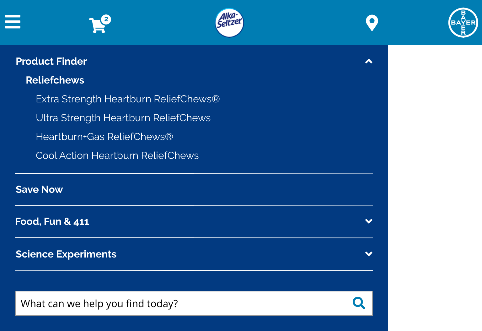
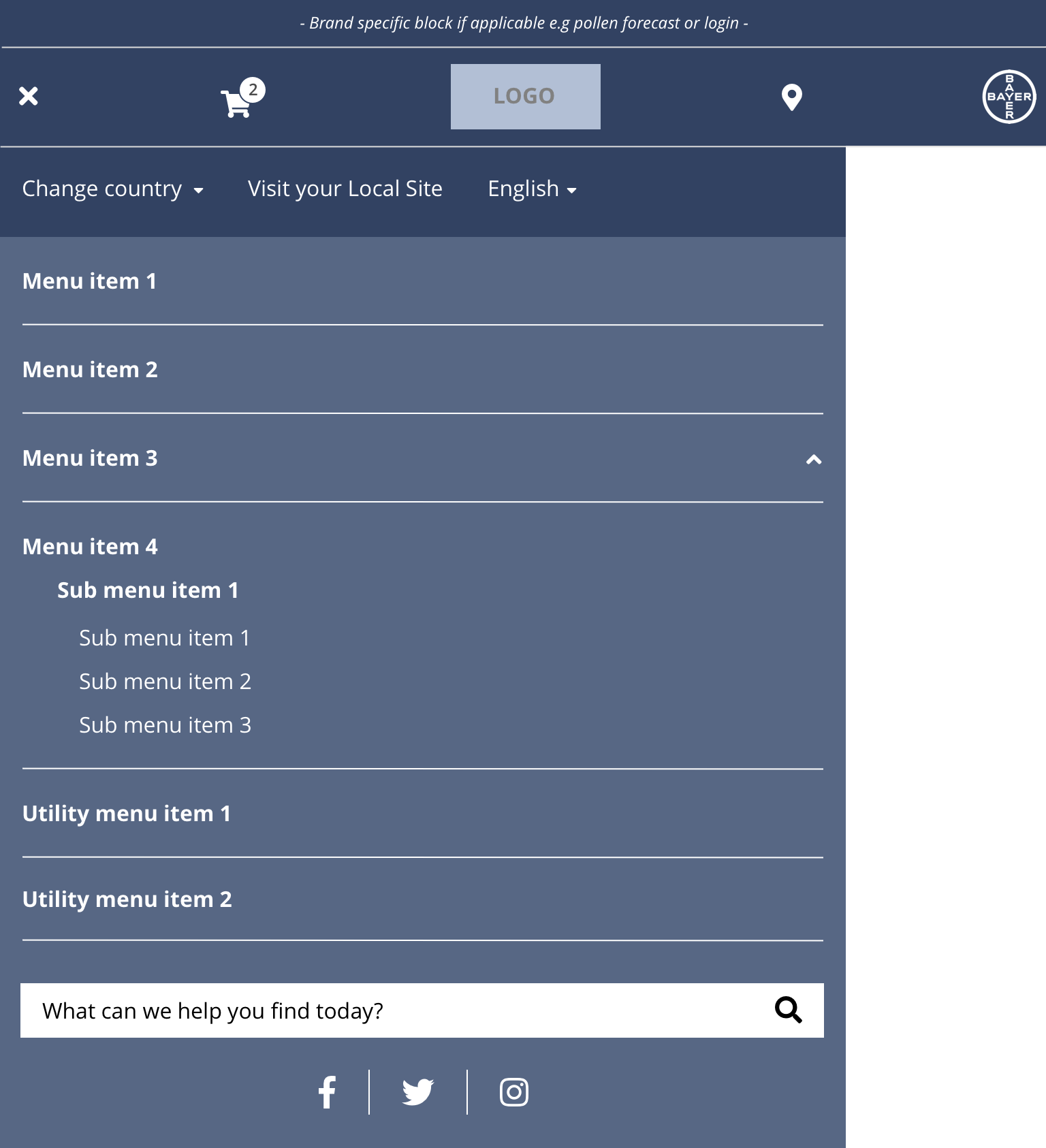
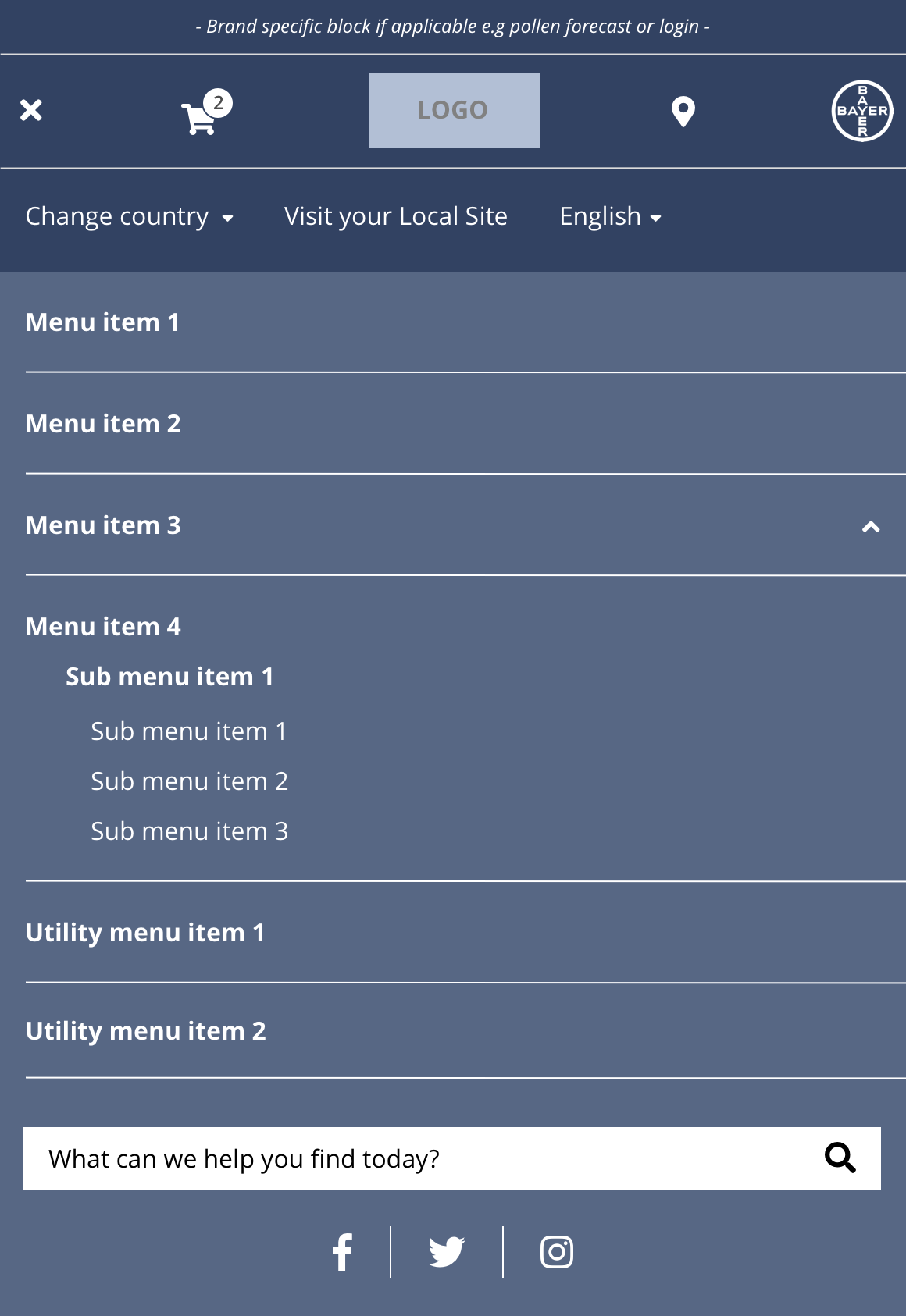
Specification tablet & mobile
This provides guidance on the build, layout and content options for this component.

Tablet

Mobile
| Component item | Requirement or purpose | Optional or mandatory | CMS options |
|---|---|---|---|
| Height | Expands the full viewport height. | n/a | n/a |
| Width | The content within the menu is full width. There is default padding set on the left and right. Tablet - 620px Mobile - 100% | n/a | n/a |
Interaction
These are the interactive aspects of the component.
| Interaction |
|---|
| Parent navigation menu items link to a defined page when clicked. |
| Child navigation menu items link to a defined page when clicked. |
These are the Style Guide Manager settings that are specific to this component. For global settings see the Style Guide Manager section.
| Component item | Requirement or purpose | Default | CMS options |
|---|---|---|---|
| Background colour | Sets the background colour of the header. | White | Choose from colour palette. |
| Parent font size | Sets the font size of the parent menu items. | 16 | Text input. |
| Parent font colour | Sets the font colour of the parent menu items. | Black | Choose from colour palette. |
| Parent font select | Sets the font of the parent menu items. | Open Sans | Choose from font stacks. |
| Parent font weight | Sets the font weight of the parent menu items. Should only be used if a font has been imported. | 700 | Text input (e.g 300, 400, 600) |
| Parent uppercase | Allows user to make text in the parent menu items uppercase. | On | On or Off |
| Child font size | Sets the font size of the menu items. | 14 | Text input. |
| Child font colour | Sets the font colour of the child menu items. | Choose from colour palette. | |
| Child font select | Sets the font of the child menu items. | Choose from font stacks. | |
| Child font weight | Sets the font weight of the parent menu items. Should only be used if a font has been imported. | 700 | Text input (e.g 300, 400, 600). |
| Child uppercase | Allows user to make text in the parent menu items uppercase. | On | On/off. |
| Border right colour | Sets the border right colour between columns. | Grey | Choose from colour palette. |