Header
The Header component consists of six regions, which are; header utilities menu, header utilities, header logo left, header (primary menu), header tools and header logo right. Each area can be configured at a site level. This component should not be accessible to site builders. See the specification for more details.
- Overview
- Specification
- Style Guide Manager
- Examples in-situ
- Usage


Specification
This provides guidance on the build, layout and content options for this component.
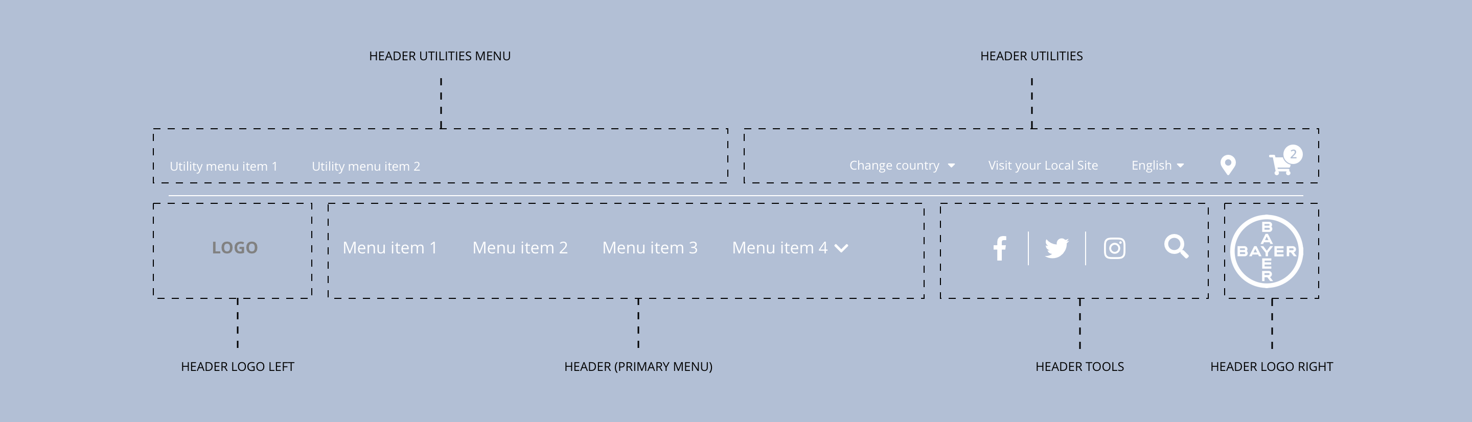
Layout specification
The header can only be configured in the Style Guide Manager.
| Component item | Requirement or purpose | Default | CMS options |
|---|---|---|---|
| Height | Expands based on size of content. For example, where a utility menu is being used. | n/a | n/a |
| Width | The content within the menu is full width with default padding set on the left and right. | n/a | n/a |
| Utility menu | This is a Drupal menu and can be configured under CH Utility menu. The Drupal block CH Utility menu needs to be added to the Header utilities menu region in the Block layout area. | n/a | Add menu items |
| Utility tools | Utility tools are populated with Drupal Blocks in the Block layout area. The Drupal blocks should be placed in the Header utilities region. The blocks can be configured once dropped into the correct region. | n/a | Place block |
| Brand logo | The brand logo is uploaded in the Appearance area under the Cohesion CH Brand Theme. | n/a | Image upload |
| Primary menu | This is a Drupal menu and can be configured under CH Main menu. The Drupal block CH Main menu needs to be added to the Header region under Block layout. | n/a | Place block |
| Primary menu tools | Primary menu tools are populated with Drupal Blocks under Block layout. The Drupal blocks should be placed in the Header tools region. The blocks can be configured once dropped into the correct region. | n/a | Place block |
| Bayer logo | The brand logo can be chosen under Appearance > Global settings. | n/a | Choose between 4 Bayer Cross logos or upload custom logo. |
Interaction
These are the interactive aspects of the component.
| Interaction |
|---|
| Primary navigation menu items link to a defined page when clicked. |
| Primary navigation menu items expand the sub navigation on hover. |
| Brand logo will link through to the home page when clicked. |
| Bayer logo will link through to Bayer.com. |
| Social media icons link through to the brand specific social media accounts. |
| Search when clicked expands down to reveal a search field below menu. |
| Utility navigation items link to a defined page or external URL. |
| Country select expands to show available country listings. |
| Language select expands to show available languages. |
| Where to buy launches retailer search. |
| View cart launches shopping cart. |
These are the Style Guide Manager settings that are specific to this component. For global settings see the Style Guide Manager section.
Header global
| Component item | Requirement or purpose | Default | CMS options |
|---|---|---|---|
| Background colour | Sets the background colour for the header. | Grey | Choose from colour palette. |
| Border bottom and search bar colour | Sets the border bottom colour and the search bar colour. | Black | Choose from colour palette. |
| Border bottom width | Sets the border bottom width of the header. | 1px | Choose size within range slider. |
| Burger menu desktop | Show burger menu in desktop resolution | Off | On/Off |
| Sticky header desktop | Sets the position of the header to fixed/sticky. | Off | On/off |
| Sticky header mobile | Sets the position of the header to fixed/sticky. | Off | On/off |
Utility bar
| Component item | Requirement or purpose | Default | CMS options |
|---|---|---|---|
| Display order | Sets the display order for the utility items. | Menu first | Menu first or utilities first. |
| Layout | Sets the layout for the items within the utility bar. | Split layout | Split layout, right aligned layout or left aligned layout. |
| Background colour | Sets the background colour of the utility bar. | White | Choose from colour palette. |
| Border bottom colour | Sets the border bottom colour of the utility bar. | n/a | Choose from colour palette. |
| Border bottom width | Sets the border bottom width. | 0px | Choose size within range slider. |
| Font size | Sets the font size of the utility bar. | 12px | Text input. |
| Font colour | Sets the font colour of the utility bar. | Grey | Choose from colour palette. |
| Font select | Sets the font of the utility bar. | Open sans | Choose from font stacks. |
| Font weight | Sets the font weight of the utility bar. Should only be used if a font has been imported. | 500 | Text input (e.g 300, 400, 600). |
| Uppercase | Allows user to make text in the utility bar uppercase. | On | On/off. |
Primary menu
| Component item | Requirement or purpose | Default | CMS options |
|---|---|---|---|
| Alignment | Sets the alignment for the primary menu. | Align left | Align left or align right. |
| Font size | Sets the font size of the primary menu. | 12px | Text input. |
| Font colour | Sets the font colour for the primary menu. | White | Choose from colour palette. |
| Active state font colour | Sets the font colour for the active page menu item. | Transparent | Choose from colour palette. |
| Font select | Sets the font for the primary menu. | Open sans | Choose from font stacks. |
| Font weight | Sets the font weight for the primary menu. Should only be used if a font has been imported. | 700 | Text input (e.g 300, 400, 600). |
| Uppercase | Allows user to make text in the primary menu uppercase. | On | On/off. |
Mobile
The burger menu icon inherits its styling from the primary menu font colour in the Primary menu section within the SGM.
The styling below is taken from the dropdown menu styling: Sub-Navigation | Overview
| Component item | Requirement or purpose | Default | CMS options |
|---|---|---|---|
| Background colour | Sets the background colour of the header. | White | Choose from colour palette. |
| Parent font size | Sets the font size of the parent menu items. | 16 | Text input. |
| Parent font colour | Sets the font colour of the parent menu items. | Black | Choose from colour palette. |
| Parent font select | Sets the font of the parent menu items. | Open Sans | Choose from font stacks. |
| Parent font weight | Sets the font weight of the parent menu items. Should only be used if a font has been imported. | 700 | Text input (e.g 300, 400, 600) |
| Parent uppercase | Allows user to make text in the parent menu items uppercase. | On | On or Off |
| Child font size | Sets the font size of the menu items. | 14 | Text input. |
| Child font colour | Sets the font colour of the child menu items. | Choose from colour palette. | |
| Child font select | Sets the font of the child menu items. | Choose from font stacks. | |
| Child font weight | Sets the font weight of the parent menu items. Should only be used if a font has been imported. | 700 | Text input (e.g 300, 400, 600). |
| Child uppercase | Allows user to make text in the parent menu items uppercase. | On | On/off. |
| Border right colour | Sets the border right colour between columns. | Grey | Choose from colour palette. |
Alternative menu items
The styling below can be applied to individual menu items with the following classes:
alt-menu-item-1alt-menu-item-2alt-menu-item-3alt-menu-item-4alt-menu-item-5
| Component item | Requirement or purpose | Default | CMS options |
|---|---|---|---|
| Alternative menu item 1 Background colour | Allows user to set the background colour for Alternative menu item 1. | Optional | Choose from colour palette. |
| Alternative menu item 1 Background hover colour | Allows user to set the hover background colour for Alternative menu item 1. | Optional | Choose from colour palette. |
| Alternative menu item 1 Font color | Allows user to set the font colour for Alternative menu item 1. | Optional | Choose from colour palette. |
| Alternative menu item 1 Font hover color | Allows user to set the hover font colour for Alternative menu item 2. | Optional | Choose from colour palette. |
| Alternative menu item 2 Background colour | Allows user to set the background colour for Alternative menu item 2. | Optional | Choose from colour palette. |
| Alternative menu item 2 Background hover colour | Allows user to set the hover background colour for Alternative menu item 2. | Optional | Choose from colour palette. |
| Alternative menu item 2 Font color | Allows user to set the font colour for Alternative menu item 2. | Optional | Choose from colour palette. |
| Alternative menu item 2 Font hover color | Allows user to set the hover font colour for Alternative menu item 2. | Optional | Choose from colour palette. |
| Alternative menu item 3 Background colour | Allows user to set the background colour for Alternative menu item 3. | Optional | Choose from colour palette. |
| Alternative menu item 3 Background hover colour | Allows user to set the hover background colour for Alternative menu item 3. | Optional | Choose from colour palette. |
| Alternative menu item 3 Font color | Allows user to set the font colour for Alternative menu item 3. | Optional | Choose from colour palette. |
| Alternative menu item 3 Font hover color | Allows user to set the hover font colour for Alternative menu item 3. | Optional | Choose from colour palette. |
| Alternative menu item 4 Background colour | Allows user to set the background colour for Alternative menu item 4. | Optional | Choose from colour palette. |
| Alternative menu item 4 Background hover colour | Allows user to set the hover background colour for Alternative menu item 4. | Optional | Choose from colour palette. |
| Alternative menu item 4 Font color | Allows user to set the font colour for Alternative menu item 4. | Optional | Choose from colour palette. |
| Alternative menu item 4 Font hover color | Allows user to set the hover font colour for Alternative menu item 4. | Optional | Choose from colour palette. |