Read more container
The Read more container contains a drop zone where components should be dropped.
- Overview
- Specification
- Examples in-situ
- Usage
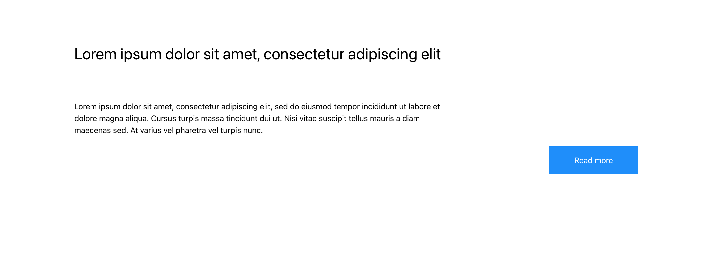
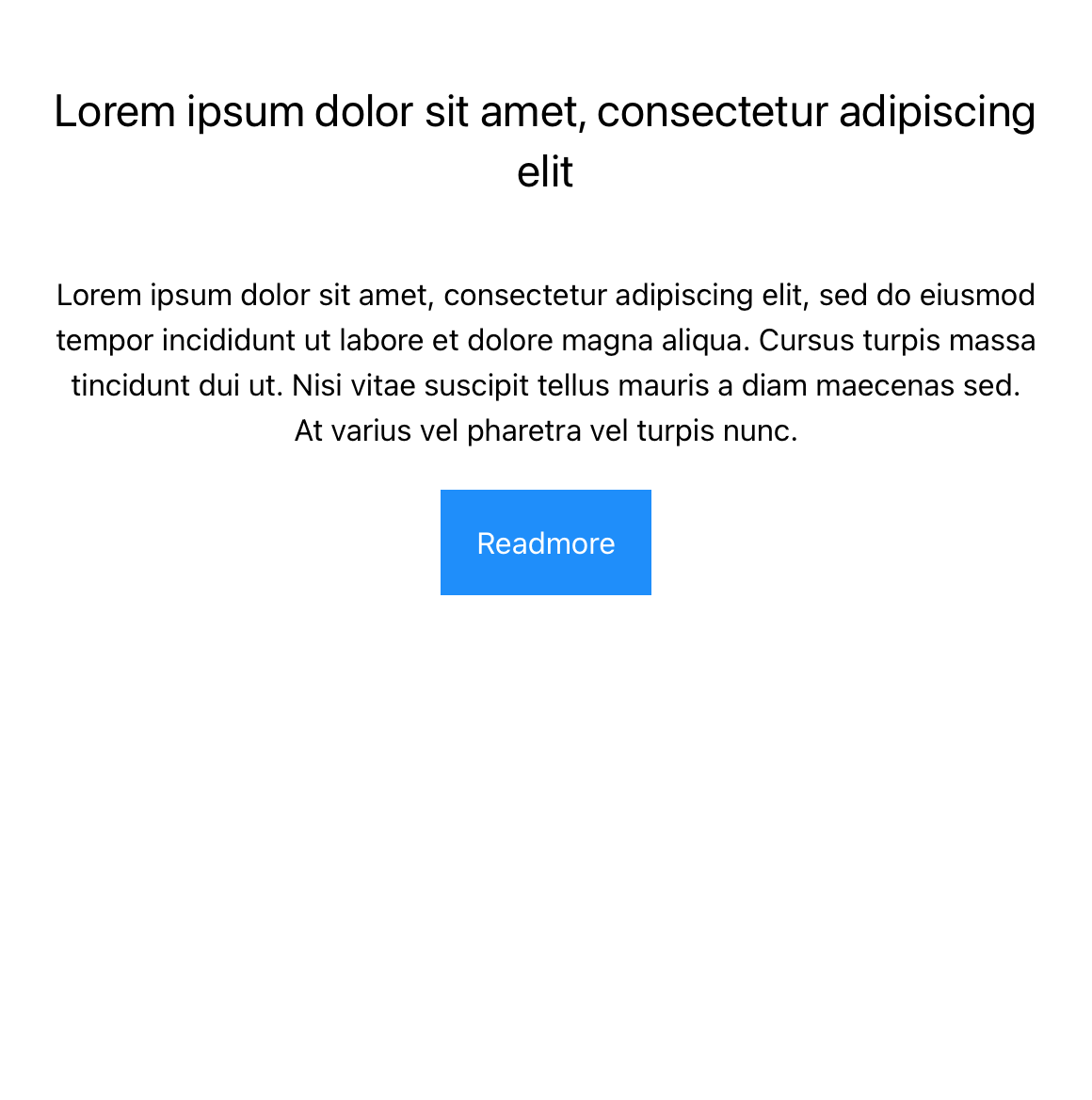
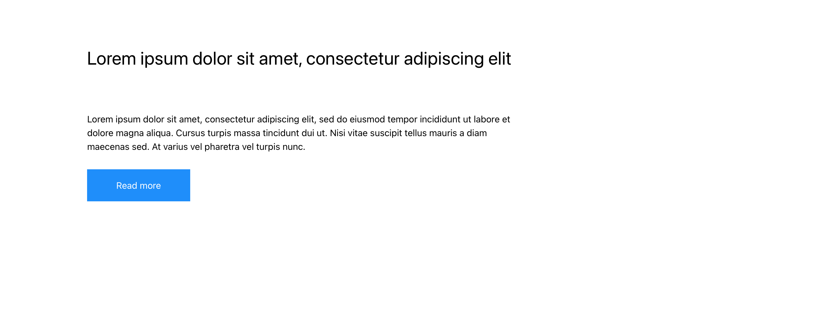
Desktop Layout


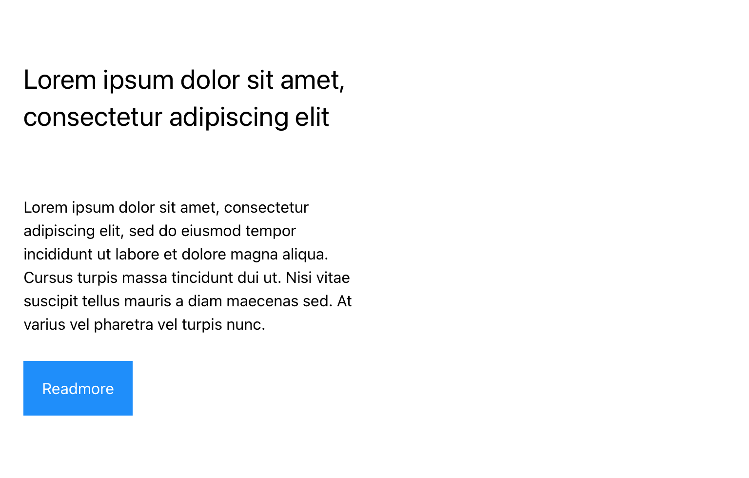
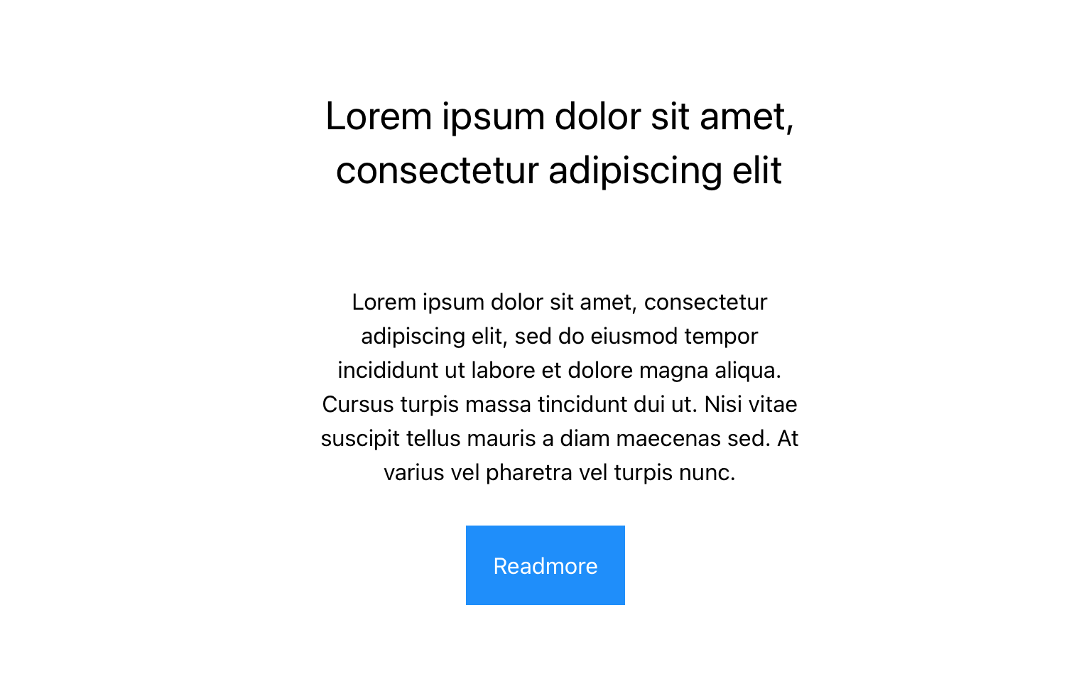
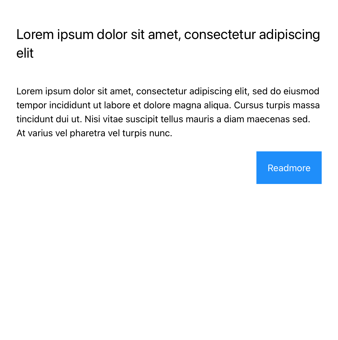
Tablet Layout

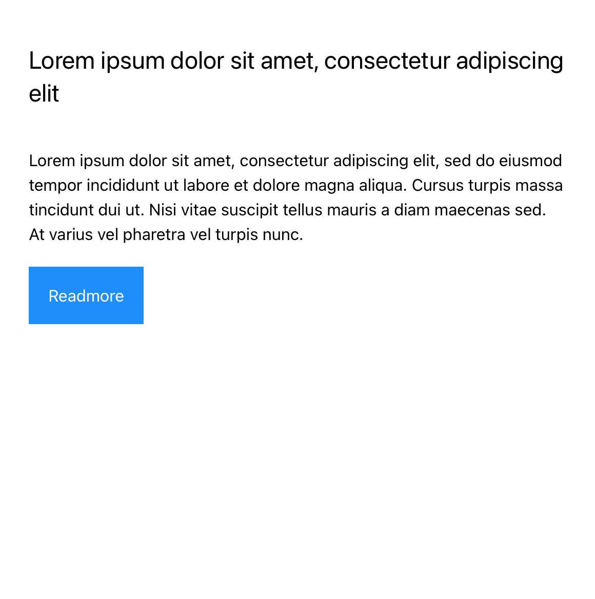
Mobile Layout
Specification
This provides guidance on the build, layout and content options for this component.


| Component item | Requirement & purpose | Optional or mandatory | CMS options |
|---|---|---|---|
| Button text (Collapsed State) | To provide read more text at collapsed state | Mandatory | text field with default value ad Read more.. |
| Button text (Expanded State) | To provide read more text at expanded state | Mandatory | Select boxed or full width for dropzone. |
| Button Style | Allows user to set choose button style from the existing styles. | Mandatory | Drop-down with text link and button link selection |
| Button Position | Allows control of button position | Mandatory | Drop down with value Left, Center and Right |
General usage dos and don'ts
| ✅ Dos | ❌ Don'ts |
|---|---|
| Ensure the text is legible. | Do not use a background image that makes the text hard to read. |