Related creative slider (Deprecated)
Please note that this component is deprecated and will not be available for newer builds. It will continue to be available on sites where it has already been implemented. For new builds, please use the updated Related creative Slider instead.
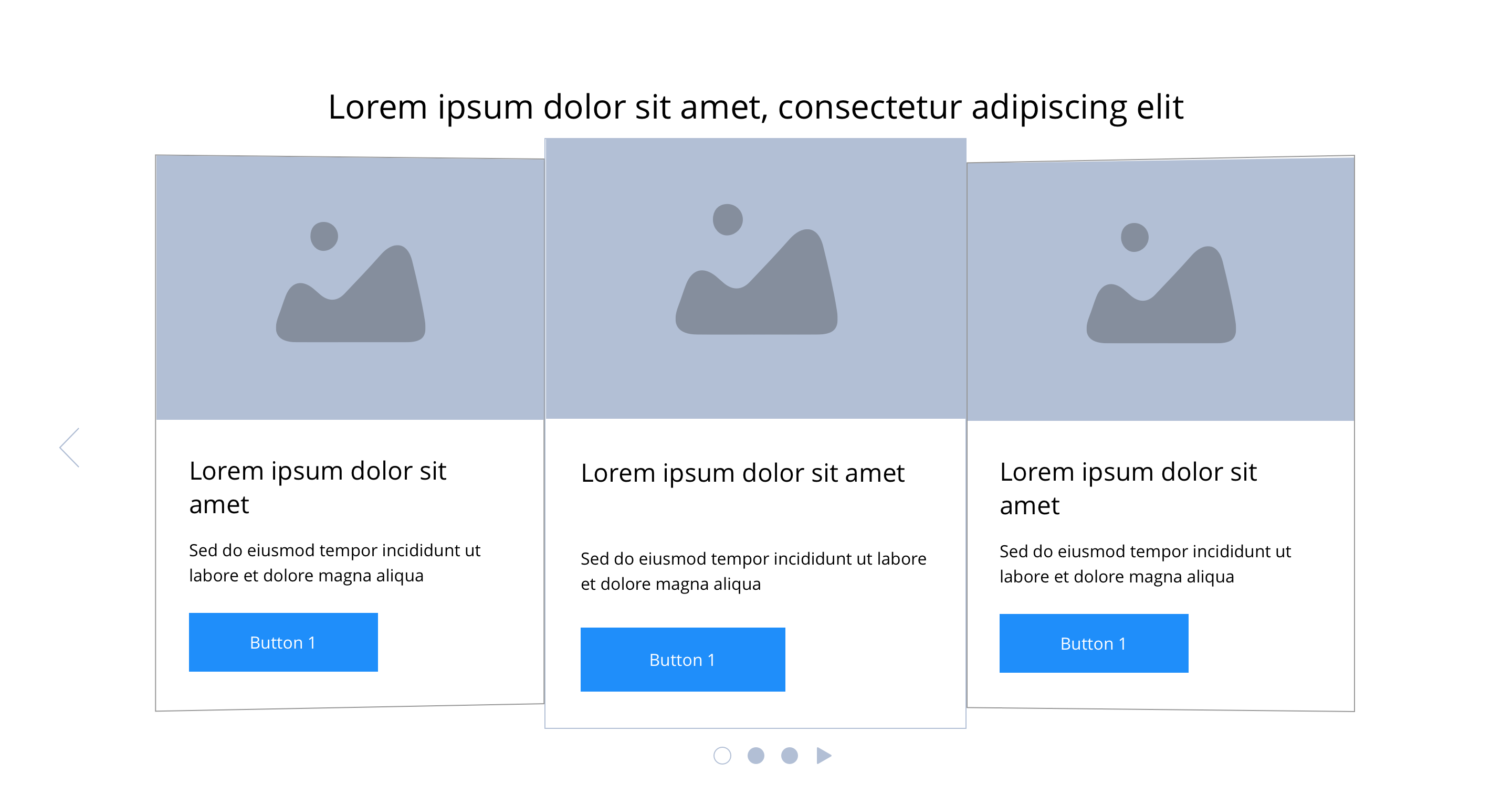
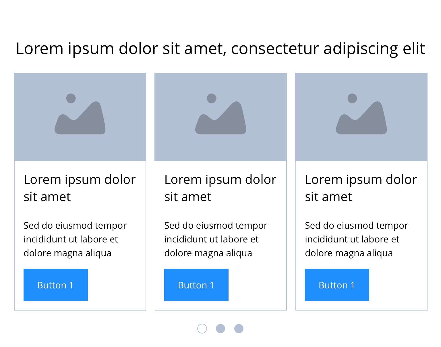
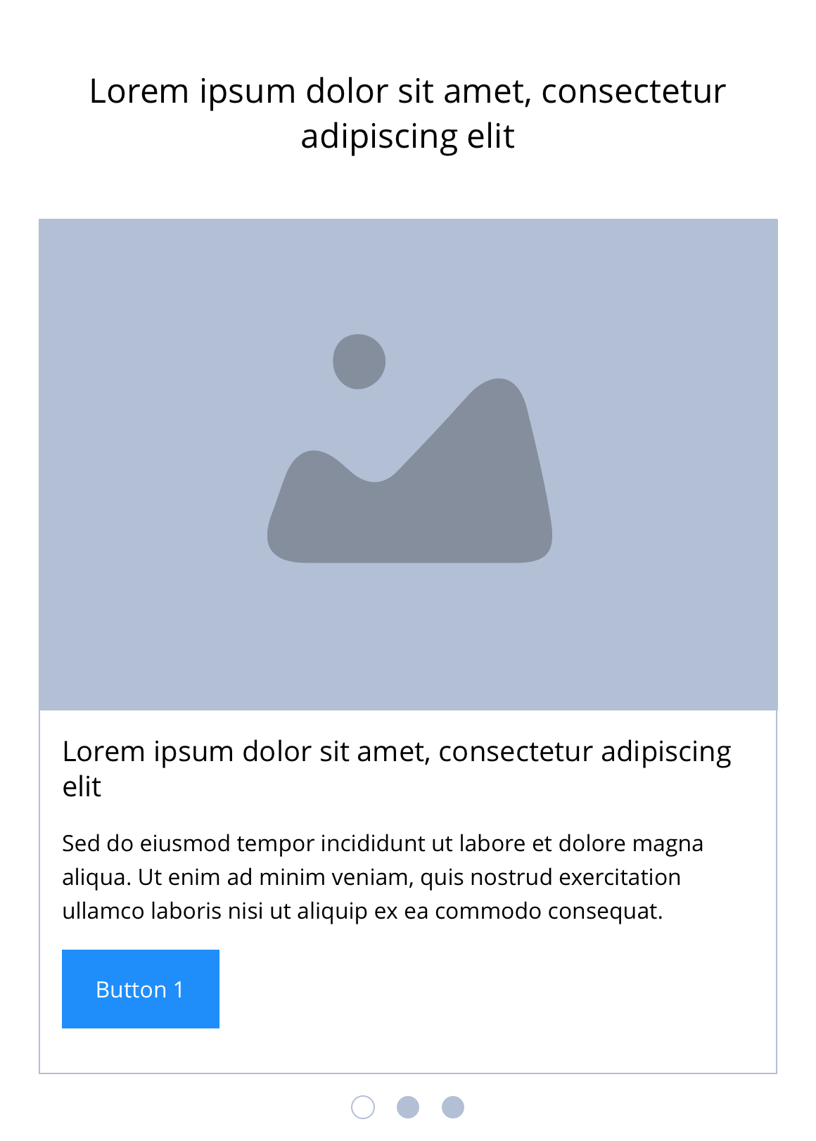
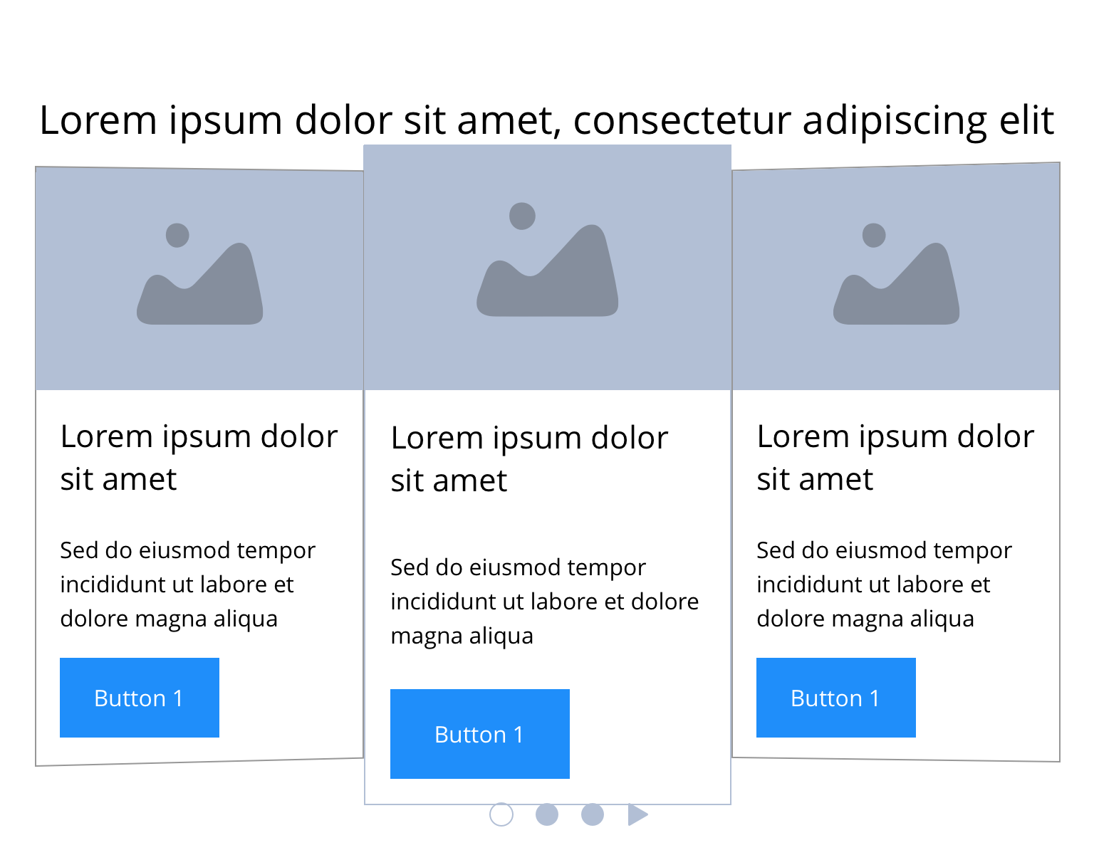
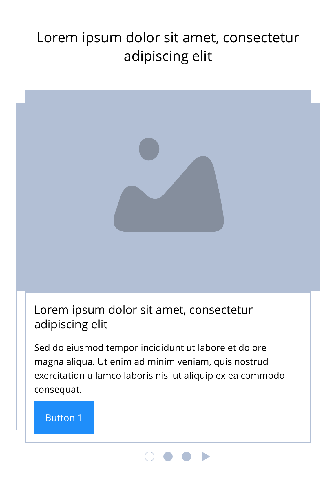
The Related creative slider is made up of two parts, the Related creative slider container and Related creative slider items. The container is almost identical to the Slider container, the key difference is that you can't control the number of slides. This component enables users to display content type teasers e.g Articles or Products. Editors can manually select specific content they wish to display here. See usage tab for more details.
- Overview
- Specification
- Style Guide Manager
- Examples in-situ
- Usage

Specification
This provides guidance on the build, layout and content options for this component.
 Layout specification
Related creative slider container
| Component item | Requirement & purpose | Optional or mandatory | CMS options |
|---|---|---|---|
| Height | Expands based on size of content. | n/a | n/a |
| Width | The content is contained by the grid width. Center aligned - text spans 10 columns max on desktop. 12 columns on tablet and below. Left and right aligned - text spans 10 columns on desktop and tablet. 12 columns on mobile. | Mandatory | Select boxed or full width for dropzone. |
| Background image | Allows user to set background image. This is full width and set to cover. | Optional | Image uploader. |
| Background image alignment | Allows control of background image alignment | Optional | Vertically align top, centre or bottom. Horizontally align left, centre or right. |
| Show/hide background image on mobile | Allows editor to hide background image on mobile breakpoint. | Optional | Show or hide. |
| Background image aria label | The aria-label allows us to specify a string to be used as the accessible label. | Optional | Text input field |
| Background colour | Allows user to set a background colour on the component. | Optional | Choose from colour palette. |
| Auto-play setting | Allow user to turn-off or tun-on auto-play to slider | Mandatory | Choose from the drop-down. On/Off. By default value will be on |
| Content alignment | Controls content horizontal alignment. | Optional | Left, centre or right. |
| Slider navigation colour | Allows user to overwrite the colour set for slider navigation in the Style Guide Manager. | Optional | Choose from colour palette. |
| Slider pagination active colour | Allows user to overwrite the colour set for the active pagination in the Style Guide Manager. | Optional | Choose from colour palette. |
| Slider pagination inactive colour | Allows user to overwrite the colour set for the inactive pagination in the Style Guide Manager. | Optional | Choose from colour palette. |
| Dropzone width | The content within the dropzone can be constrained to the box grid or set to full width. | Mandatory | Boxed width or full width. |
| Padding top and bottom | Allows control of the top and bottom spacing within this component. Set globally via the SGM. | Mandatory | Large, medium, small or none. |
| Margin bottom | Allows control of the spacing below the component. Set globally via the SGM. | Mandatory | Large, medium, small or none. |
| Pre-heading text | Allows user to set a pre-heading before H1. | Optional | Text input. |
| Pre-heading text colour | Sets pre-heading colour. | Optional | Choose from colour palette. |
| Heading text | Sets heading text. | Optional | Text input. |
| Heading element | Sets H2, H3 or H4 on component. | Optional | Select heading element. |
| Heading style | Allows user to choose where more than one type of heading style may be present (i.e. multiple H2's). | Optional | Select heading style. |
| Heading colour | Sets heading colour. | Optional | Choose from colour palette. |
| Paragraph text | Sets paragraph content. | Optional | Text input. |
| Paragraph style | Sets paragraph style. | Optional | Paragraph style select. |
| Paragraph colour | Sets paragraph colour. | Optional | Choose from colour palette. |
| WYSIWYG | Allows user to format text where additional styles may be required. | Optional | WYSIWYG. |
| Link 1 (above dropzone) | Allows user to link to a URL or launch a modal. | Optional | Link text input. Link style select. Link URL input. Target select: Same window or open in new. Modal ID input. |
| Link 2 (above dropzone) | Allows user to link to a URL or launch a modal. | Optional | Link text input. Link style select. Link URL input. Target select: Same window or open in new. Modal ID input. |
| Alternative CTA (below dropzone) | Allows user to link to a URL or launch a modal. | Optional | Link text input. Link style select. Link URL input. Target select: Same window or open in new. Modal ID input. |
| Footnote text and colour | Sets footnote content and colour. | Optional | Text input. Choose from colour palette. |
Interaction
These are the interactive aspects of the component.
| Interaction |
|---|
| On click block links to featured content. |
| Slider navigation switches between slides. |
| Slider pagination switches between slides. |
| Swipe/drag switches between slides. |
| On mouseover/ hover the slider pauses if set to auto slide. |
Related creative slider item
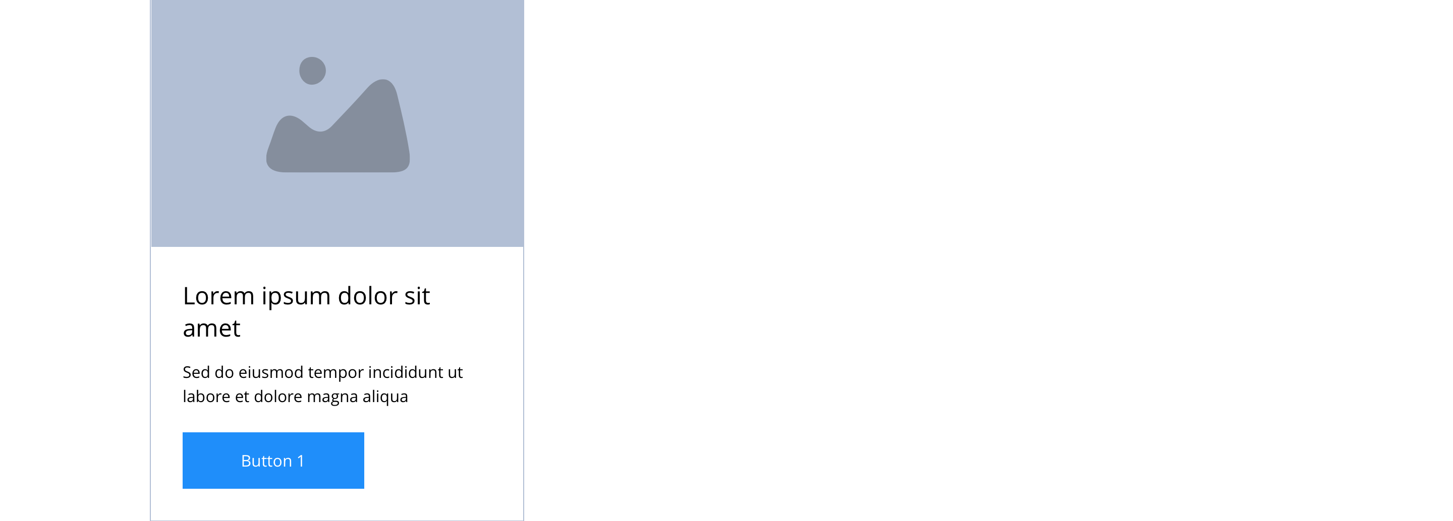
Content is added via the content type (e.g Article or Product).
| Component item | Requirement & purpose | Optional or mandatory | CMS options |
|---|---|---|---|
| Entity | Allows the user to select what content to display. i.e. Article or Product teaser. | Mandatory | Text input. |
Animation
For each link there will be option to add button animation. Animation configuration option will be following
| Button animate | Allows users to switch On/Off the animation functionality for the button link. | Optional | On/off. |
| Select animation | Allow user to select animation from the drop-down list. | Optional | Select list |
| Duration | Set how long in seconds the animation will take to run | Required | Numeric Input |
| Delay | Set a start delay on the animation in seconds | Optional | Numeric Input |
| Iteration | Set the number of times the animation should run | Optional | Numeric Input (Maximum two) |
| Offset | Set the animation to start at a specific offset before or after the element has entered the viewport | Optional | Numeric Input (Pixel) |
These are the Style Guide Manager settings that are specific to this component. For global settings see the Style Guide Manager section.
Product teaser
| Property | Requirement & purpose | Default | SGM override |
|---|---|---|---|
| Heading element | Sets H2, H3 or H4 site wide on the teasers. | H4 | Select heading element. |
| Heading colour | Sets the site wide teaser heading colour. | Black | Choose from colour palette. |
| Link style | Sets the site wide teaser link style of the CTA. | Primary text link | Select link style. |
| Background colour | Sets the site wide teaser background colour. | White | Choose from colour palette. |
| Border width | Sets the site wide teaser border width. | 0px | Choose size within range slider. |
| Border colour | Sets the site wide teaser border colour. | n/a | Choose from colour palette. |
| Border radius | Sets the site wide teaser border radius. | 0 | Text input (e.g 0px, 4px, 8px). |
| Drop shadow | Adds a site wide drop shadow around the teasers. | Off | On/off. |
Article teaser
| Property | Requirement & purpose | Default | SGM override |
|---|---|---|---|
| Heading element | Sets H2, H3 or H4 site wide on the teasers. | H4 | Select heading element. |
| Heading colour | Sets the site wide teaser heading colour. | Black | Choose from colour palette. |
| Link style | Sets the site wide teaser link style of the CTA. | Primary text link | Select link style. |
| Background colour | Sets the site wide teaser background colour. | White | Choose from colour palette. |
| Border width | Sets the site wide teaser border width. | 0px | Choose size within range slider. |
| Border colour | Sets the site wide teaser border colour. | n/a | Choose from colour palette. |
| Border radius | Sets the site wide teaser border radius. | 0 | Text input (e.g 0px, 4px, 8px). |
| Drop shadow | Adds a site wide drop shadow around the teasers. | Off | On/off. |

General usage dos and don'ts
| ✅ Dos | ❌ Don'ts |
|---|---|
| These components should only be used to display content type teasers. i.e. Articles or Products. | Select other content types that do not have teaser content i.e. a basic page or FAQ. |
| Ensure the text is legible. | Do not use a background image that makes the text hard to read. |
| The content selectable here are the teasers for the specific content type. i.e. an article or a product. As such, if a user changes the content in the Product type teaser, this content will update site wide. | |
| This component allows users to add as many teasers as required. If only three items are selected, as per our stacking rules, this will trigger a slider at mobile breakpoint. Add more than three Related content slider items and this will also trigger the slider functionality at desktop. |