Related Content Teaser
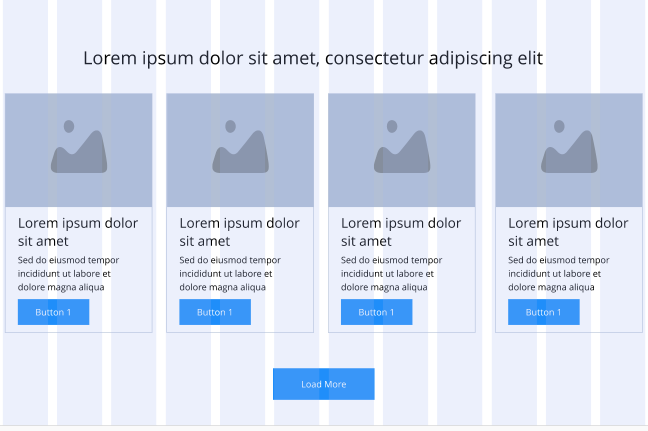
The Related Content Teaser will be made up of two parts, the Related content Teaser container and Related content Teaser Items. The container will be almost identical to the Slider container, the key difference is that there will be no sliders. This component enables users to display content type teasers e.g Articles or Products. Editors can manually select specific content they wish to display here. See usage tab for more details.
- Overview
- Specification
 Related Content Teaser Container
 Related Content Teaser Items
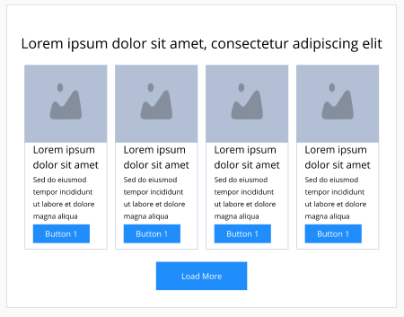
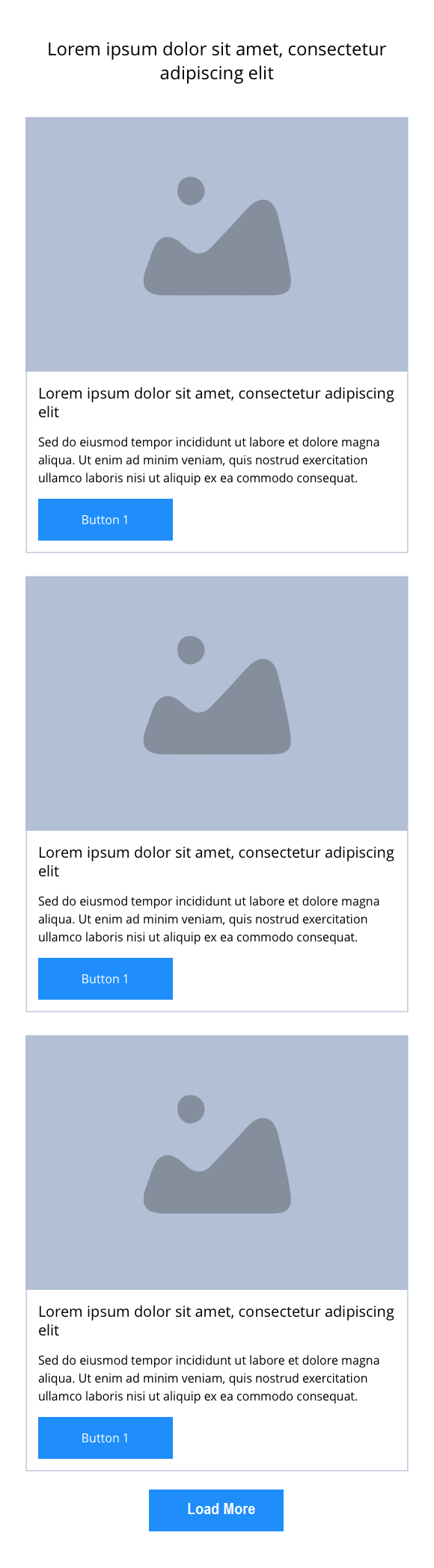
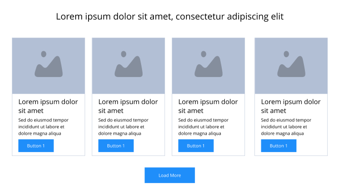
This provides guidance on the build, layout and content options for this component.
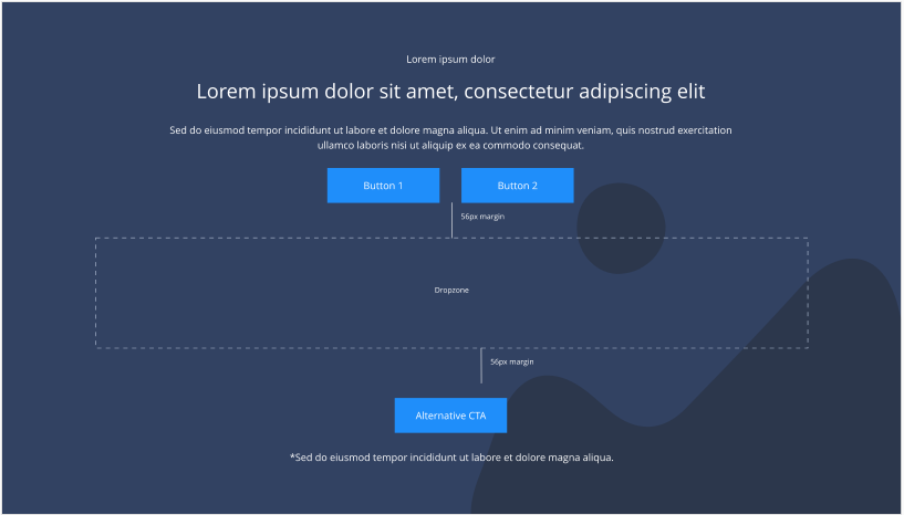
Related content Slider container
| Component item | Requirement & purpose | Optional or mandatory | CMS options |
|---|---|---|---|
| Height | Expands based on size of content. | n/a | n/a |
| Width | The content is contained by the grid width. Center aligned - text spans 10 columns max on desktop. 12 columns on tablet and below. Left and right aligned - text spans 10 columns on desktop and tablet. 12 columns on mobile. | Mandatory | Select boxed or full width for dropzone. |
| Background image | Allows user to set background image. This is full width and set to cover. | Optional | Image uploader. |
| Background image alignment | Allows control of background image alignment | Optional | Vertically align top, centre or bottom. Horizontally align left, centre or right. |
| Show/hide background image on mobile | Allows editor to hide background image on mobile breakpoint. | Optional | Show or hide. |
| Background colour | Allows user to set a background colour on the component. | Optional | Choose from colour palette. |
| Content alignment | Controls content horizontal alignment. | Optional | Left, centre or right. |
| Dropzone width | The content within the dropzone can be constrained to the box grid or set to full width. | Mandatory | Boxed width or full width. |
| Padding top and bottom | Allows control of the top and bottom spacing within this component. Set globally via the SGM. | Mandatory | Large, medium, small or none. |
| Margin bottom | Allows control of the spacing below the component. Set globally via the SGM. | Mandatory | Large, medium, small or none. |
| Pre-heading text | Allows user to set a pre-heading before H1. | Optional | Text input. |
| Pre-heading text colour | Sets pre-heading colour. | Optional | Choose from colour palette. |
| Heading text | Sets heading text. | Optional | Text input. |
| Heading element | Sets H2, H3 or H4 on component. | Optional | Select heading element. |
| Heading style | Allows user to choose where more than one type of heading style may be present (i.e. multiple H2's). | Optional | Select heading style. |
| Heading colour | Sets heading colour. | Optional | Choose from colour palette. |
| Paragraph text | Sets paragraph content. | Optional | Text input. |
| Paragraph style | Sets paragraph style. | Optional | Paragraph style select. |
| Paragraph colour | Sets paragraph colour. | Optional | Choose from colour palette. |
| WYSIWYG | Allows user to format text where additional styles may be required. | Optional | WYSIWYG. |
| Link 1 (above dropzone) | Allows user to link to a URL or launch a modal. | Optional | Link text input. Link style select. Link URL input. Target select: Same window or open in new. Modal ID input. |
| Link 2 (above dropzone) | Allows user to link to a URL or launch a modal. | Optional | Link text input. Link style select. Link URL input. Target select: Same window or open in new. Modal ID input. |
| Alternative CTA (below dropzone) | Allows user to link to a URL or launch a modal. | Optional | Link text input. Link style select. Link URL input. Target select: Same window or open in new. Modal ID input. |
| Footnote text and colour | Sets footnote content and colour. | Optional | Text input. Choose from colour palette. |