Related content accordion
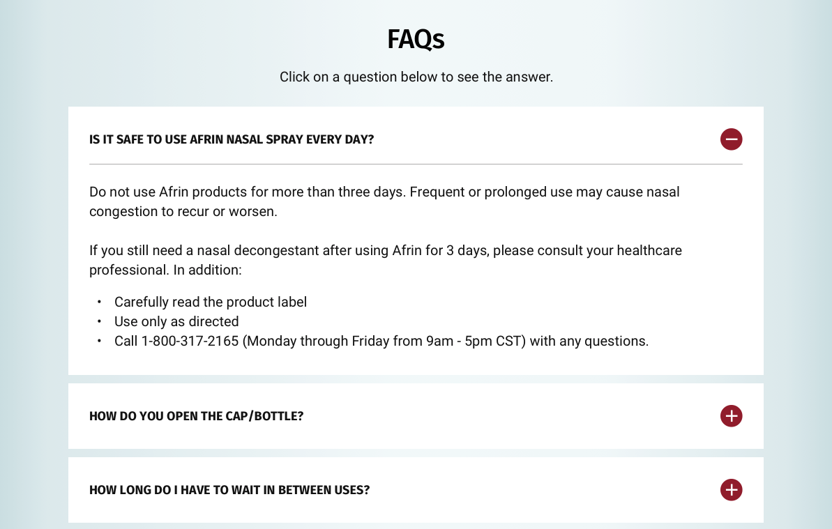
The Related content accordion is made up of two parts, the Related content accordion container and Related content accordion items. The Related content accordion is almost identical to standard accordions. The difference is that this enables users to display content type teasers e.g FAQs. Editors can manually select specific content they wish to display here. See usage tab for more details.
- Overview
- Specification
- Style Guide Manager
- Examples in-situ
- Usage
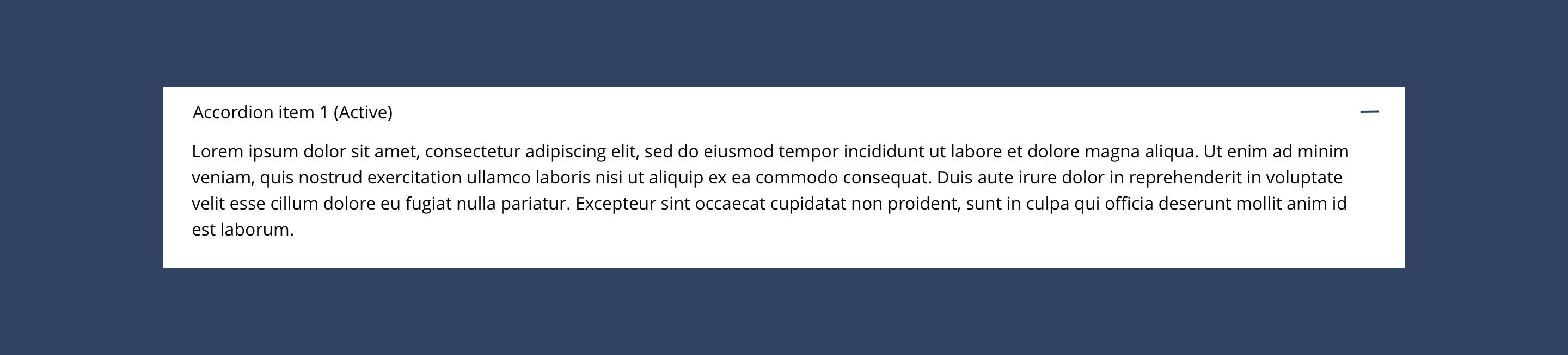
Related content accordion container
The Related content accordion container is used in conjunction with Related content accordion items.
Overview
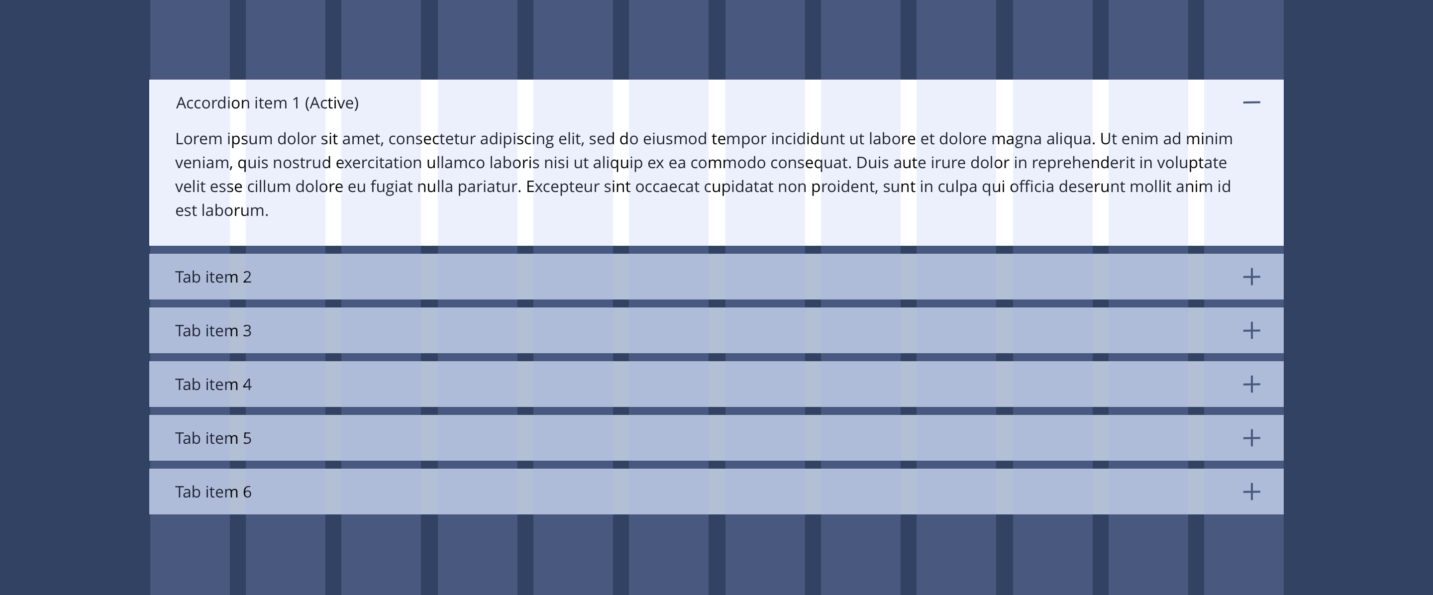
Example showing Related content accordion items nested within the Related content accordion container component.
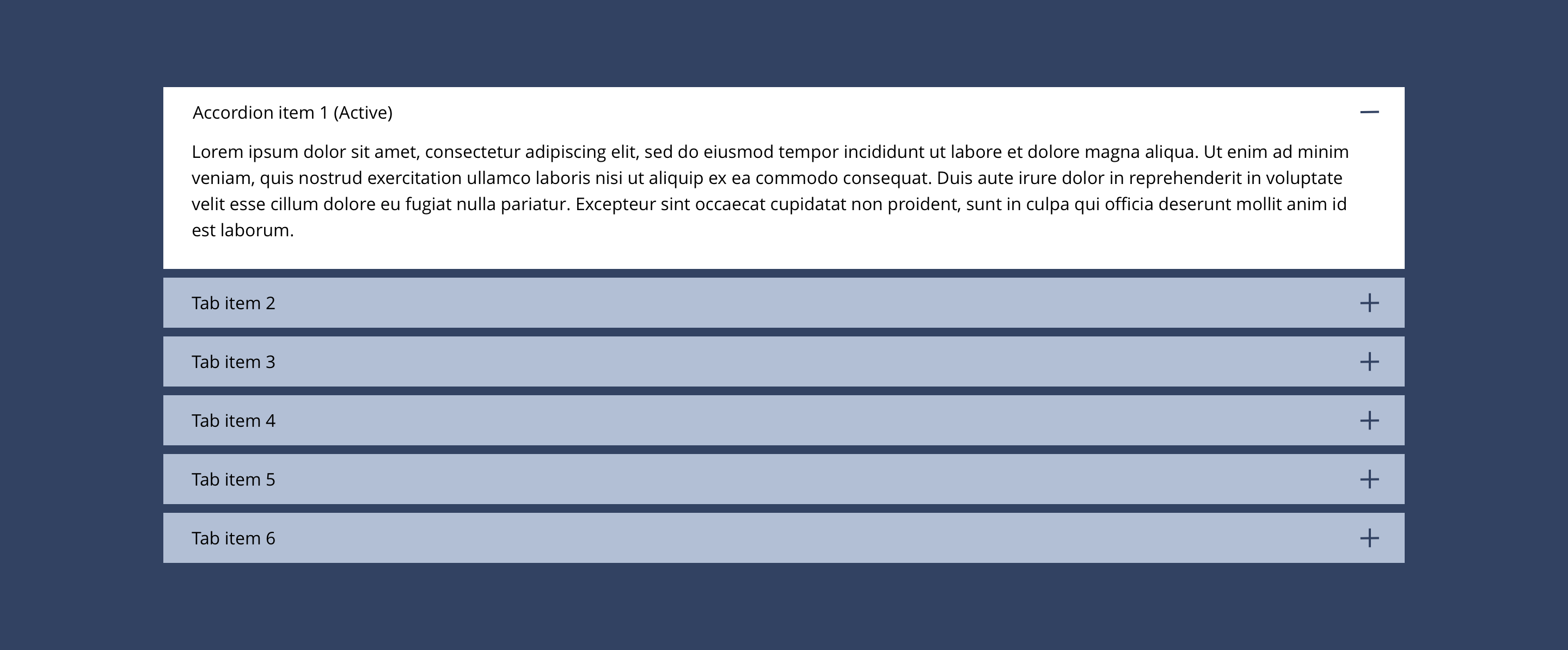
Related content accordion container

Related content accordion can only be configured in the Style Guide Manager.
Related content accordion item
| Component item | Requirement & purpose | Optional or mandatory | CMS options |
|---|---|---|---|
| Entity | Allows the user to select what content to display. | Mandatory | Text input. |
For the styling, you should follow the specification in the Accordions section of this guide.
General usage dos and don'ts
| ✅ Dos | ❌ Don'ts |
|---|---|
| These components should only be used to display FAQs. | Select other content types other than FAQs. |
| Ensure the text is legible. | Do not use a background image that makes the text hard to read. |
| The content selectable here are the teasers for the specific content type. i.e. FAQs. As such, if a user changes the content in the FAQ question or answer, this content will update site wide. |