id: 12-text-over-background-image
1/2 text over background image
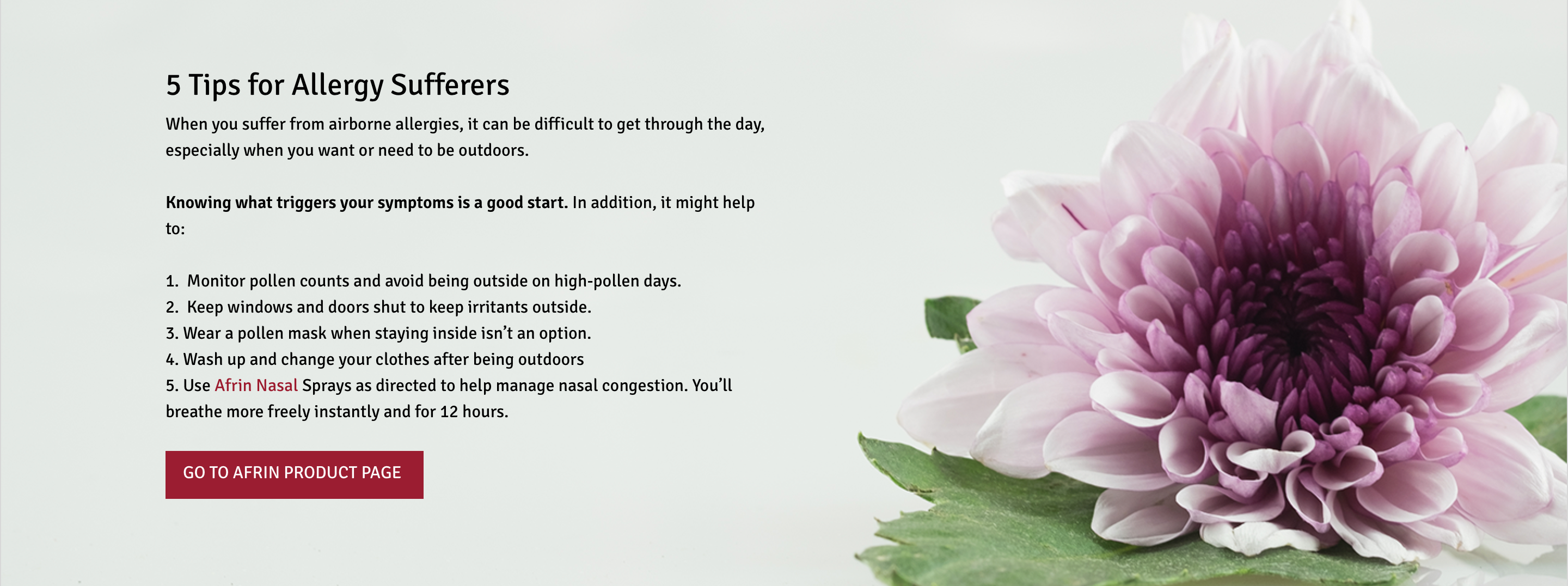
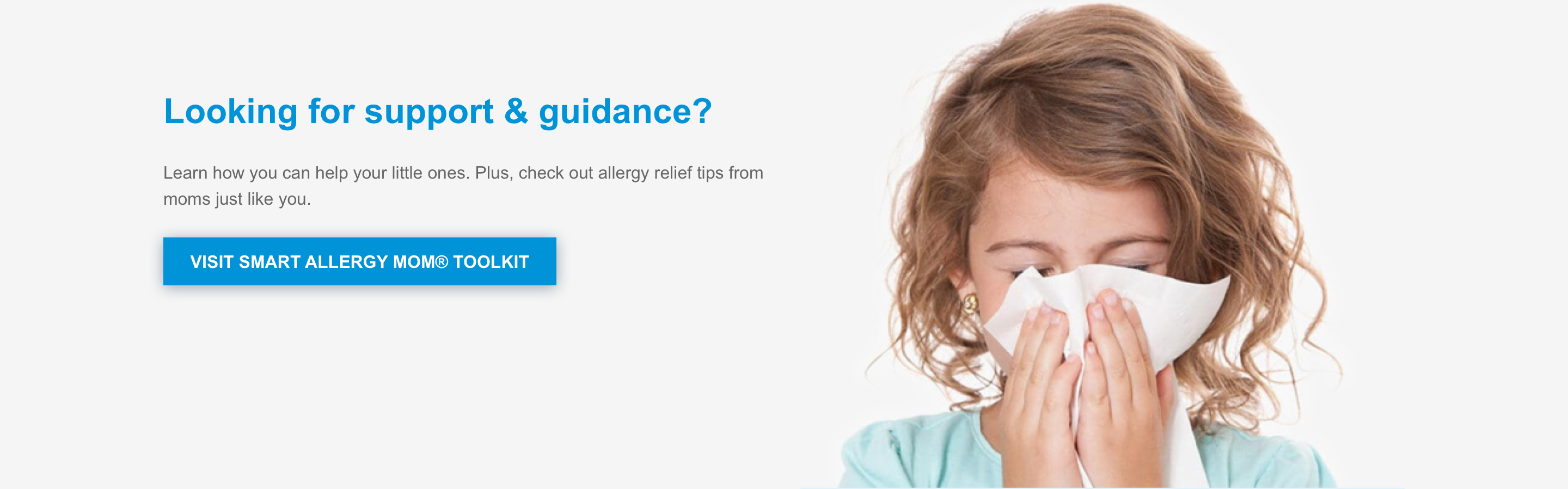
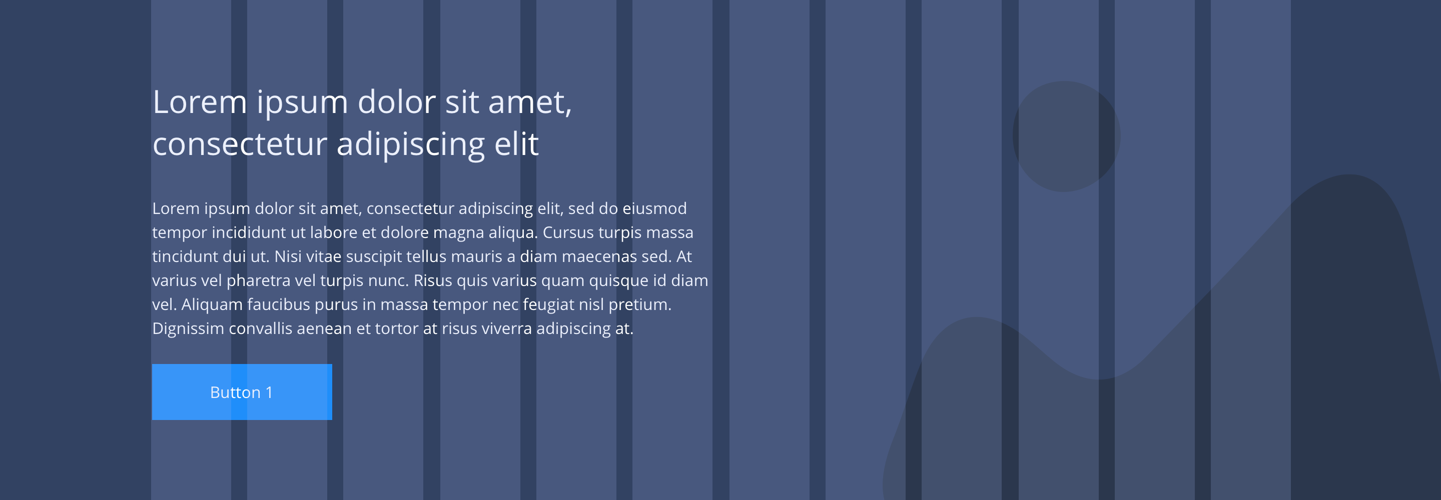
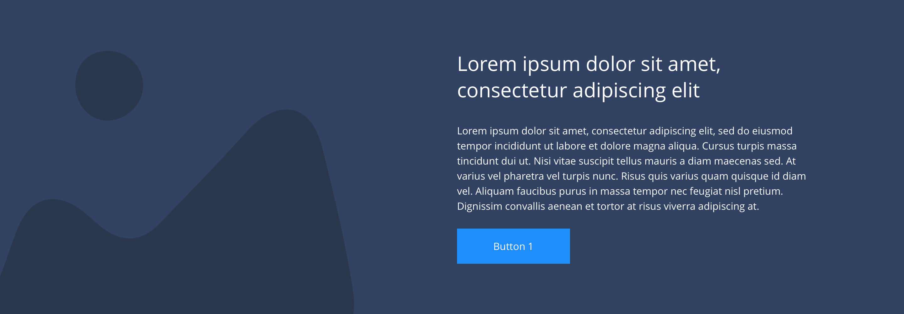
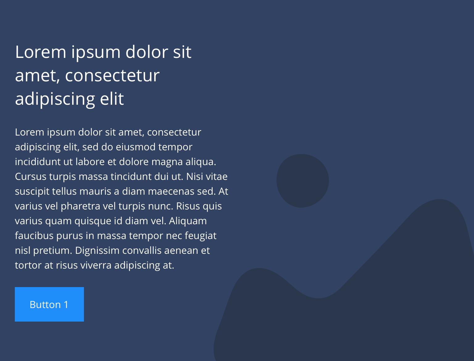
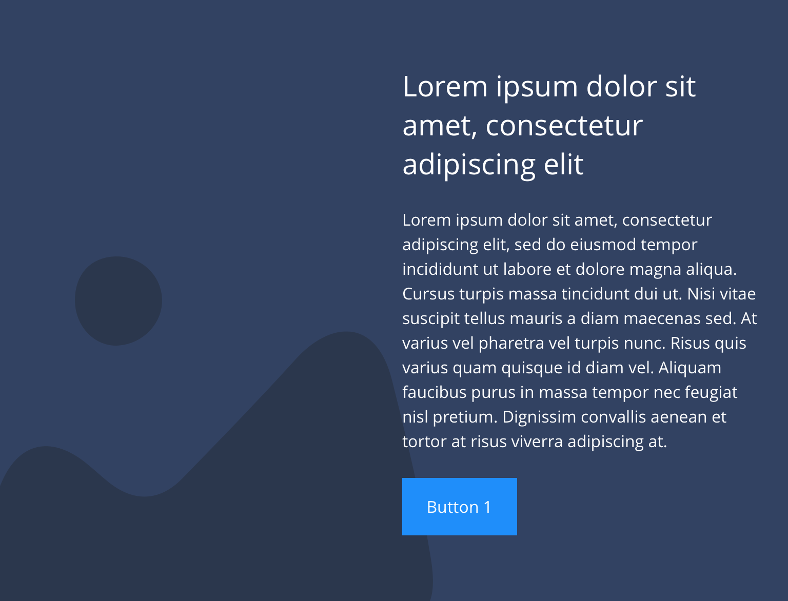
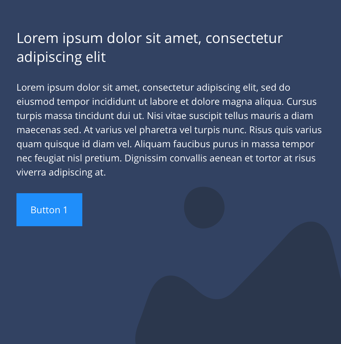
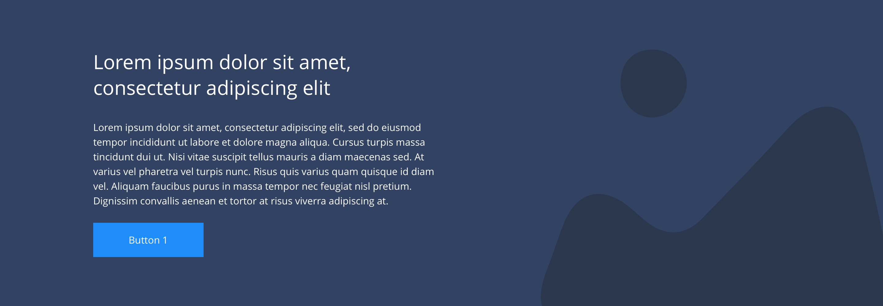
The 1/2 text over background image component is a full width text and image section. It has an option to position text directly over the background image or contain it within a panel. It can be customised further as described in the specification tab below.
- Overview
- Specification
- Style Guide Manager
- Examples in-situ
- Usage

Specification
This provides guidance on the build, layout and content options for this component.
 Layout specification
id: 12-text-over-background-image
| Component item | Requirement & purpose | Optional or mandatory | CMS options |
|---|---|---|---|
| Minimum height | Sets minimum height of component for each breakpoint. Component expands based on content. | n/a | Set globally via SGM and affects all instances of the component on the site. |
| Width | The container is set full width. Content is constrained to the width of the grid. | n/a | n/a |
| Lazy Load toggle | Allows the user to switch On/Off the Lazy Load functionality for the background image. | Option | On/Off |
| Desktop background image | Allows user to set a background image. This is full width and should be set to cover. | Optional | Image uploader. |
| Desktop background image alignment | Allows control of background image alignment. | Optional | Vertically align top, centre or bottom. Horizontally align left, centre or right. |
| Mobile background image | Allows user to set a background image. This is full width and should be set to cover. | Optional | Image uploader. |
| Background image aria label | The aria-label allows us to specify a string to be used as the accessible label. | Optional | Text input fieloverviewd |
| Mobile background image alignment | Allows control of background image alignment. | Optional | Vertically align top, centre or bottom. Horizontally align left, centre or right. |
| Show/hide background image on mobile | Allows editor to hide background image on mobile breakpoint. | Optional | Show or hide. |
| Background colour | Allows user to set a background colour on the component. | Optional | Choose from colour palette. |
| Text alignment on desktop and tablet | Controls text alignment. | Optional | Vertically align top, centre or bottom. Horizontally align left, centre or right. |
| Text alignment on mobile | Controls text alignment. | Optional | Horizontally align left, centre or right. |
| Text position | Controls position of text. | Mandatory | Left or right. |
| Text panel background and colour | Sets a coloured background panel behind text. When applied, padding automatically matches the SGM block padding value. | Optional | Show/hide. Choose from colour palette. |
| Full border | Allows a full width border to be added to the component. | Optional | On/off. |
| Full border width | Sets the border width. | Optional | Add a px value. |
| Full border colour | Sets the border colour. | Optional | Choose from colour palette. |
| Border bottom | Allows a boxed width border to be added to the bottom of the component. | Optional | On/off. |
| Border bottom width | Sets the border width. | Optional | Add a px value. |
| Border bottom colour | Sets the border colour. | Optional | Choose from colour palette. |
| Padding top and bottom | Allows control of the top and bottom spacing within this component. Set globally via the SGM. | Mandatory | Large, medium small or none. |
| Margin bottom | Allows control of the spacing below the component. Set globally via the SGM. | Mandatory | Large, medium, small or none. |
| Heading text | Sets heading text. | Optional | Text input. |
| Heading element | Sets H2, H3, H4 or H5 on component. | Optional | Select heading element. |
| Heading style | Allows user to choose where more then one type of heading style may be present (i.e. multiple H2's). | Optional | Select heading style. |
| Heading colour | Sets heading colour. | Optional | Choose from colour palette. |
| Paragraph | Sets paragraph content. | Optional | Text input. |
| Paragraph style | Sets paragraph style. | Optional | Paragraph style select. |
| Paragraph colour | Sets paragraph colour. | Optional | Choose from colour palette. |
| WYSIWYG | Allows user to format text where additional styles may be required. | Optional | WYSIWYG. |
| PWA | To enable PWA CTA | Optional | Toggle Button |
| Link 1 | Allows user to link to a URL or launch a modal. | Optional | Link text input. Link style select. Link URL input. Target select: Same window or open in new. Modal ID input. |
| Button Shapes | Allows user to select different button shapes. | Optional | Select from dropdown |
Interaction
These are the interactive aspects of the component.
| Interaction |
|---|
| Link 1 links to either a defined page or can launch a modal. |
Animationoverview
For each link there will be option to add button animation. Animation configuration option will be following
| Button animate | Allows users to switch On/Off the animation functionality for the button link. | Optional | On/off. |
|---|---|---|---|
| Select animation | Allow user to select animation from the drop-down list. | Optional | Select list |
| Duration | Set how long in seconds the animation will take to run | Required | Numeric Input |
| Delay | Set a start delay on the animation in seconds | Optional | Numeric Input |
| Iteration | Set the number of times the animation should run | Optional | Numeric Input (Maximum two) |
| offset | Set the animation to start at a specific offset before or after the element has entered the view port | Optional | Numeric Input (Pixel) |
Animation Container
| Select animation | Allow user to select animation from the drop-down list. | Optional | Select list |
|---|---|---|---|
| Duration | Set how long in seconds the animation will take to run | Required | Numeric Input |
| Delay | Set a start delay on the animation in seconds | Optional | Numeric Input |
| Iteration | Set the number of times the animation should run | Optional | Numeric Input (Maximum two) |
| offset | Set the animation to start at a specific offset before or after the element has entered the view port | Optional | Numeric Input (Pixel) |
These are the Style Guide Manager settings that are specific to this component. For global settings see the Style Guide Manager section.
| Property | Default | SGM override |
|---|---|---|
| Minimum height | Desktop - 440px Tablet - 400px Mobile - 584px | Desktop Tablet Mobile |