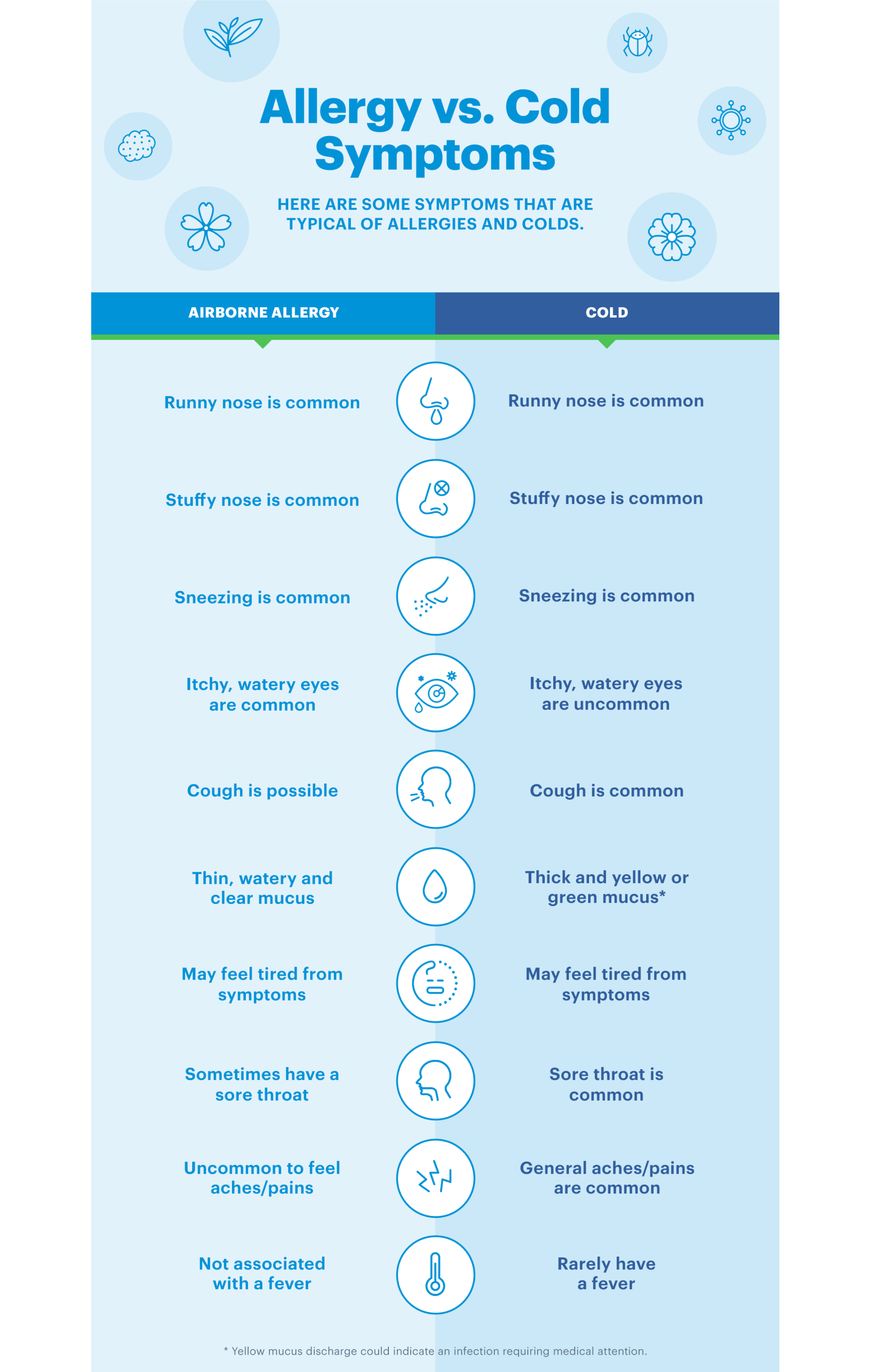
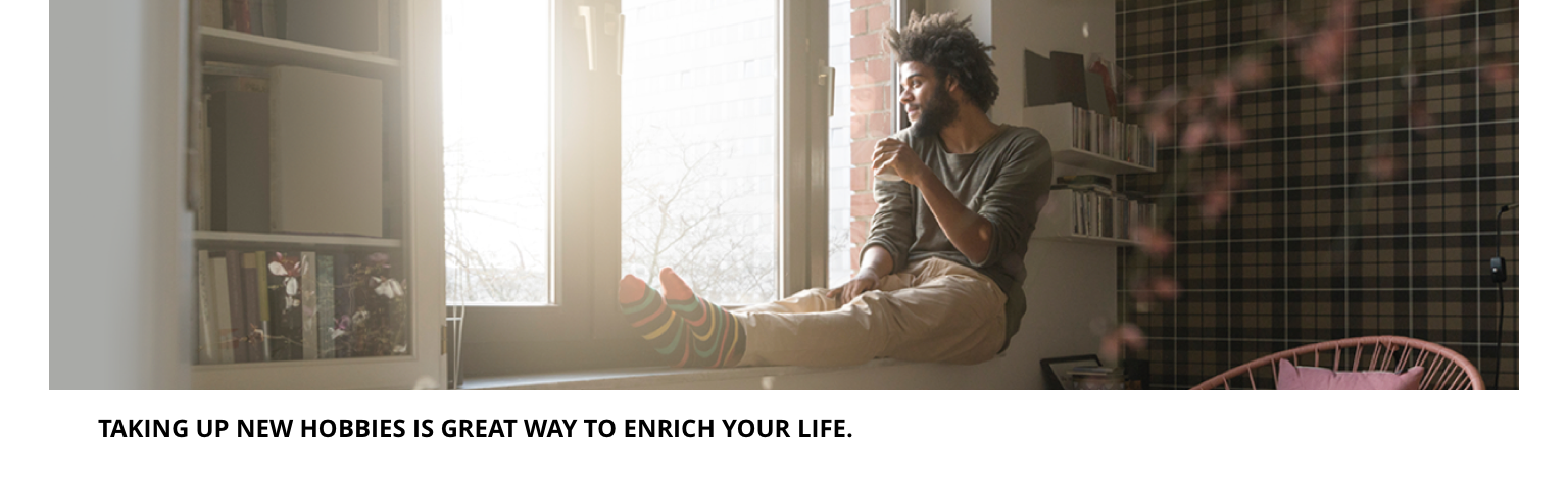
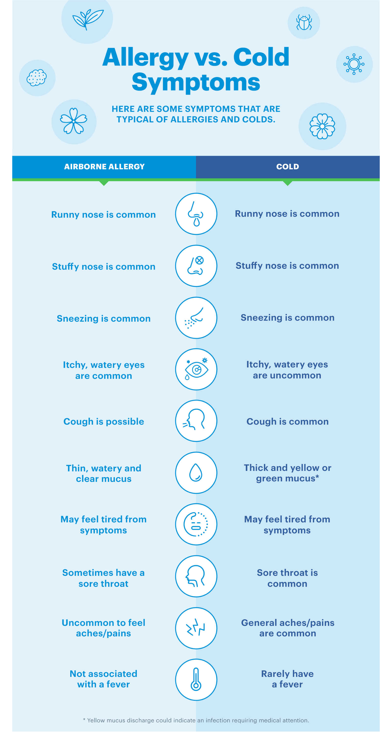
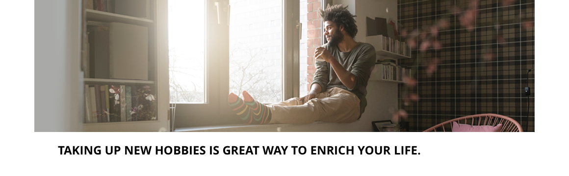
Image
The Image component can be either constrained by the width of the grid or a full width section. It includes an image and caption and can be customised as described in the specification tab below.
- Overview
- Specification
- Style Guide Manager
- Examples in-situ
- Usage


Specification
This provides guidance on the build, layout and content options for this component.
Layout specification
| Component item | Requirement & purpose | Optional or mandatory | CMS options |
|---|---|---|---|
| Image size | Allows user to choose whether the image appears at the 'actual size' it has been uploaded or if it scales to fill the container it is in. | Mandatory | Actual size or responsive. |
| Content alignment | Controls alignment of both image and caption. | Mandatory | Left, centre or right. |
| Full border | Allows a full width border to be added to the component. | Optional | On/off. |
| Full border width | Sets the border width. | Optional | Add a px value. |
| Full border colour | Sets the border colour. | Optional | Choose from colour palette. |
| Border bottom | Allows a boxed width border to be added to the bottom of the component. | Optional | On/off. |
| Border bottom width | Sets the border width. | Optional | Add a px value. |
| Border bottom colour | Sets the border colour. | Optional | Choose from colour palette. |
| Width | The image can be constrained to the the box grid or set to full width. | Mandatory | Select boxed or full width. |
| Margin bottom | Allows control of the spacing below the component. set globally via the SGM. | Mandatory | Large, medium, small or none. |
| Foreground image | Allows user to set a foreground image for desktop and mobile. | Mandatory | Image uploader. |
| Image alt text | Adds alt text to an image. | Mandatory | Text input. |
| Image caption | Sets caption for image. | Optional | Text input. |
| Text caption size | This is the small paragraph text style. | n/a | n/a |
| Text caption spacing | Should be 16px margin between image and caption, 24px margin left/right. | n/a | n/a |
| Lazy Load Foreground | Allows users to switch On/Off the Lazy Load functionality for the foreground image. | Optional | On/Off |
| Link | Allows user to link to a URL | Optional | Link text input. Link URL input. Target select: Same window or open in new. |
Interaction
These are the interactive aspects of the component.
Animation Container
| Select animation | Allow user to select animation from the drop-down list. | Optional | Select list |
|---|---|---|---|
| Duration | Set how long in seconds the animation will take to run | Required | Numeric Input |
| Delay | Set a start delay on the animation in seconds | Optional | Numeric Input |
| Iteration | Set the number of times the animation should run | Optional | Numeric Input (Maximum two) |
| offset | Set the animation to start at a specific offset before or after the element has entered the view port | Optional | Numeric Input (Pixel) |
| Interaction |
|---|
| None |
There are no style guide settings for this component.

General usage dos and don'ts
| ✅ Dos | ❌ Don'ts |
|---|---|
| Compress images before uploading to a WYSIWYG. | Do not upload uncompressed images, this can make your website load slower. Image size should be managed to balance quality and load on the site with the recommendation images not to exceed 100kb. |
| Add alt text where you are using images. | Do not upload an image without adding alt text. |
| Give consideration to the height of the image you are uploading. | Avoid using images that are unnecessarily tall. This increases file size and on shallower devices potentially fill the screen. |
| Read our guidance on imagery. |