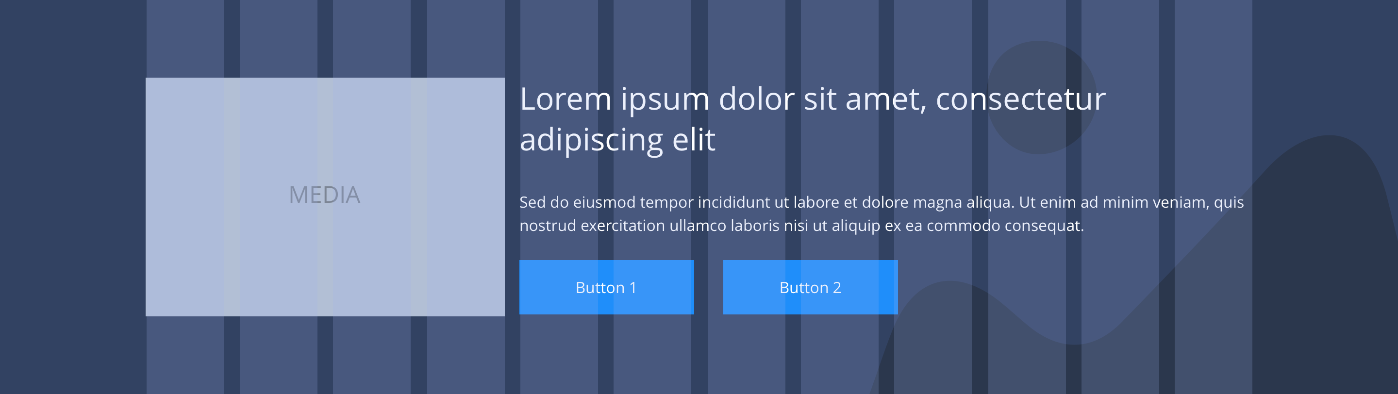
2/3 media 1/3 text
The 2/3 media 1/3 text component is a full width text and media section. The media section can be used for either an image or a video. It can be customised as described in the specification tab below.
- Overview
- Specification
- Style Guide Manager
- Examples in-situ
- Usage
 Text left
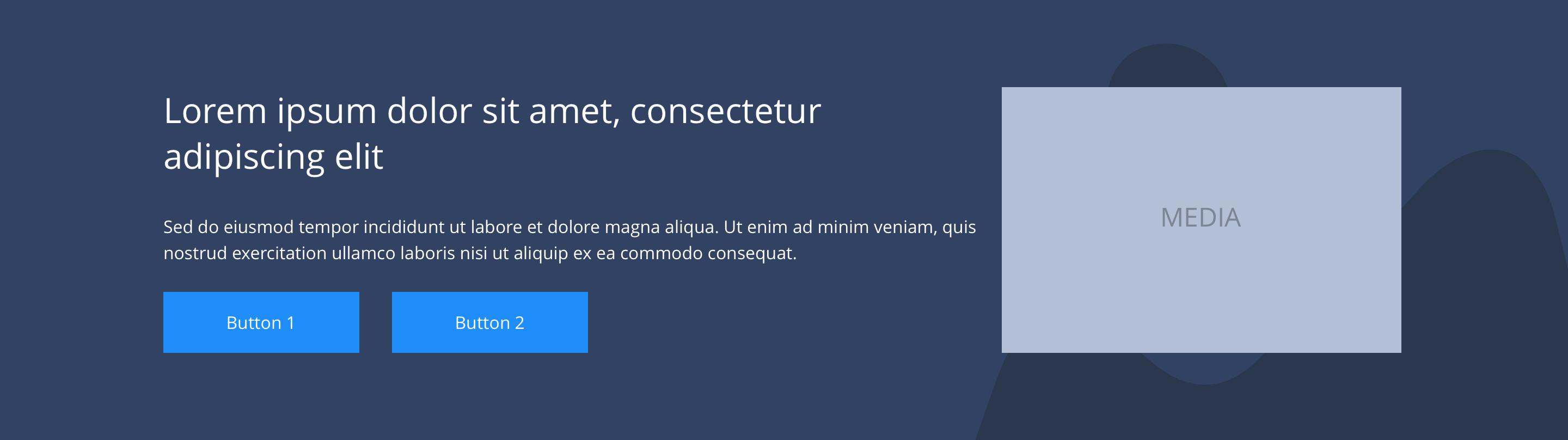
 Text right
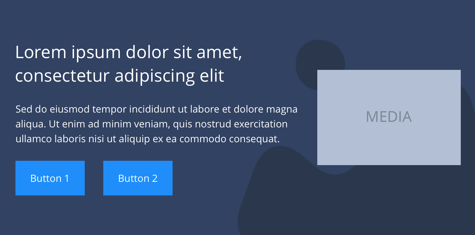 Text left
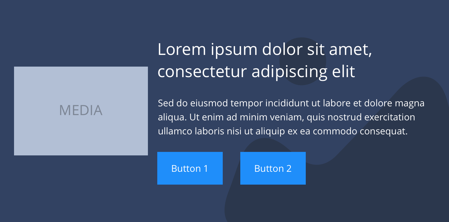 Text right
 Text left
 Text right
Specification
This provides guidance on the build, layout and content options for this component.
Layout specification
| Component item | Requirement & purpose | Optional or mandatory | CMS options |
|---|---|---|---|
| Height | Expands based on size of content. | n/a | n/a |
| Width | The container is set full width. Content is constrained to the width of the grid. | n/a | n/a |
| Desktop background image | Allows user to set a background image. This is full width and set to cover. | Optional | Image uploader. |
| Desktop background image alignment | Allows control of background image alignment. | Optional | Vertically align top, centre or bottom. Horizontally align left, centre or right. |
| Mobile background image | Allows user to set a background image. This is full width and should be set to cover. | Optional | Image uploader. |
| Background image aria label | The aria-label allows us to specify a string to be used as the accessible label. | Optional | Text input field |
| Lazy Load Background | Allows users to switch On/Off the Lazy Load functionality for the background image. | Optional | On/Off |
| Mobile background image alignment | Allows control of background image alignment. | Optional | Vertically align top, centre or bottom. Horizontally align left, centre or right. |
| Show/hide background image on mobile | Allows editor to hide background image on mobile breakpoint. | Optional | Show/hide. |
| Background colour | Allows user to set a background colour on the component. | Optional | Choose from colour palette. |
| Text alignment on desktop and tablet | Controls text alignment. | Optional | Horizontally align left, centre or right. |
| Text alignment on mobile | Controls text alignment. | Optional | Horizontally align left, centre or right. |
| Text/media ordering | Controls position of text and media. | Mandatory | Text left or right. |
| Full border | Allows a full width border to be added to the component. | Optional | On/off. |
| Full border width | Sets the border width. | Optional | Add a px value. |
| Full border colour | Sets the border colour. | Optional | Choose from colour palette. |
| Border bottom | Allows a boxed width border to be added to the bottom of the component. | Optional | On/off. |
| Border bottom width | Sets the border width. | Optional | Add a px value. |
| Border bottom colour | Sets the border colour. | Optional | Choose from colour palette. |
| Padding top and bottom | Allows control of the top and bottom spacing within this component. Set globally via the SGM. | Mandatory | Large, medium small or none. |
| Margin bottom | Allows control of the spacing below the component. Set globally via the SGM. | Mandatory | Large, medium, small or none. |
| Media width (for mobile) | Allows opting for a full width image/video which extends full screen width in mobile | Optional | Full width or boxed width. |
| Video URL | Allows user to set a Vimeo or YouTube video URL. | Optional | Video URL input. |
| Poster image | Allows user to set a background image. | Mandatory | Image uploader |
| Lazy Load Video Poster | To improve the performance. | Optional | On/Off |
| Foreground image | Allows user to upload a foreground image. | Optional | Image uploader. |
| Image alt text | Adds alt text to an image. | Mandatory where image is used | Text input. |
| Lazy Load Foreground | Allows users to switch On/Off the Lazy Load functionality for the foreground image. | Optional | On/Off |
| Heading text | Sets heading text. | Optional | Text input. |
| Heading element | Sets H2, H3, H4 or H5 on component. | Optional | Select heading element. |
| Heading style | Allows user to choose where more then one type of heading style may be present (i.e. multiple H2's). | Optional | Select heading style. |
| Heading colour | Sets heading colour. | Optional | Choose from colour palette. |
| Paragraph | Sets paragraph content. | Optional | Text input. |
| Paragraph style | Sets paragraph style. | Optional | Paragraph style select. |
| Paragraph colour | Sets paragraph colour. | Optional | Choose from colour palette. |
| WYSIWYG | Allows user to format text where additional styles may be required. | Optional | WYSIWYG. |
| PWA | To enable PWA CTA | Optional | Toggle Button |
| Link 1 | Allows user to link to a URL or launch a modal. | Optional | Link text input. Link style select. Link URL input. Target select: Same window or open in new. Modal ID input. |
| Link 2 | Allows user to link to a URL or launch a modal. | Optional | Link text input. Link style select. Link URL input. Target select: Same window or open in new. Modal ID input. |
| Button Shapes | Allows user to select different button shapes. | Optional | Select from dropdown |
Interaction
These are the interactive aspects of the component.
Animation Container
| Select animation | Allow user to select animation from the drop-down list. | Optional | Select list |
|---|---|---|---|
| Duration | Set how long in seconds the animation will take to run | Required | Numeric Input |
| Delay | Set a start delay on the animation in seconds | Optional | Numeric Input |
| Iteration | Set the number of times the animation should run | Optional | Numeric Input (Maximum two) |
| offset | Set the animation to start at a specific offset before or after the element has entered the view port | Optional | Numeric Input (Pixel) |
| Interaction |
|---|
| Link 1 links to either a defined page or can launch a modal. |
| Link 2 links to either a defined page or can launch a modal. |
| Play/pause video on click. |
| Adjust volume on video. |
There are no style guide settings for this component.
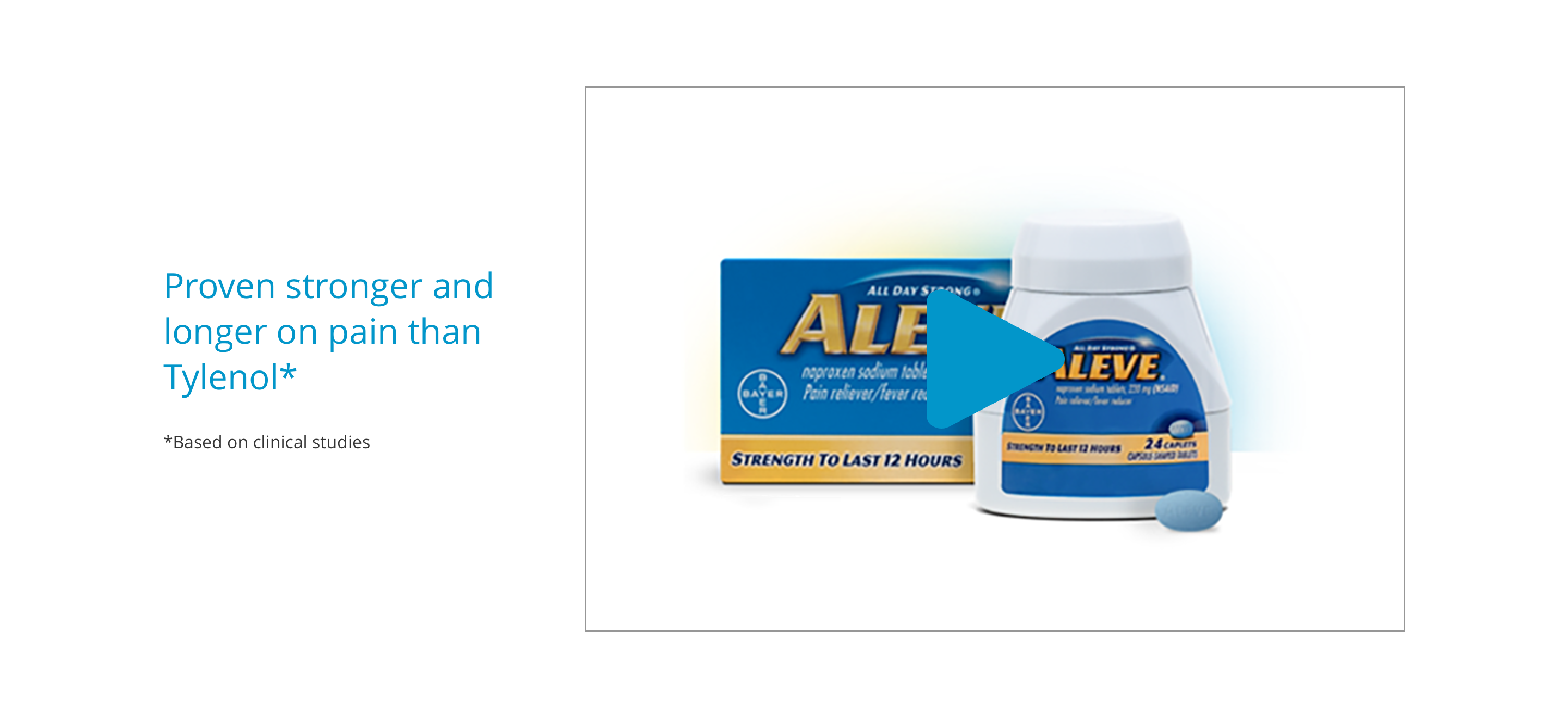
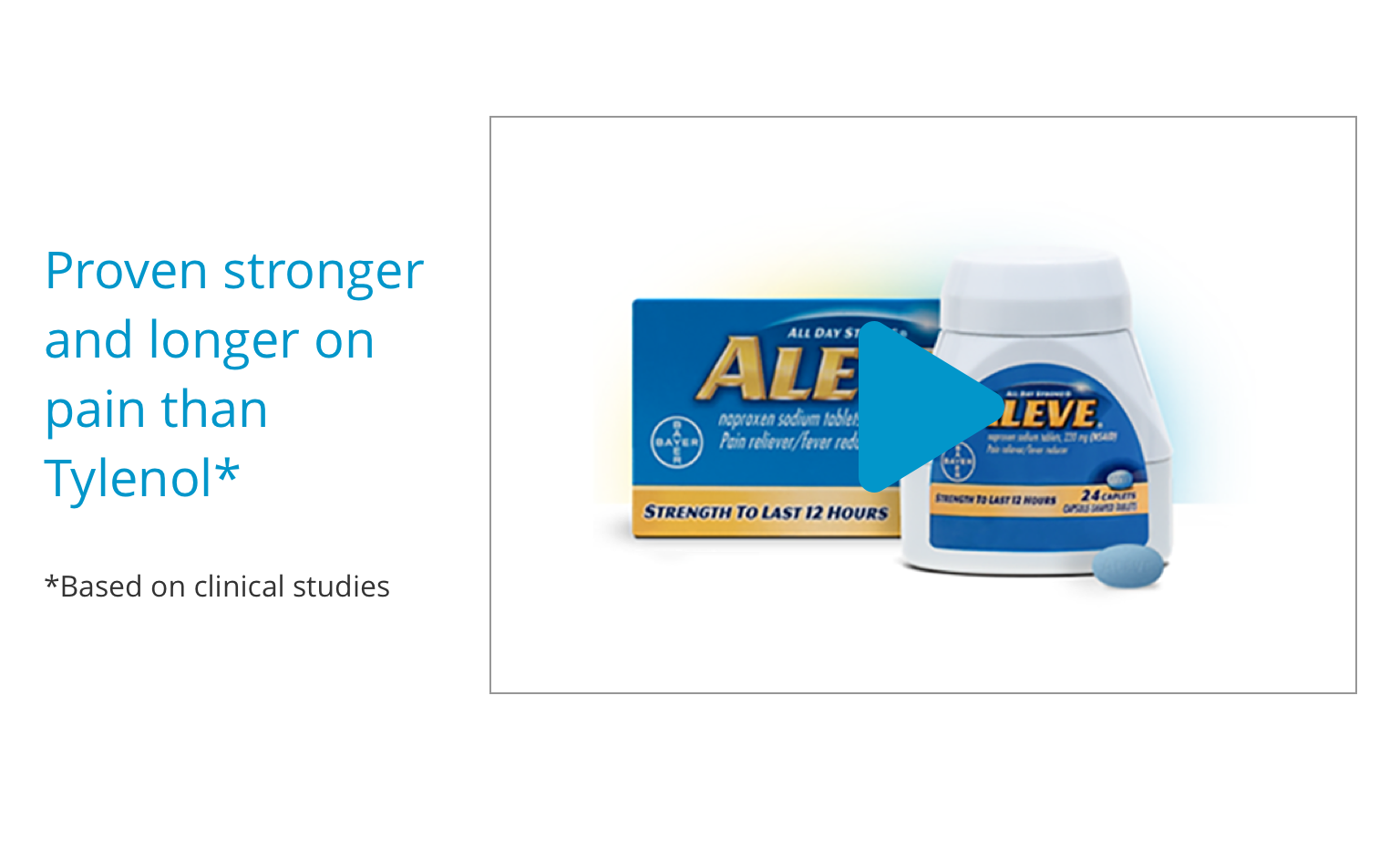
 Iberogast
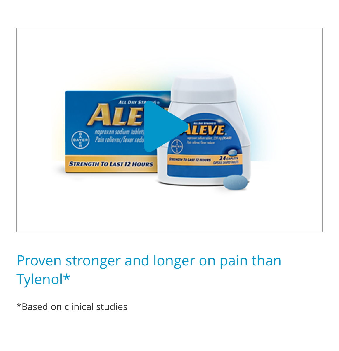
Aleve
Iberogast
AleveGeneral usage dos and don'ts
| ✅ Dos | ❌ Don'ts |
|---|---|
| Ensure the text is legible. | Do not use a background image that makes the text hard to read. |
| Use to display either an image OR a video. | You should not populate both an image and video into this component. |
| Read our guidance on imagery. | |
| Read our guidance on videos. | |
| Read our guidance on the use of WYSIWYGs. |