Full width container
The Full width container component is a basic component used to contain other content panels. It allows you to set a background colour or image that spans multiple components. See examples for a better understanding of how this can be used.
- Overview
- Specification
- Style Guide Manager
- Examples in-situ
- Usage
Specification
This provides guidance on the build, layout and content options for this component.
Layout specification
| Component item | Requirement & purpose | Optional or mandatory | CMS options |
|---|---|---|---|
| Minimum height | Sets minimum height of component for each breakpoint. Component expands based on content. | n/a | Set globally via SGM and affects all instances of the component on the site. |
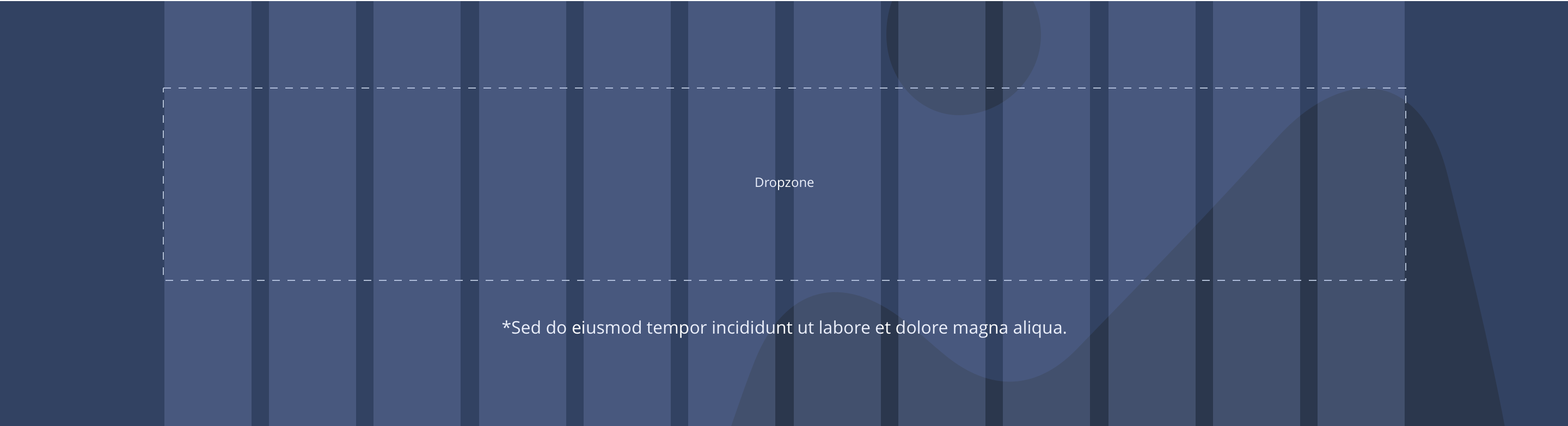
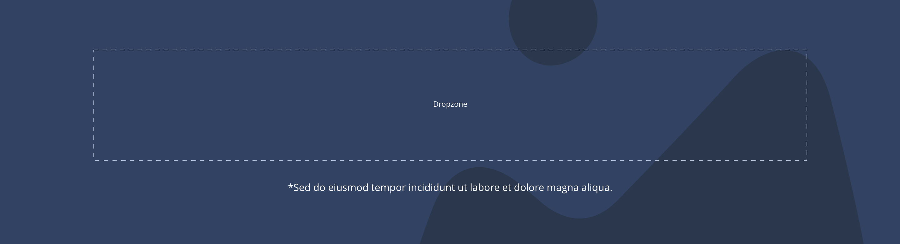
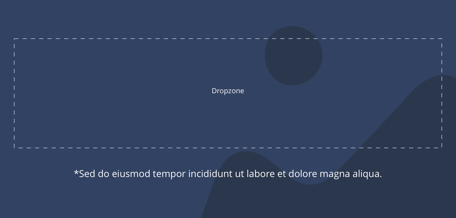
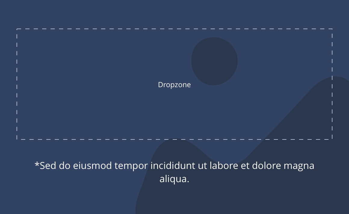
| Dropzone container width | option to choose full width or boxed width | madatory | Drop down - full width / boxed width |
| Content width | The container is set to full width. Content is constrained to the width of the grid. The content is full width by default but can be restricted to either 10 or 8 columns on desktop and tablet. The content is always full width on mobile. | n/a | 12, 10 or 8 column width. |
| Desktop background image | Allows user to set a background image. This is full width and set to cover. | Optional | Image uploader. |
| Desktop background image alignment | Allows control of background image alignment. | Optional | Vertically align top, centre or bottom. Horizontally align left, centre or right. |
| Mobile background image | Allows user to set a background image. This is full width and should be set to cover. | Optional | Image uploader. |
| Background image aria label | The aria-label allows us to specify a string to be used as the accessible label. | Optional | Text input field |
| Lazy Load Background | Allows users to switch On/Off the Lazy Load functionality for the background image. | Optional | On/Off |
| Mobile background image alignment | Allows control of background image alignment. | Optional | Vertically align top, centre or bottom. Horizontally align left, centre or right. |
| Show/hide background image on mobile | Allows editor to hide background image on mobile breakpoint. | Optional | Show/hide. |
| Background colour | Allows user to set a background colour on the component. | Optional | Choose from colour palette. |
| Padding top and bottom | Allows control of the top and bottom spacing within this component. Set globally via the SGM. | Mandatory | Large, medium small or none. |
| Margin bottom | Allows control of the spacing below the component. set globally via the SGM. | Mandatory | Large, medium or small or none. |
| Footnote text and color | Sets footnote content and color. | Optional | Text input. Choose from colour palette. |
| Background gradient | Allows user to select various gradient properties for background image | Optional | Select from dropdown |
Interaction
These are the interactive aspects of the component.
| Interaction |
|---|
| None |
| Foreground image animate | Allows users to switch On/Off the animation functionality for the foreground image. | Optional | On/off. |
|---|---|---|---|
| Select animation | Allow user to select animation from the drop-down list. | Optional | Select list |
| Duration | Set how long in seconds the animation will take to run | Required | Numeric Input |
| Delay | Set a start delay on the animation in seconds | Optional | Numeric Input |
| Iteration | Set the number of times the animation should run | Optional | Numeric Input (Maximum two) |
| offset | Set the animation to start at a specific offset before or after the element has entered the view port | Optional | Numeric Input (Pixel) |
Gradient
For the components there will be three gradient options and their corresponding configurations.
| Background Gradient | Allows users to switch On/Off the gradient functionality for the background. | Optional | On/off |
|---|---|---|---|
| Gradient Style | Allows users to select various gradient styles | Required | Select from dropdown |
| Linear Gradient Direction | Allows user to select the direction of the linear gradient style. | Required | Select from dropdown |
| Radial Gradient Option | Allows user to select the options of the radial gradient style. | Required | Select from dropdown |
| Color | There are three color options which allows the user to select the color combinations | Required | Select from the color palette |
| Linear color distribution percentage | Allows the user to set the color distribution | Optional | Range slider |
| Radial Color distribution percentage | Allows the user to set the color distribution | Optional | Range slider |
| Angle | Allows the user to rotate the gradient color in a specific angle | Optional | Range slider |
Background Overlay
Option for a transparent layer over background image to improve contrast when there is text on top of the image.
| Enable background overlay | Allows users to switch On/Off the background overlay functionality. | Optional | On/off |
|---|---|---|---|
| Use color or gradient | Allows users to select between color or gradient to be used in the overlay | Required | Select from dropdown |
| Opacity | Allows user to select the opacity for the background overlay | Required | Input field |
| Property | Global | Default | SGM override |
|---|---|---|---|
| Minimum height | Yes | Desktop - 464px Tablet - 280px Mobile - 360px | Desktop Tablet Mobile |


General usage dos and don'ts
| ✅ Dos | ❌ Don'ts |
|---|---|
| This should only be used where you want multiple components with same background colour or image. | Do not use with Responsive Blocks or Sliders. They have their own purpose designed containers. |