WYSIWYG
The WYSIWYG component is a full width text section, that allows formatting of the text that goes within it. You can add text styles into it, such as; headings, block quotes, lists and images. It can also be used to achieve advanced text formatting styles.
- Overview
- Specification
- Style Guide Manager
- Examples in-situ
- Usage
Specification
This provides guidance on the build, layout and content options for this component.

Layout specification
| Component item | Requirement & purpose | Optional or mandatory | CMS options |
|---|---|---|---|
| Height | Expands based on size of content. | n/a | n/a |
| Width | The container is set full width. Content is constrained to the width of the grid. | n/a | n/a |
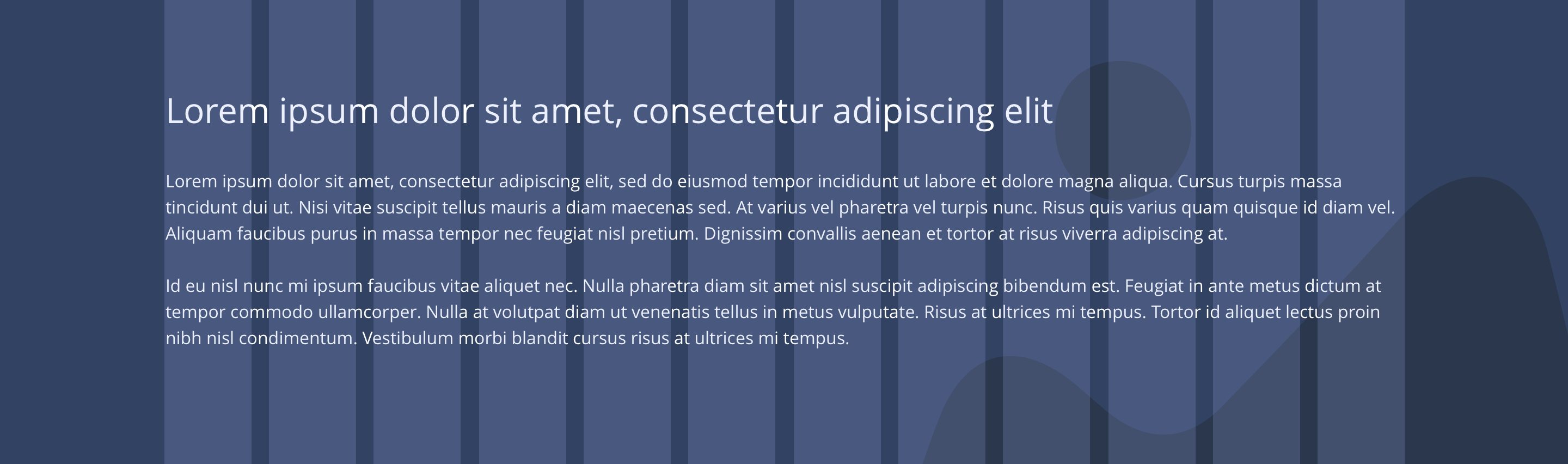
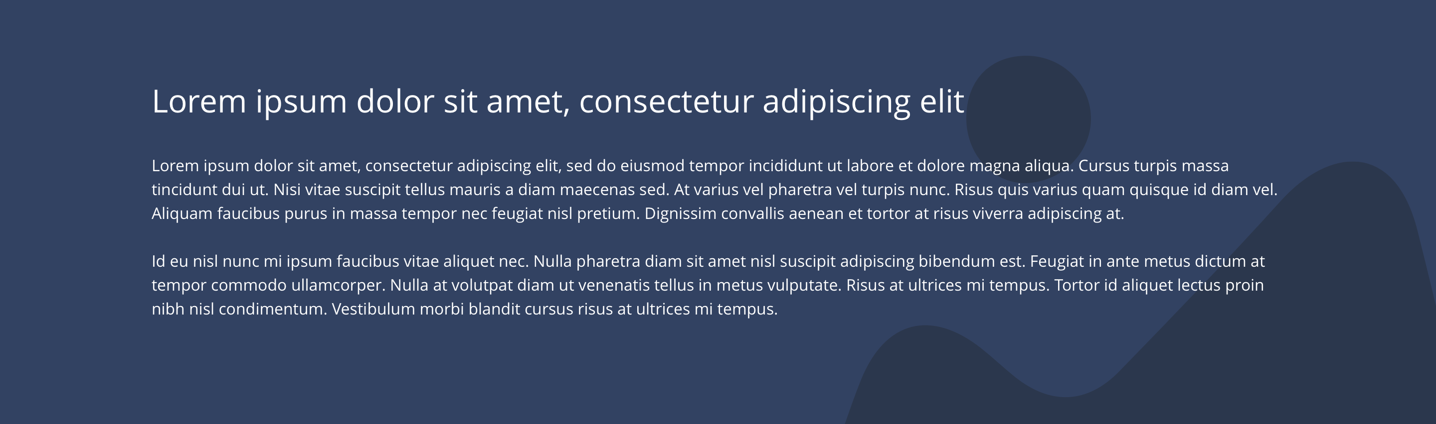
| Desktop background image | Allows user to set a background image. This is full width and should be set to cover. | Optional | Image uploader. |
| Desktop background image alignment | Allows control of background image alignment. | Optional | Vertically align top, centre or bottom. Horizontally align left, centre or right. |
| Mobile background image | Allows user to set a background image. This is full width and should be set to cover. | Optional | Image uploader. |
| Background image aria label | The aria-label allows us to specify a string to be used as the accessible label. | Optional | Text input field |
| Lazy Load Background | Allows users to switch On/Off the Lazy Load functionality for the background image. | Optional | On/Off |
| Mobile background image alignment | Allows control of background image alignment. | Optional | Choose from colour palette. |
| Show/hide background image on mobile | Allows editor to hide background image on mobile breakpoint. | Optional | Show/hide. |
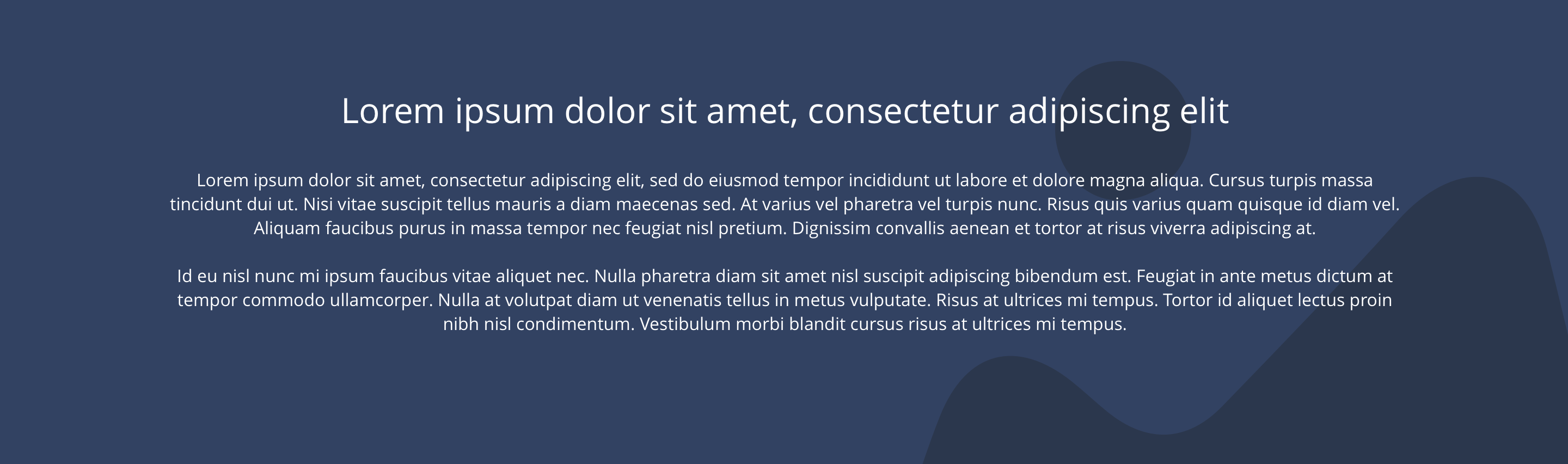
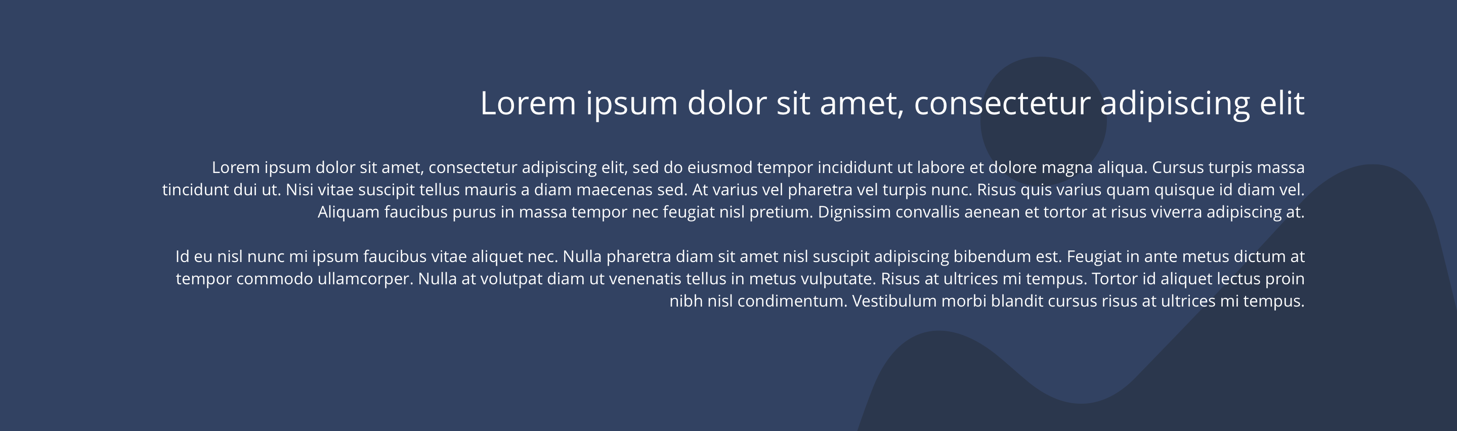
| Background colour | Allows user to set a background colour on the component. | Optional | Choose from colour palette. |
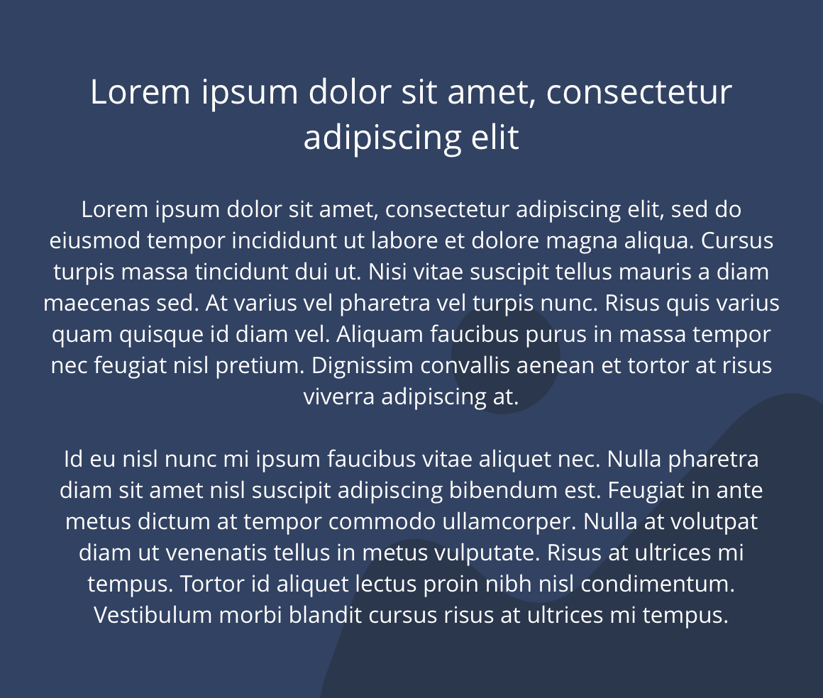
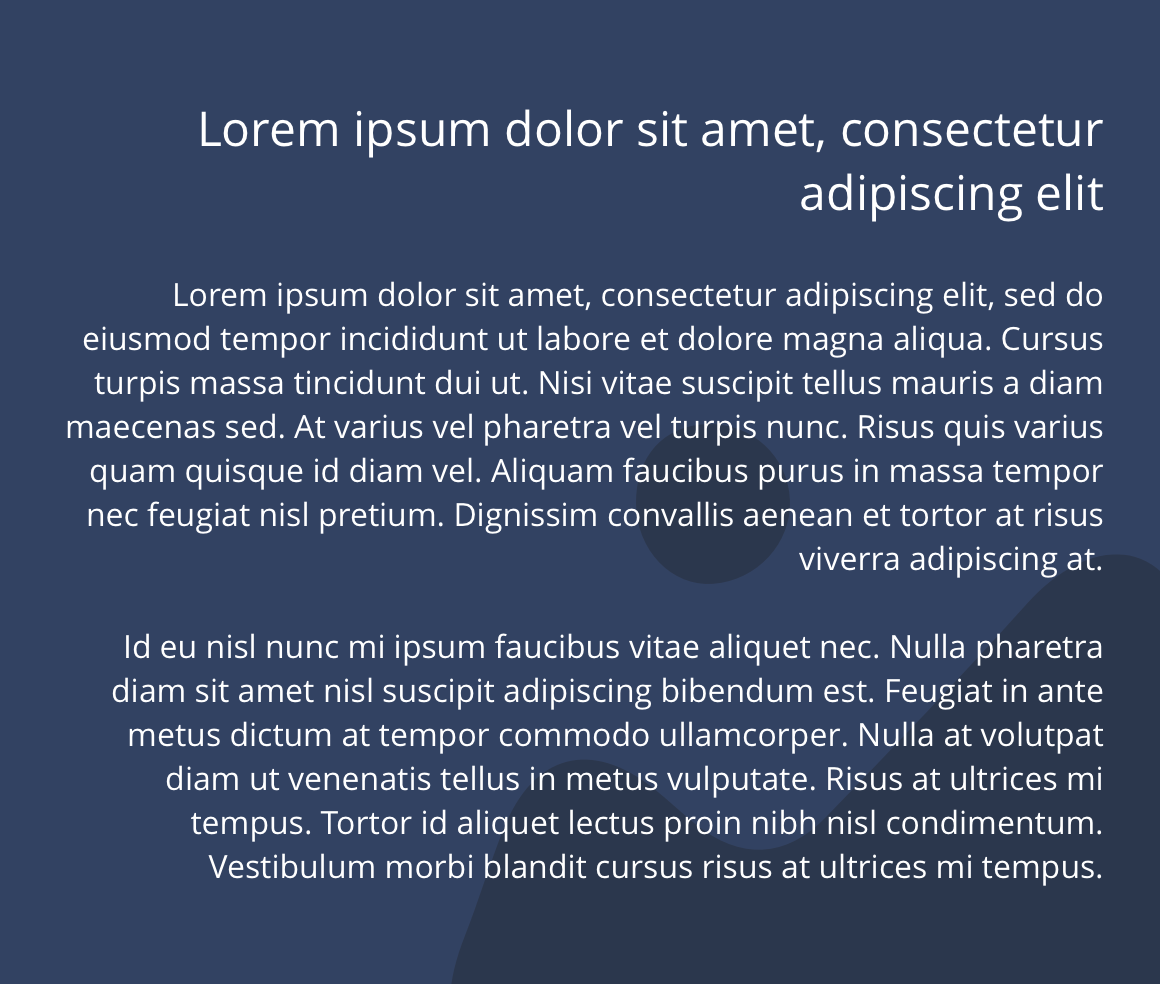
| Text alignment on desktop and tablet | Controls text alignment. | Optional | Horizontally align left, centre or right. |
| Text alignment on mobile | Controls text alignment. | Optional | Horizontally align left, centre or right. |
| Full border | Allows a full width border to be added to the component. | Optional | On/off. |
| Full border width | Sets the border width. | Optional | Add a px value. |
| Full border colour | Sets the border colour. | Optional | Choose from colour palette. |
| Border bottom | Allows a boxed width border to be added to the bottom of the component. | Optional | On/off |
| Border bottom width | Sets the border width. | Optional | Add a px value. |
| Border bottom colour | Sets the border colour. | Optional | Choose from colour palette. |
| Padding top and bottom | Allows control of the top and bottom spacing within this component. Set globally via the SGM. | Mandatory | Large, medium small or none. |
| Margin bottom | Allows control of the spacing below the component. set globally via the SGM. | Mandatory | Large, medium, small or none. |
| WYSIWYG | Allows user to set heading and paragraph content and format text. | Mandatory | WYSIWYG. |
Interaction
These are the interactive aspects of the component.
Animation Container
| Select animation | Allow user to select animation from the drop-down list. | Optional | Select list |
|---|---|---|---|
| Duration | Set how long in seconds the animation will take to run | Required | Numeric Input |
| Delay | Set a start delay on the animation in seconds | Optional | Numeric Input |
| Iteration | Set the number of times the animation should run | Optional | Numeric Input (Maximum two) |
| offset | Set the animation to start at a specific offset before or after the element has entered the view port | Optional | Numeric Input (Pixel) |
| Interaction |
|---|
| None |
There are no style guide settings for this component.
General usage dos and don'ts
| ✅ Dos | ❌ Don'ts |
|---|---|
| Utilise H2, H3 and H4 for your headings. | Do not make the headings H1. H1 should only be present in the hero section of the page. |
| Remove the formatting of any text before it is pasted in to the WYSIWYG. | Do not paste text straight in to the WYSIWYG. You may copy over formatting from the web or other word processors, that may stop your websites styles from working correctly. |
| Use for content only. | Do not create layouts within the WYSIWYG. |
| Ensure the text is legible. | Do not use a background image that makes the text hard to read. |
| Read our guidance on imagery. | |
| Read our guidance on the use of WYSIWYGs. |