id: 13-text-over-background-image
1/3 text over background image
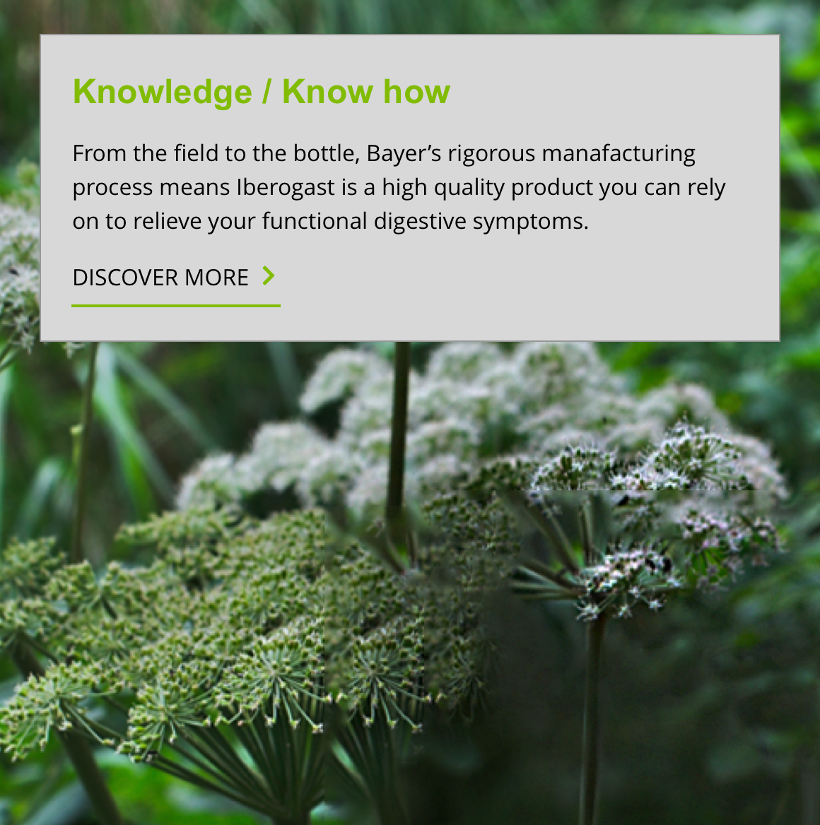
The 1/3 text over background image component is a full width text and image section. It has an option to position text directly over the background image or contain it within a panel. It can be customised further as described in the specification tab below.
- Overview
- Specification
- Style Guide Manager
- Examples in-situ
- Usage
 Overview
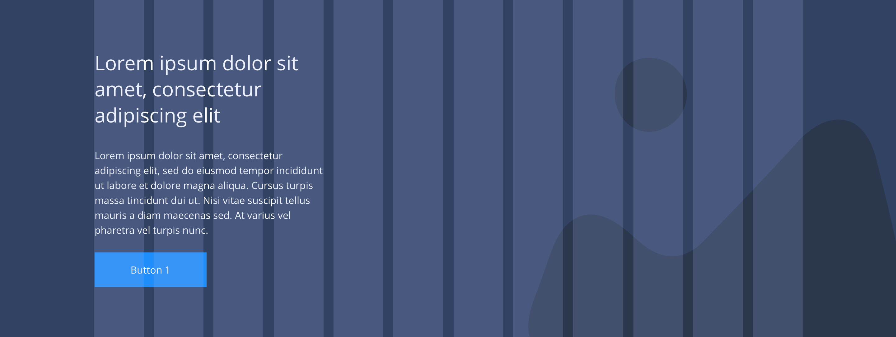
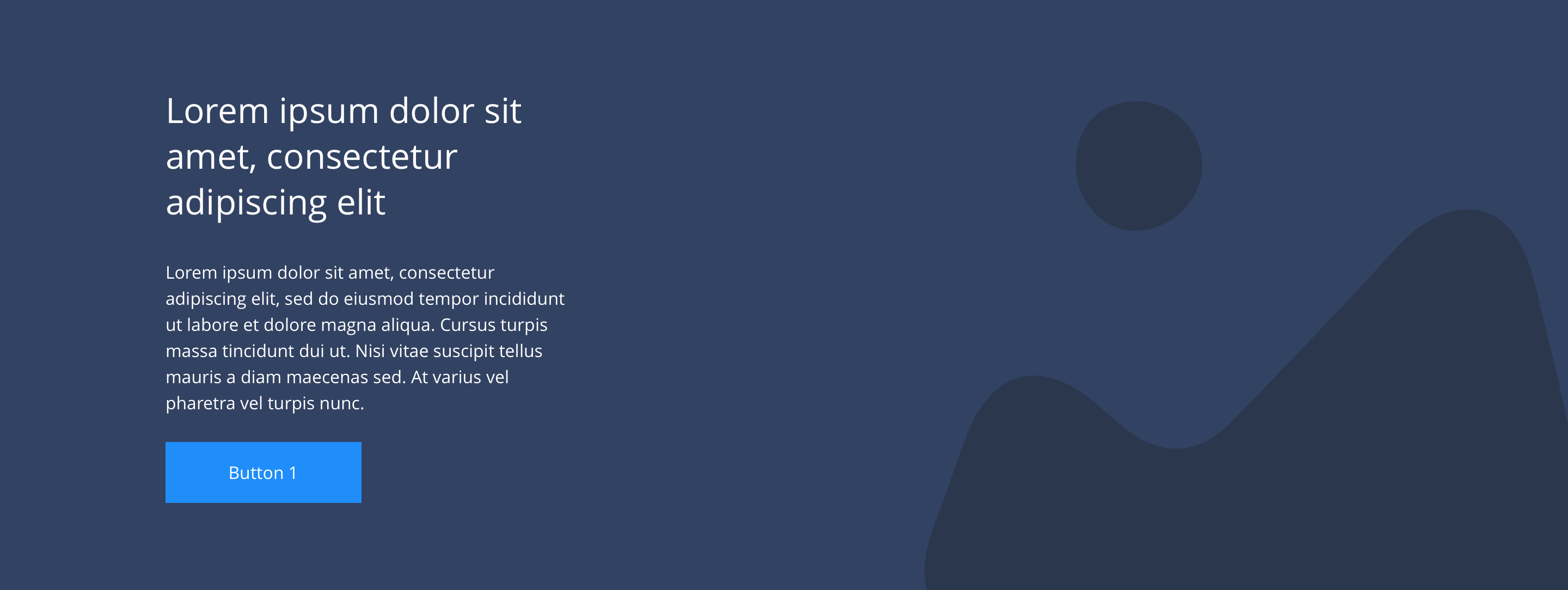
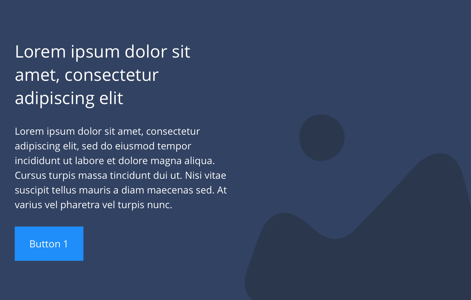
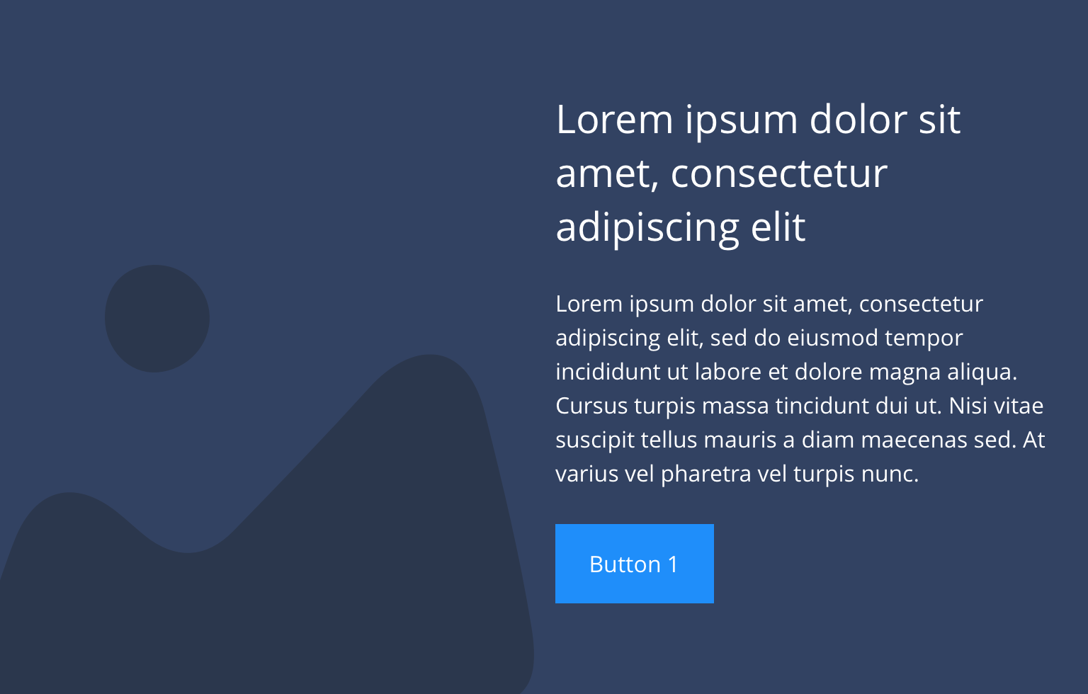
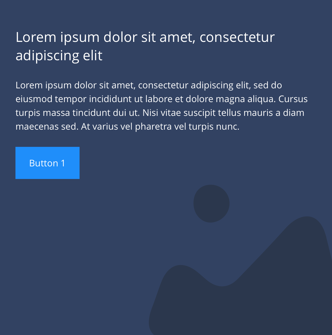
Text spans 1/3 of the grid, within a container and the background image or colour is set to full width.
Desktop
 Text left
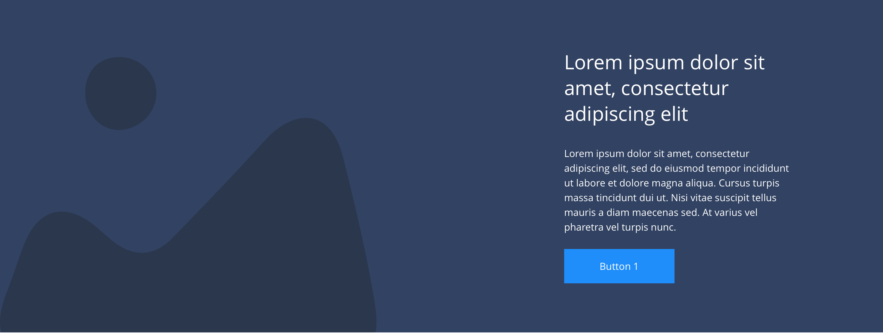 Text right
Tablet
 Text left
 Text right
Mobile
 Text left
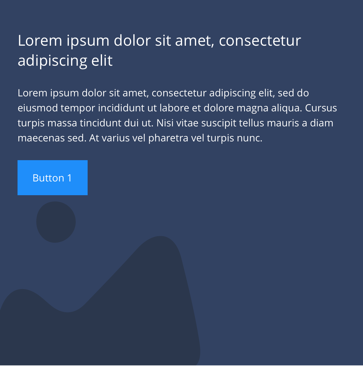 Text right
Specification
This provides guidance on the build, layout and content options for this component.
 Layout specification
| Component item | Requirement & purpose | Optional or mandatory | CMS options |
|---|---|---|---|
| Minimum height | Sets minimum height of component for each breakpoint. Component expands based on content. | n/a | Set globally via SGM and affects all instances of the component on the site. |
| Width | The container is set full width. Content is constrained to the width of the grid. | n/a | n/a |
| Lazy Load toggle | Allows the user to switch On/Off the Lazy Load functionality for the background image. | Option | On/Off |
| Desktop background image | Allows user to set a background image. This is full width and set to cover. | Optional | Image uploader. |
| Desktop background image alignment | Allows control of background image alignment. | Optional | Vertically align top, centre or bottom. Horizontally align left, centre or right. |
| Mobile background image | Allows user to set background image. This is full width and should be set to cover. | Optional | Image uploader. |
| Background image aria label | The aria-label allows us to specify a string to be used as the accessible label. | Optional | Text input field |
| Mobile background image alignment | Allows control of background image alignment. | Optional | Vertically align top, centre or bottom. Horizontally align left, centre or right. |
| Show/hide background image on mobile | Allows editor to hide background image on mobile breakpoint. | Optional | Show/hide. |
| Background colour | Allows user to set a background colour on the component. | Optional | Choose from colour palette. |
| Text alignment on desktop and tablet | Controls text alignment. | Optional | Vertically align top, centre or bottom. Horizontally align left, centre or right. |
| Text alignment on mobile | Controls text alignment. | Optional | Horizontally align left, centre or right. |
| Text position | Controls position of text. | Mandatory | Left or right. |
| Text panel background and colour | Sets a coloured background panel behind text. When applied, padding automatically matches the SGM block padding value. | Optional | Show/hide. Choose from colour palette. |
| Full border | Allows a full width border to be added to the component. | Optional | On/off. |
| Full border width | Sets the border width. | Optional | Add a px value. |
| Full border colour | Sets the border colour. | Optional | Choose from colour palette. |
| Border bottom | Allows a boxed width border to be added to the bottom of the component. | Optional | On/off. |
| Border bottom width | Sets the border width. | Optional | Add a px value. |
| Border bottom colour | Sets the border colour. | Optional | Choose from colour palette. |
| Padding top and bottom | Allows control of the top and bottom spacing within this component. Set globally via the SGM. | Mandatory | Large, medium small or none. |
| Margin bottom | Allows control of the spacing below the component. Set globally via the SGM. | Mandatory | Large, medium, small or none. |
| Heading text | Sets heading text. | Optional | Text input. |
| Heading element | Sets H2, H3, H4 or H5 on component. | Optional | Select heading element. |
| Heading style | Allows user to choose where more then one type of heading style may be present (i.e. multiple H2's). | Optional | Select heading style. |
| Heading colour | Sets heading colour. | Optional | Choose from colour palette. |
| Paragraph | Sets paragraph content. | Optional | Text input. |
| Paragraph style | Sets paragraph style. | Optional | Paragraph style select. |
| Paragraph colour | Sets paragraph colour. | Optional | Choose from colour palette. |
| WYSIWYG | Allows user to format text where additional styles may be required. | Optional | WYSIWYG |
| PWA | To enable PWA CTA | Optional | Toggle Button |
| Link 1 | Allows user to link to a URL or launch a modal. | Optional | Link text input. Link style select. Link URL input. Target select: Same window or open in new. Modal ID input. |
| Button Shapes | Allows user to select different button shapes. | Optional | Select from dropdown |
Interaction
These are the interactive aspects of the component.
| Interaction |
|---|
| Link 1 links to either a defined page or can launch a modal. |
Animation
For each link there will be option to add button animation. Animation configuration option will be following
| Button animate | Allows users to switch On/Off the animation functionality for the button link. | Optional | On/off. |
|---|---|---|---|
| Select animation | Allow user to select animation from the drop-down list. | Optional | Select list |
| Duration | Set how long in seconds the animation will take to run | Required | Numeric Input |
| Delay | Set a start delay on the animation in seconds | Optional | Numeric Input |
| Iteration | Set the number of times the animation should run | Optional | Numeric Input (Maximum two) |
| offset | Set the animation to start at a specific offset before or after the element has entered the view port | Optional | Numeric Input (Pixel) |
Animation Container
| Select animation | Allow user to select animation from the drop-down list. | Optional | Select list |
|---|---|---|---|
| Duration | Set how long in seconds the animation will take to run | Required | Numeric Input |
| Delay | Set a start delay on the animation in seconds | Optional | Numeric Input |
| Iteration | Set the number of times the animation should run | Optional | Numeric Input (Maximum two) |
| offset | Set the animation to start at a specific offset before or after the element has entered the view port | Optional | Numeric Input (Pixel) |
These are the Style Guide Manager settings that are specific to this component. For global settings see the Style Guide Manager section.
| Property | Default | SGM override |
|---|---|---|
| Minimum height | Desktop - 440px Tablet - 400px Mobile - 584px | Desktop Tablet Mobile |
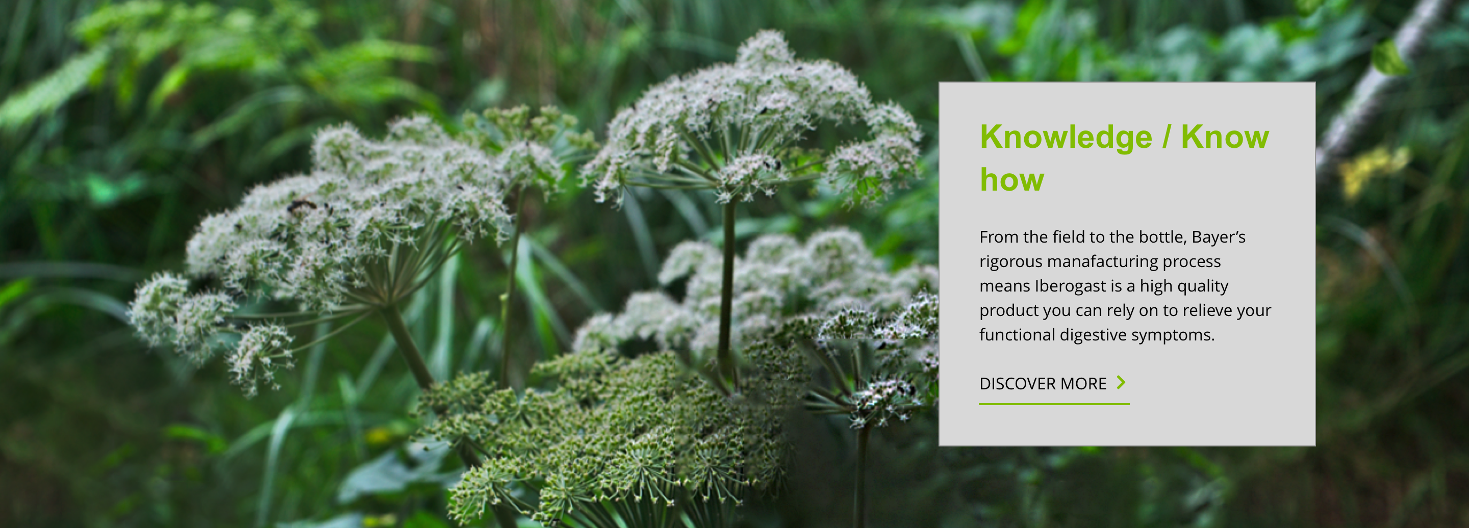 Iberogast
 Iberogast