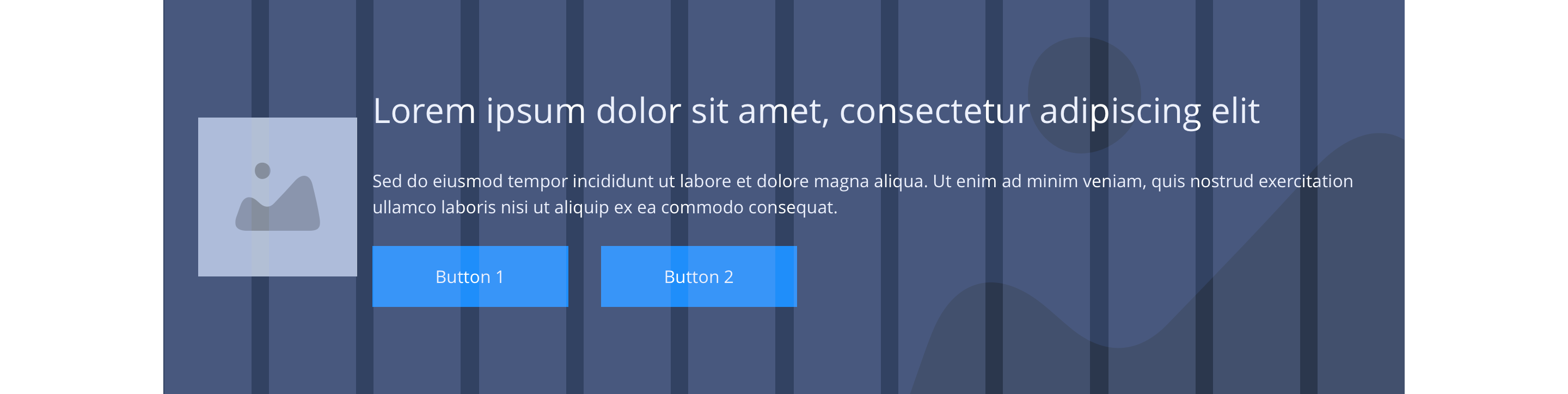
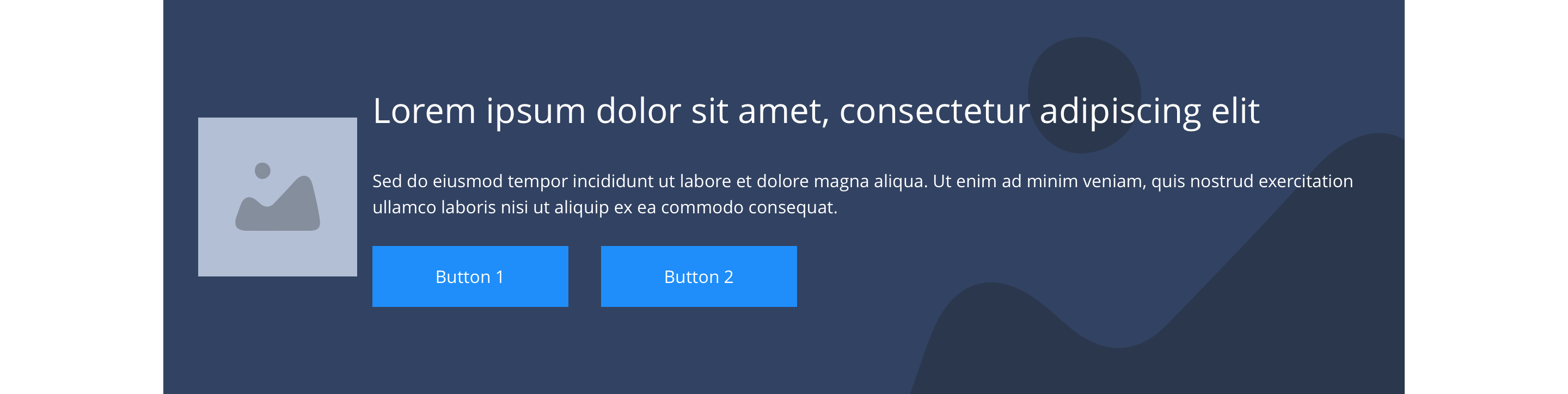
Flexible image left - text right
The Flexible image - text right component section is constrained by the width of the grid. Primarily for use with notifications or messages (see examples), the image is optional and will appear at the size it is loaded in for increased flexibility. This component can have a border added to all sides.
- Overview
- Specification
- Style Guide Manager
- Examples in-situ
- Usage
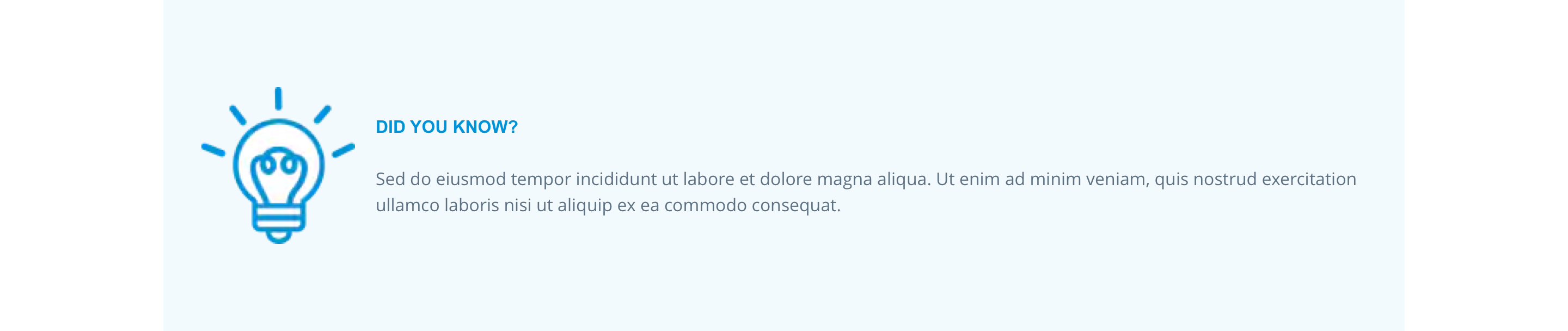
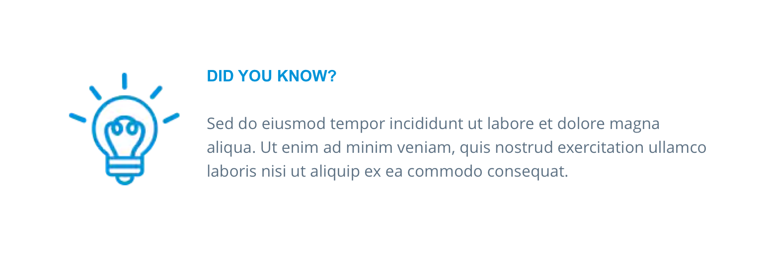
teaser
Overview
Image has a default margin of 16px left and right, with the text spanning across the remaining columns. The container with a background image or colour is set to full width.
Desktop
Desktop
Tablet
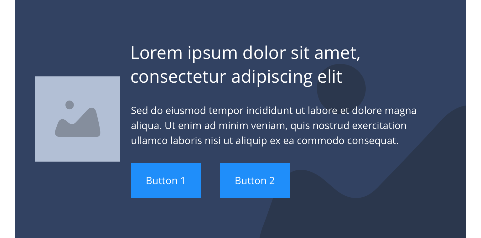 Tablet
Mobile
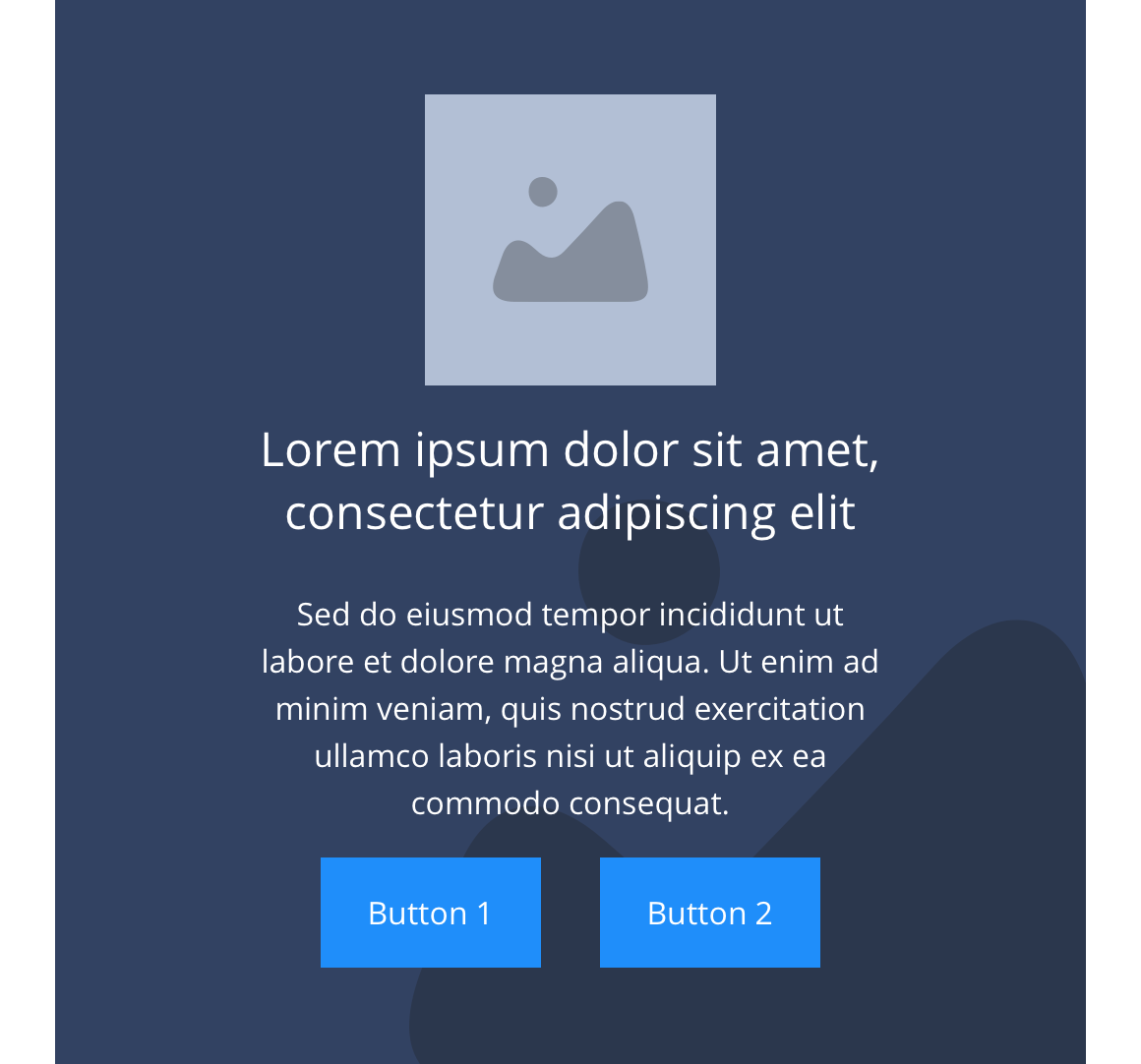
Mobile
Specification
This provides guidance on the build, layout and content options for this component.

Layout specification
| Component item | Requirement & purpose | Optional or mandatory | CMS options |
|---|---|---|---|
| Height | Expands based on size of content. | n/a | n/a |
| Width | The background image and content is contained by the boxed width. | n/a | n/a |
| Background image | Allows user to set a background image. This is boxed width and set to cover. | Optional | Image uploader. |
| Background image aria label | The aria-label allows us to specify a string to be used as the accessible label. | Optional | Text input field |
| Background image alignment | Allows control of background image alignment. | Optional | Vertically align top, centre or bottom. Horizontally align left, centre or right. |
| Lazy Load Background | Allows users to switch On/Off the Lazy Load functionality for the background image. | Optional | On/Off |
| Show/hide background image on mobile | Allows editor to hide background image on mobile breakpoint. | Optional | Show/hide. |
| Background colour | Allows user to set a background colour on the component. | Optional | Choose from colour palette. |
| Full border | Allows a full width border to be added to the component. | Optional | On/off. |
| Full border width | Sets the border width. | Optional | Add a px value. |
| Full border colour | Sets the border colour. | Optional | Choose from colour palette. |
| Border | Allows a boxed width border to be added to the bottom of the component. | Optional | On/off. |
| Border bottom | Sets the border width. | Optional | Add a px value. |
| Border colour | Sets the border colour. | Optional | Choose from colour palette. |
| Padding top and bottom | Allows control of the top and bottom spacing within this component. Set globally via the SGM. | Mandatory | Large, medium, small or none. |
| Margin bottom | Allows control of the spacing below the component. set globally via the SGM. | Optional | Large, medium, small or none. |
| Desktop foreground image | Allows user to set a foreground image. | Optional | Image uploader. |
| Mobile foreground image | Allows user to set a foreground image for the mobile breakpoint. | Optional | Image uploader. |
| Image alt text | Adds alt text to an image. | Mandatory where foreground image used | Text input. |
| Lazy Load Foreground | Allows users to switch On/Off the Lazy Load functionality for the foreground image. | Optional | On/Off |
| Heading text | Sets heading text. | Optional | Text input. |
| Heading element | Sets H2, H3, H4 or H5 on component. | Optional | Select heading element. |
| Heading style | Allows user to choose where more then one type of heading style may be present (i.e. multiple H2's). | Optional | Select heading style. |
| Heading colour | Sets heading colour. | Optional | Choose from colour palette. |
| Paragraph text | Sets paragraph content. | Optional | Text input. |
| Paragraph style | Sets paragraph style. | Optional | Paragraph style select. |
| Paragraph colour | Sets paragraph colour. | Optional | Choose from colour palette. |
| WYSIWYG | Allows user to format text where additional styles may be required. | Optional | WYSIWYG. |
| Link 1 | Allows user to link to a URL or launch a modal. | Optional | Link text input. Link style select. Link URL input. Target select: Same window or open in new. Modal ID input. |
| Link 2 | Allows user to link to a URL or launch a modal. | Optional | Link text input. Link style select. Link URL input. Target select: Same window or open in new. Modal ID input. |
| Button Shapes | Allows user to select different button shapes. | Optional | Select from dropdown |
Interaction
These are the interactive aspects of the component.
| Interaction |
|---|
| Link 1 links to either a defined page or can launch a modal. |
| Link 2 links to either a defined page or can launch a modal. |
Animation
For each link there will be option to add button animation. Animation configuration option will be following
| Button animate | Allows users to switch On/Off the animation functionality for the button link. | Optional | On/off. |
|---|---|---|---|
| Select animation | Allow user to select animation from the drop-down list. | Optional | Select list |
| Duration | Set how long in seconds the animation will take to run | Required | Numeric Input |
| Delay | Set a start delay on the animation in seconds | Optional | Numeric Input |
| Iteration | Set the number of times the animation should run | Optional | Numeric Input (Maximum two) |
| offset | Set the animation to start at a specific offset before or after the element has entered the view port | Optional | Numeric Input (Pixel) |
Animation Container
| Select animation | Allow user to select animation from the drop-down list. | Optional | Select list |
|---|---|---|---|
| Duration | Set how long in seconds the animation will take to run | Required | Numeric Input |
| Delay | Set a start delay on the animation in seconds | Optional | Numeric Input |
| Iteration | Set the number of times the animation should run | Optional | Numeric Input (Maximum two) |
| offset | Set the animation to start at a specific offset before or after the element has entered the view port | Optional | Numeric Input (Pixel) |
There are no style guide settings for this component.
Desktop
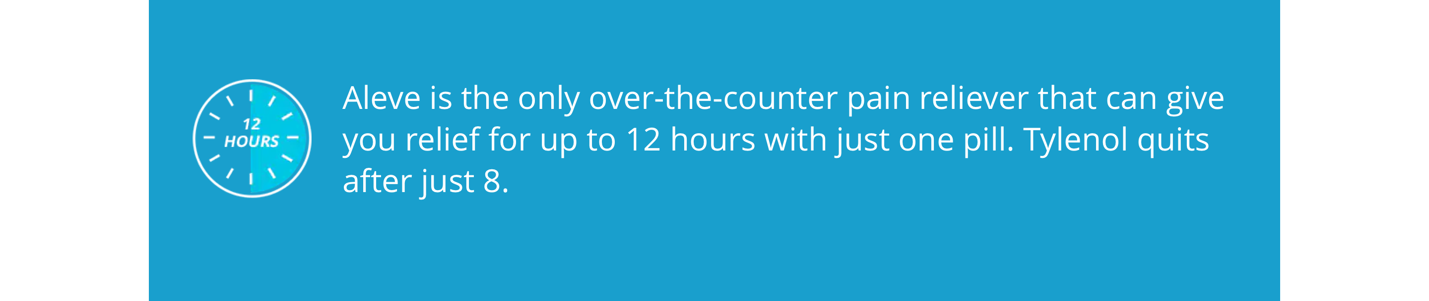
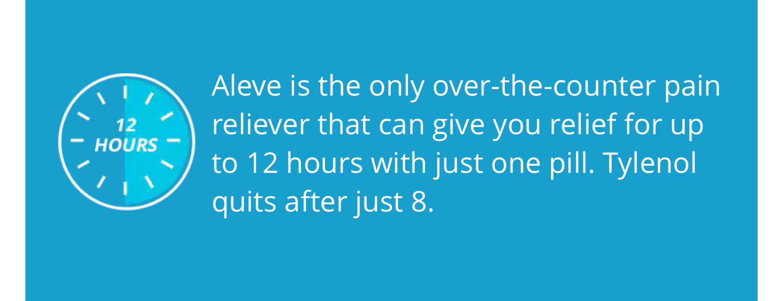
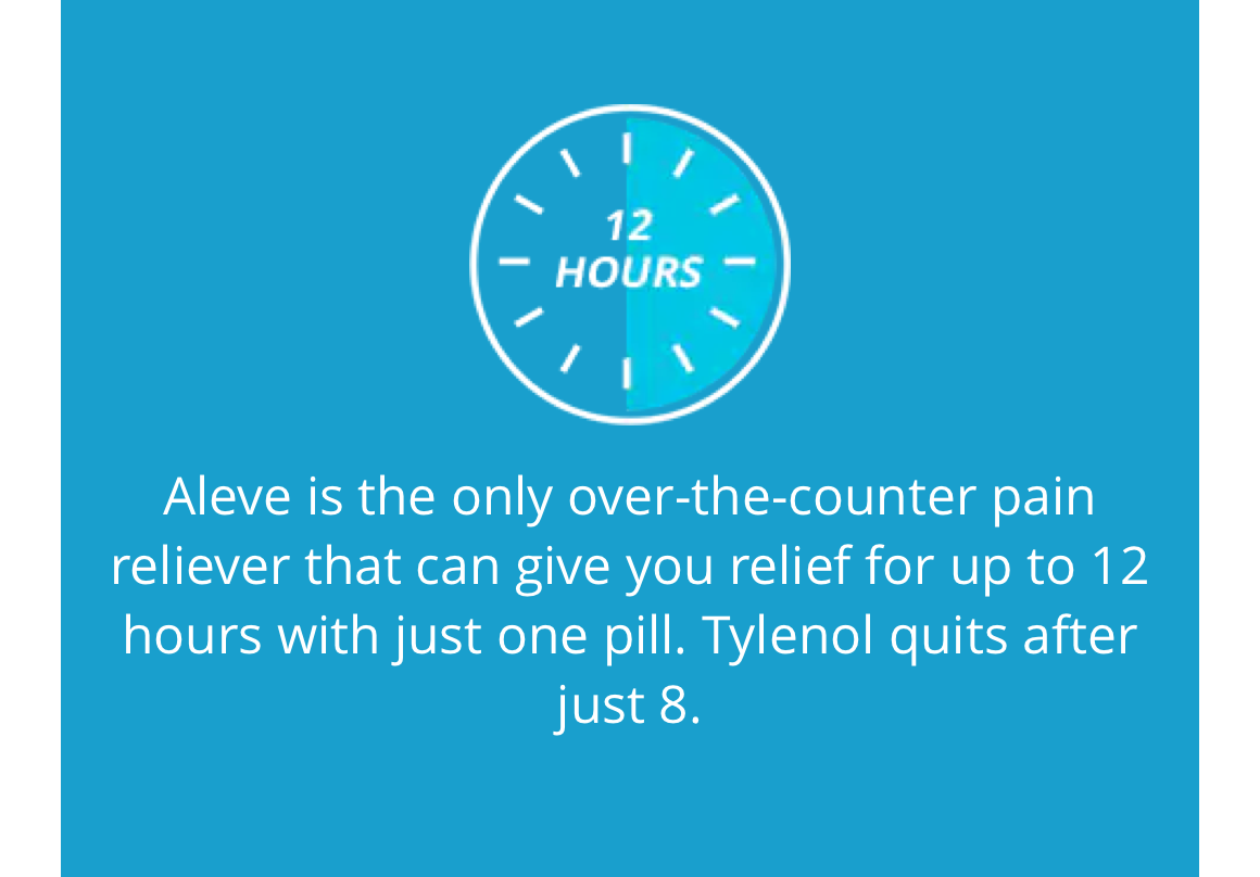
Aleve

Iberogast
Claritin

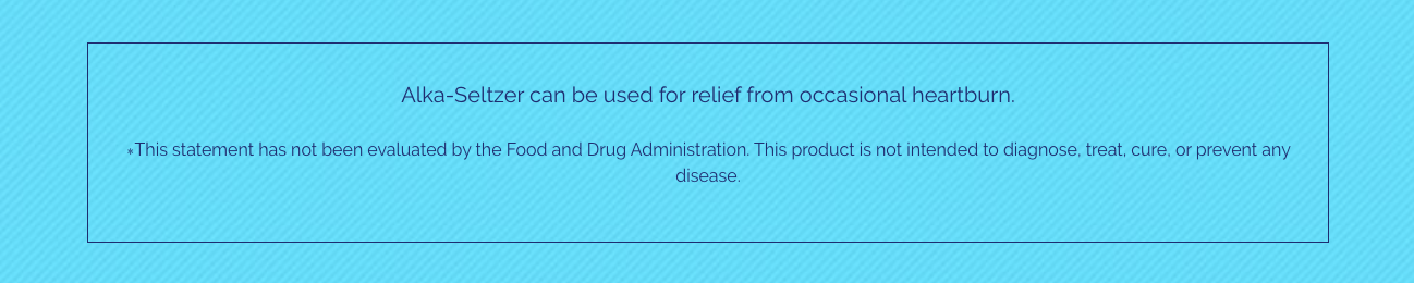
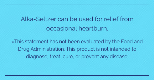
Alka Seltzer
Tablet
Aleve
Claritin

Iberogast
Alka Seltzer

Mobile
Aleve
Claritin

Iberogast
Alka Seltzer
General usage dos and don'ts
| ✅ Dos | ❌ Don'ts |
|---|---|
| Ensure the text is legible. | Do not use a background image that makes the text hard to read. |
| Add the image in at the size you want it to render. NB. Image is constrained by image styles to ensure it does not exceed 1000px wide). | |
| Read our guidance on imagery. | |
| Read our guidance on the use of WYSIWYGs. |