Article
Use the Article content type to add articles to your website. When adding the article, you can create both the detailed article page and the accompanying teaser.
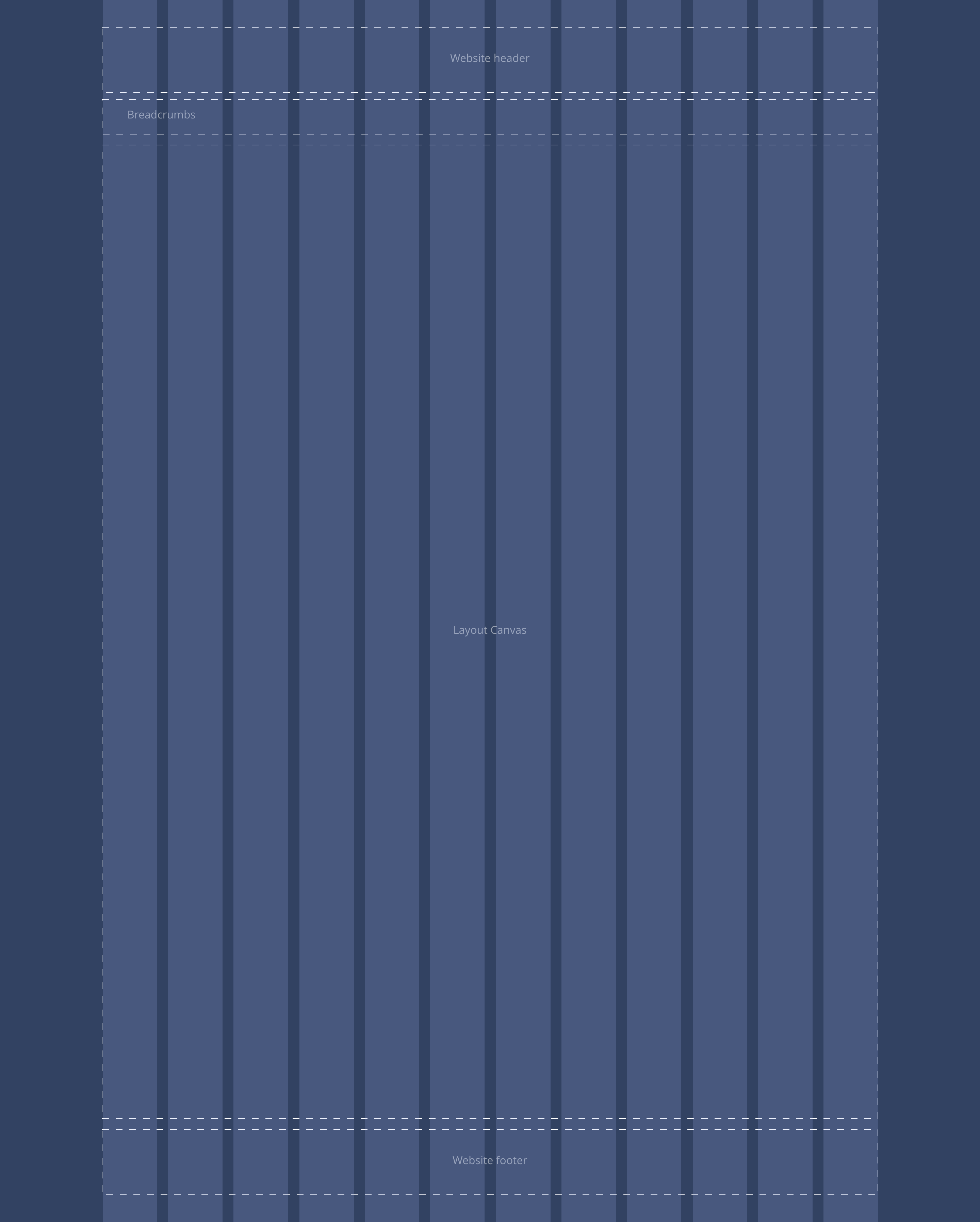
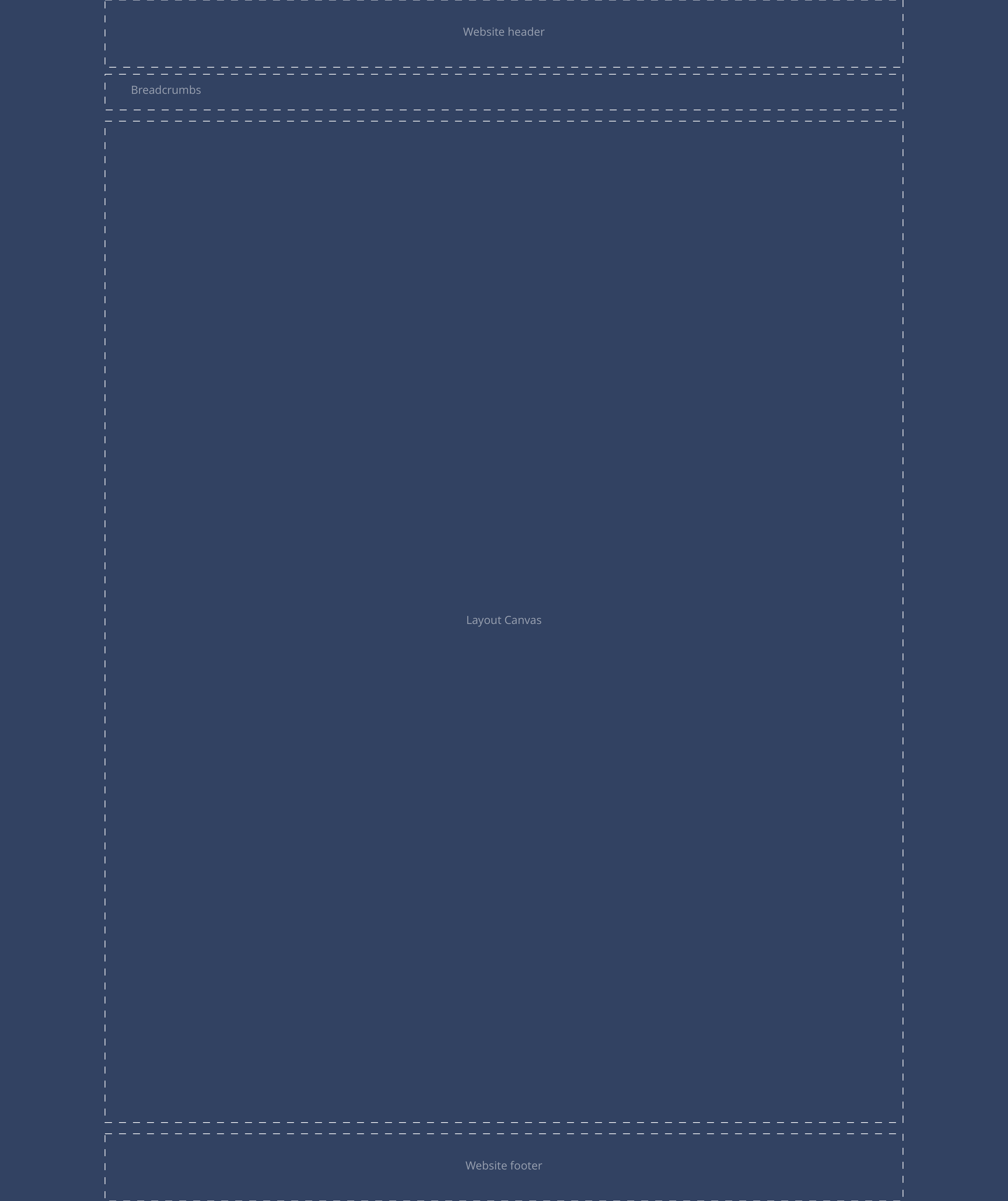
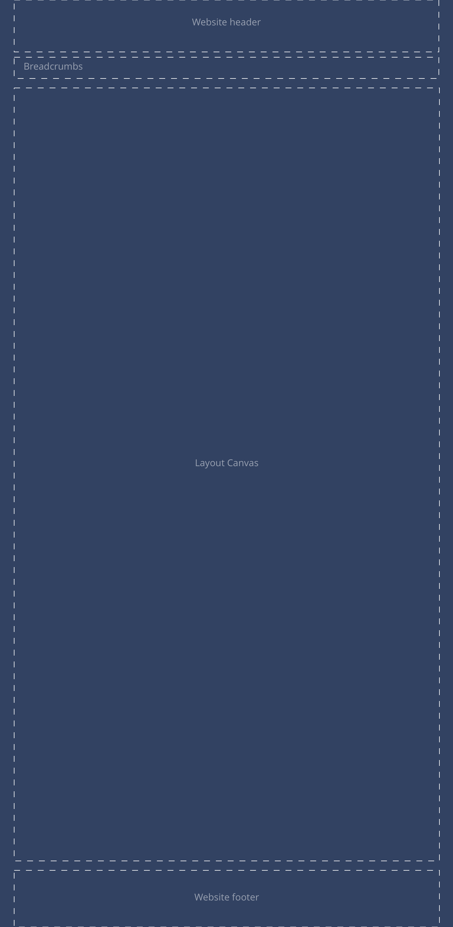
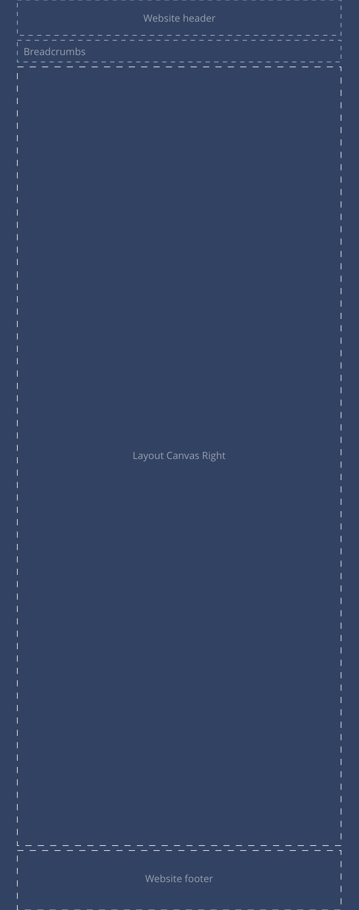
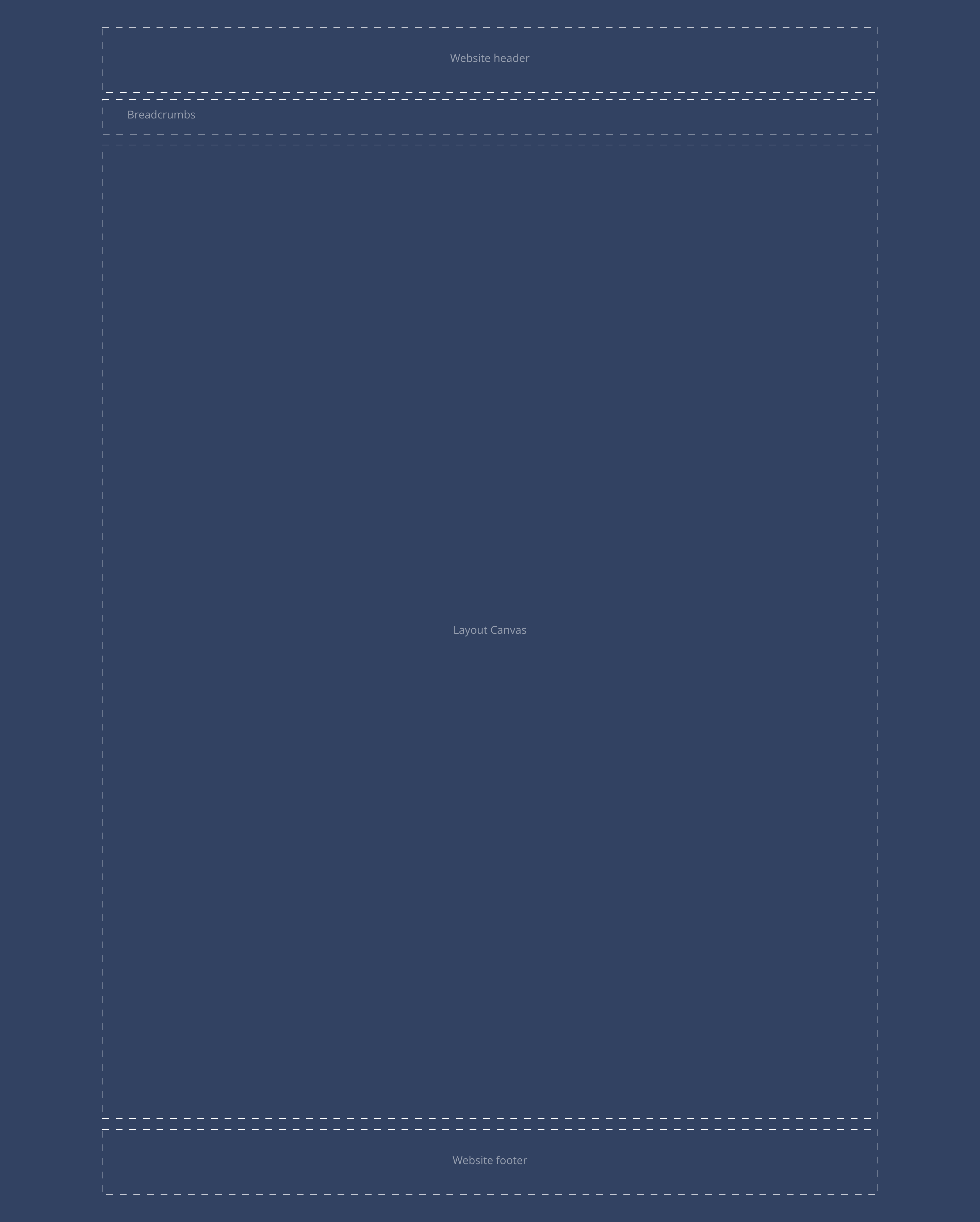
Because articles across brands vary so much in layout, a layout canvas has been provided to allow brands to achieve their required layouts. See examples for a better understanding of how this can be used.
- Overview
- Specification
- Style Guide Manager
- Examples in-situ
- Usage
Article
This provides guidance on the build, layout and content options for this content type.
Layout specification
| Content type item | Requirement & purpose | Optional or mandatory | CMS options |
|---|---|---|---|
| Title | Allows the user to add a title to the article. | Mandatory | Input field. |
| Layout Canvas | Allows the user to utilise all available components to achieve the brand designs. | n/a | A dropzone. |
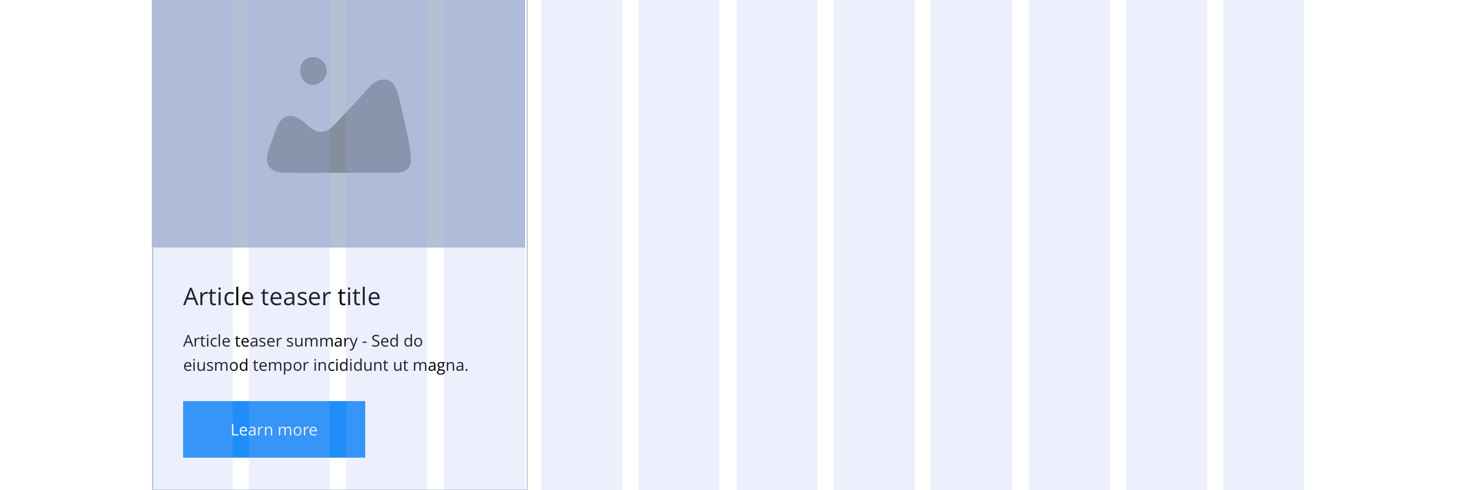
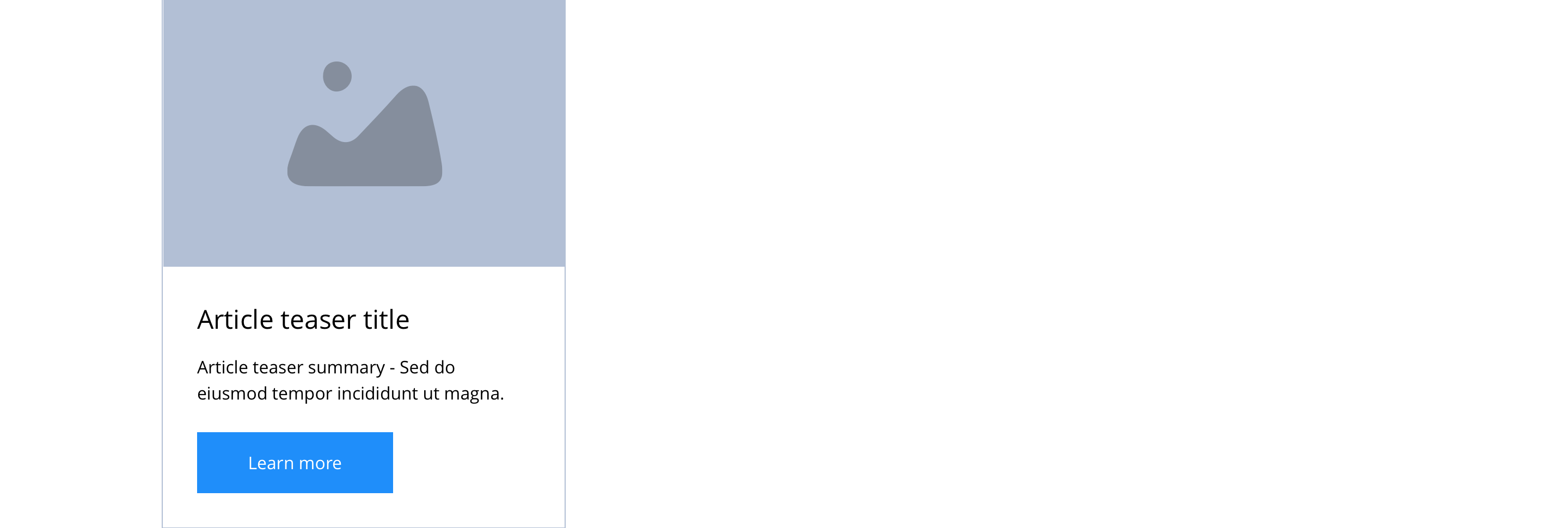
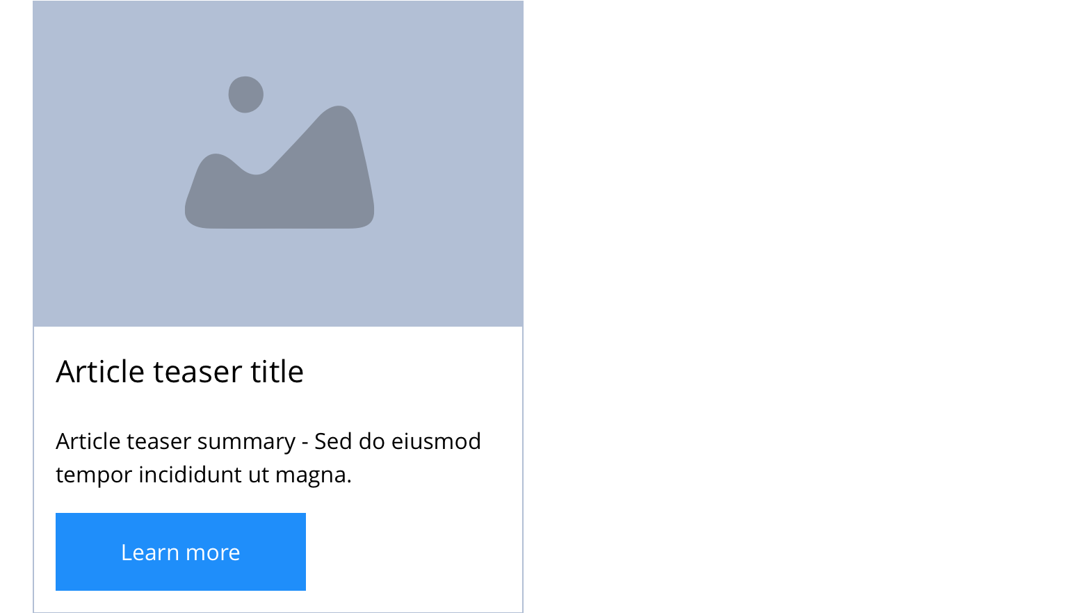
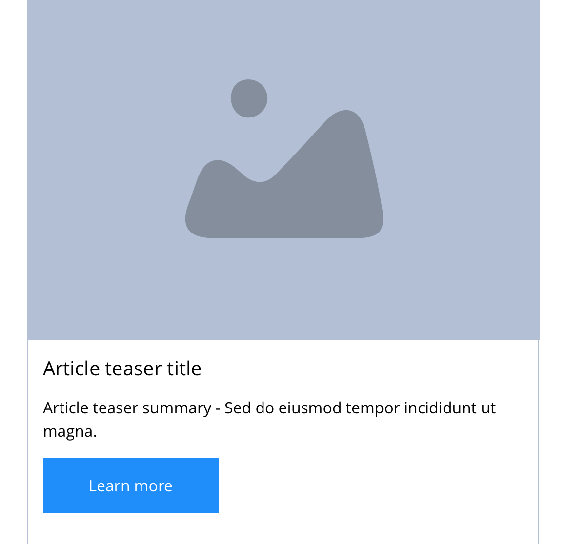
Article teaser
| Component item | Requirement & purpose | Optional or mandatory | CMS options |
|---|---|---|---|
| Image | Allows the user to upload a article image. | Mandatory | Image upload, image alt text input, image title input. |
| Teaser Title | Allows the user to set a title for the article teaser. | Mandatory | Text input. |
| Summary | Allows the user to add a product summary to the article teaser. | Mandatory | WYSIWYG. |
These are the Style Guide Manager settings that are specific to this content type. For global settings see the Style Guide Manager section.
Article
There are no style guide settings for this.
Article teaser
| Property | Requirement & purpose | Default | SGM override |
|---|---|---|---|
| Heading element | Sets H2, H3, H4 or H5 on the Article teaser site wide. | H4 | Select heading element. |
| Heading colour | Sets the site wide colour for the Article teaser heading. | Black | Choose from colour palette. |
| Link style | Sets the site wide link style for the Article teaser. | Primary text link | Choose from text link and button styles. |
| Background colour | Sets the site wide background colour for the Article teaser. | White | Choose from colour palette. |
| Border width | Sets the site wide border width for the Article teaser. | n/a | Choose width within range slider. |
| Border colour | Sets the site wide border colour for the Article teaser. | n/a | Choose from colour palette. |
| Border radius | Sets the site wide border radius for the Article teaser. | n/a | Text input (e.g 8px). |
| Drop shadow | Sets the site wide drop shadow for the Article teaser. | Off | On/off. |
| Text panel padding (Top, bottom, left and right) | Allows control of the spacing around the text within this component. | Mandatory | On/off. |
| Horizontal alignment | Sets the horizontal alignment of the content for the Article teaser | Left | Select from dropdown |