Product
The Product content type is used to add products to your website. It allows you to create detailed product pages along with an accompanying teaser. See examples for a better understanding of how this can be used.
- Overview
- Specification
- Style Guide Manager
- Examples in-situ
- Usage


Product
This provides guidance on the build, layout and content options for this content type.
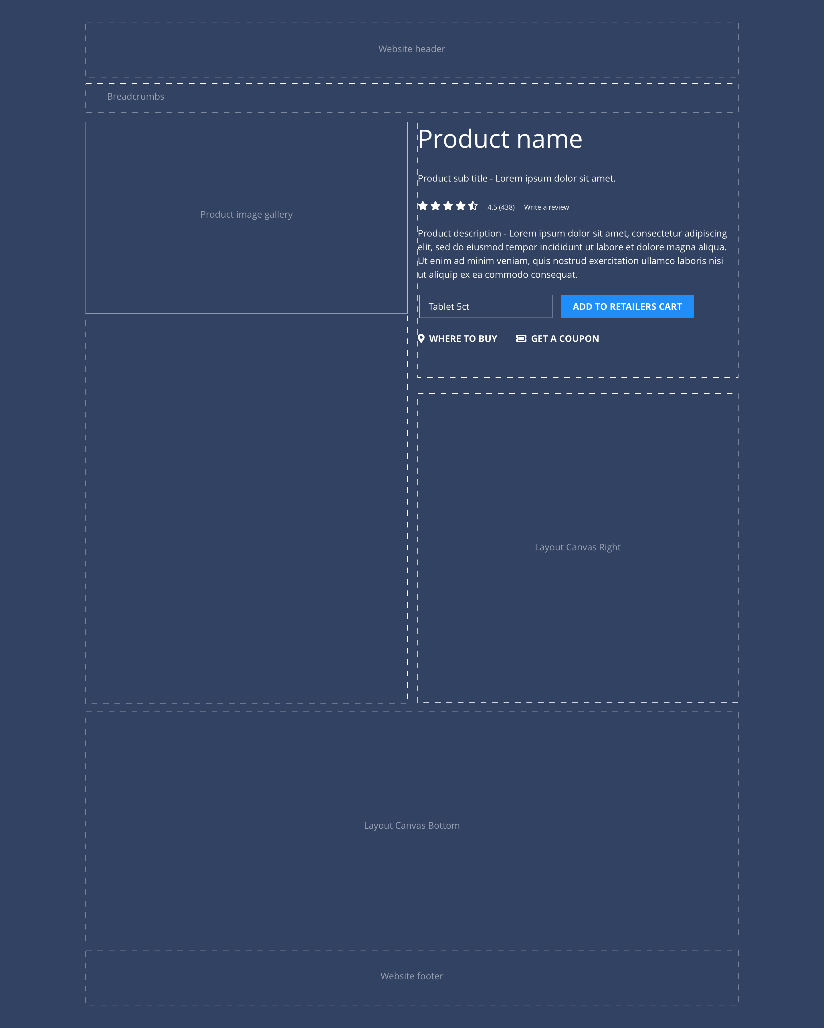
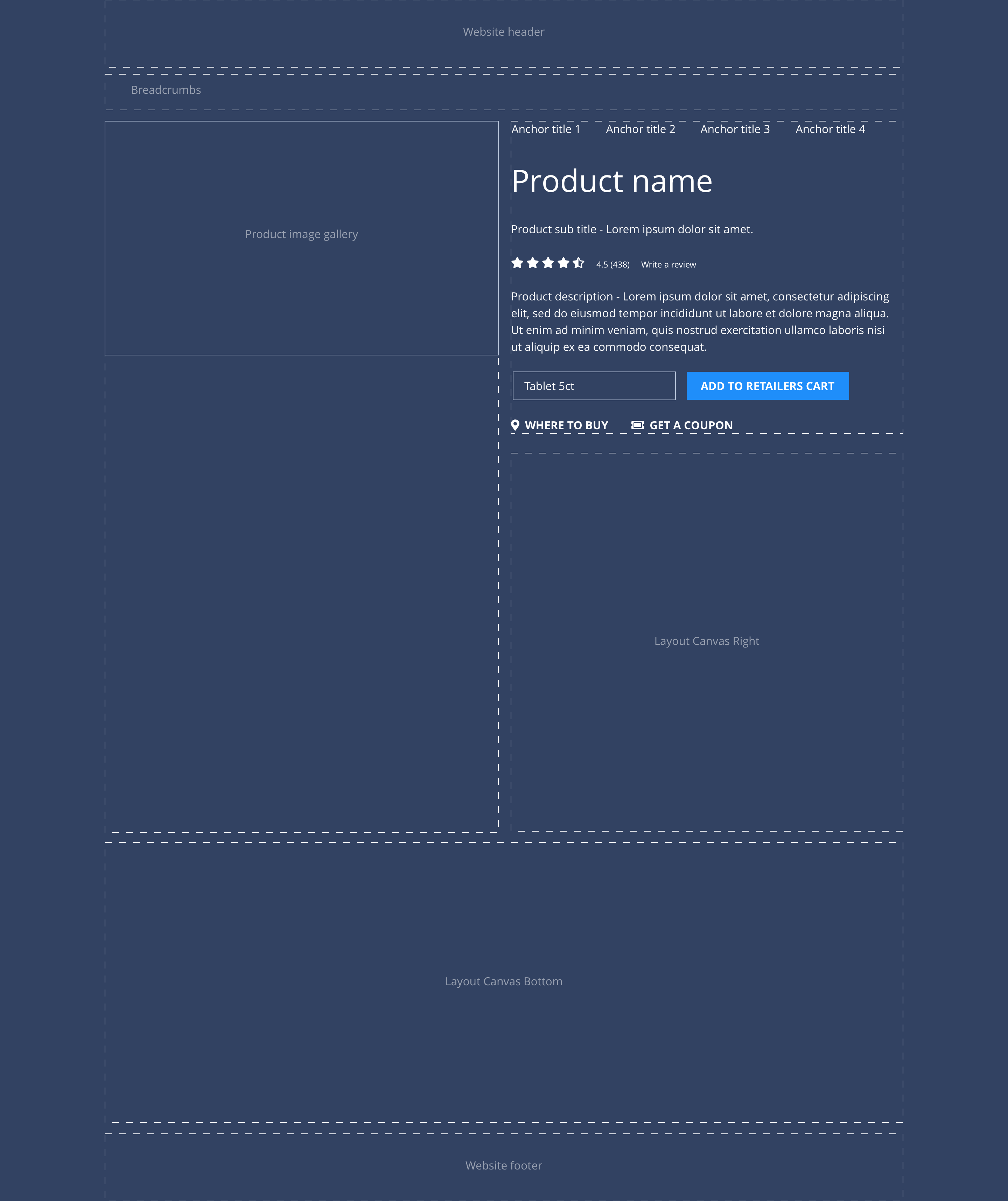
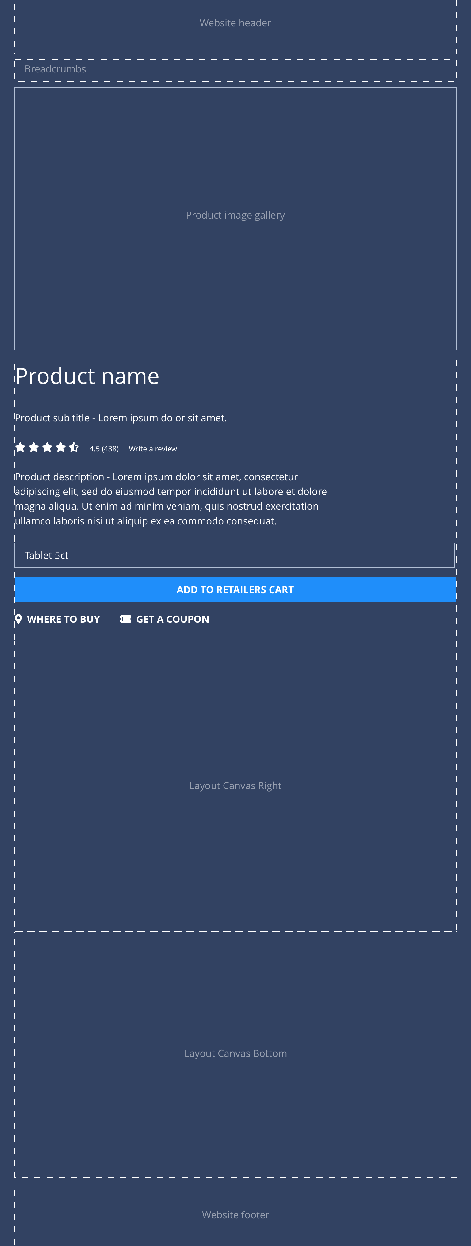
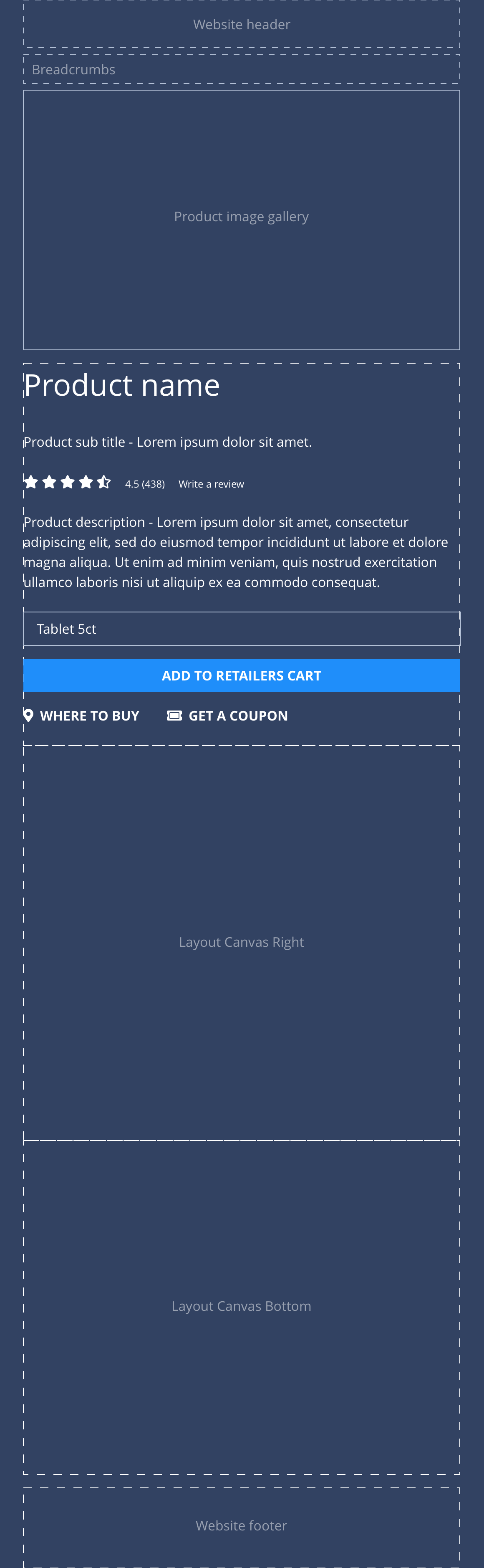
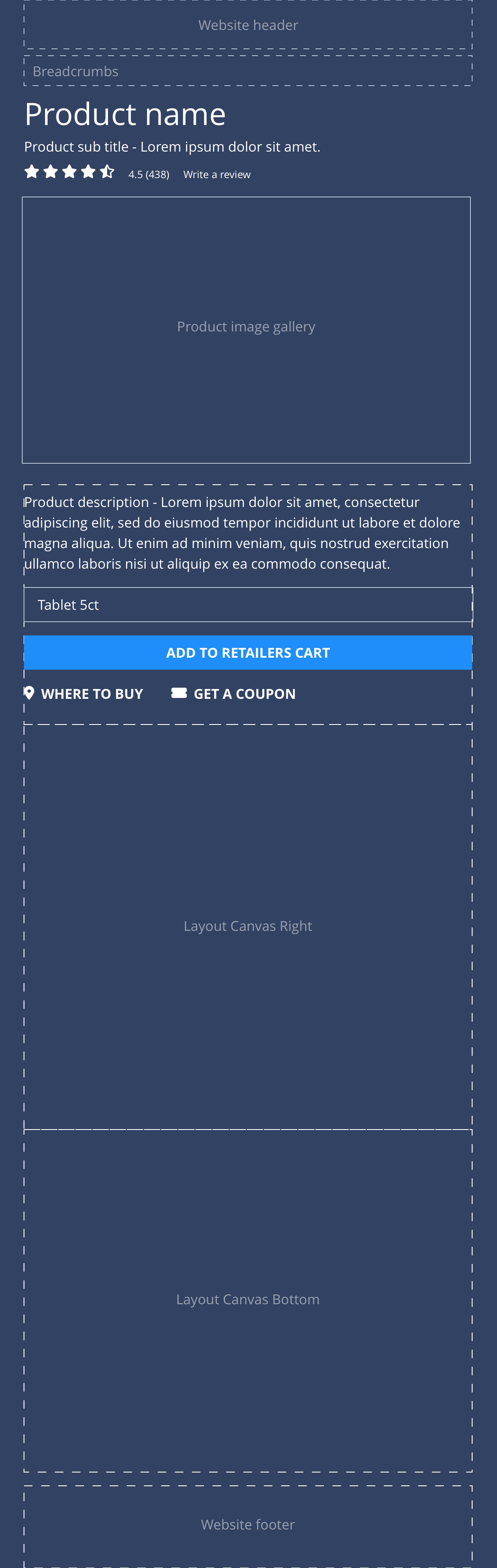
Layout specification
| Content type item | Requirement & purpose | Optional or mandatory | CMS options |
|---|---|---|---|
| Product gallery | Allows the user to upload images to the product gallery. At desktop - the image gallery is sticky and will remain static as the user scrolls down the page. On tablet and mobile, the image gallery appears at the top and will scroll with the rest of the content. | Mandatory | Image uploader. |
| Templated area | A templated area dedicated to content that is consistent through all Consumer Health brands. | n/a | Product title text input. Sub title text input. Description text input. Coupon link text and URL input. |
| Layout Canvas Right | Allows the user to utilise all available components to achieve the brand designs. | n/a | A layout canvas drop zone. |
| Layout Canvas Bottom | Allows the user to utilise all available components to achieve the brand designs. | n/a | A layout canvas drop zone. |
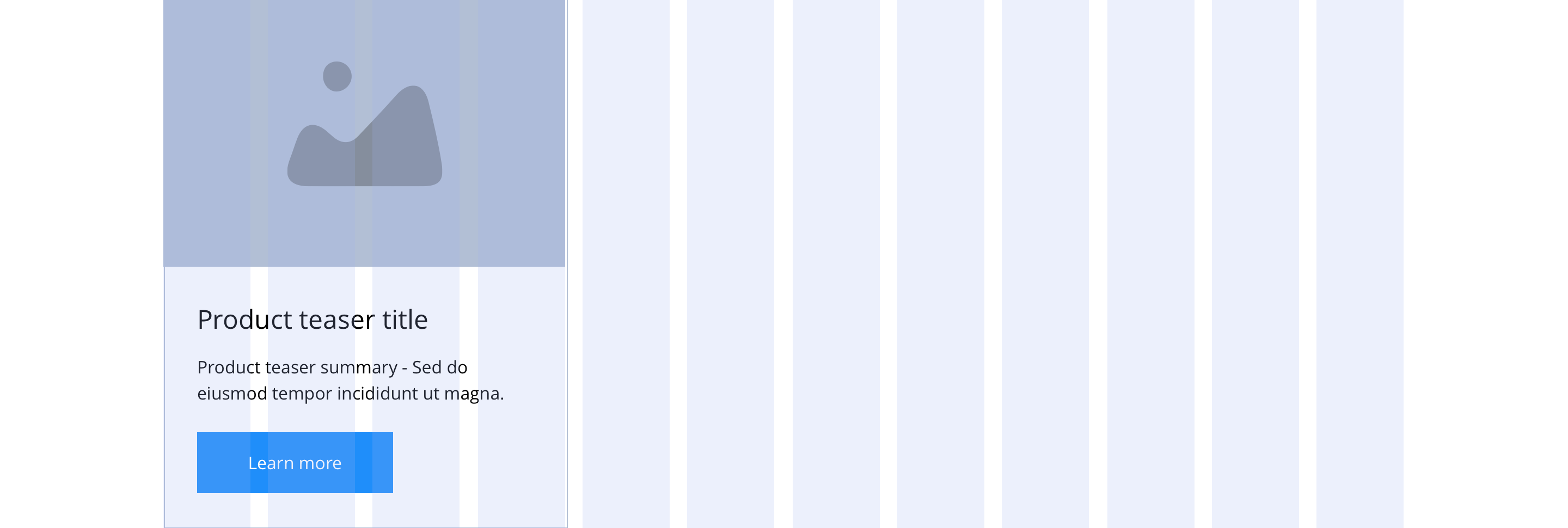
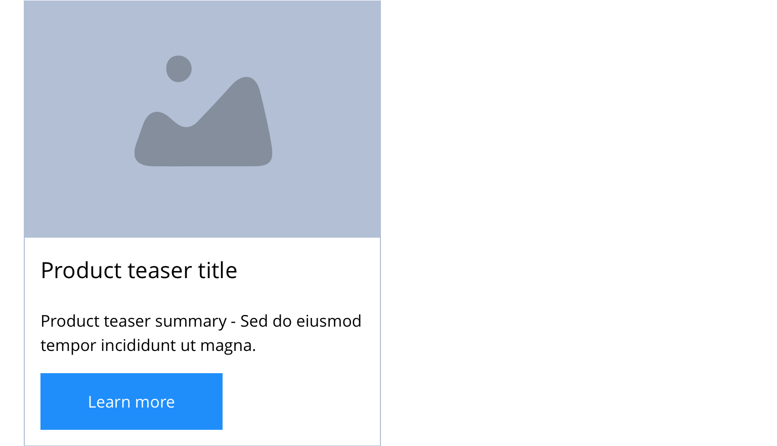
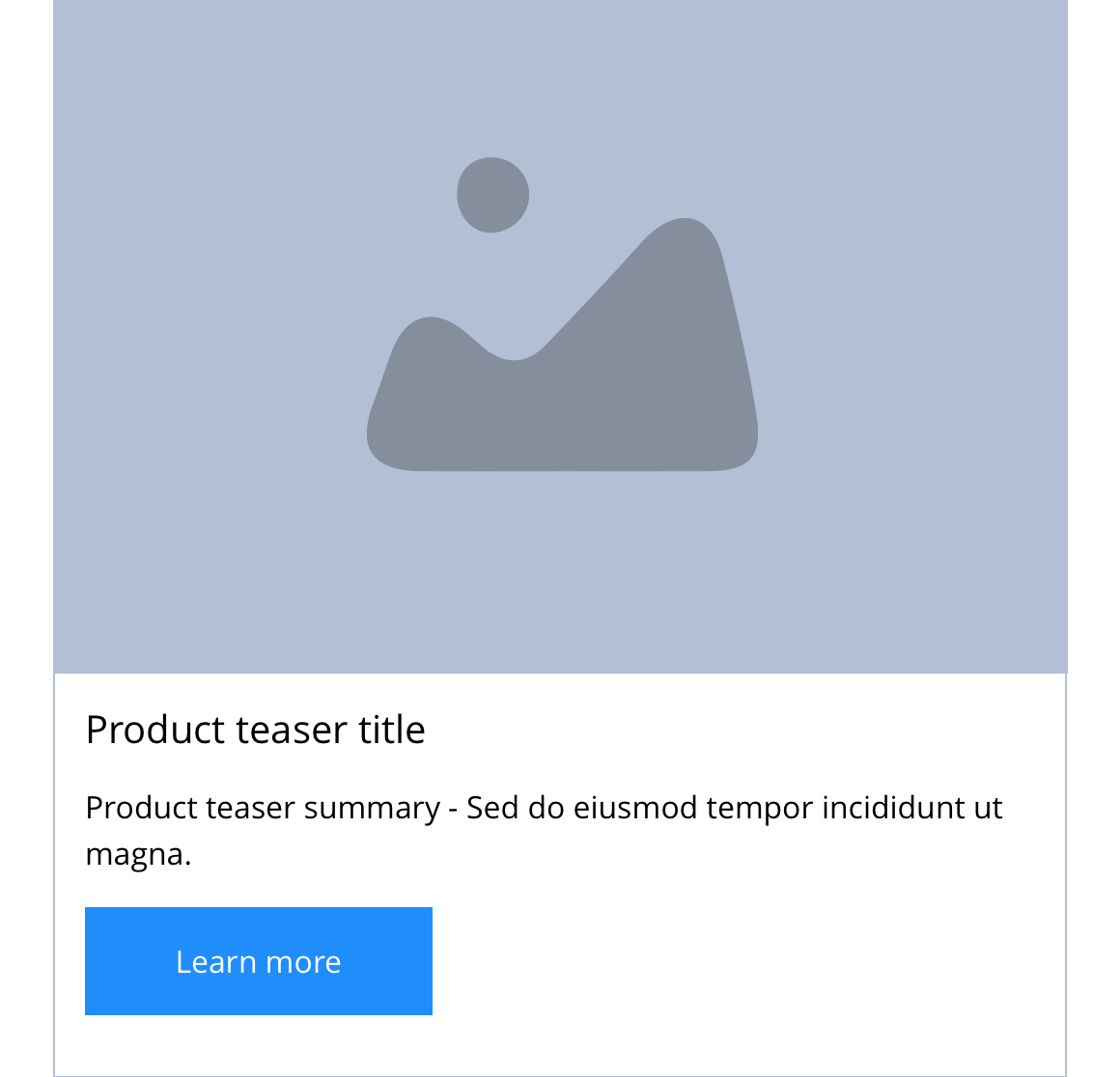
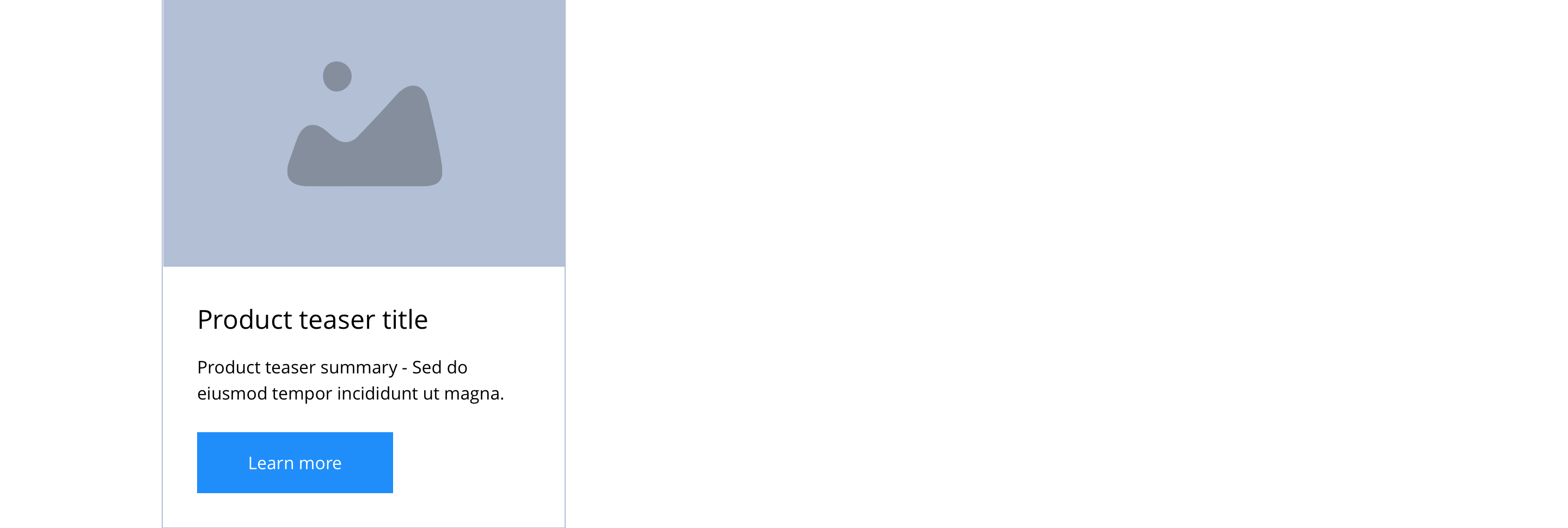
Product teaser
Layout specification
| Content type item | Requirement & purpose | Optional or mandatory | CMS options |
|---|---|---|---|
| Image | Allows the user to upload a product image. | Mandatory | Image upload, image alt text input, image title input. |
| Teaser Title | Allows the user to set a title for the product teaser. | Mandatory | Text input. |
| Summary | Allows the user to add a product summary to the product teaser. The summary is limited to 150 characters. | Mandatory | WYSIWYG. |
These are the Style Guide Manager settings that are specific to this content type. For global settings see the Style Guide Manager section.
Product
| Property | Requirement & purpose | Default | SGM override |
|---|---|---|---|
| Templated area alignment | Sets the site wide alignment for the content in the templated area. | Left | Left, centre or right. |
| Alternative Mobile PDP | Set the alternative layout for mobile with Product title and rating at top above the Product image gallery. | Off | On/off. |
| Product title font picker | Sets the site wide font for the product title. | Open Sans | Choose from font stacks. |
| Product title font weight | Sets the site wide font weight for product title. Should only be used if a font has been imported. | n/a | Text input (e.g 300, 400, 600) |
| Product title font colour | Sets the site wide colour for the product title. | Black | Choose from colour palette. |
| Where to buy icon | Sets the site wide icon that appears before the Where to buy link. | FontAwesome f3ff | Choose from icon picker. |
| Get a coupon icon | Sets the site wide icon that appears before the Get a coupon link. | FontAwesome f3c5 | Choose from icon picker. |
| Where to buy and Get a coupon link colour | Sets the site wide colour for the Where to buy and Get a coupon links. | Black | Choose from colour palette. |
| Product gallery background colour | Sets the site wide background colour of the product gallery. | Grey | Choose from colour palette. |
| Product gallery slider navigation colour | Sets the site wide colour for the product gallery slider navigation. | Black | Choose from colour palette. |
| Anchor link content title colour | Sets the site wide colour for the anchor link content title. | Grey | Choose from colour palette. |
| Product content colour | Allows you the option to a max of 5 different colour styles for product pages | Black | Choose from colour palette. |
Product teaser
| Property | Requirement & purpose | Default | SGM override |
|---|---|---|---|
| Heading element | Sets H2, H3, H4 or H5 on the product teaser site wide. | H4 | Select heading element. |
| Heading colour | Sets the site wide colour for the product teaser heading. | Black | Choose from colour palette. |
| Link style | Sets the site wide link style for the product teaser. | Primary text link | Choose from text link and button styles. |
| Background colour | Sets the site wide background colour for the product teaser. | White | Choose from colour palette. |
| Border width | Sets the site wide border width for the product teaser. | n/a | Choose width within range slider. |
| Border colour | Sets the site wide border colour for the product teaser. | n/a | Choose from colour palette. |
| Border radius | Sets the site wide border radius for the product teaser. | n/a | Text input (e.g 8px). |
| Drop shadow | Sets the site wide drop shadow for the product teaser. | Off | On/off. |
| Text panel padding (Top, bottom, left and right) | Allows control of the spacing around the text within this component. | Mandatory | On/off. |
| Horizontal alignment | Sets the horizontal alignment of the content for the product teaser | Left | Select from dropdown. |

