Link - Block 1 - Image & text vertical
The Link - Block 1 - Image & text vertical component can span either 1/4, 1/3, 1/2 or 2/3 of the grid. It contains an optional button but the entire block is a clickable link. It can be customised as described in the specification tab below.
- Overview
- Specification
- Style Guide Manager
- Examples in-situ
- Usage
Overview
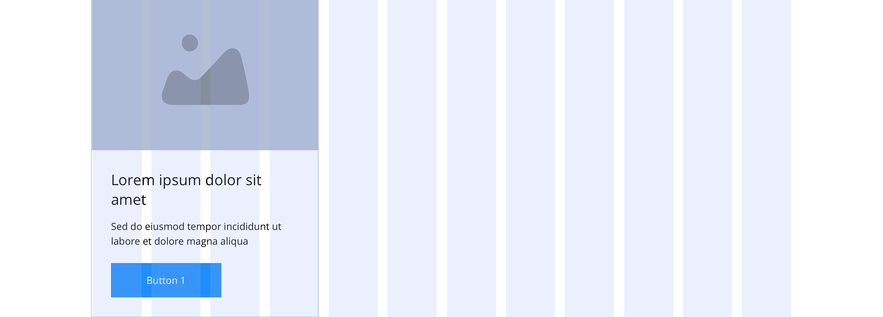
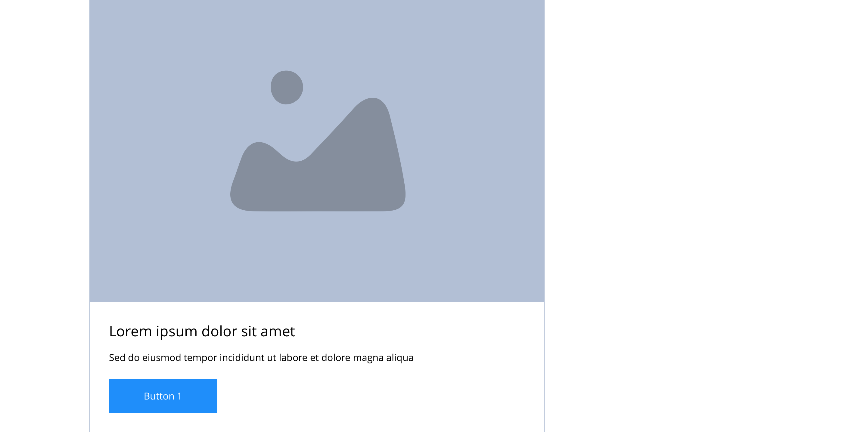
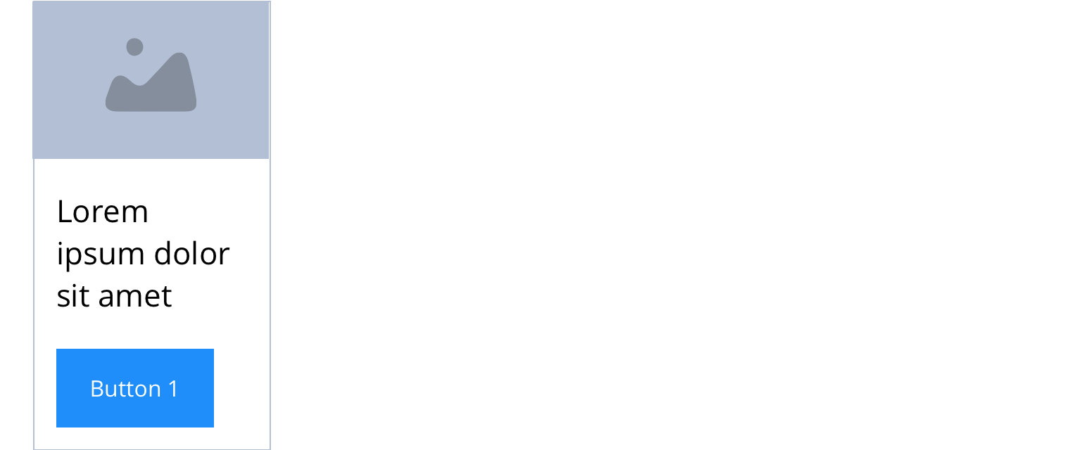
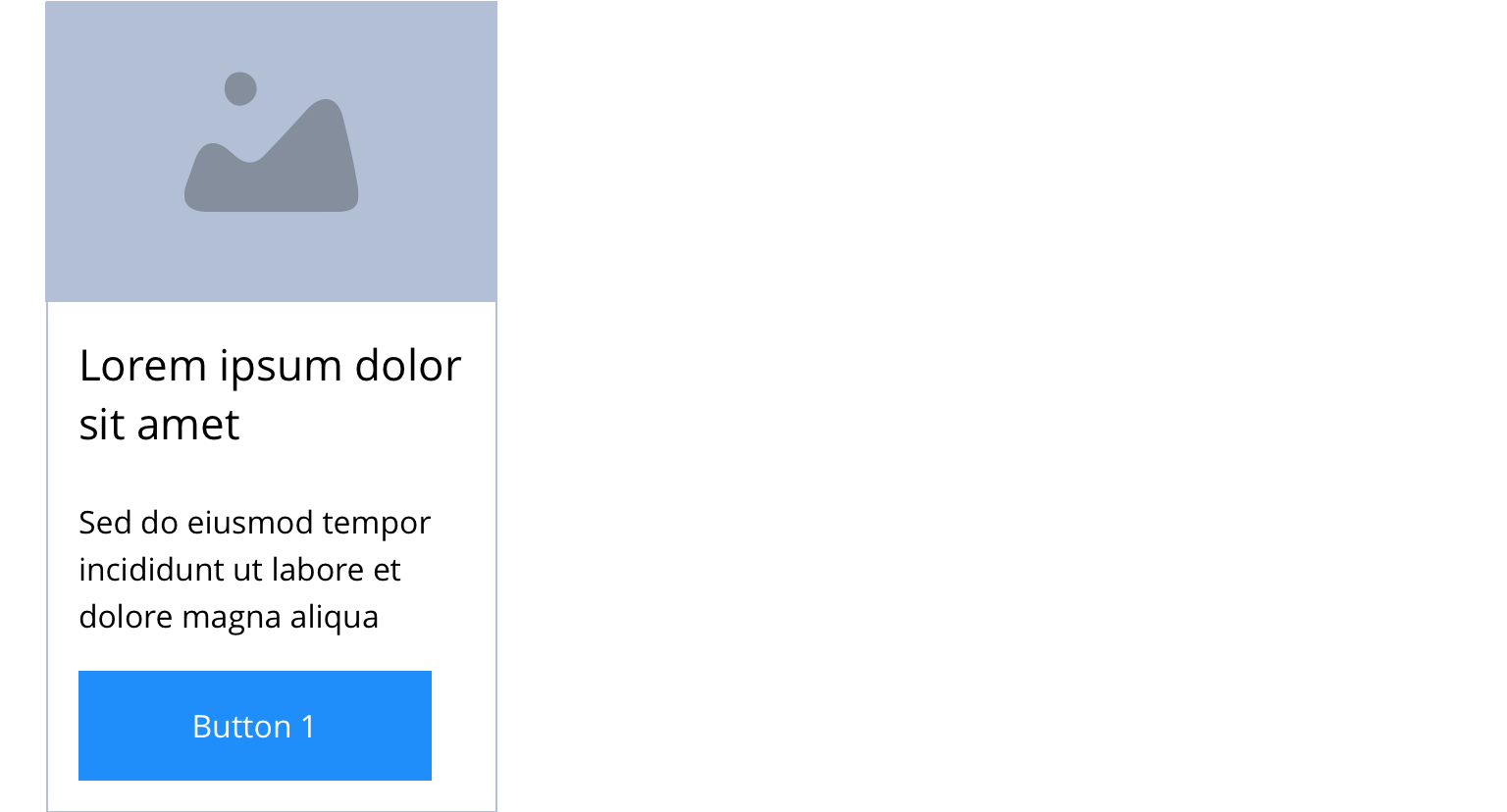
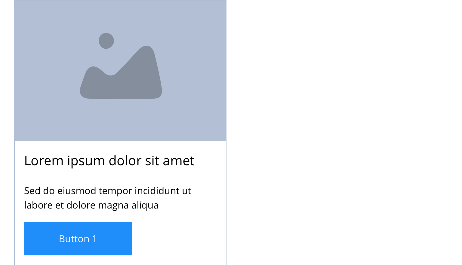
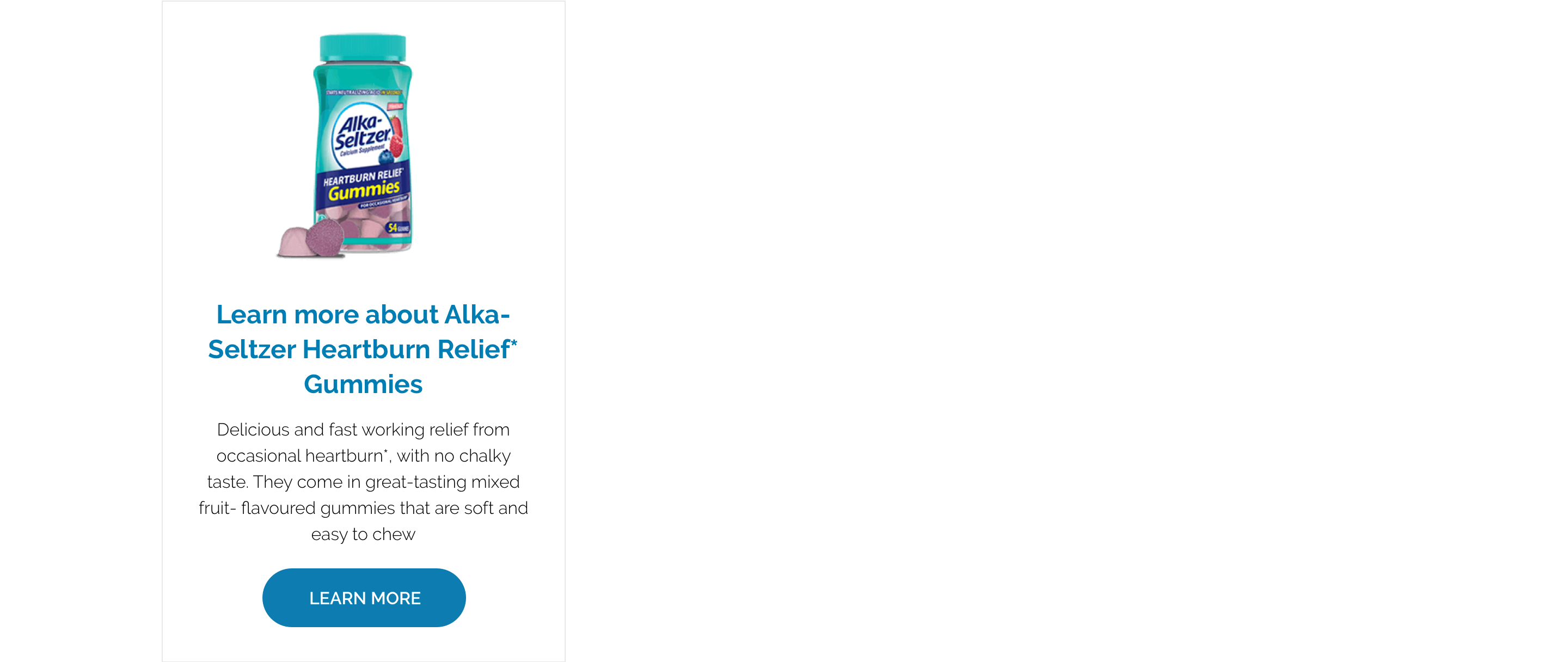
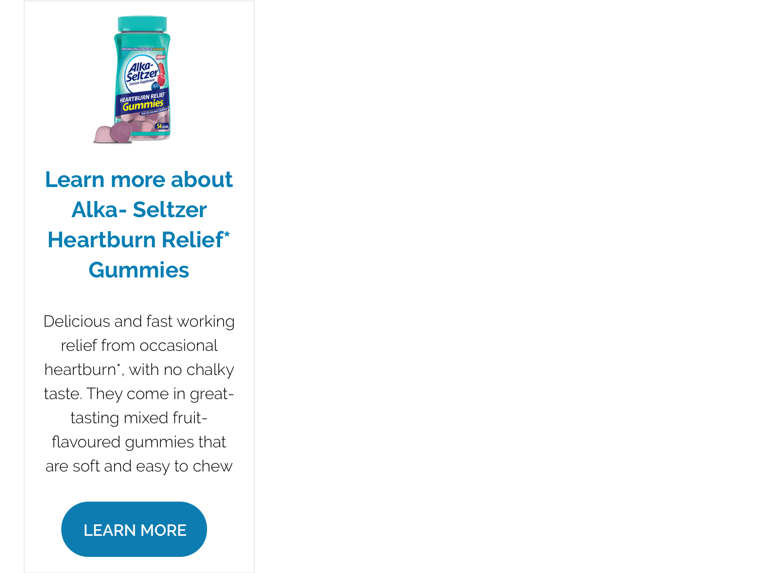
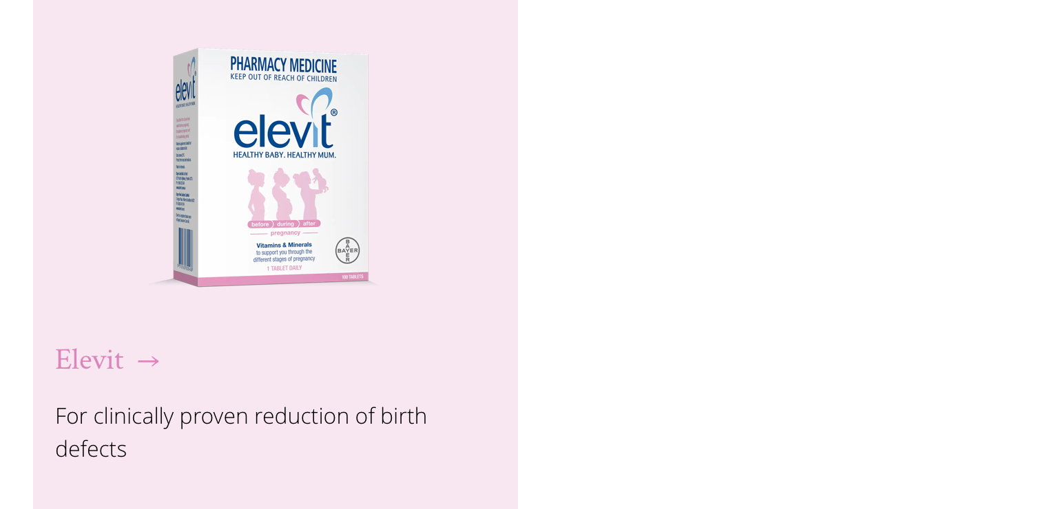
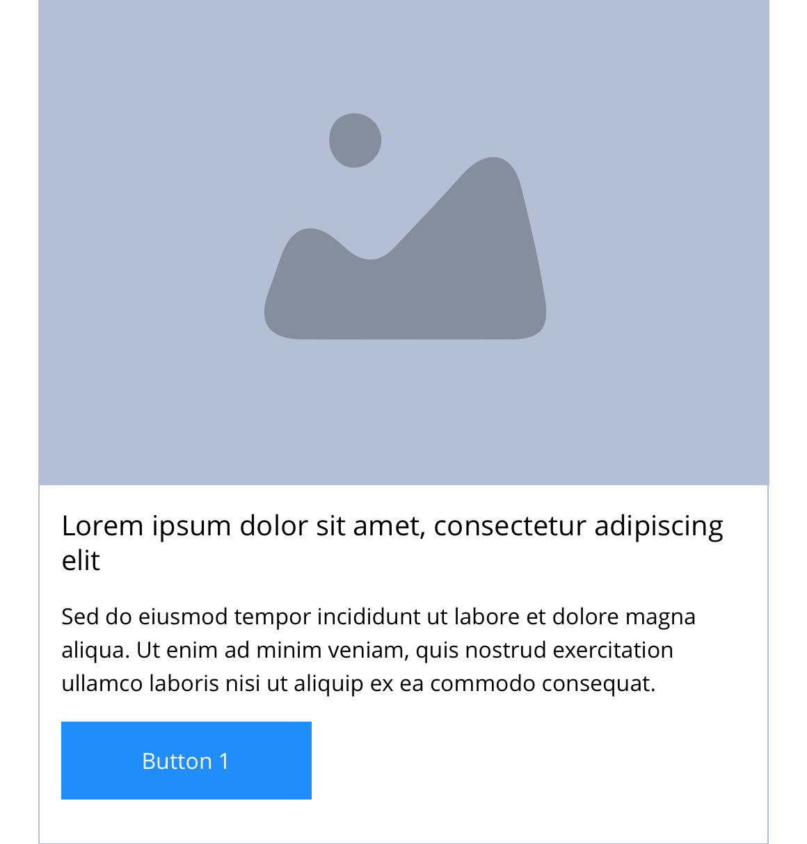
Example shows No link - Block 1 spanning 1/3 of the grid.
Desktop
1/4
1/3
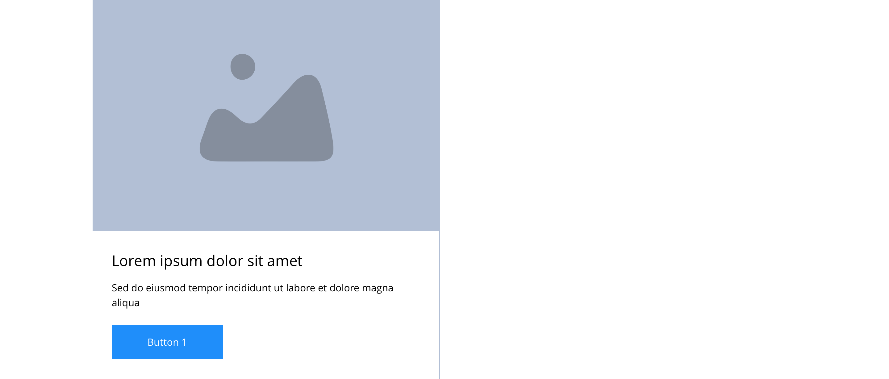
1/2
2/3
Tablet
1/4
1/3
1/2
2/3
Mobile

1(Full Width)
1/2
This provides guidance on the build, layout and content options for this component.
Layout specification
Same as No link - Block 1 - Image & text vertical with the addition of linking properties.
| Component item | Requirement & purpose | Optional or mandatory | CMS options |
|---|---|---|---|
| Full border | Allows a full width border to be added to the component. | Optional | On/off. |
| Full border width | Sets the border width. | Optional | Add a px value. |
| Full border colour | Sets the border colour. | Optional | Choose from colour palette. |
| PWA | To enable PWA CTA | Optional | Toggle Button |
| Link text | Entire block (image and text panel) is a link.'Call-to-action' is superficial but allows users to see the area is clickable. 'Call-to-action' does not render if link text not entered. | Optional | Link text input. |
| Link style | Sets link style (Link should align to bottom of block.) | Optional | Link style select. |
| Button Shapes | Allows user to select various button shapes | Optional | Dropdown |
| Button animate | Allows users to switch On/Off the animation functionality for the link/button. | Optional | On/off. |
| Select animation | Allow user to select animation from the drop-down list. | Optional | Select list |
| Duration | Set how long in seconds the animation will take to run | Required | Numeric Input |
| Delay | Set a start delay on the animation in seconds | Optional | Numeric Input |
| Iteration | Set the number of times the animation should run | Optional | Numeric Input (Maximum two) |
| offset | Set the animation to start at a specific offset before or after the element has entered the view port | Optional | Numeric Input (Pixel) |
| Make Foreground image out of the box | Allows to make the Foreground image at the top center of the box container. | Optional | On/Off |
| Link URL | Sets link on the block. | Mandatory | Set link URL for block. |
| Target | Sets link to open in the same or a new window. | Mandatory | Target select: Same window or open in new. |
| Aria Label | Use this field to provide a description of the link. This field is used for website accessibility. | Optional | Text Field |
Interaction
These are the interactive aspects of the component.
Animate container (To add animation to component)
| Select animation | Allow user to select animation from the drop-down list. | Optional | Select list |
|---|---|---|---|
| Duration | Set how long in seconds the animation will take to run | Required | Numeric Input |
| Delay | Set a start delay on the animation in seconds | Optional | Numeric Input |
| Iteration | Set the number of times the animation should run | Optional | Numeric Input (Maximum two) |
| offset | Set the animation to start at a specific offset before or after the element has entered the view port | Optional | Numeric Input (Pixel) |
| Interaction |
|---|
| Block when clicked links to a defined page. |
There are no style guide settings for this component.
General usage dos and don'ts
| ✅ Dos | ❌ Don'ts |
|---|---|
| Ensure the text is legible. | Do not use a background image that makes the text hard to read. |
| Add a URL in the 'URL' field. | Do not add a link in the WYSIWYG. Adding a link within a link will break the layout of the component. |
| Read our guidance on imagery. | |
| Read our guidance on the use of WYSIWYGs. |