Responsive Blocks - Overview
The Responsive block is a highly flexible component, that has been designed to allow for a number of flexible card based layouts.
The responsive block comes in two parts, the responsive block container and the responsive block items. Responsive block items are dropped into the container as required. The width can be set on each block to achieve the desired layout. To keep the rows aesthetically tidy, each block will take on the height of the tallest block within that same container. Guidance on creating these layouts can be found on the following pages.
Responsive blocks can vary in width as needed. Depending on which block is used they can be set to span 1/3, 1/2, 2/3's or full width of the available grid.
Responsive blocks come in two versions, links and no links. The whole block on the link version is clickable. No links should be added in the WYSIWYG area of the link blocks. Adding a link within a link will break the layout of the component.
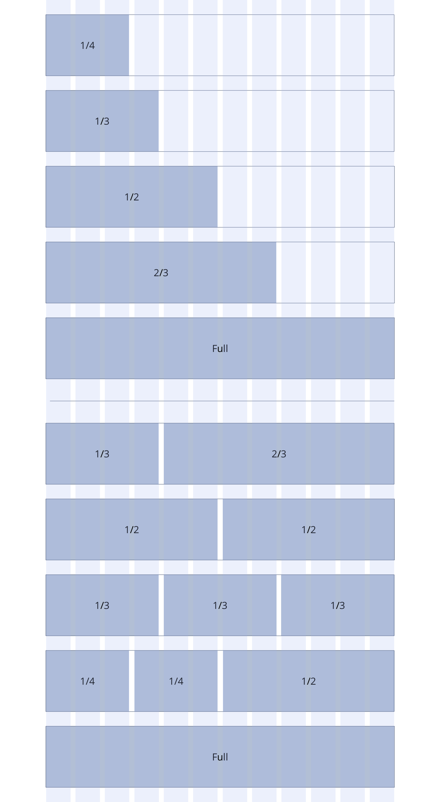
Overview
Overview showing the example layouts that can be achieved by using Responsive Blocks at varying widths.