No link - Block 4 - Background image & text overlay
The No link - Block 4 - Background image & text overlay component can span either 1/3, 1/2, 2/3 or full width of the grid. This block can be rendered with or without a background image and has an optional panel behind the text.
- Overview
- Specification
- Style Guide Manager
- Examples in-situ
- Usage
Overview
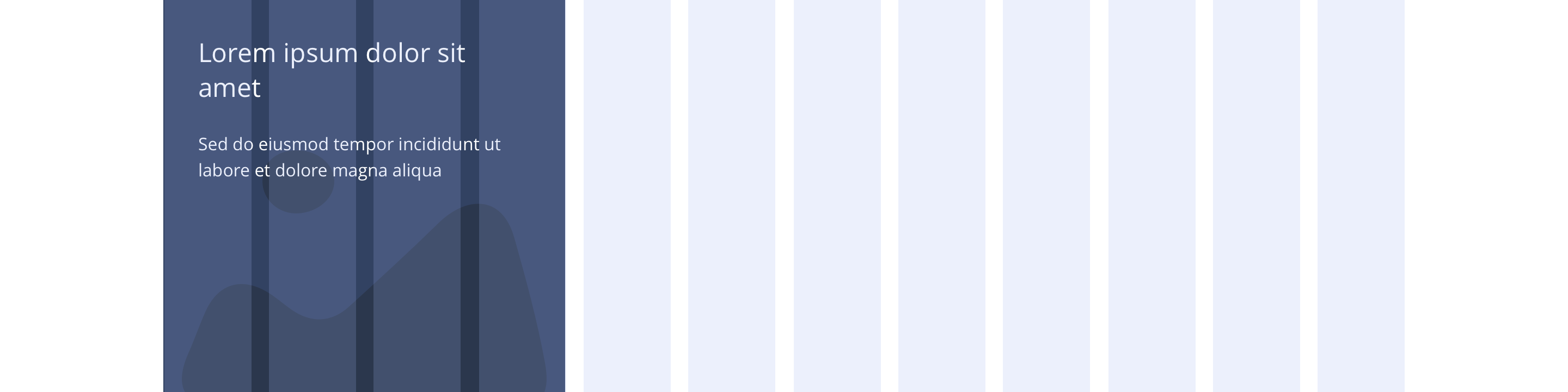
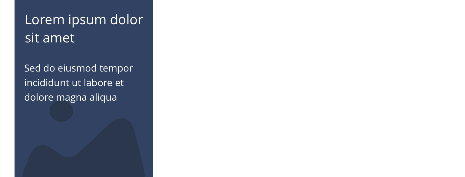
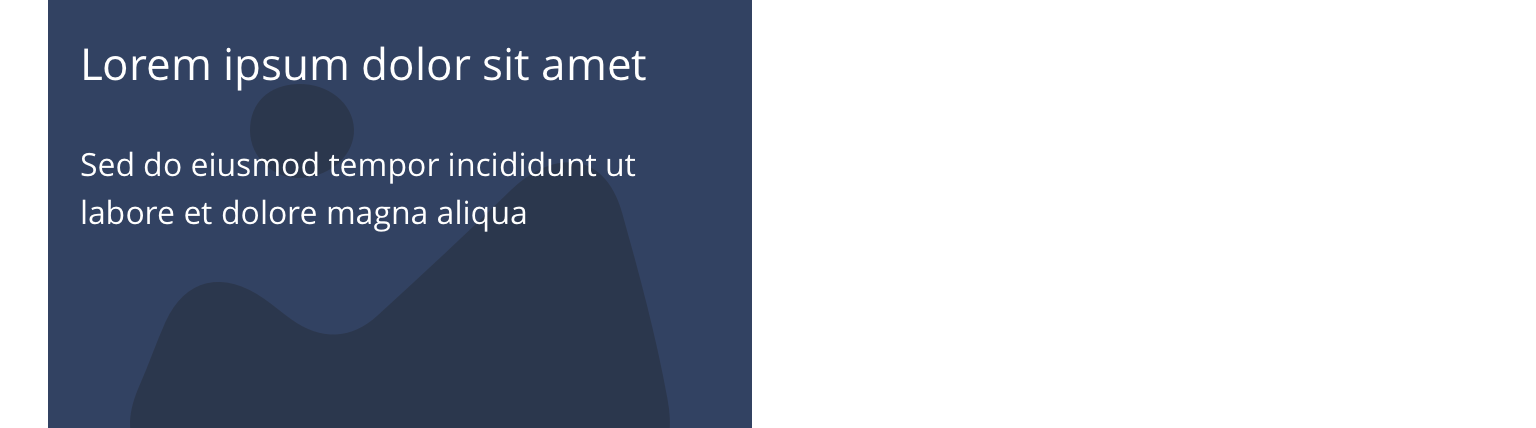
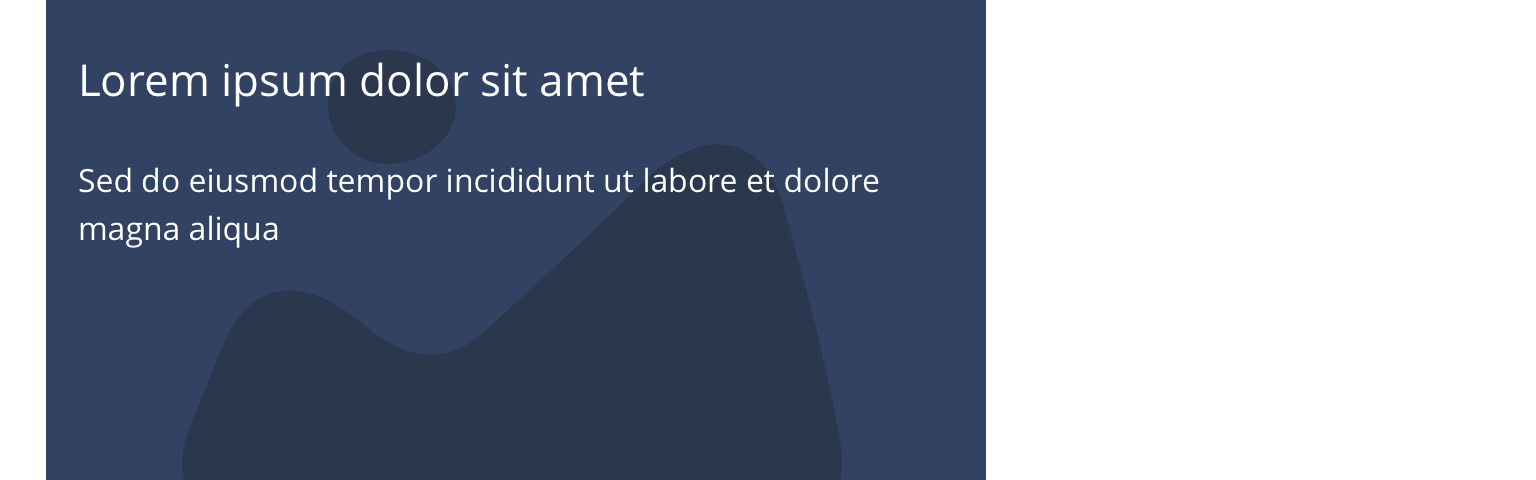
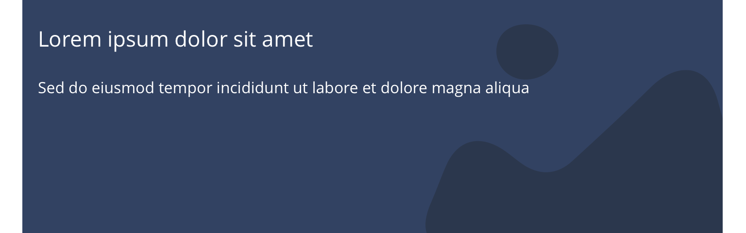
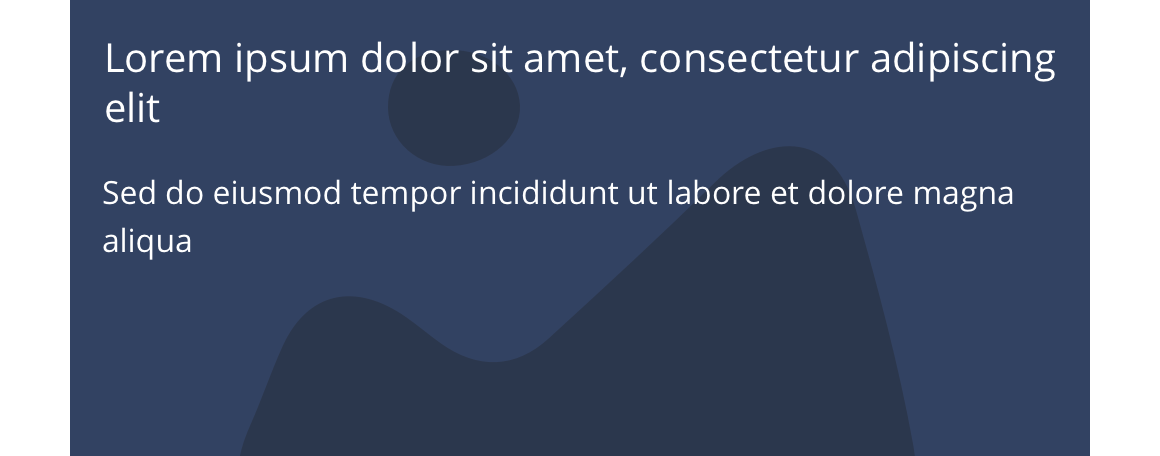
Example shows No link - Block 4 spanning 1/3 of the grid
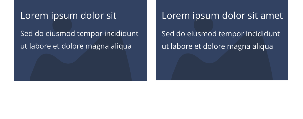
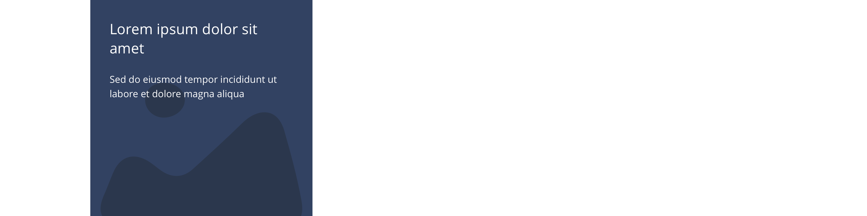
Desktop

1/3
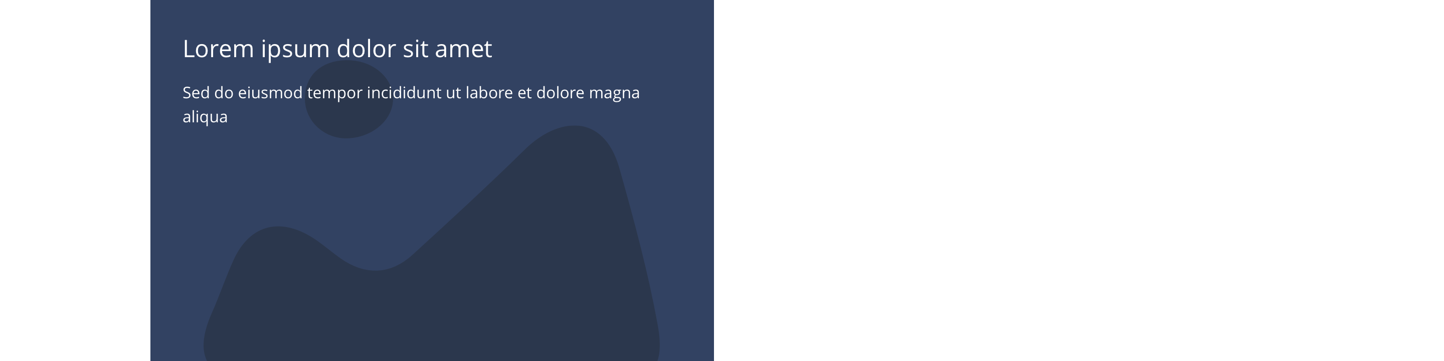
1/2
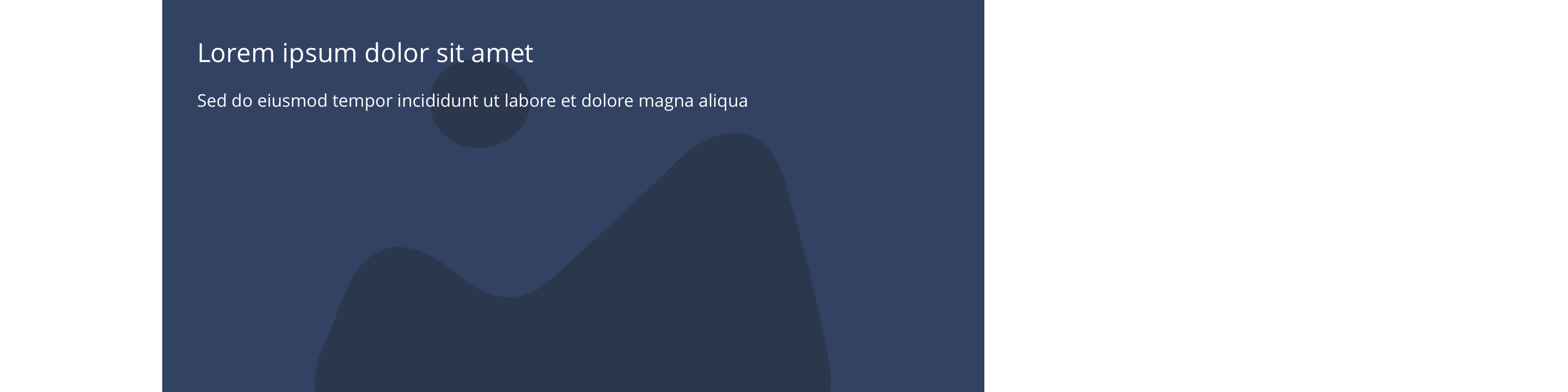
2/3
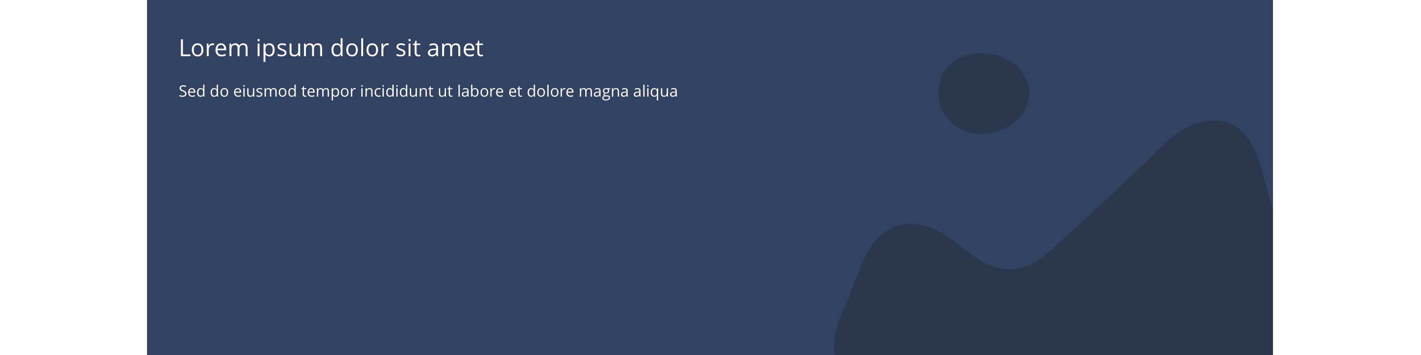
Full
Tablet
1/3
1/2
2/3
Full
Mobile
1(Full Width)
1/2 updated
This provides guidance on the build, layout and content options for this component.
Layout specification
| Component item | Requirement & purpose | Optional or mandatory | CMS options |
|---|---|---|---|
| Minimum height | Sets minimum height of component for each breakpoint. Component expands based on content. | n/a | Set globally via SGM and affects all instances of the component on the site. |
| Width | The container is set full width. Content is constrained to the width of the grid. | n/a | n/a |
| Background image | Allows user to set a background image. This is full width and set to cover. | Optional | Image uploader. |
| Background image aria label | The aria-label allows us to specify a string to be used as the accessible label. | Optional | Text input field |
| Lazy Load Background | Allows users to switch On/Off the Lazy Load functionality for the background image. | Optional | On/Off |
| Background colour | Allows user to set a background colour on the component. | Optional | Choose from colour palette. |
| Content alignment | Controls the alignment of text and call to action in block. | Mandatory | Vertically align top, centre or bottom.Horizontally align left, centre or right. |
| Content alignment on mobile | Controls the alignment of text and call to action in block. | Mandatory | Vertically align top, centre or bottom.Horizontally align left, centre or right. |
| Text padding top, bottom, left and right | Allows control of the spacing around the text within this component. | Optional | On/off for each individual padding property. |
| Text panel margin | Adds margin to the left or right side of the panel within the component. | Optional | No margin/margin left/margin right. |
| Text panel background and colour | Sets a coloured background panel behind text. When applied, padding automatically matches the SGM block padding value. | Optional | On/offChoose from colour palette. |
| Block width | Block can span 1/3, 1/2 or 2/3 or full width of grid. Content is always full width on mobile. | Mandatory | Desktop: 1/3, 1/2, 2/3 or full width.Tablet: 1/3, 1/2, 2/3 or full width.Mobile: 1 (Full width), 1/2. |
| Drop shadow | Adds a default drop shadow around entire block.Default value - 0 0 13px 0 RGBA (93,113,131,.2). | Optional | On/off. |
| Full border | Allows a full width border to be added to the component. | Optional | On/off. |
| Full border width | Sets the border width. | Optional | Add a px value. |
| Full border colour | Sets the border colour. | Optional | Choose from colour palette. |
| Heading text | Sets heading text. | Optional | Text input. |
| Heading element | Sets H2, H3, H4 or H5 on component. | Optional | Select heading element. |
| Heading style | Allows user to choose where more then one type of heading style may be present (i.e. multiple H2's). | Optional | Select heading style. |
| Heading colour | Sets heading colour. | Optional | Choose from colour palette. |
| Paragraph | Sets paragraph content. | Optional | Text input. |
| Paragraph style | Sets paragraph style. | Optional | Paragraph style select. |
| Paragraph colour | Sets paragraph colour. | Optional | Choose from colour palette. |
| WYSIWYG | Allows user to format text where additional styles may be required. | Optional | WYSIWYG. |
| Margin bottom | Controls spacing below component. Set to 16px to match the gutters. | n/a | n/a |
Interaction
These are the interactive aspects of the component.
Animate container (To add animation to component)
| Select animation | Allow user to select animation from the drop-down list. | Optional | Select list |
|---|---|---|---|
| Duration | Set how long in seconds the animation will take to run | Required | Numeric Input |
| Delay | Set a start delay on the animation in seconds | Optional | Numeric Input |
| Iteration | Set the number of times the animation should run | Optional | Numeric Input (Maximum two) |
| offset | Set the animation to start at a specific offset before or after the element has entered the view port | Optional | Numeric Input (Pixel) |
| Interaction |
|---|
| None |
These are the Style Guide Manager settings that are specific to this component. For global settings see the Style Guide Manager section.
| Property | Requirement & purpose | Default | SGM override |
|---|---|---|---|
| Image margin bottom | Add space between the image and the text | Desktop - 264px Tablet - 240px Mobile - 224px | Desktop Tablet Mobile |
There are no current design examples.
General usage dos and don'ts
| ✅ Dos | ❌ Don'ts |
|---|---|
| Ensure the text is legible. | Do not use a background image that makes the text hard to read. |
| Use a superficial button and add the link to the entire block. | Do not add a separate link within the block itself. This will break the block. |
| Read our guidance on imagery. | |
| Read our guidance on the use of WYSIWYGs. |