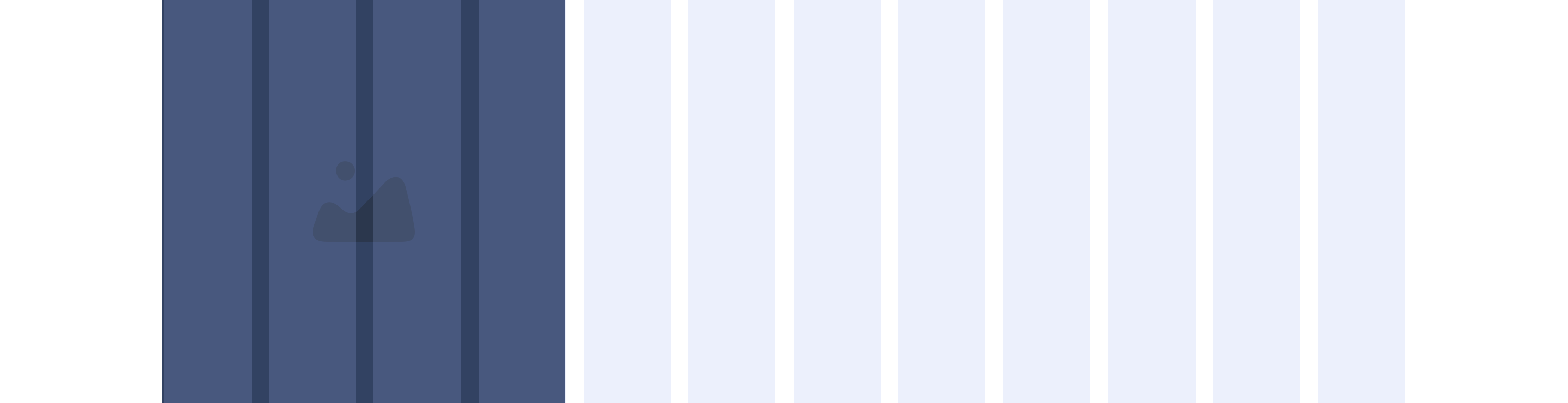
No Link - Block 5 - Image only
The No link - Block 5 - Image only component can span either 1/3, 1/2 or 2/3 of the grid. It can be customised as described in the specification tab below.
- Overview
- Specification
- Style Guide Manager
- Examples in-situ
- Usage
Overview
Example shows No link - Block 5 spanning 1/3 of the grid
Desktop

1/3

1/2

2/3
Tablet

1/3

1/2

2/3
Mobile

1(Full Width)
1/2 updated
This provides guidance on the build, layout and content options for this component.

Layout specification
| Component item | Requirement & purpose | Optional or mandatory | CMS options |
|---|---|---|---|
| Link URL | Sets link on the block. | Mandatory | Set link URL for block. |
| Target | Sets link to open in the same or a new window. | Mandatory | Target select: Same window or open in new. |
| Aria Label | Use this field to provide a description of the link. This field is used for website accessibility. | Optional | Text Field |
Interaction
These are the interactive aspects of the component.
Animate container (To add animation to component)
| Select animation | Allow user to select animation from the drop-down list. | Optional | Select list |
|---|---|---|---|
| Duration | Set how long in seconds the animation will take to run | Required | Numeric Input |
| Delay | Set a start delay on the animation in seconds | Optional | Numeric Input |
| Iteration | Set the number of times the animation should run | Optional | Numeric Input (Maximum two) |
| offset | Set the animation to start at a specific offset before or after the element has entered the view port | Optional | Numeric Input (Pixel) |
| Interaction |
|---|
| Block when clicked links to a defined page. |
There are no style guide settings for this component.