No link - Block 1 - Image & text vertical
The No link - Block 1 - Image & text vertical component can span either 1/4, 1/3, 1/2 or 2/3 of the grid. It can be customised as described in the specification tab below. Please see usage tab for guidance on adding images to this component.
- Overview
- Specification
- Style Guide Manager
- Examples in-situ
- Usage
Overview
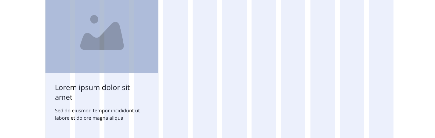
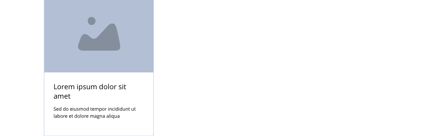
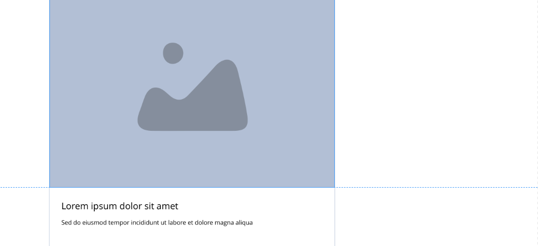
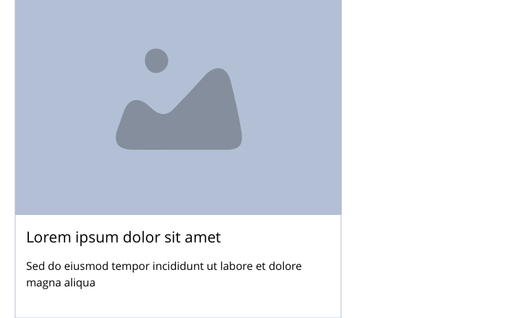
Example shows No link - Block 1 spanning 1/3 of the grid.
Desktop
1/4
1/3
1/2
2/3
Tablet
1/4
1/3
1/2
2/3
Mobile
1(Full Width)
1/2
This provides guidance on the build, layout and content options for this component.
Layout specification
| Component item | Requirement & purpose | Optional or mandatory | CMS options |
|---|---|---|---|
| Height | Expands based on size of content.Each block within the container will match the height of the tallest block. | n/a | n/a |
| Background colour | Allows user to set a background colour on entire responsive block. | Optional | Choose from colour palette. |
| Content alignment | Controls the alignment of text and call to action in block. | Mandatory | Vertically align top, centre or bottom.Horizontally align left, centre or right. |
| Content alignment mobile | Controls the alignment of text and call to action in block. | Mandatory | Vertically align top, centre or bottom.Horizontally align left, centre or right. |
| Text/image ordering | Controls order of text and image. | Mandatory | Text top or bottom. |
| Text padding top, bottom, left and right | Allows control of the spacing around the text within this component. | Mandatory | On/off for each individual padding property.The value is set within the SGM. |
| Block width | Block can span 1/3, 1/2, or 2/3 of grid. Content is always full width on mobile. | Mandatory | Desktop: 1/3, 1/2 or 2/3.Tablet: 1/3, 1/2 or 2/3.Mobile: 1 (Full width), 1/2. |
| Full border | Allows a full width border to be added to the component. | Optional | On/off. |
| Full border width | Sets the border width. | Optional | Add a px value. |
| Full border colour | Sets the border colour. | Optional | Choose from colour palette. |
| Border | Allows a boxed width border to be added to the bottom of the component. | Optional | On/off. |
| Border width | Sets the border width. | Optional | Add a px value. |
| Border colour | Sets the border colour. | Optional | Choose from colour palette. |
| Drop shadow | Adds a default drop shadow around entire block. Default value - 0 0 13px 0 RGBA (93,113,131,.2). | Optional | On/off. |
| Foreground image | Allows user to set the foreground image. | Mandatory | Image uploader. |
| Image alt text | Adds alt text to an image. | Mandatory | Text input. |
| Lazy Load Foreground | Allows users to switch On/Off the Lazy Load functionality for the foreground image. | Optional | On/off. |
| Foreground image animate | Allows users to switch On/Off the animation functionality for the foreground image. | Optional | On/off. |
| Select animation | Allow user to select animation from the drop-down list. | Optional | Select list |
| Duration | Set how long in seconds the animation will take to run | Required | Numeric Input |
| Delay | Set a start delay on the animation in seconds | Optional | Numeric Input |
| Iteration | Set the number of times the animation should run | Optional | Numeric Input (Maximum two) |
| offset | Set the animation to start at a specific offset before or after the element has entered the view port | Optional | Numeric Input (Pixel) |
| Make Foreground image out of the box | Allows to make the Foreground image at the top center of the box container. | Optional | On/Off |
| Heading text | Sets heading text. | Optional | Text input. |
| Heading element | Sets H2, H3, H4 or H5 on component. | Optional | Select heading element. |
| Heading style | Allows user to choose where more then one type of heading style may be present (i.e. multiple H2's). | Optional | Select heading style. |
| Heading colour | Sets heading colour. | Optional | Choose from colour palette. |
| Paragraph text | Sets paragraph content. | Optional | Text input. |
| Paragraph style | Sets paragraph style. | Optional | Paragraph style select. |
| Paragraph colour | Sets paragraph colour. | Optional | Choose from colour palette. |
| WYSIWYG | Allows user to format text where additional styles may be required. | Optional | WYSIWYG. |
| Margin bottom | Controls spacing below component. Set to 16px to match the gutters. | n/a | n/a |
Interaction
These are the interactive aspects of the component.
Animate container (To add animation to component)
| Select animation | Allow user to select animation from the drop-down list. | Optional | Select list |
|---|---|---|---|
| Duration | Set how long in seconds the animation will take to run | Required | Numeric Input |
| Delay | Set a start delay on the animation in seconds | Optional | Numeric Input |
| Iteration | Set the number of times the animation should run | Optional | Numeric Input (Maximum two) |
| offset | Set the animation to start at a specific offset before or after the element has entered the view port | Optional | Numeric Input (Pixel) |
| Interaction |
|---|
| None |
There are no style guide settings for this component.
See Link - Block 1 - Image & text vertical for layout examples (NB. the no link version has no link)
General usage dos and don'ts
| ✅ Dos | ❌ Don'ts |
|---|---|
| Ensure the text is legible. | Do not use a background image that makes the text hard to read. |
| Full bleed images - e.g. articles, images should be uploaded as required. These will bleed to the edge of the panel. Images with white space - e.g. products, should be cut to the required size and these will automatically centre within the component. NB - this component has been created to cover a range of scenarios, when cropping the image whitespace will need to be added top and bottom to avoid it touching the panel edge when borders and background colours are being used. | |
| Read our guidance on imagery. | |
| Read our guidance on the use of WYSIWYGs. |