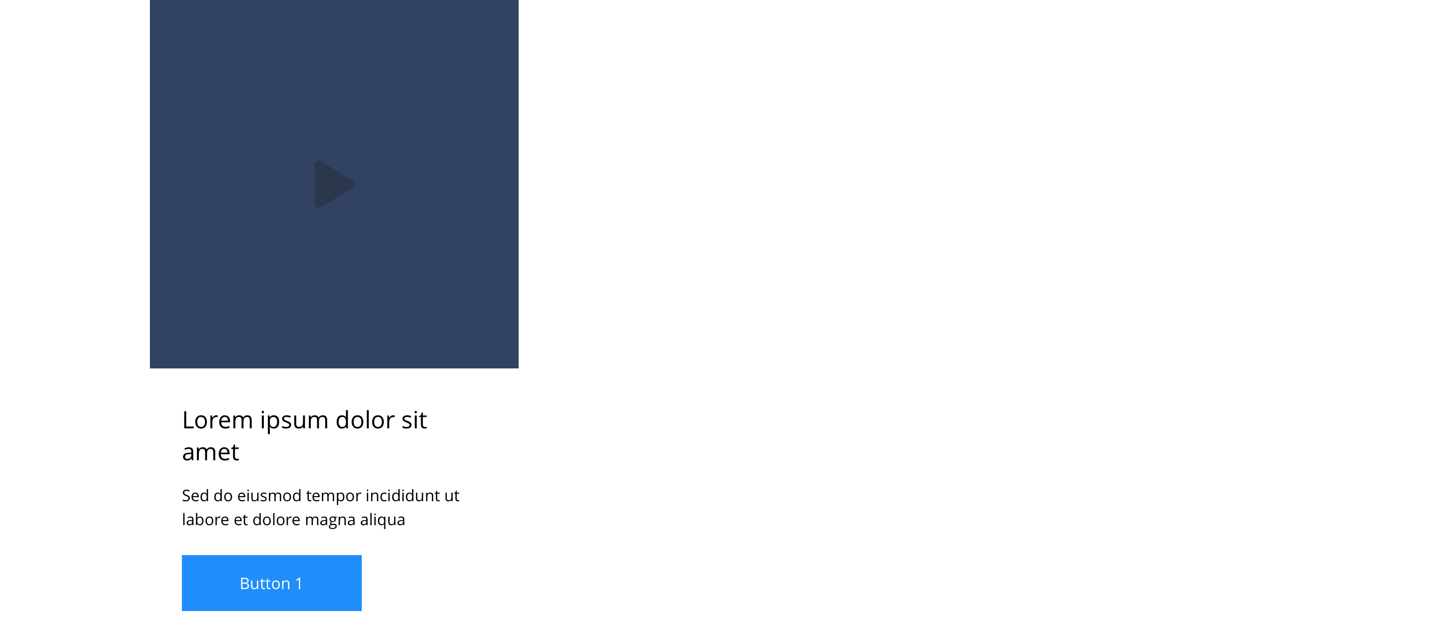
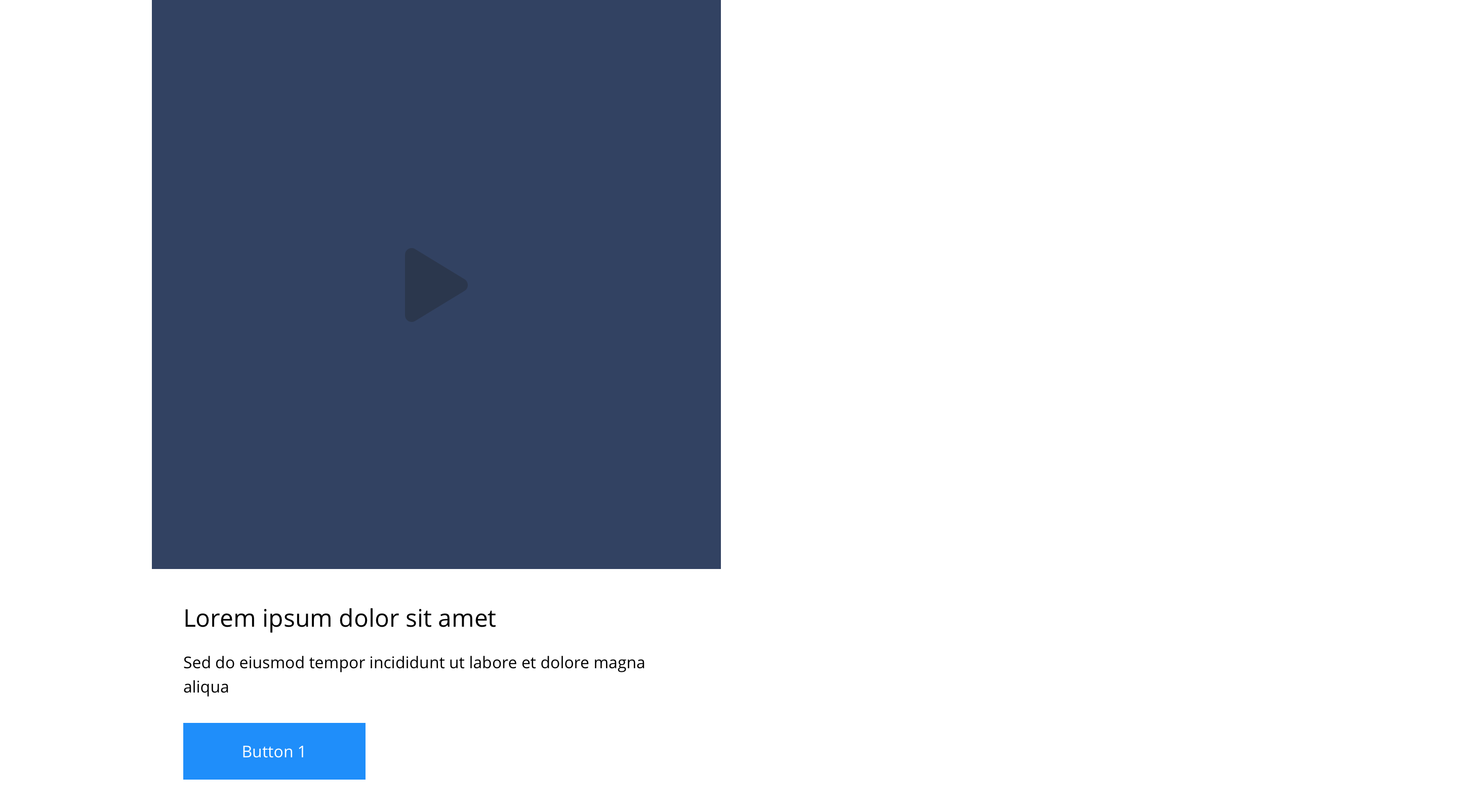
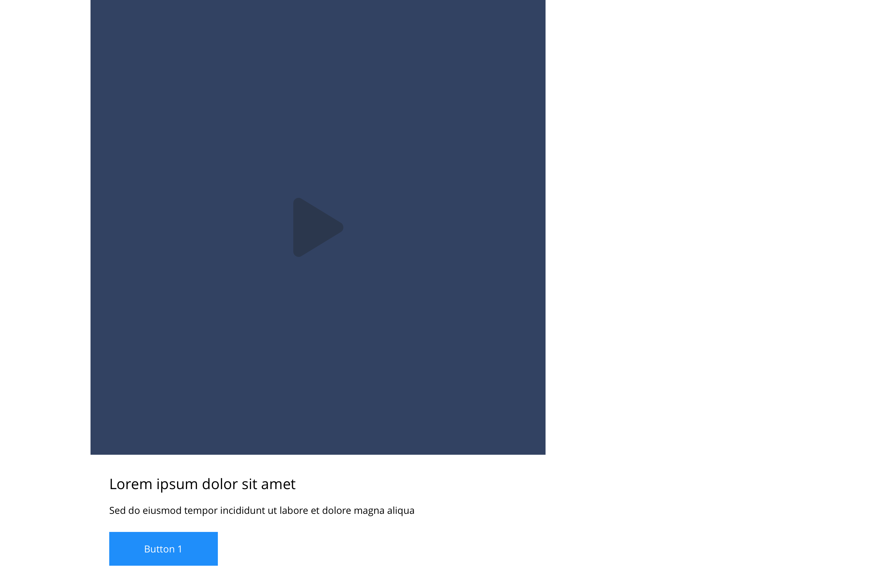
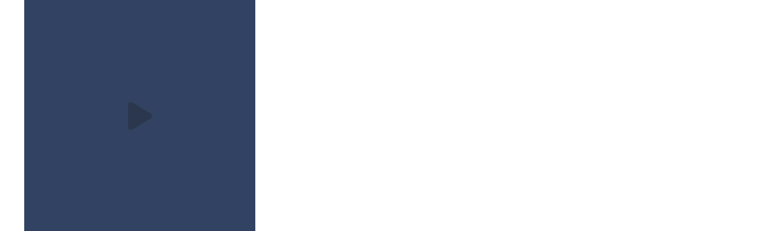
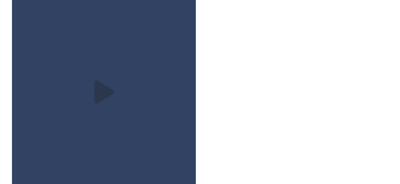
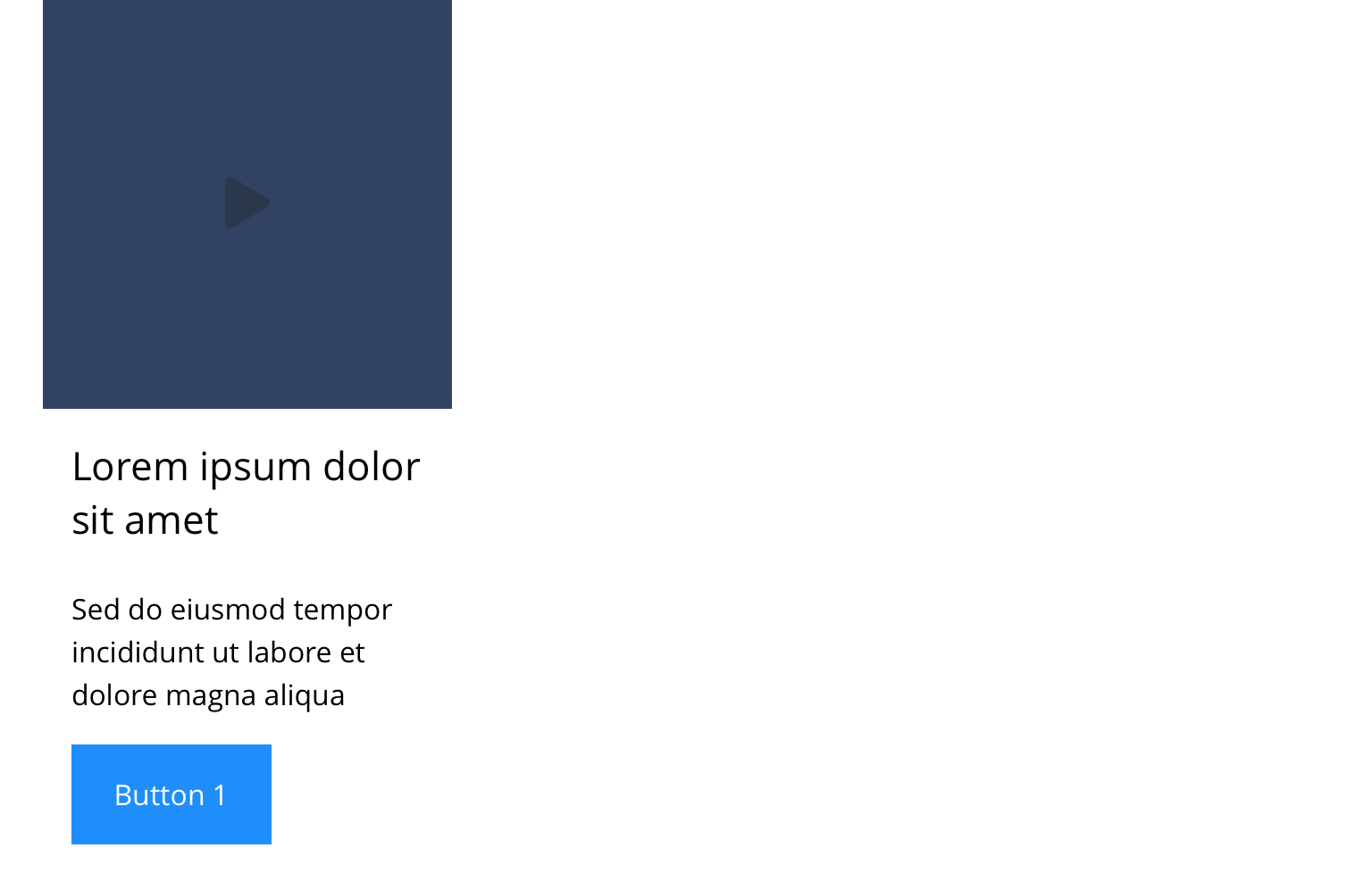
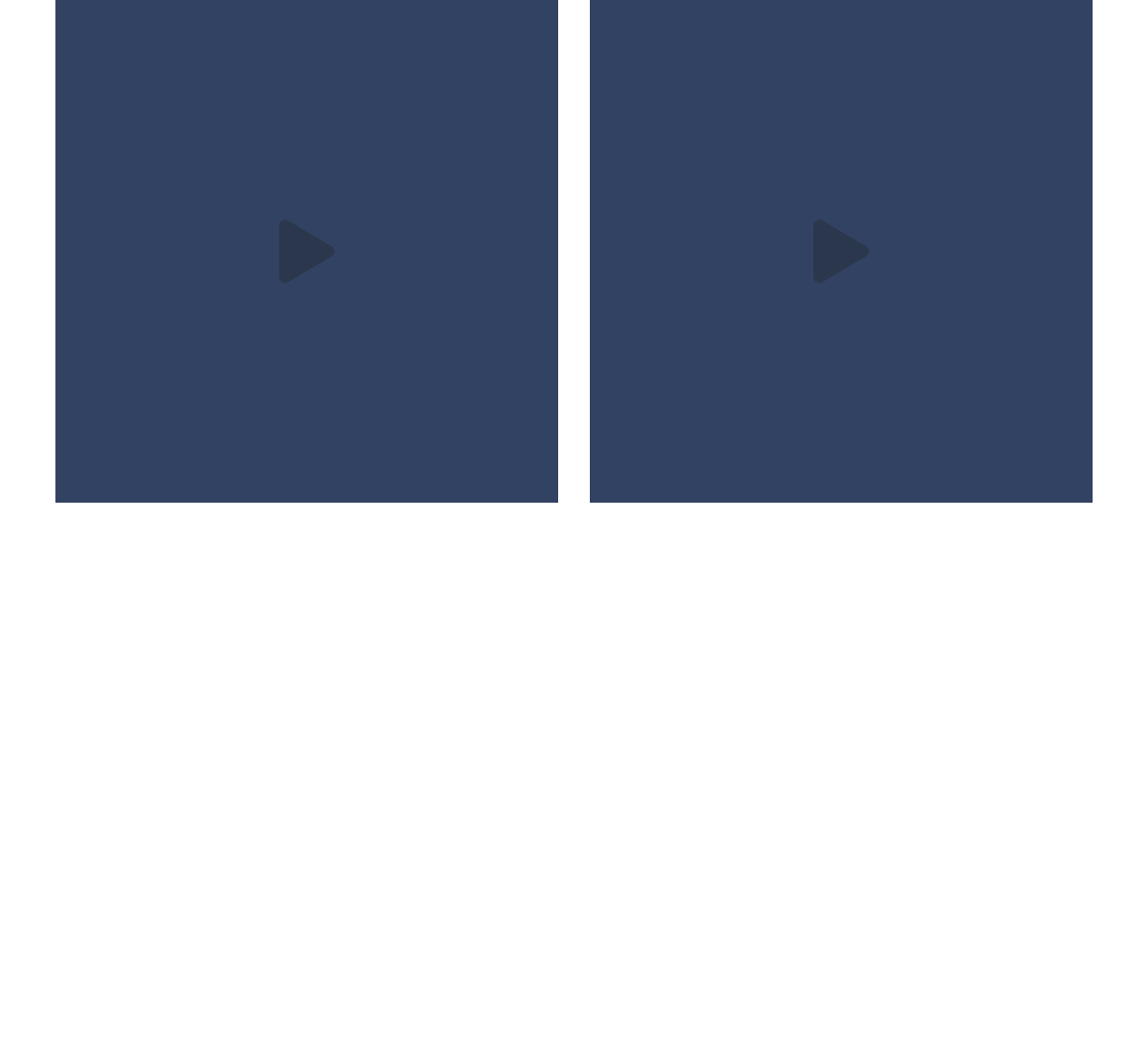
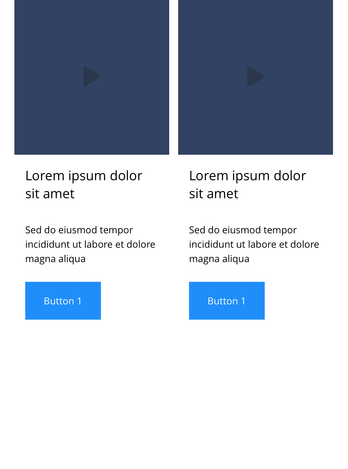
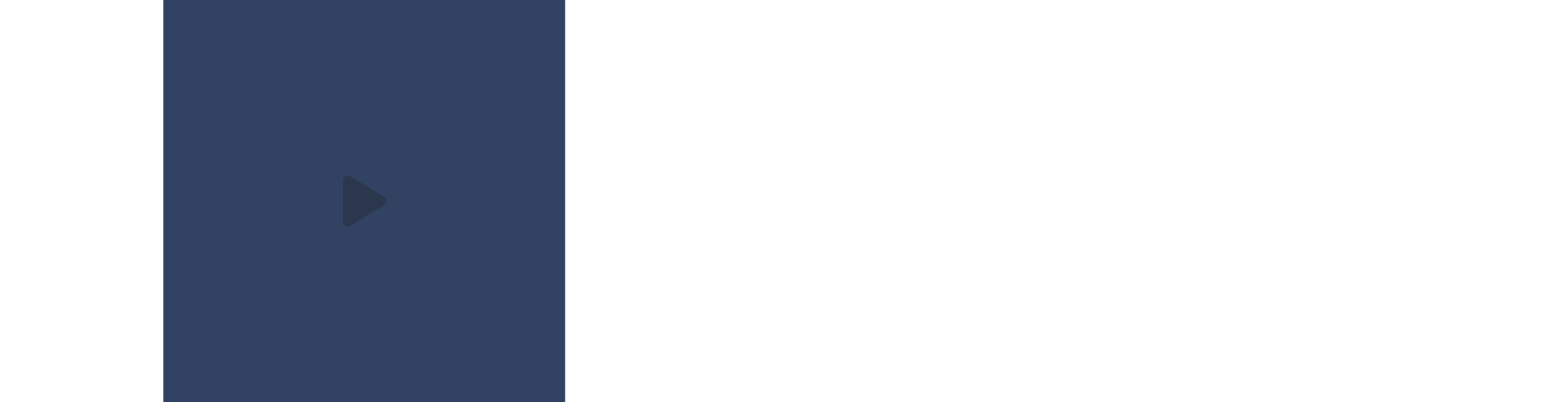
Link - Block 7 - Video
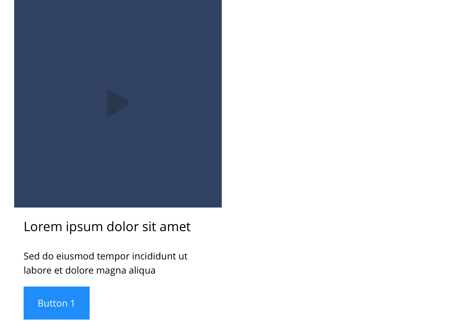
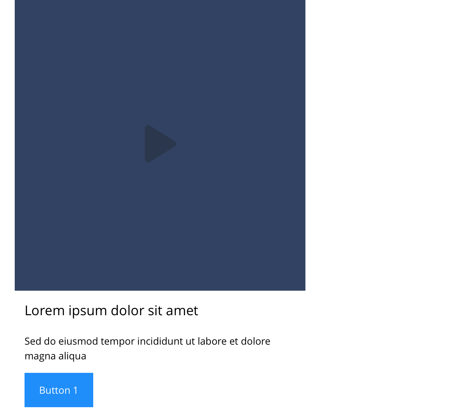
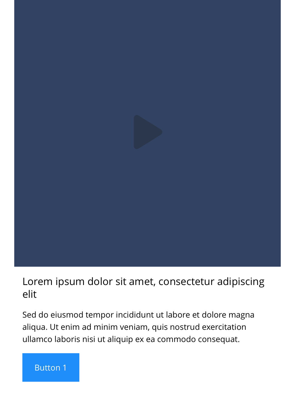
The Link - Block 7 - Video component can span either 1/3, 1/2 or 2/3 of the grid. You can upload a poster image to the block, that when clicked will launch the video in a modal. It can be customised as described in the specification tab below.
You also have the option to add additional text and a link to turn the component into a video card.
- Overview
- Specification
- Style Guide Manager
- Examples in-situ
- Usage


This provides guidance on the build, layout and content options for this component.
Layout specification
| Component item | Requirement & purpose | Optional or mandatory | CMS options |
|---|---|---|---|
| Height | Desktop min - 360px Table min - 240px Mobile min - 220px Height can expand if required. Each block within the container will match the height of the tallest block. | n/a | n/a |
| Modal background colour | Sets the background colour that appears behind the video. | Mandatory | Choose from colour palette. |
| Background colour | Allows user to set a background colour on entire responsive block. | Optional | Choose from colour palette. |
| Content alignment | Controls the alignment of text and call to action in block. | Mandatory | Vertically align top, centre or bottom. Horizontally align left, centre or right. |
| Content alignment mobile | Controls the alignment of text and call to action in block. | Mandatory | Vertically align top, centre or bottom. Horizontally align left, centre or right. |
| Text padding top, bottom, left and right | Allows control of the spacing around the text within this component. | Mandatory | On/off for each individual padding property. The value is set within the SGM. |
| Block width | Block can span 1/3, 1/2, or 2/3 of grid. Content is always full width on mobile. | Mandatory | Desktop: 1/3, 1/2 or 2/3. Tablet: 1/3, 1/2 or 2/3. |
| Drop shadow | Adds a default drop shadow around entire block. Default value - 0 0 13px 0 RGBA (93,113,131,.2). | Optional | On/off. |
| Full border | Allows a full width border to be added to the component. | Optional | On/off. |
| Full border width | Sets the border width. | Optional | Add a px value. |
| Full border colour | Sets the border colour. | Optional | Choose from colour palette. |
| Video type | Sets the process of how the video will display when the play icon has been triggered. | Optional | Modal/Play in place |
| Video URL | Allows user to set a Vimeo or YouTube video URL. | Optional | Video URL input. |
| Poster image | Allows user to set a background image. | Mandatory | Image uploader |
| Lazy Load Video Poster | To improve the performance. | Optional | On/Off |
| Aspect Ratio | Allows user to set aspect ratio for the poster image | 1/1 ,1/2,1/5,2/1,2/3,2/5, 2/7 and many more | |
| Modal link | Entire block is a link. | Mandatory | Set Modal ID for block. |
| PWA | To enable PWA CTA | Optional | Toggle Button |
| Link text | 'Call-to-action' does not render if link text not entered. | Optional | Link text input. |
| Link style | Sets link style (Link should align to bottom of block.) | Optional | Link style select. |
| Button Shapes | Allows user to select various button shapes | Optional | Dropdown |
| Link URL | Sets link on the button. | Optional | Set link URL for button. |
| Target | Sets link to open in the same or a new window. | Mandatory | Target select: Same window or open in new. |
| Margin bottom | Allows control of the spacing below the component. Set globally via the SGM. | Optional | Large, medium, small or none. |
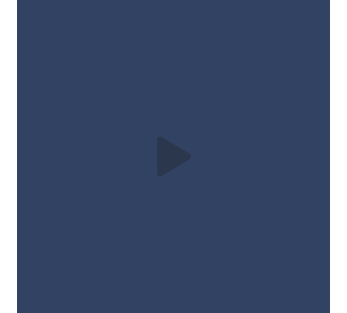
| Play icon | Overlays a play icon horizontally and vertically aligned to the centre. | n/a | n/a |
| Heading text | Sets heading text. | Optional | Text input. |
| Heading element | Sets H2, H3, H4 or H5 on component. | Optional | Select heading element. |
| Heading style | Allows user to choose where more then one type of heading style may be present (i.e. multiple H2's). | Optional | Select heading style. |
| Heading colour | Sets heading colour. | Optional | Choose from colour palette. |
| Paragraph text | Sets paragraph content. | Optional | Text input. |
| Paragraph style | Sets paragraph style. | Optional | Paragraph style select. |
| Paragraph colour | Sets paragraph colour. | Optional | Choose from colour palette. |
| WYSIWYG | Allows user to format text where additional styles may be required. | Optional | WYSIWYG. |
| Aria Label | Use this field to provide a description of the link. This field is used for website accessibility. | Optional | Text field |
Interaction
These are the interactive aspects of the component.
Animate container (To add animation to component)
| Select animation | Allow user to select animation from the drop-down list. | Optional | Select list |
|---|---|---|---|
| Duration | Set how long in seconds the animation will take to run | Required | Numeric Input |
| Delay | Set a start delay on the animation in seconds | Optional | Numeric Input |
| Iteration | Set the number of times the animation should run | Optional | Numeric Input (Maximum two) |
| offset | Set the animation to start at a specific offset before or after the element has entered the view port | Optional | Numeric Input (Pixel) |
| Interaction |
|---|
| On click block opens modal containing video. |
There are no style guide settings for this component.