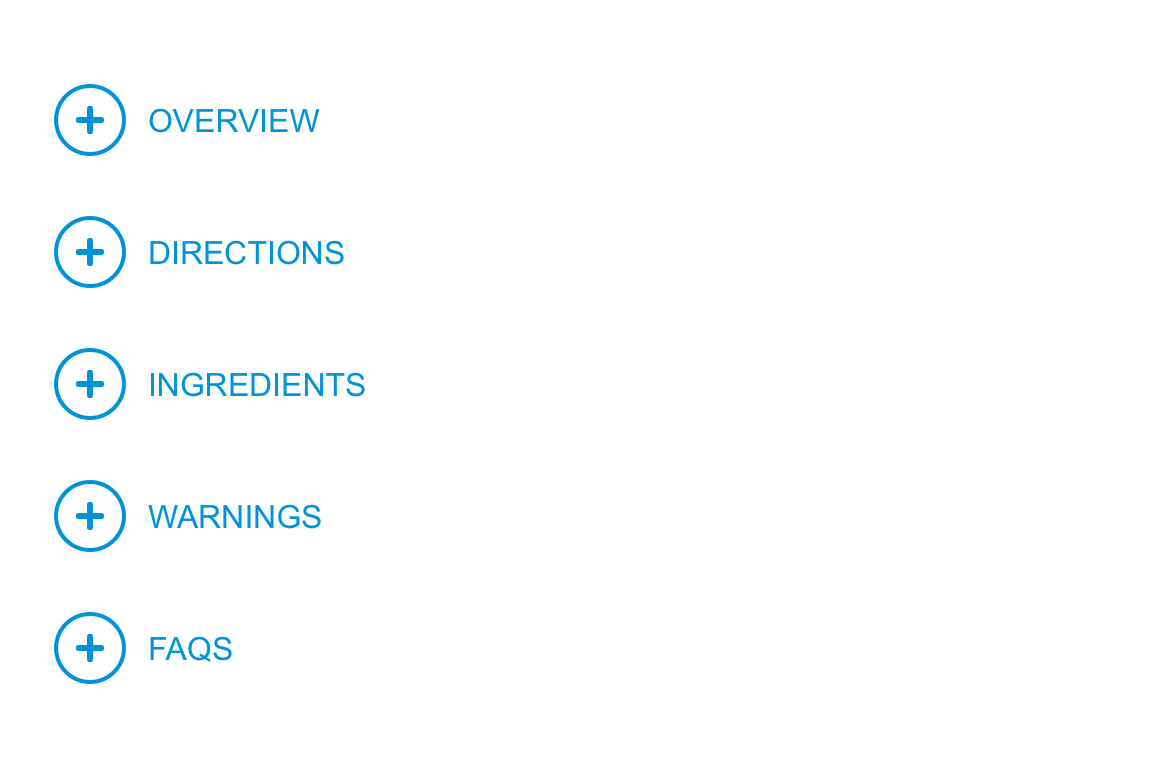
Anchor links
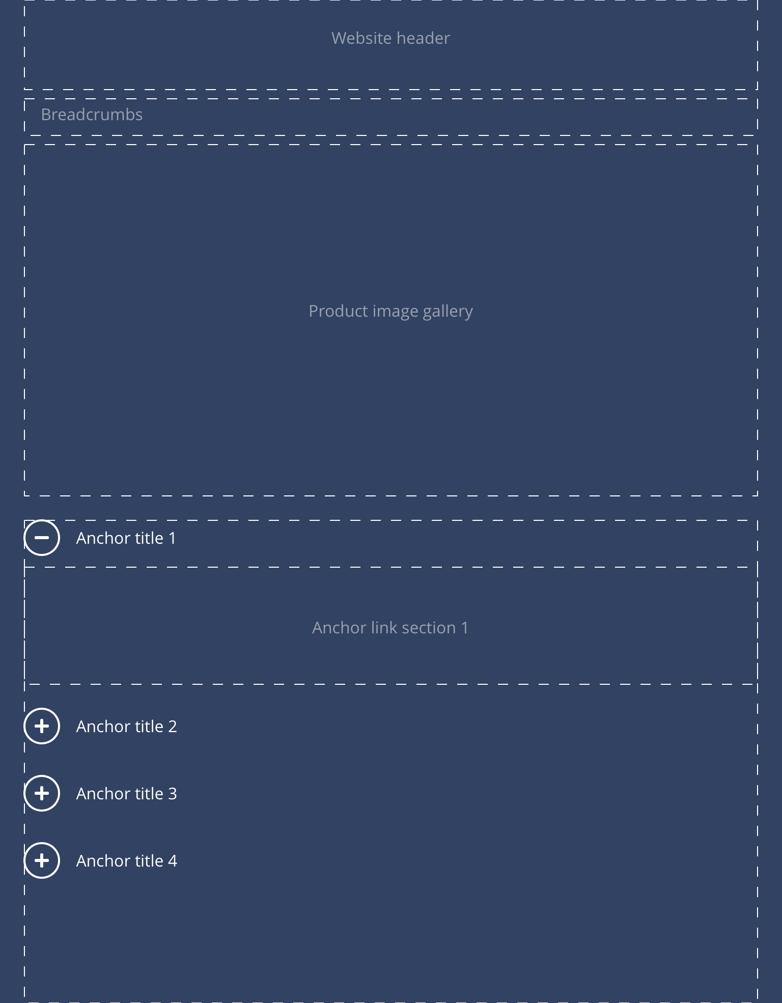
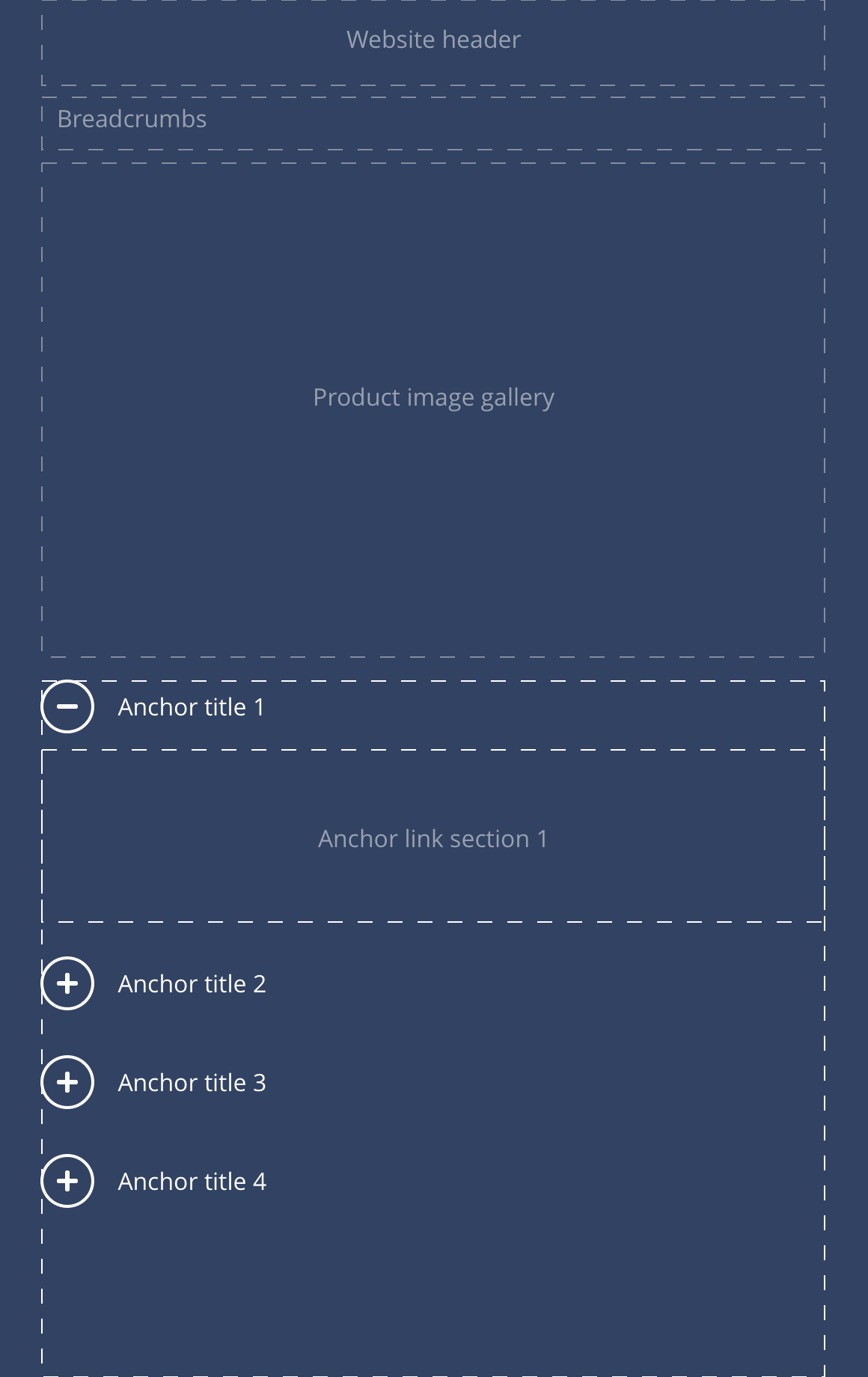
Anchor links are another way to break the delivery into smaller more manageable sections beyond the use of sub-navigation. This features on the Product Detail page and enables users to quickly navigate their way down the page. The mobile function shifts the buttons into an accordion, that reveals content on click.
The Anchor link component should only be used on the Product detail pages. Standard anchor links for other pages can be created within the WYSIWYG.
- Overview
- Specification
- Style Guide Manager
- Example in Situ
- Usage
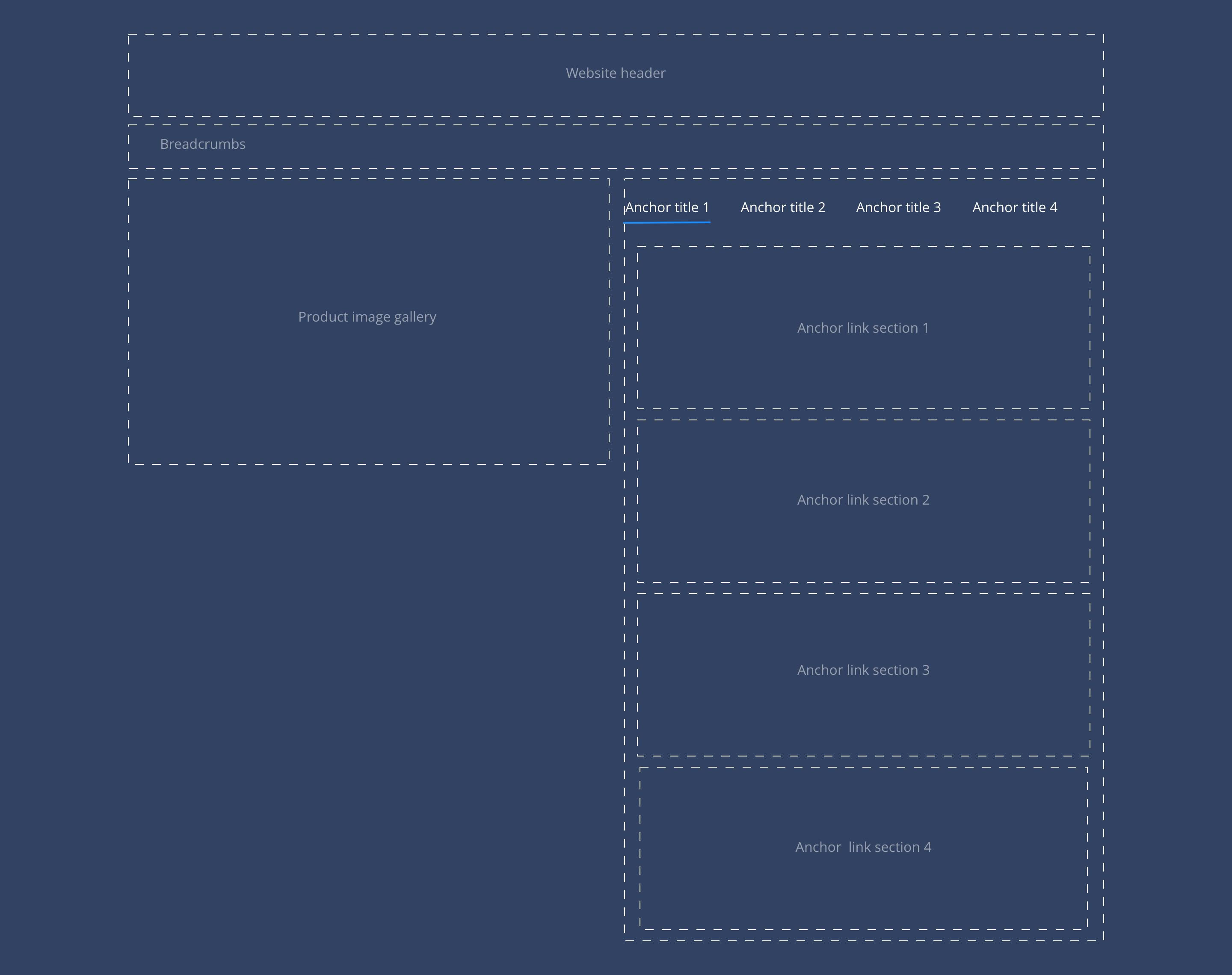
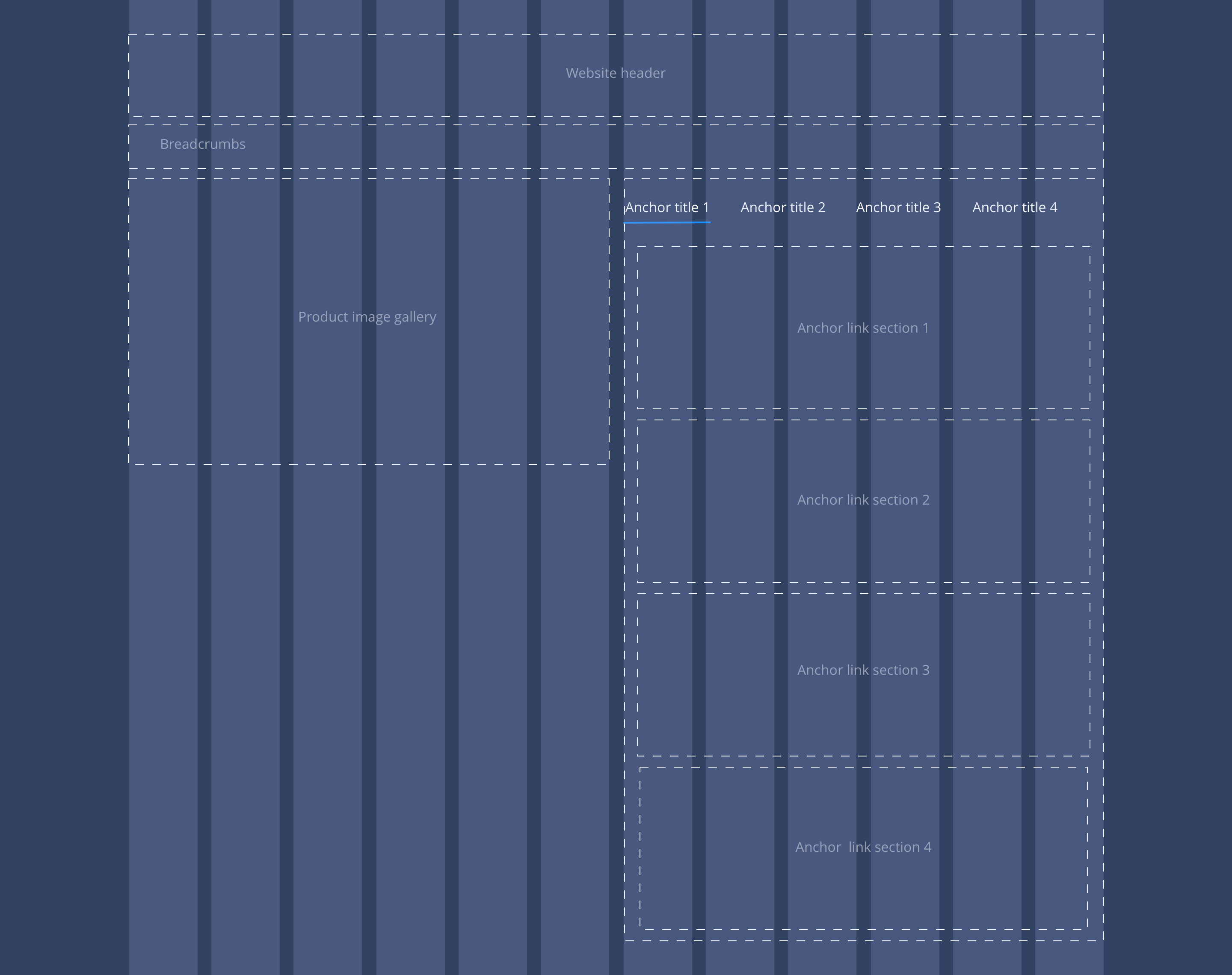 Overview
Example showing Anchor links and Container components in right hand column.
Overview
Example showing Anchor links and Container components in right hand column.
 Desktop
 Tablet
 Mobile
Anchor link container
An anchor link container component can be added to a page with Anchor link content components nested inside them. The Anchor link titles, set within the Anchor link content component, will automatically generate anchor links at the top of the page. This allows users to organise content by sections, where a brand is looking for that content to remain structured for a chapter like delivery.
Layout specification
| Component item | Requirement & purpose | Optional or mandatory | CMS options |
|---|---|---|---|
| n/a | n/a | n/a | n/a |
Anchor link content
Anchor link content components can be added to a page with other components nested inside them. Within the Anchor link content component, users add two titles that are linked to each other. One title displays directly above the content within this component, and the other title displays at the top of the page. The title at the top of the page can be clicked to anchor the user down to the other title featured further down on the page.
| Component item | Requirement & purpose | Optional or mandatory | CMS options |
|---|---|---|---|
| Anchor link title | Sets the anchor link text at the top of the page. | Optional | WYSIWYG. |
| Heading element | Sets H2, H3 or H4 on component. | Optional | Select heading element. |
| Heading colour | Sets the colour of the heading. | Optional | Choose from colour palette. |
| Anchor link content title | Sets anchor link text above the anchor link content. | Mandatory | Text input. |
| Background image | Allows user to set a background image. This is full width and should be set to cover. | Optional | Image uploader. |
| Background image alignment | Allows control of background image alignment. | Optional | Vertically align top, centre or bottom. Horizontally align left, centre or right. |
| Background colour | Allows user to set a background colour on the component. | Optional | Choose from colour palette. |
| Padding left and right | Allows control of the left and right spacing within this component. This can be configured at brand level. | 0px | Choose width within range slider. |
These are the Style Guide Manager settings that are specific to this component. For global settings see the Style Guide Manager section.
| Property | Requirement & purpose | Default | SGM override |
|---|---|---|---|
| Default link title colour | Sets the site wide colour for the anchor link. | Black | Choose from a defined colour palette. |
| Active link title colour | Sets the site wide colour for the anchor link. | Grey | Choose from a defined colour palette. |
| Active link title border bottom colour | Sets the site wide colour for the border bottom of the active anchor link. | Grey | Choose from a defined colour palette. |
| Letter case | Sets the letter case for the anchor links displaying at the top of the page. | Uppercase | Choose from Uppercase or Sentence case. |
| Content divider border | Sets the border on the anchor link content components. | On | On/off. |


General usage dos and don'ts
| ✅ Do's | ❌ Don'ts |
|---|---|
| Ensure the text is legible. | Do not use a background image that makes the text hard to read. |
| The button text should clearly indicate the purpose. Navigation should be accomplished by links. | |
| Use standard HTML anchor links created within the WYSIWYG if anchor links are needed on pages other than the product detail pages. | Don't use the Anchor Link component on pages other than the product detail pages. |