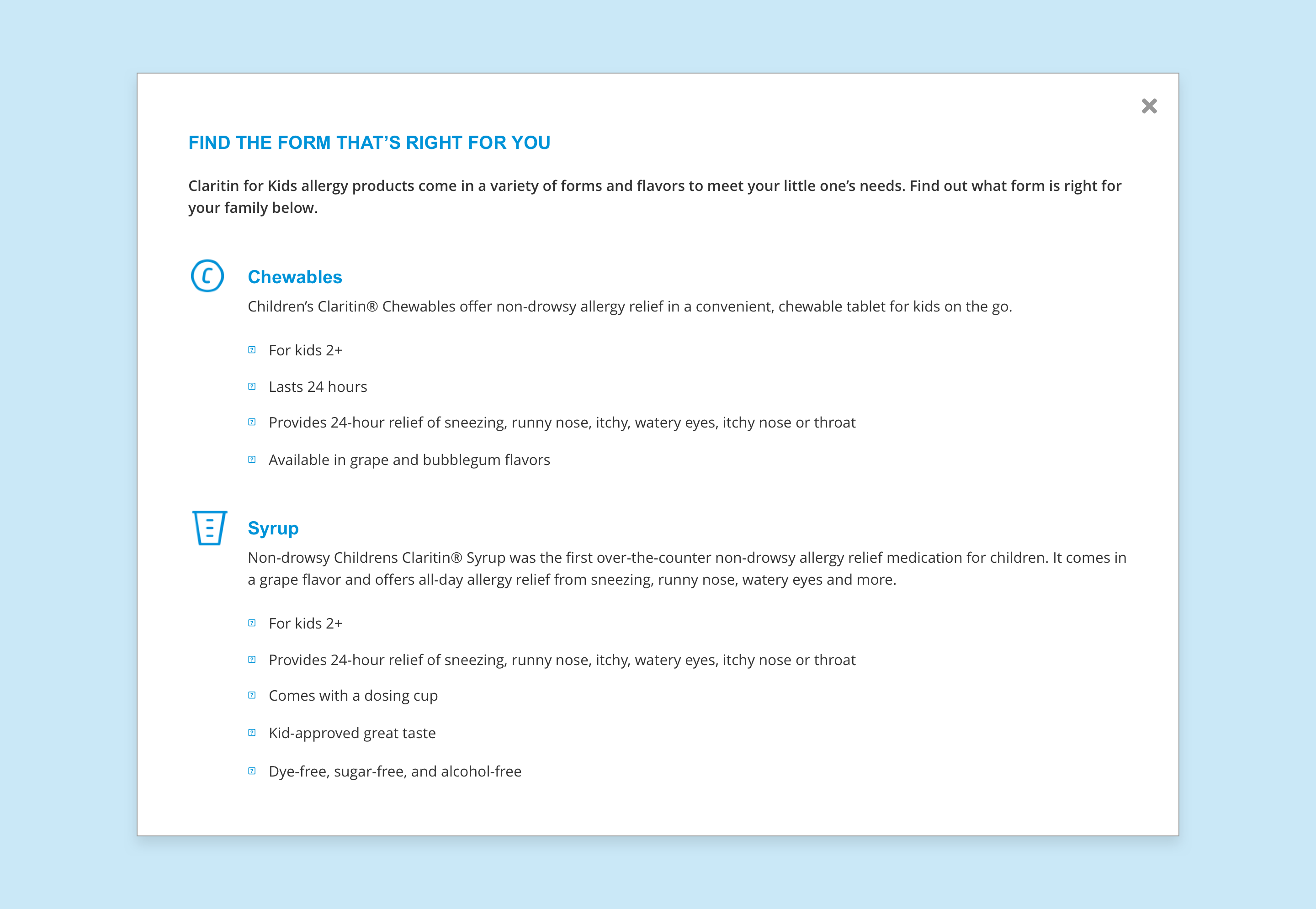
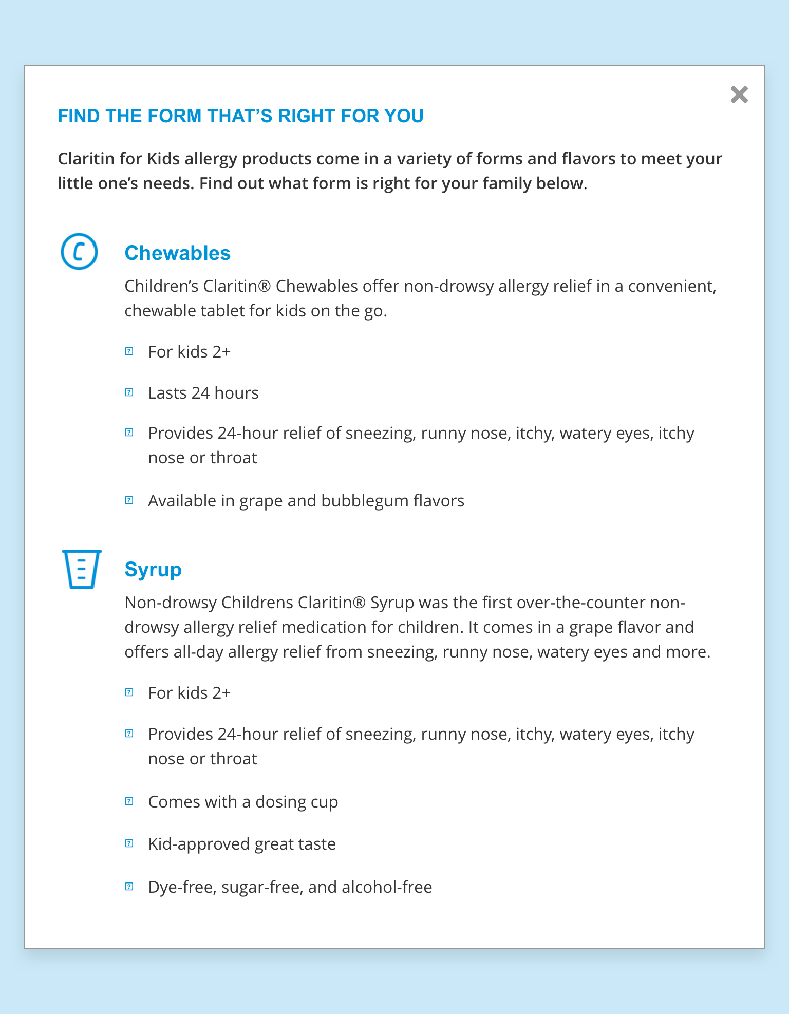
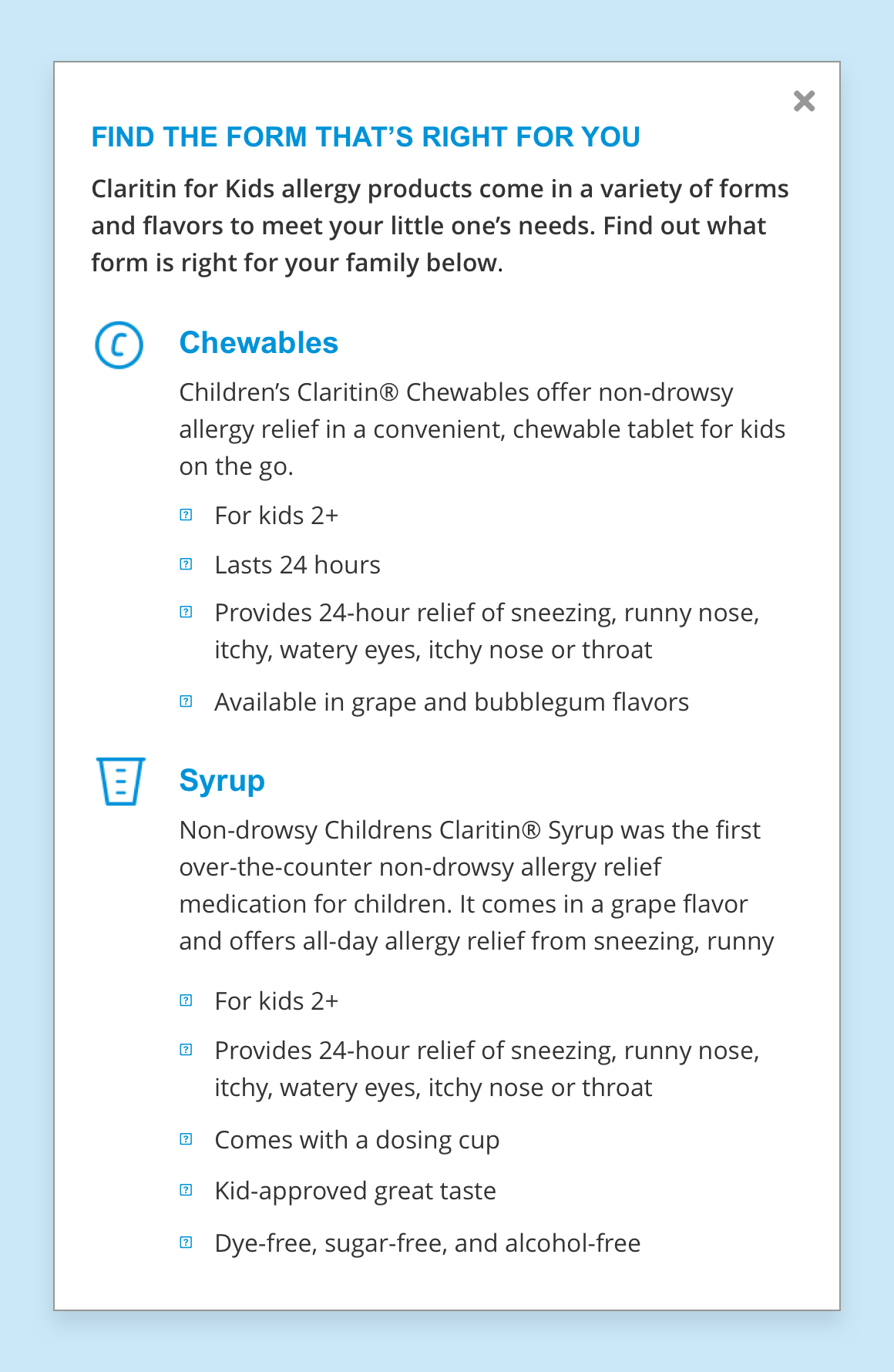
Modal
The Modal component is a customisable light box. When triggered, it will appear over the content on the rest of the page. The modal’s content can contain a combination of other components including; text, imagery, videos and buttons. Interactive elements such as forms, will require development.
- Overview
- Specification
- Style Guide Manager
- Example in Situ
- Usage
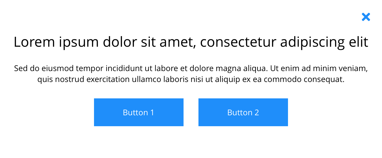
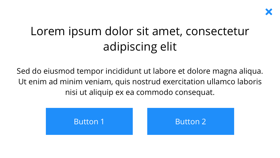
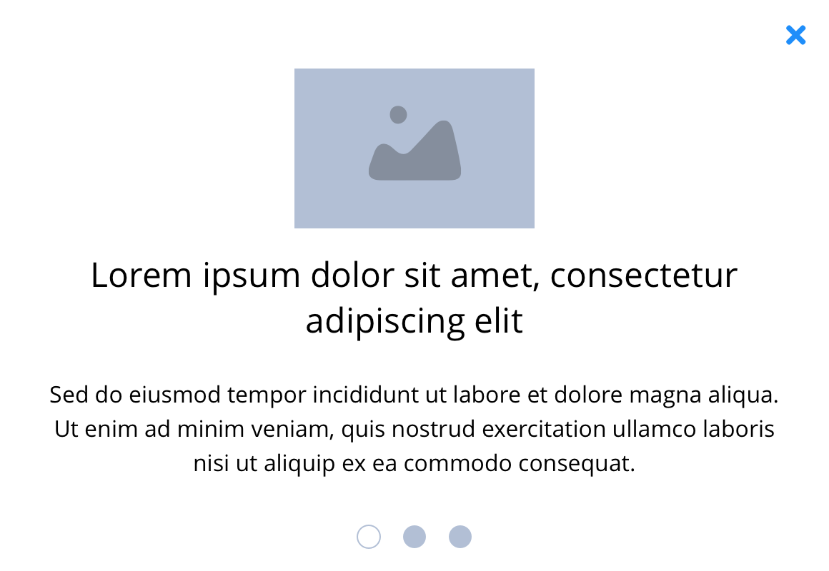
Text & image
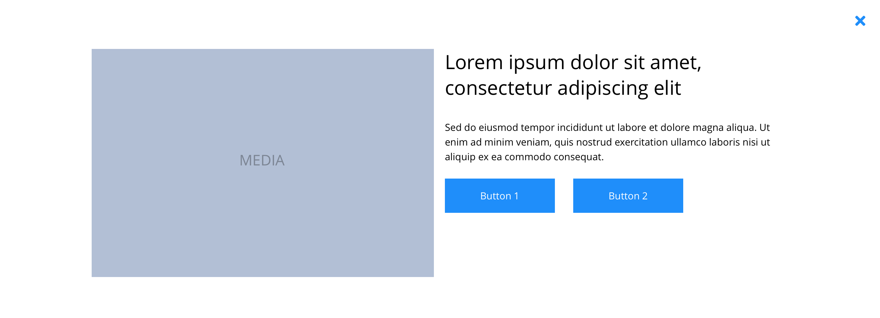 Desktop
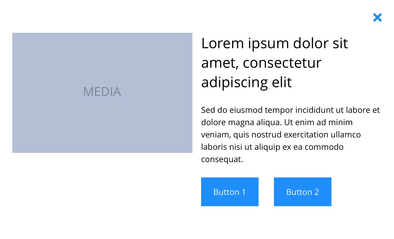 Tablet
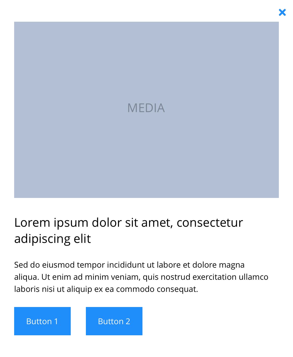 Mobile
Text
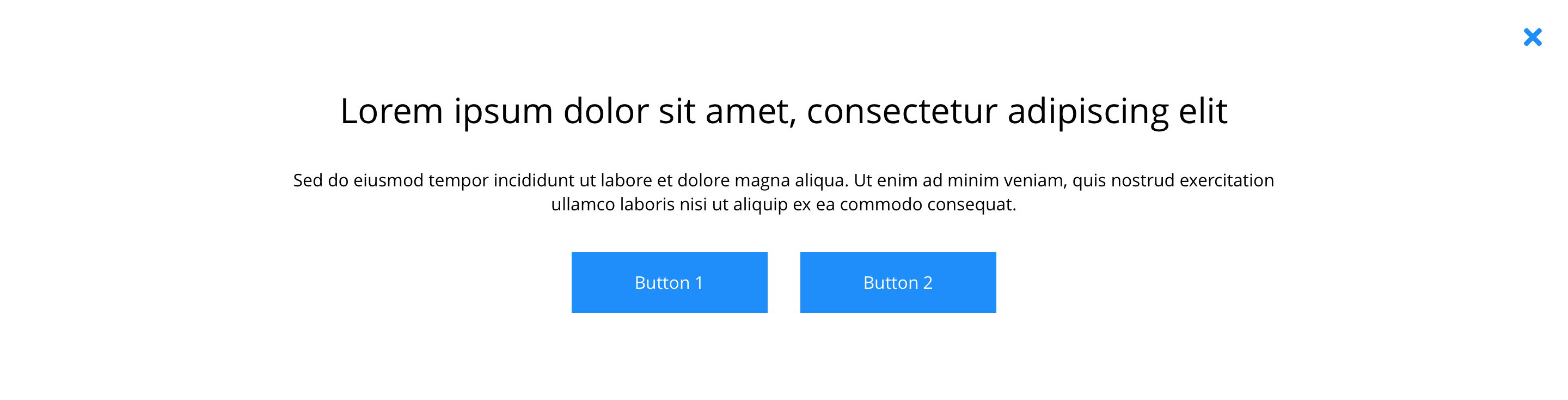 Desktop
 Tablet
 Mobile
Slider
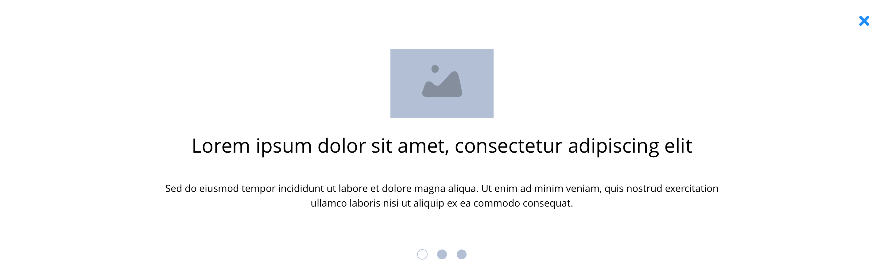 Desktop
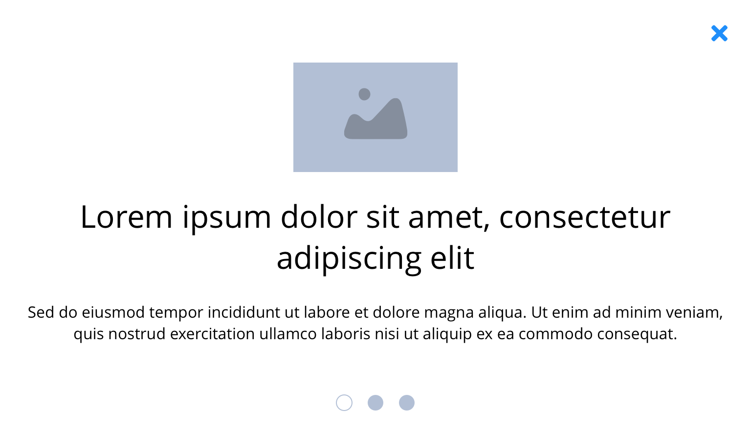 Tablet
 Mobile
Form
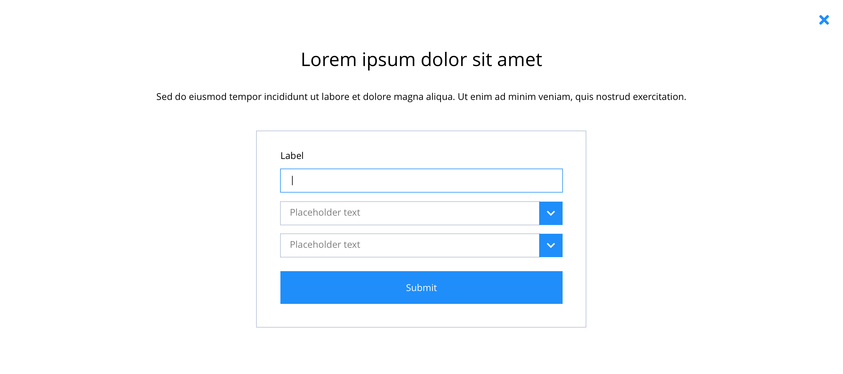 Desktop
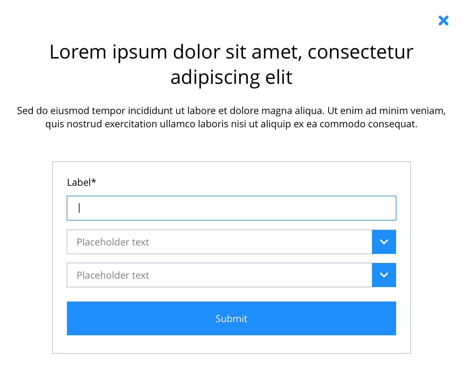 Tablet
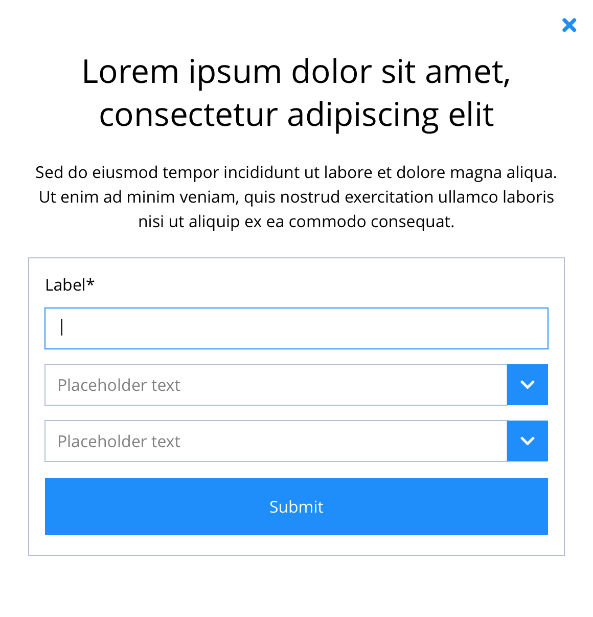 Mobile
Video
 Desktop
 Tablet
 Mobile
This provides guidance on the build, layout and content options for this component.

Layout specification
| Component item | Requirement & purpose | Optional or mandatory | CMS options |
|---|---|---|---|
| Height | Expands based on size of content. | n/a | n/a |
| Width | The modal is full width and the content is contained by the grid width. | n/a | n/a |
| Background colour | Allows user to set a background colour within the modal panel. | Optional | Choose from colour palette. |
| Display border | Allows user to apply a 2px wide border around the modal content. | Optional | Off/on. |
| Border colour | Allows the user to choose the border colour. | Optional | Choose from colour palette. |
| Border Radius | to ser border as rounded corner | Optional | Range slider |
| Modal ID | Allows the user to set an ID for the modal. | Mandatory | Text input. |
| Position | Allows the user to position the modal light box. | Optional | Top left, top centre, top right, centre left, centre, centre right, bottom left, bottom centre or bottom right. |
| Auto open | Allows for the modal to open without a trigger. | Optional | On/off. |
| Delay auto open | Allows the user to set a delay to the auto open. | Optional | Text input (milliseconds). |
| Auto close | Allows the modal to close without a trigger. | Optional | On/off. |
| Show overlay | Allows user to enable/disable modal overlay. | Optional | On/Off |
| Overlay click to close | Allows the modal to close without clicking the close icon. | Option | On/off. |
| Delay auto close | Allows the user to set a delay to the auto close. | Optional | Text input (milliseconds). |
| Show close button | Allows the user to show or hide the close button. | Optional | On/off. |
| Close button text | Sets the button text. | Optional | Text input. |
| Close button position | Allows the user to position the close button. | Optional | Top left, top centre, top right, centre left, centre right, bottom left, bottom centre or bottom right. |
| Overlay color | Allows user to set a colour that overlays the website behind the modal light box. | Optional | Choose from colour palette. |
| Padding | Different padding option for Desktop Tablet and Mobile | Optional | Range Slider |
| Modal width | To set width to different breakpoints Desktop, Tablet, Mobile | Optional | Desktop, Tablet, Mobile |
Interaction
These are the interactive aspects of the component.
| Interaction |
|---|
| Close button closes the modal. |
| Clicking outside of the light box closed the modal. |
| All other interactions defined by components used within modal. |
These are the Style Guide Manager settings that are specific to this component. For global settings see the Style Guide Manager section.
| Property | Requirement & purpose | Default | SGM override |
|---|---|---|---|
| Close icon | Sets the site wide close icon. | FontAwesome f00d | Choose from icon picker. |
| Close icon colour | Sets the site wide close icon colour. | Back | Choose from colour palette. |
| Close icon background colour | Sets the site wide close icon background colour. | White | Choose from colour palette. |
| Close icon font size | Sets the site wide close icon font size. | 16px | Choose size within range slider. |
General usage dos and don'ts
| ✅ Dos | ❌ Don'ts |
|---|---|
| Modal ID must be unique. |