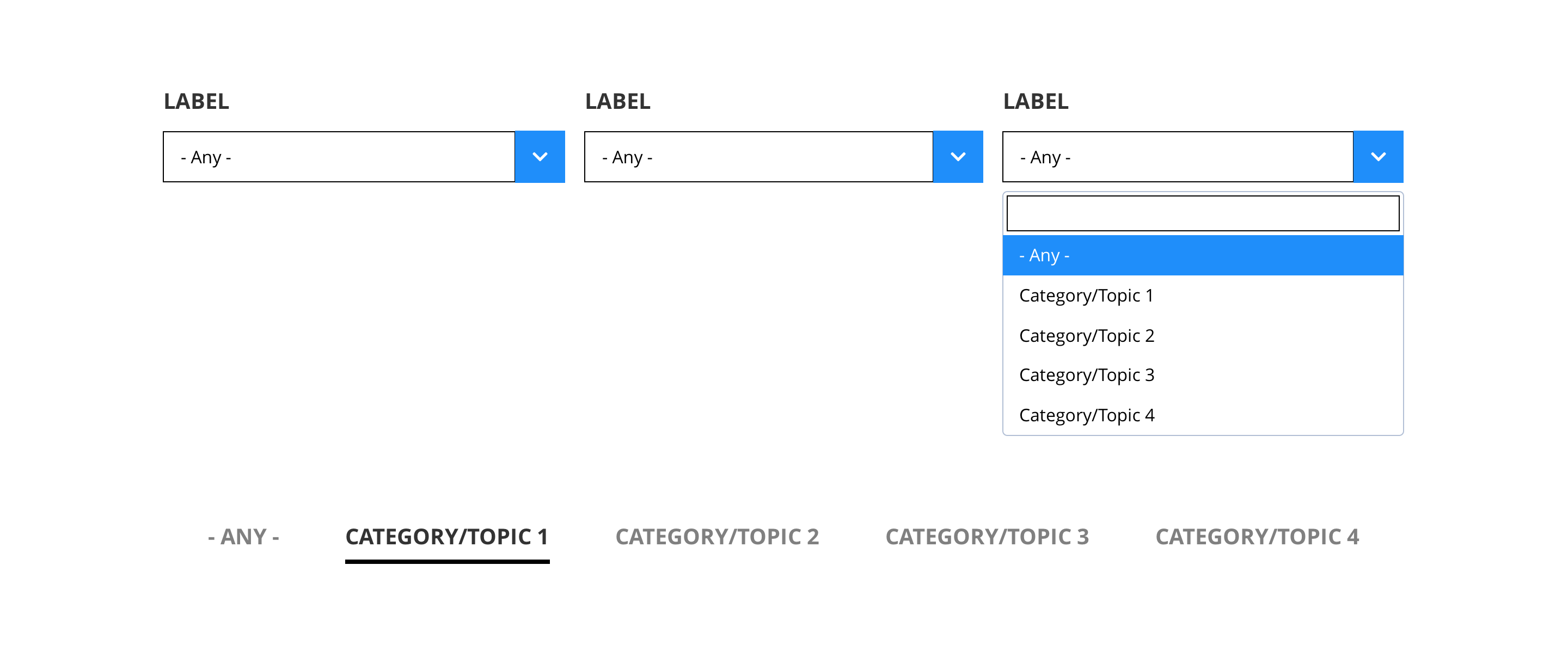
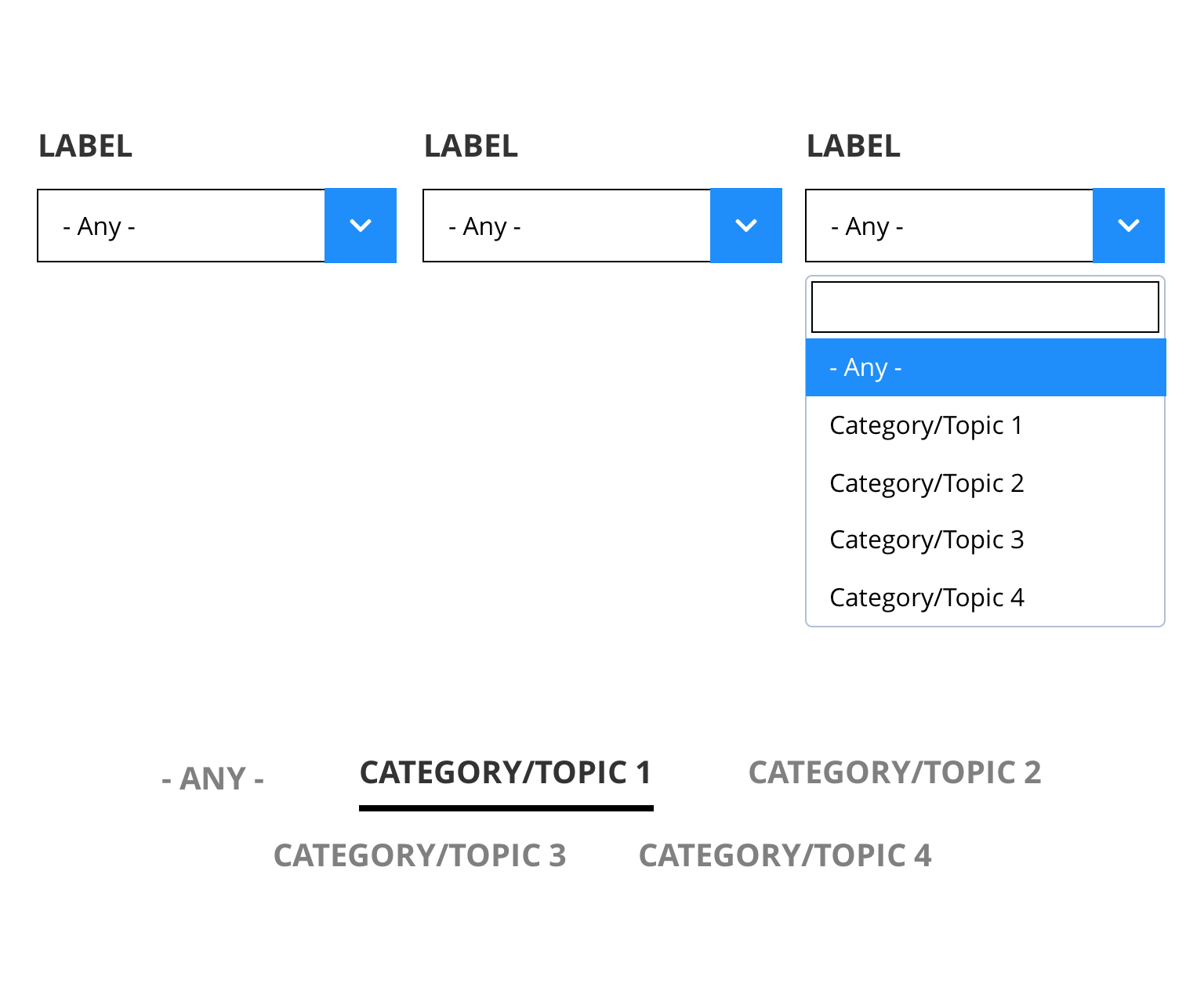
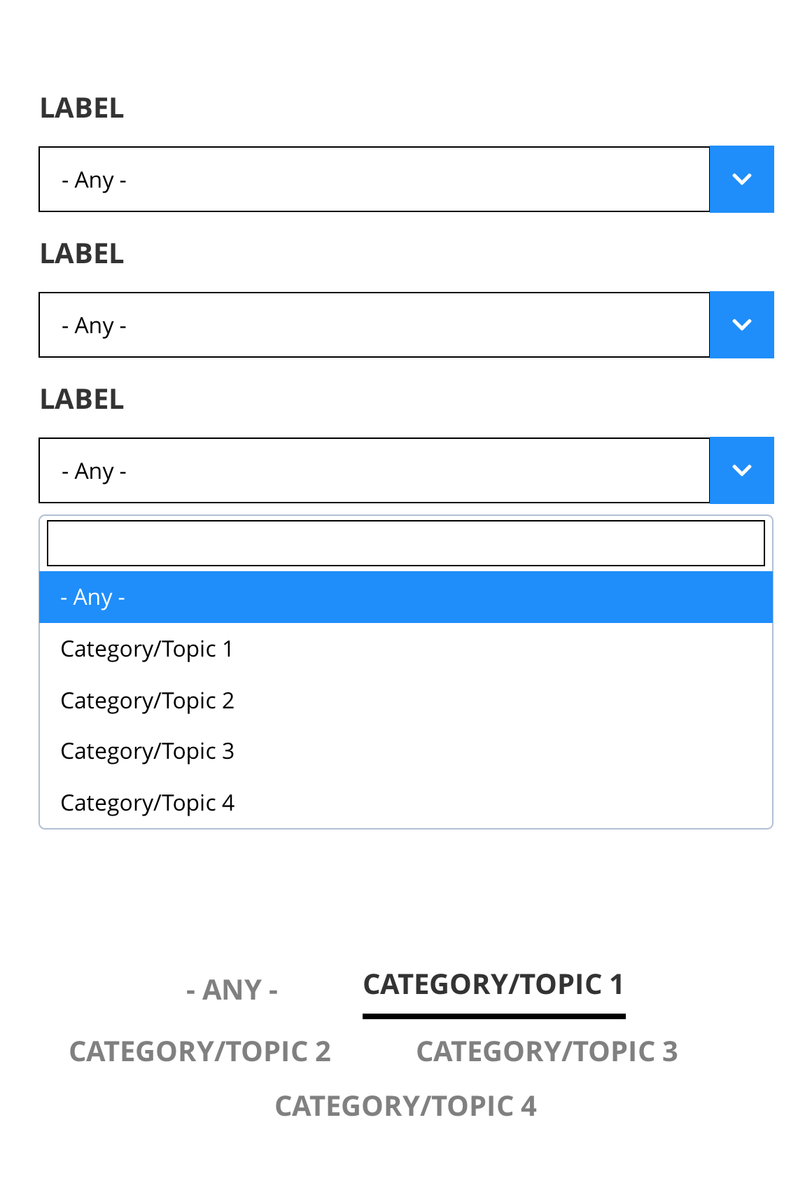
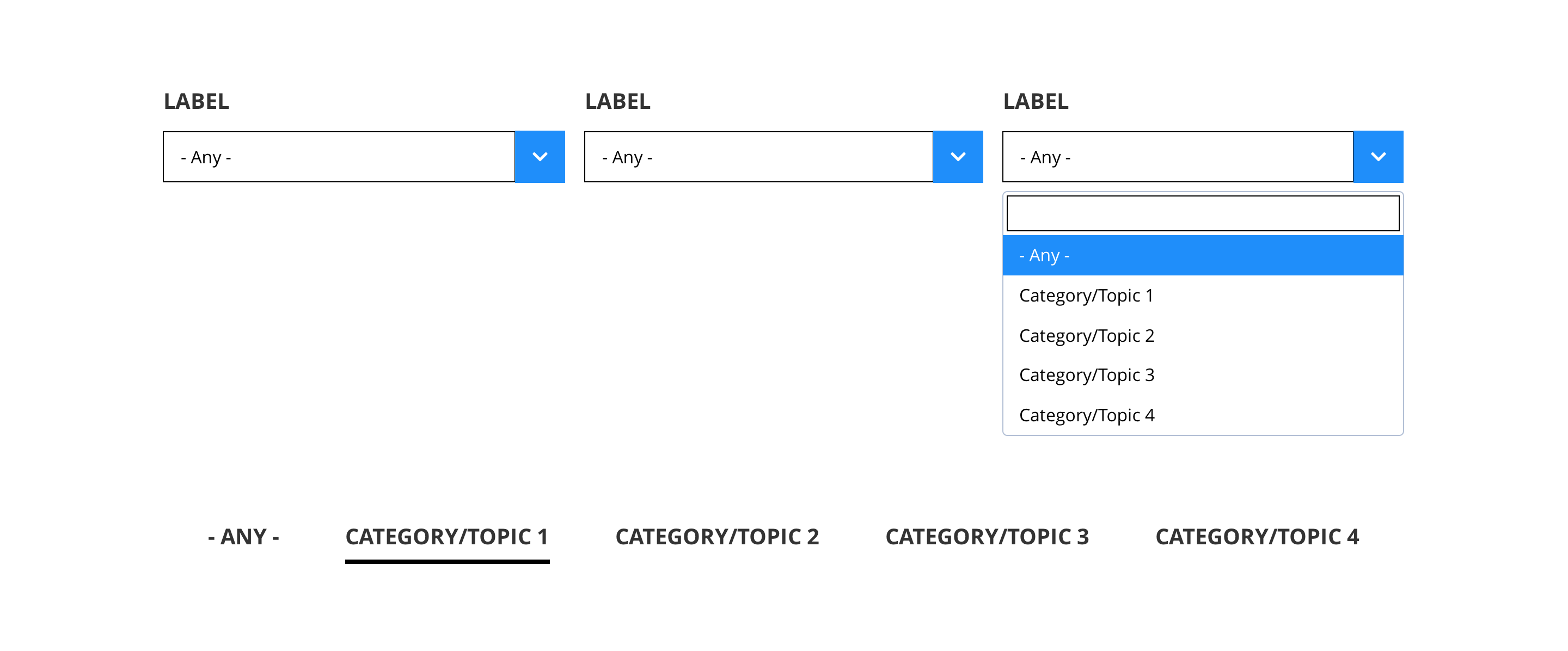
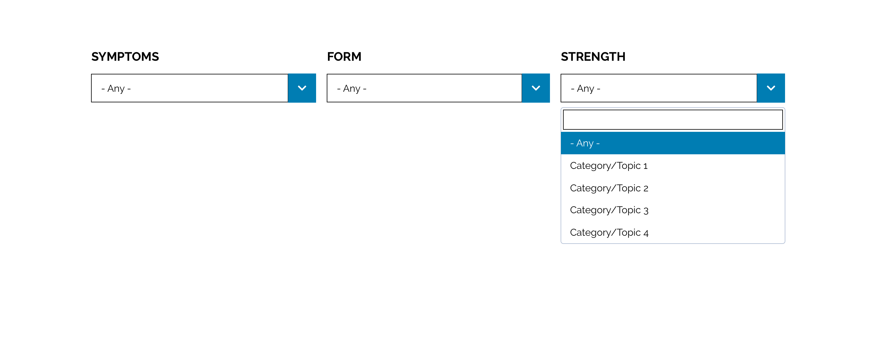
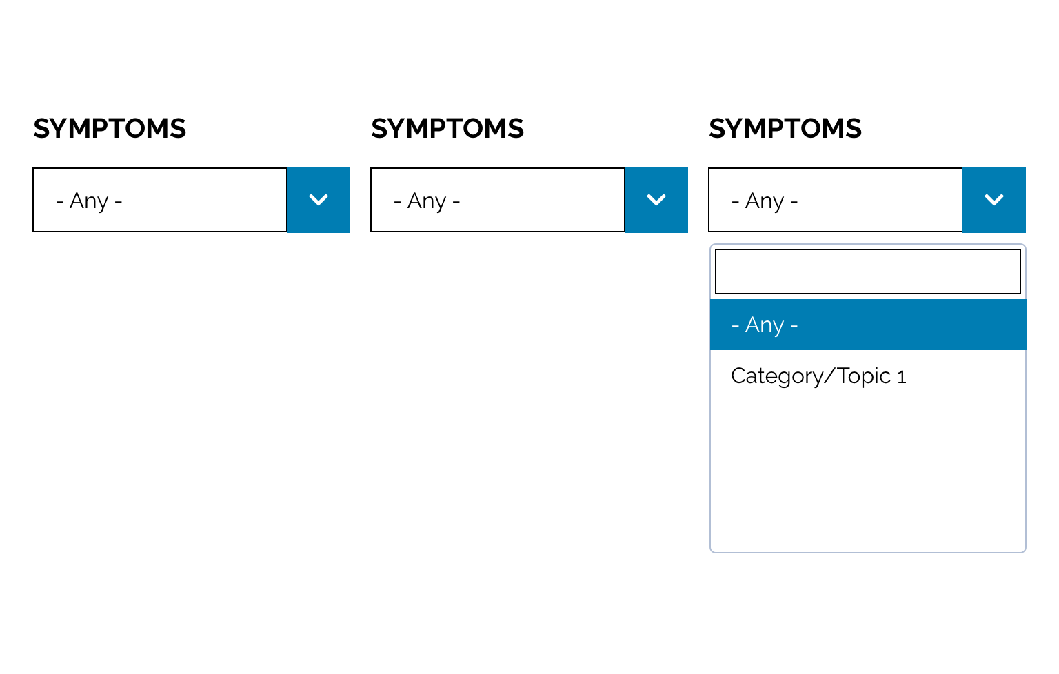
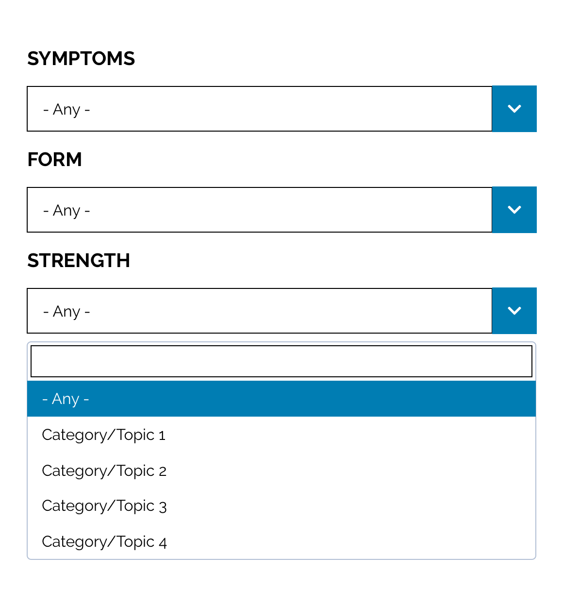
Filters
Filters can be used where there is a need to filter a portfolio of products or articles based on user preference.
There are two types of filters; Drop down selects and Text links. These can be customised as described in the Style Guide Manager tab below.
- Overview
- Specification
- Style Guide Manager
- Examples in-situ
- Usage
| Property | Requirement & purpose | Default | SGM override |
|---|---|---|---|
| Highlight colour | Sets the highlight colour for the filter. | Black | Choose from colour palette. |
| Highlight text and icon colour | Sets the font colour and the icon colour that appears with the highlight colour. | n/a | Choose from colour palette. |
General usage dos and don'ts
| ✅ Dos | ❌ Don'ts |
|---|---|
| Ensure the text is legible. | Do not use a highlight colour that makes the text hard to read. |
| ACCESSIBILITY Drop-downs should be clearly labeled to indicate their purpose. Placeholder text, since it disappears once the user starts typing in the field, is not sufficient to indicate purpose. However labels can be hidden to browsers and still be available to screen readers. |