Tooltips
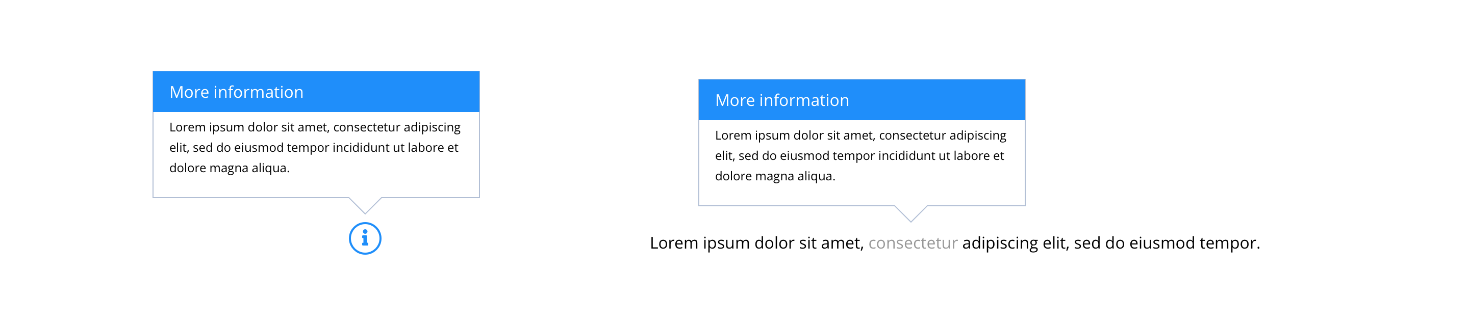
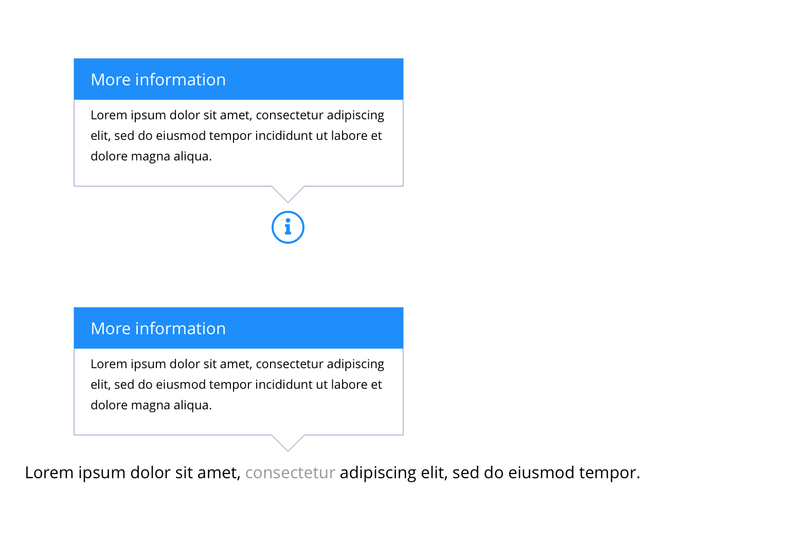
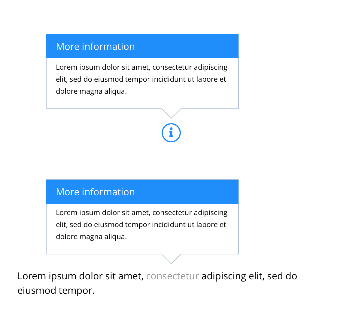
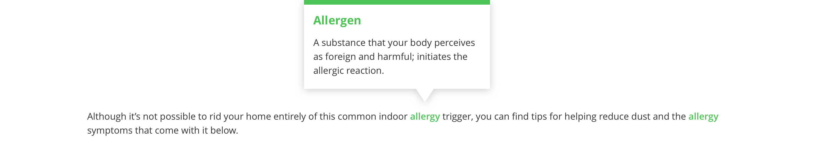
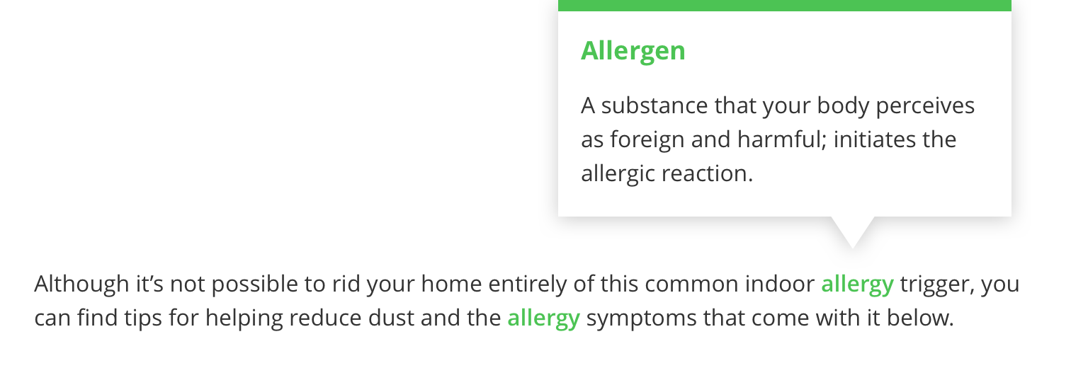
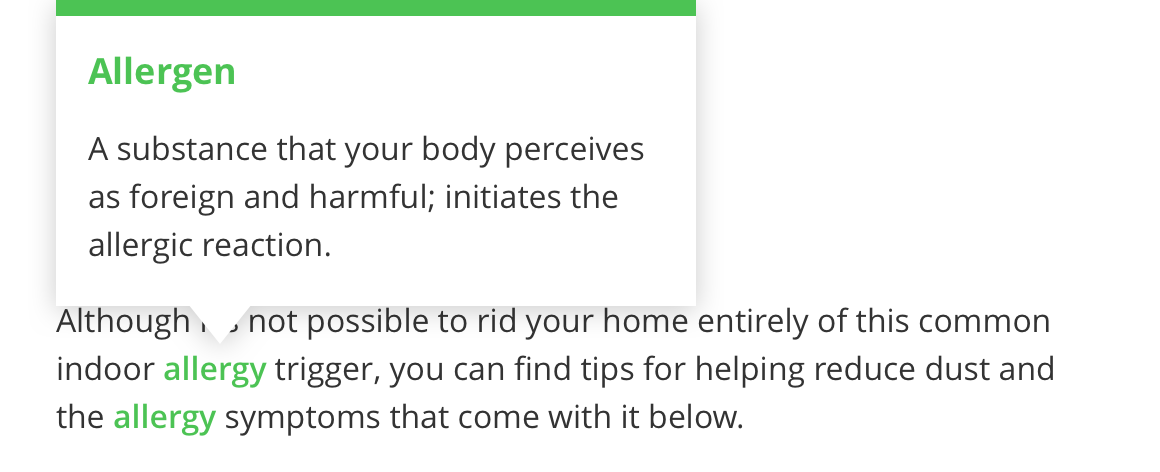
Tooltips contain information defining or explaining the purpose of an element or action. Tooltips should be accessible through all devices and they should be heard in screen readers. An example of use is the Bayer Buy Online function or on form fields that have Legal requirements that need to be made clear to a consumer within the user experience. The function is enabled with the placement of a small question mark icon that opens a dialogue box on click to uncover a brief overview or context.
- Overview
- Specification
- Style Guide Manager
- Examples in-situ
- Usage
Specification
This provides guidance on the build, layout and content options for this component.
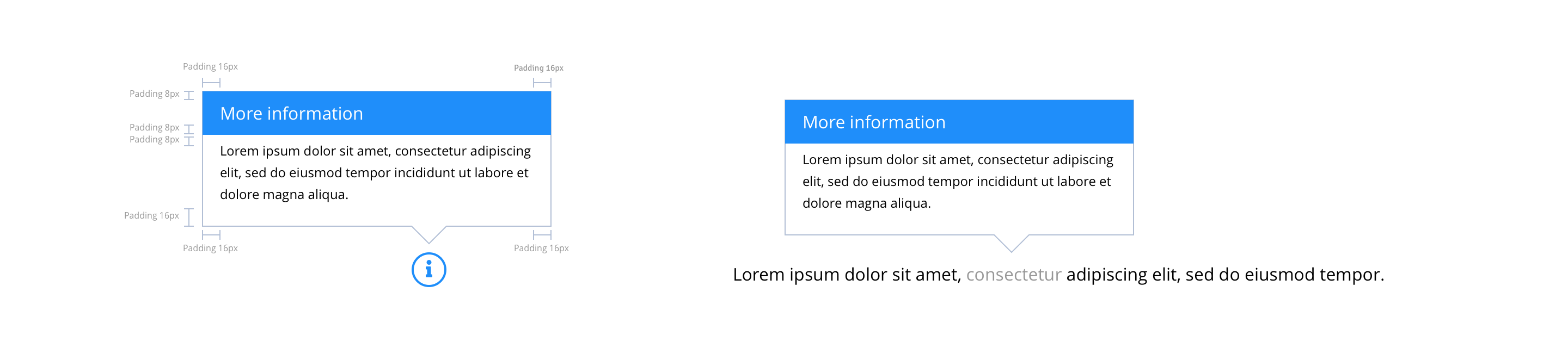
Layout specification
Tooltips can only be configured in the Style Guide Manager.
| Component item | Requirement & purpose | Optional or mandatory | CMS options |
|---|---|---|---|
| n/a | n/a | n/a | n/a |
These are the Style Guide Manager settings that are specific to this component. For global settings see the Style Guide Manager section.
| Property | Requirement & purpose | Default | SGM override |
|---|---|---|---|
| Border top colour | Sets the site wide border top colour. | Black | Choose from colour palette. |
| Close icon | Sets the site wide close icon. | FontAwesome f00d | Choose from icon picker. |
| Close icon colour | Sets the site wide close icon colour. | Black | Choose from colour palette. |
| Close icon font size | Sets the site wide close icon colour. | 20 | Choose size within range slider. |
General usage dos and don'ts
| ✅ Do's | ❌ Don'ts |
|---|---|
| Ensure the text is legible. | Do not use a background image that makes the text hard to read. |
| Tool Tip was developed as a function to provide context to any function of the site that may require additional context that is not part of the content strategy. | |
| It is only recommended where there is additional detail that is needed for the consumer to gain the additional context to inform or complete a task. |