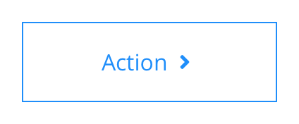
Links and buttons
Links and buttons should only be used for actions and as such the labels should clearly express the desired action. A number of components within the design system feature multiple link and button options for use in your designs.
All links and buttons have active and hover states that can be configured at brand level. The text size of text links and buttons is based on the standard paragraph size.
- Overview
- Specification
- Style Guide Manager
- Example in Situ
- Usage
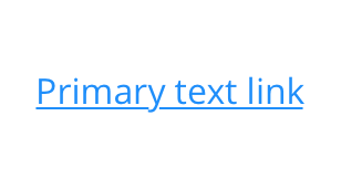
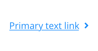
Text Link - 1
 Default
 Hover
Hover
Text Link - 2
 Default
 Hover
Hover
Text Link - 3
 Default
 Hover
Hover
Text Link - 4
 Default
 Hover
Hover
Text Link - 5
 Default
 Hover
Hover
Text Link - 6
 Default
 Hover
Hover
Text Link - 7
 Default
 Hover
Hover
Text Link - 8
 Default
 Hover
Hover
Text Link - 9
 Default
 Hover
Hover
Text Link - 10
 Default
 Hover
Hover
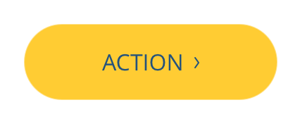
Button Link - 1
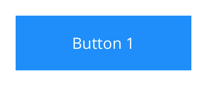 Default
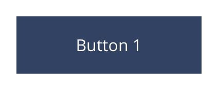 Hover
Hover
Button Link - 2
 Default
 Hover
Hover
Button Link - 3
 Default
 Hover
Hover
Button Link - 4
 Default
 Hover
Hover
Button Link - 5
 Default
 Hover
Hover
Button Link - 6
 Default
 Hover
Hover
Button Link - 7
 Default
 Hover
Hover
Button Link - 8
 Default
 Hover
Hover
Button Link - 9
 Default
 Hover
Hover
Button Link - 10
 Default
 Hover
Hover
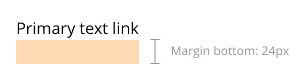
Text Link
 Layout specification
Text links can only be configured in the Style Guide Manager.
| Component item | Requirement & purpose | Optional or mandatory | CMS options |
|---|---|---|---|
| n/a | n/a | n/a | n/a |
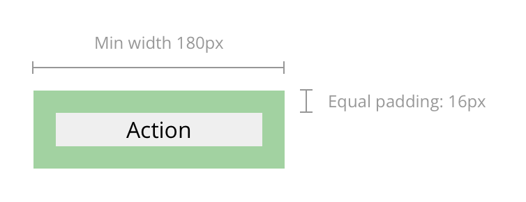
Button
 Layout specification
Buttons can only be configured in the Style Guide Manager.
| Component item | Requirement & purpose | Optional or mandatory | CMS options |
|---|---|---|---|
| n/a | n/a | n/a | n/a |
Interaction
These are the interactive aspects of the text link / button.
| Interaction |
|---|
| Text links and buttons click through to a defined page or launches a modal. |
These are the Style Guide Manager settings that are specific to this component. For global settings see the Style Guide Manager section.
Text links
All text links have the same options.
| Property | Requirement & purpose | Default | SGM override |
|---|---|---|---|
| Font picker | Sets the site wide font for the link. | Open Sans | Choose from font stacks. |
| Font weight | Sets the site wide font weight for the link. Should only be used if a font has been imported. | n/a | Text input (e.g 300, 400, 600) |
| Default font colour | Sets the site wide colour for the link. | Grey | Choose from colour palette. |
| Hover font colour | Sets the site wide hover colour for the link. | Black | Choose from colour palette. |
| Uppercase | Allows user to make links uppercase. | Off | On/off. |
| Icon before | Sets the site wide icon that appears before the link. | n/a | Choose from icon picker. |
| Icon after | Sets the site wide icon that appears after the link. | n/a | Choose from icon picker. |
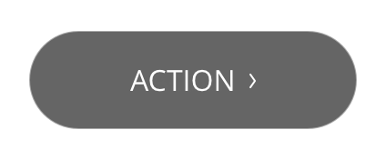
Buttons
All buttons have the same options.
| Property | Requirement & purpose | Default | SGM override |
|---|---|---|---|
| Font picker | Sets the site wide font for the link. | Open Sans | Choose from font stacks. |
| Font weight | Sets the site wide font weight for the link. Should only be used if a font has been imported. | n/a | Text input (e.g 300, 400, 600). |
| Default font colour | Sets the site wide colour for the link. | Grey | Choose from colour palette. |
| Hover font colour | Sets the site wide hover colour for the link. | Black | Choose from colour palette. |
| Uppercase | Allows user to make links uppercase. | Off | On/off. |
| Default background colour | Sets the default site wide background colour for the button. | Black | Choose from colour palette. |
| Hover background colour | Sets the site wide hover background colour for the button. | Grey | Choose from colour palette. |
| Border width | Sets the site wide border width for the button. | n/a | Choose width within range slider. |
| Default border colour | Sets the default site wide border colour for the button. | n/a | Choose from colour palette. |
| Hover border colour | Sets the site wide hover border colour for the button. | n/a | Choose from colour palette. |
| Border radius | Sets the site wide border radius for the button. | n/a | Text input (e.g 8px). |
| Padding top and bottom | Sets the site wide padding top and bottom for the button. | 16px | Choose padding within range slider. |
| Padding left and right | Sets the site wide padding left and right for the button. | 16px | Choose padding within range slider. |
| Minimum width | Sets the site wide minimum width for the button. | Desktop - 180px Tablet - 80px Mobile - 60px | Choose width within range slider. |
| Icon before | Sets the site wide icon that appears before the link. | n/a | Choose from icon picker. |
| Icon after | Sets the site wide icon that appears after the link. | n/a | Choose from icon picker. |
Text link
 Claritin
 Claritin - Hover
Button
 Aleve
Aleve
 Aleve - Hover
 Alka-Seltzer
 Alka-Seltzer - Hover
 Claritin
 Claritin - Hover
General usage dos and don'ts
| ✅ Do's | ❌ Don'ts |
|---|---|
| Buttons should be created using the fields as specified in the component and not the WYSIWYG. Adding buttons within the WYSIWYG only allows for limited styling and doesn't enable you to replace icons. | |
| Ensure the text is legible. | Do not use a background image that makes the text hard to read. |
| The button text should clearly indicate the | |
| Be sure to create a colour strategy that clearly defines colour(s) that can be used for all actionable items. |