Floating action buttons
Floating action buttons should be used sparingly and should be reserved for brand alerts or attributes that are required for context to inform customer experience.
- Overview
- Specification
- Style Guide Manager
- Examples in-situ
- Usage
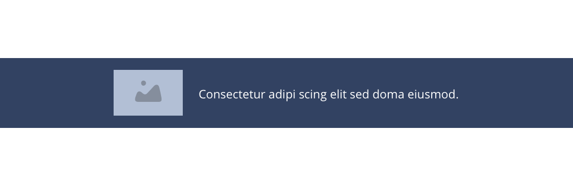
Floating button
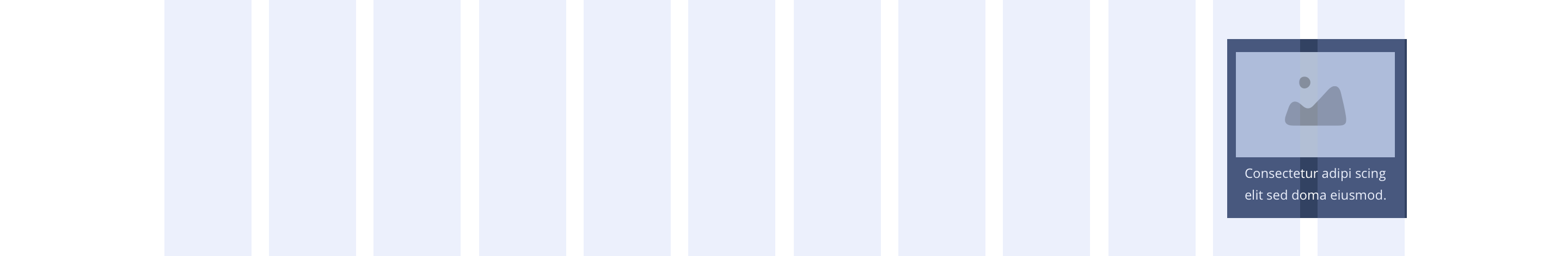
Overview Example showing Right floating action button
Full-width

Overview Example showing Right floating action button

Desktop

Tablet
Mobile
Right floating
Layout specification
| Component item | Requirement & purpose | Optional or mandatory | CMS options |
|---|---|---|---|
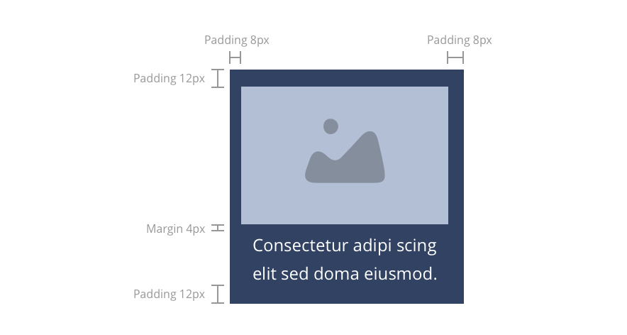
| Padding top, bottom, left and right | Is the default padding within the button. Top - 12px Bottom - 12px Left - 8px Right - 8px | n/a | n/a |
| Link URL | Allows user to link to a URL. | Mandatory | Text input. |
| Link text | Sets text for the button. | Mandatory | Text input. |
| WYSIWYG | Allows the user to add text to the floating action button. | Mandatory | Text input. |
| Image | Allows the user to upload an image to the floating action button. | Mandatory | Image uploader. |
These are the Style Guide Manager settings that are specific to this component. For global settings see the Style Guide Manager section.
| Property | Requirement & purpose | SGM override |
|---|---|---|
| Background colour | Allows user to change the background colour on the button. | Choose from colour palette. |
| Text colour | Allows user to change the text colour on the button. | Choose from colour palette. |
| Border radius | Allows the user to change the border radius on the button. | Text input. |
| Positioning | Allows the user to move the button away from the browser edge. | Choose offset within range slider. |
| Text and image ordering | Allows the user to choose if the image should be displayed above the text or to the left of the text. | Image above/image left. |
| Width | Sets the desktop width of the button. Button is full width on tablet and mobile breakpoints. | Choose width within range slider. |
| Height | Sets the height of the button. | Choose height within range slider. |
Desktop
General usage dos and don'ts
| ✅ Do's | ❌ Don'ts |
|---|---|
| Ensure the text is legible. | Do not use a background image that makes the text hard to read. |
| The button text should clearly indicate the purpose. | |