Tables
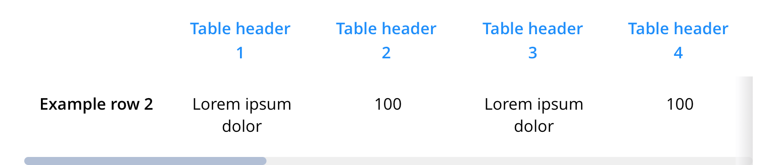
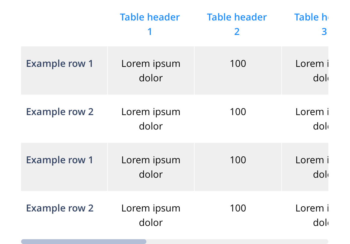
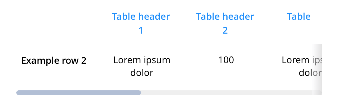
Tables are used to allow the user to quickly contrast and/or compare information. By default, tables will not reorder columns and rows in mobile. The table will scroll. Where required, fully responsive tables will need additional development per table.
- Overview
- Specification
- Style Guide Manager
- Examples in-situ
- Usage

Specification
This provides guidance on the build, layout and content options for this component.
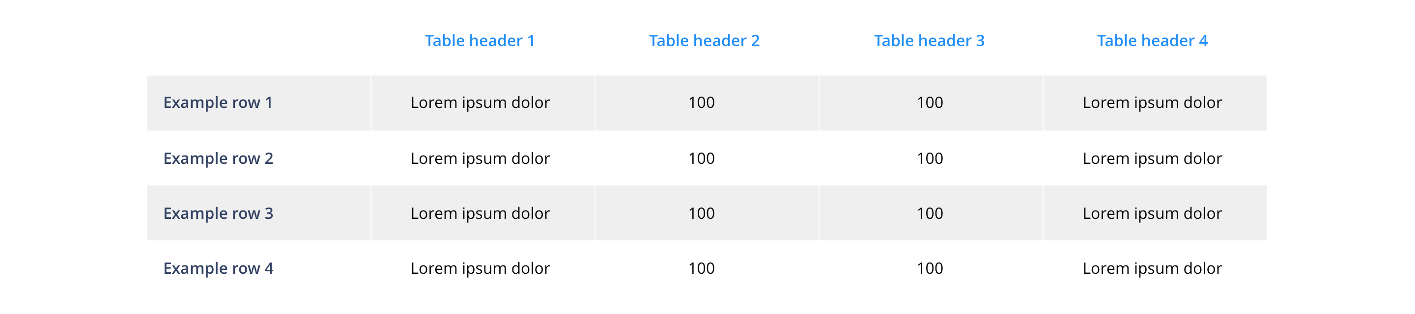
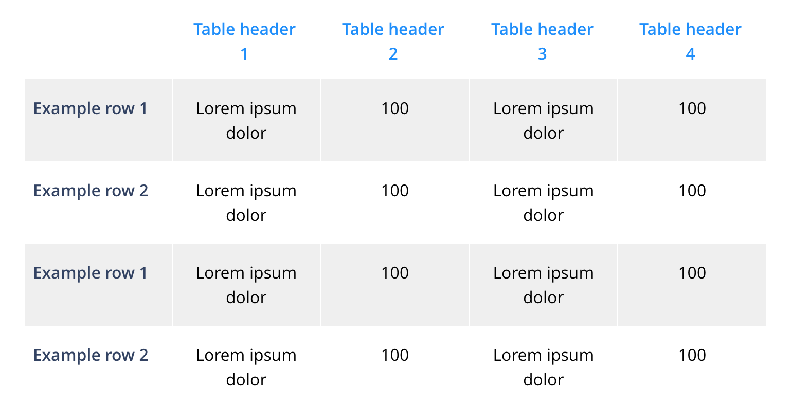
Layout specification
Table styling
Basic table styling is offered in the Style Guide Manager. All advanced formats and layout should be configured inline in the WYSIWYG.
The table should always be wrapped in <div class="table-container"> in order for all the styling to pull through. In this div you can also add the following classes to change the alignment of all the content within the table:
text-align-left
text-align-center
text-align-right
You can also apply styling that will freeze the header and add a drop shadow/shade to provide a visual queue, to add this you need to add the following class to the table container div:
freeze-header
Images in tables
Images added to tables will always be centrally aligned. Images added in the table head will appear as actual size, and images in the table body are restricted to 20 x 20px.
Interaction
These are the interactive aspects of the component.
| Interaction |
|---|
| None. |
These are the Style Guide Manager settings that are specific to this component. For global settings see the Style Guide Manager section.
| Property | Requirement & purpose | Default | SGM override |
|---|---|---|---|
| Table heading colour | Sets the site wide table heading colour. | Black | Choose from colour palette. |
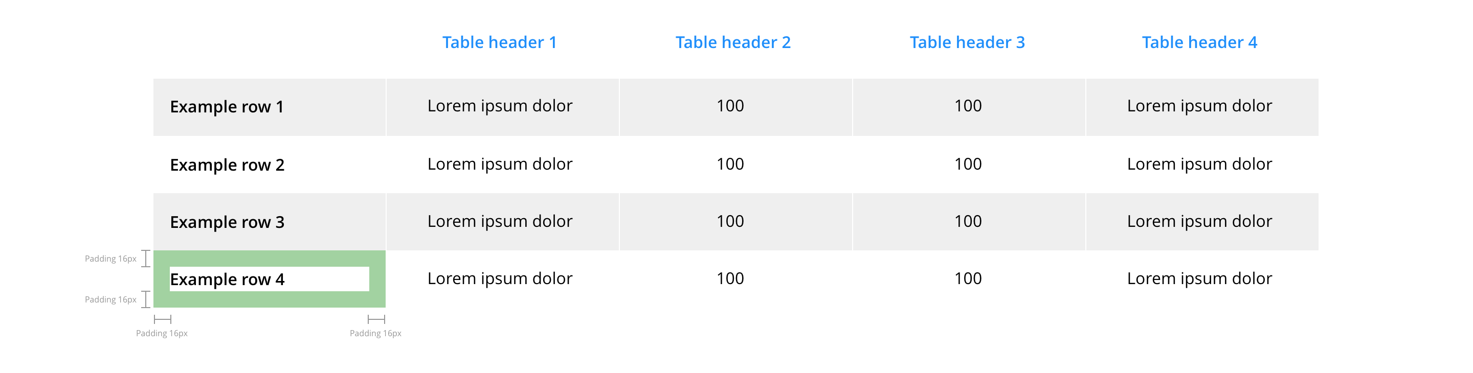
| Table heading padding | Sets the site wide table heading padding. | 24px | Choose size within range slider. |
| Table cell padding | Sets the site wide table cell padding. | 16px | Choose size within range slider. |
| Odd row background colour | Sets the site wide odd row background colour. | White | Choose from colour palette. |
| Even row background colour | Sets the site wide even row background colour. | Grey | Choose from colour palette. |
General usage dos and don'ts
| ✅ Do's | ❌ Don'ts |
|---|---|
| ACCESSIBILITY When a table image must be used, there must be an alternative means of providing the information to non-visual agents such as a screen reader. The table image should also conform to the requirements for images with alt text attributes and contrast of at least 4.5:1. For small amounts of content, the alt text attribute may be sufficient. For extensive or detailed content, the long description attribute should be used. Consult with the development team for the best approach. | Do not use a background image that makes the text hard to read. |
| Whenever possible, we recommend the use of the table function rather than a table image to ensure this context can be crawled and indexed for search. | |
| The available rows and columns are flexible, but it is recommended that the UI of the small screen be considered when developing a table to ensure a good user experience and full context is provided to the detail of the table. |