Poll
The Poll component is used to allow the user to feature Polls on any page to display a questionnaire. The Poll component can be customised and styled as described in the Style Guide Manager tab below.
- Overview
- Specification
- Style Guide Manager
- Example in Situ
- Usage
Specification
| Component item | Requirement & purpose | Optional or mandatory | CMS options |
|---|---|---|---|
| Answer button width | To select the width of the buttons. | Mandatory | 1/2 width/Full width. |
These are the Style Guide Manager settings that are specific to this component. For global settings see the Style Guide Manager section.
| Property | Requirement & purpose | Default |
|---|---|---|
| Heading font size | Sets the site wide size of the header. | 32px |
| Heading colour | Sets the site wide colour for the poll header | Black |
| Submit button font size | Sets the font size within the button. | 16px |
| Submit button font hover colour | Sets the site wide colour for the poll header | Uppercase |
| Choice button colour | Sets the border on the anchor link content components. | Black |
| Choice button font size | Sets the font size within the button | 16px |
| Choice button font colour | Sets the site wide font colour | Grey |
| Choice button font hover colour | Sets the site wide colour for the poll header | White |
| Results font size | Sets the font size site wide | 16px |
| Results font colour | Sets the site wide font colour | Black |
| Total font size | Sets the font size site wide | 16px |
| Total font colour | Sets the site wide font colour | Black |
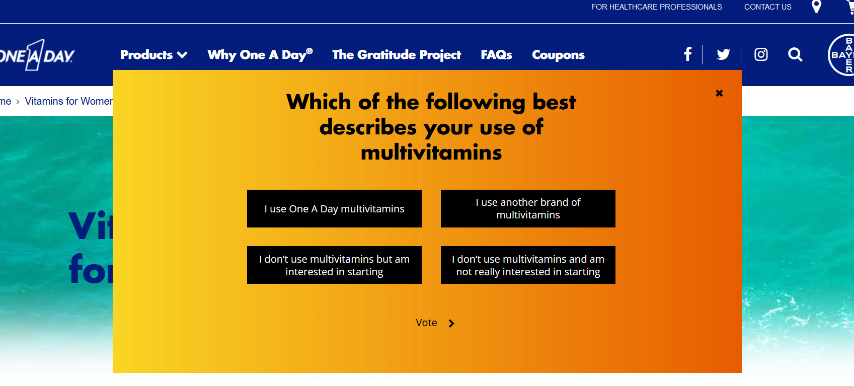
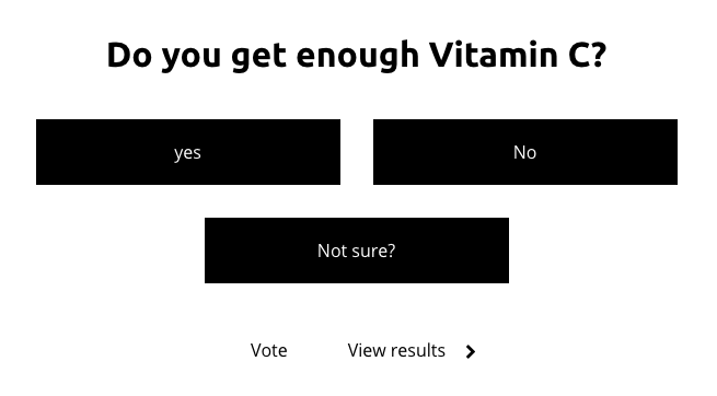
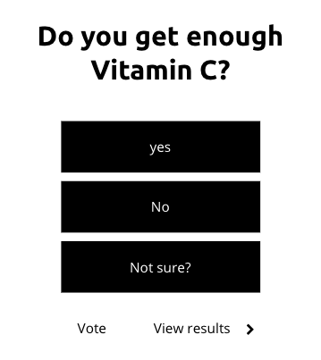
Example Poll: One a Day (US):
https://www.oneaday.com/vitamins/vitamins-for-women
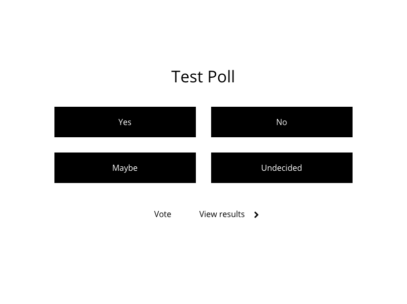
Desktop

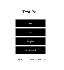
Tablet
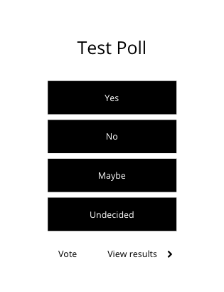
Mobile
General usage dos and don'ts
| ✅ Do's | ❌ Don'ts |
|---|---|
| Ensure the text is legible. | Do not use a background image that makes the text hard to read. |