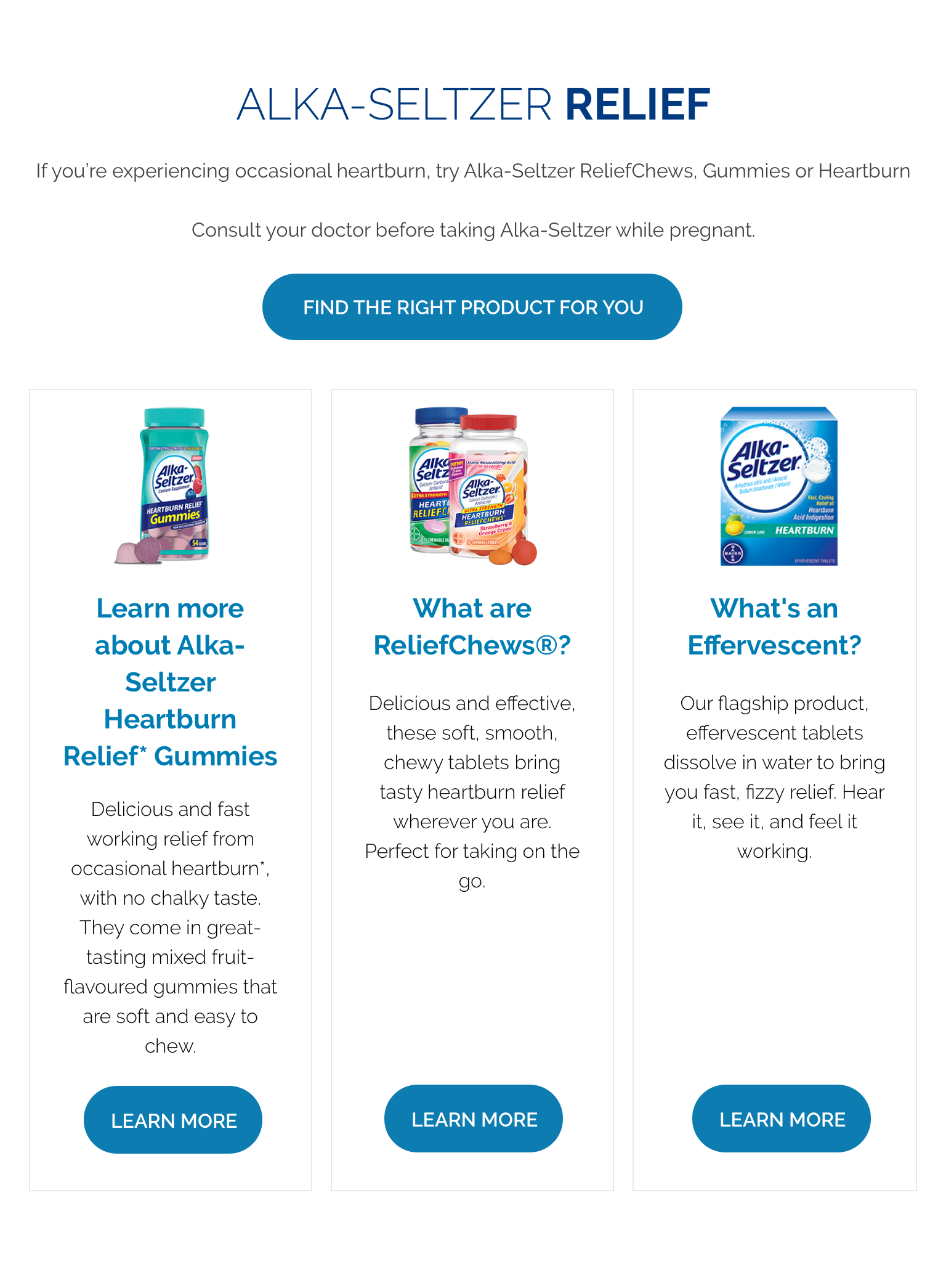
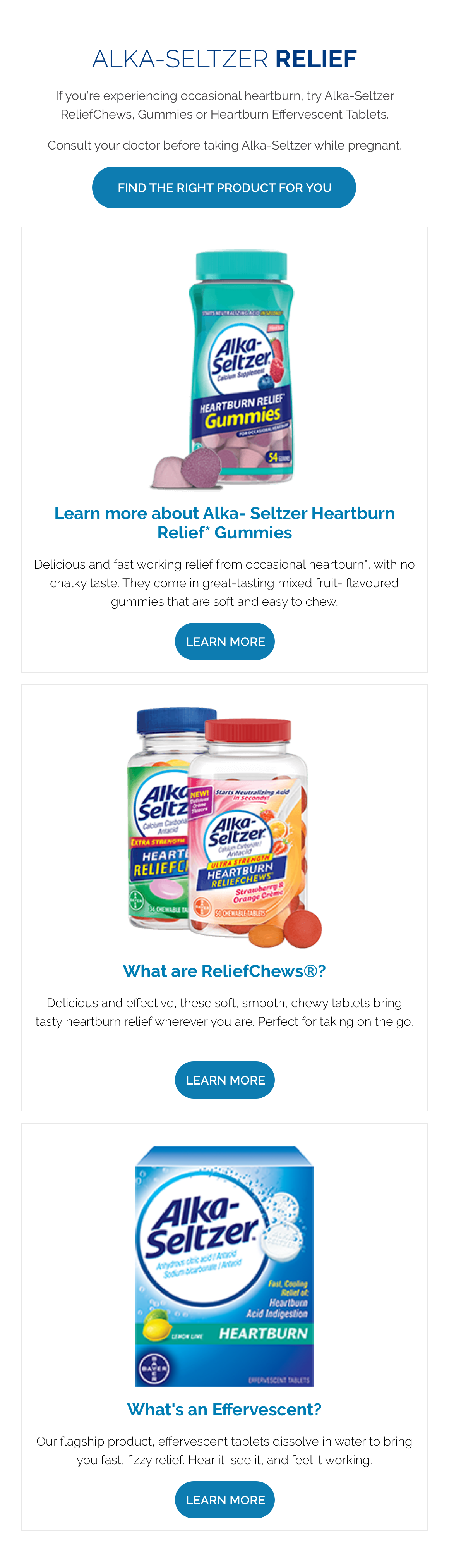
Product container
The Product container is made up of several configurable elements, allowing for a range of customisable layouts. Text, button positioning and background colour/image settings can all be configured to create a number of layout variations.
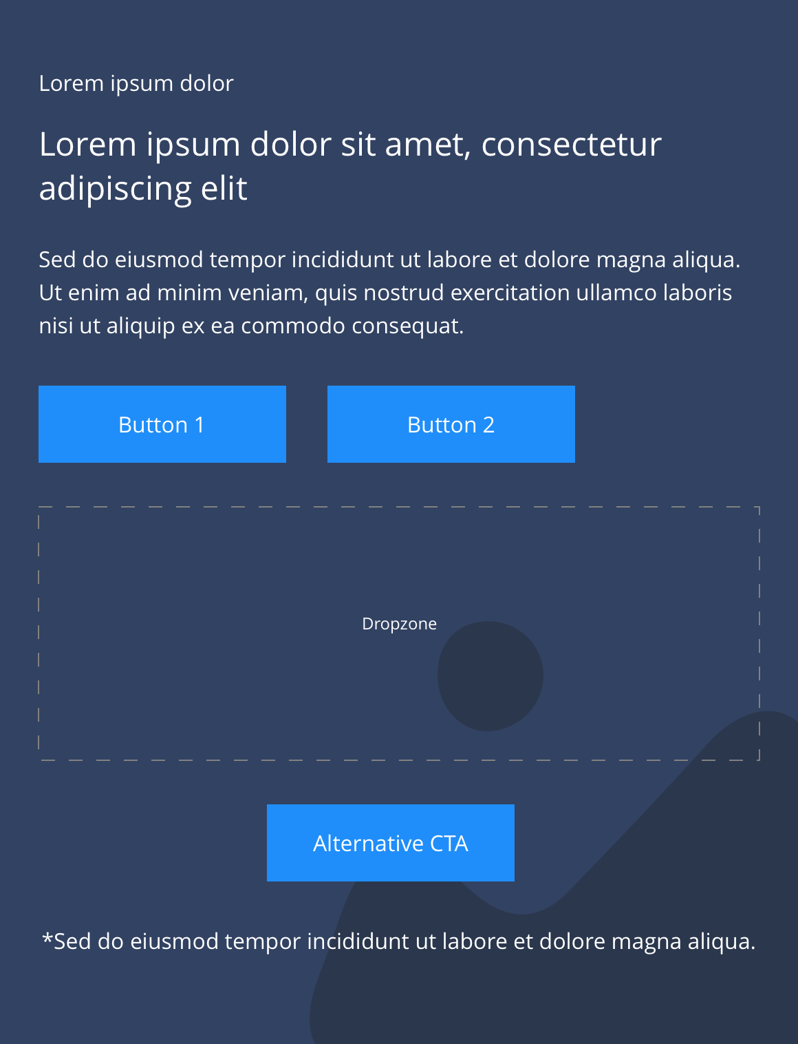
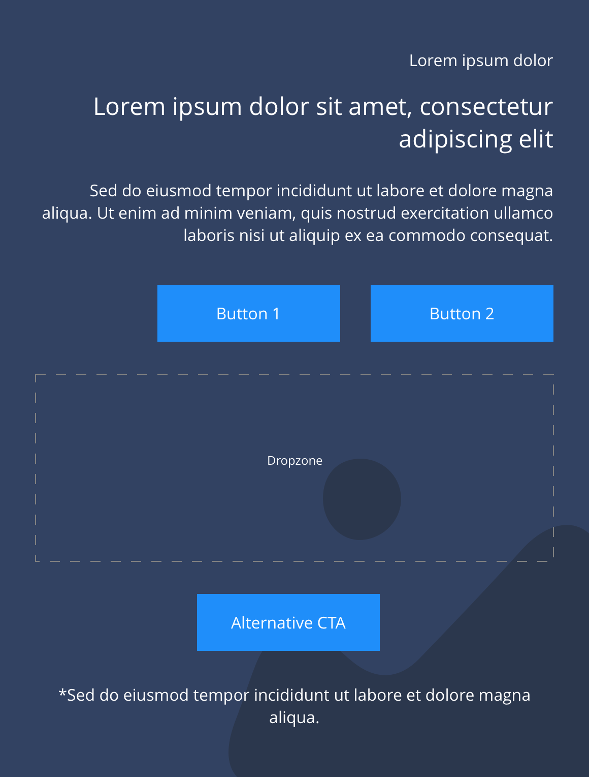
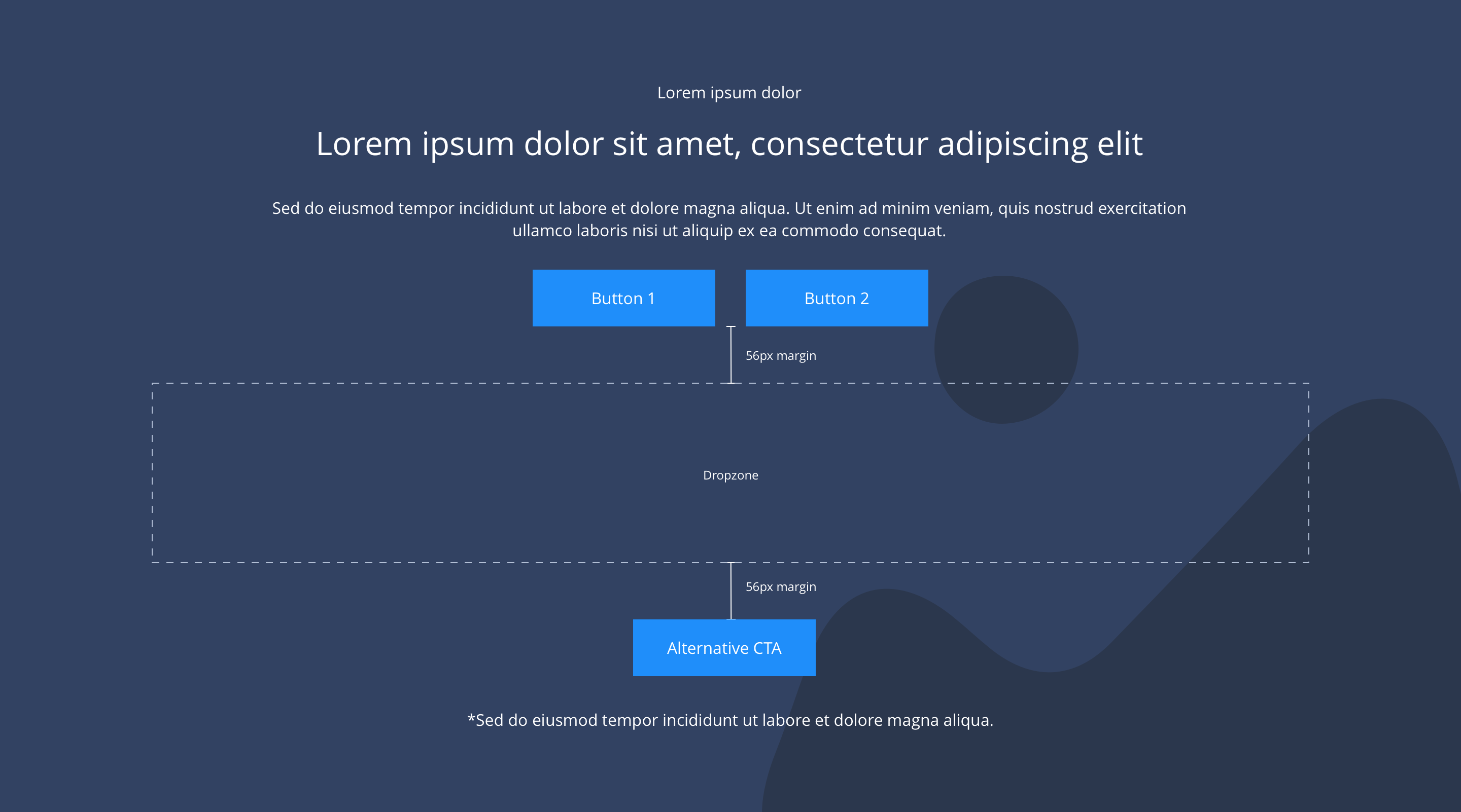
It also contains a drop zone where you can drag and drop the Product.
- Overview
- Specification
- Style Guide Manager
- Examples in-situ
- Usage
Overview
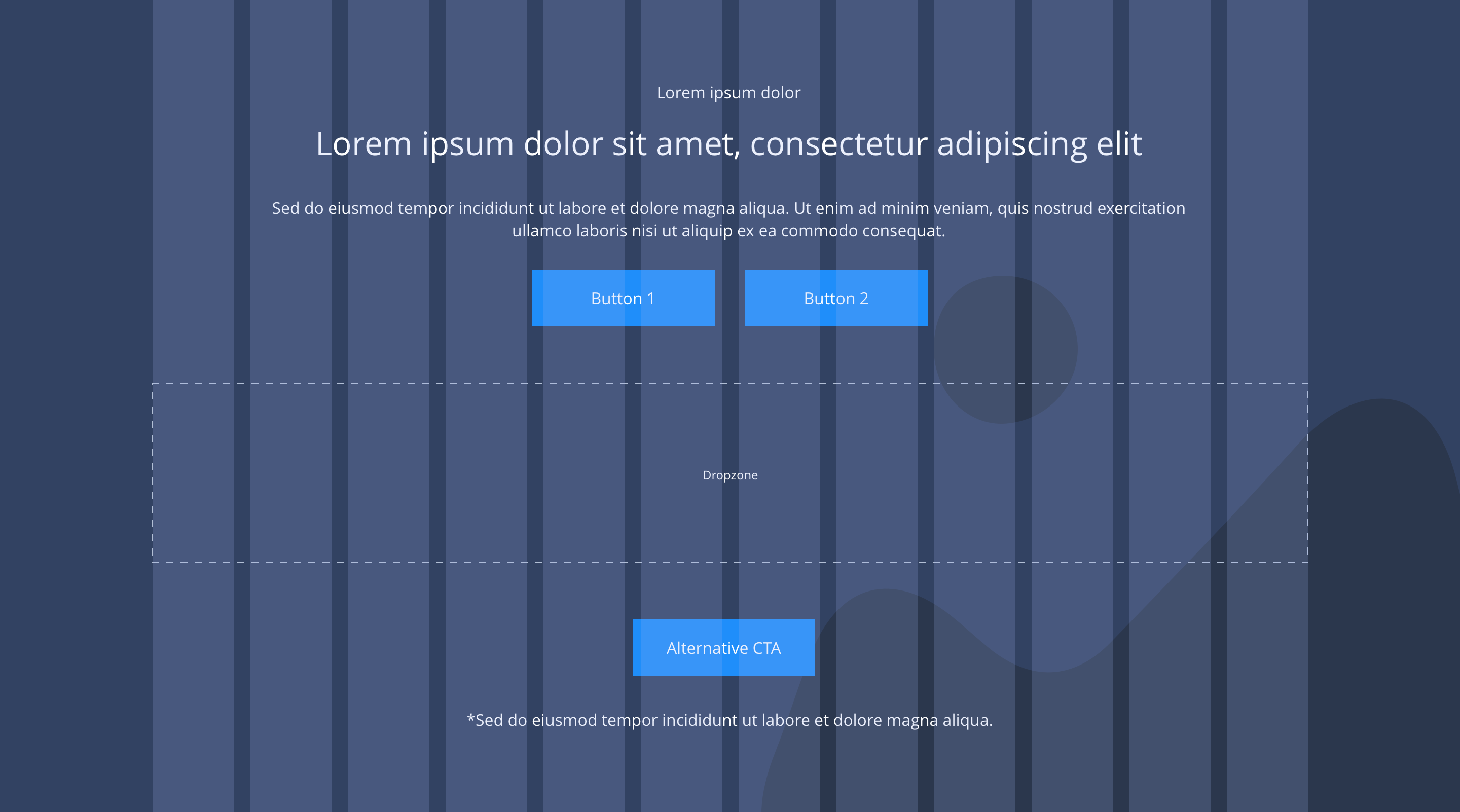
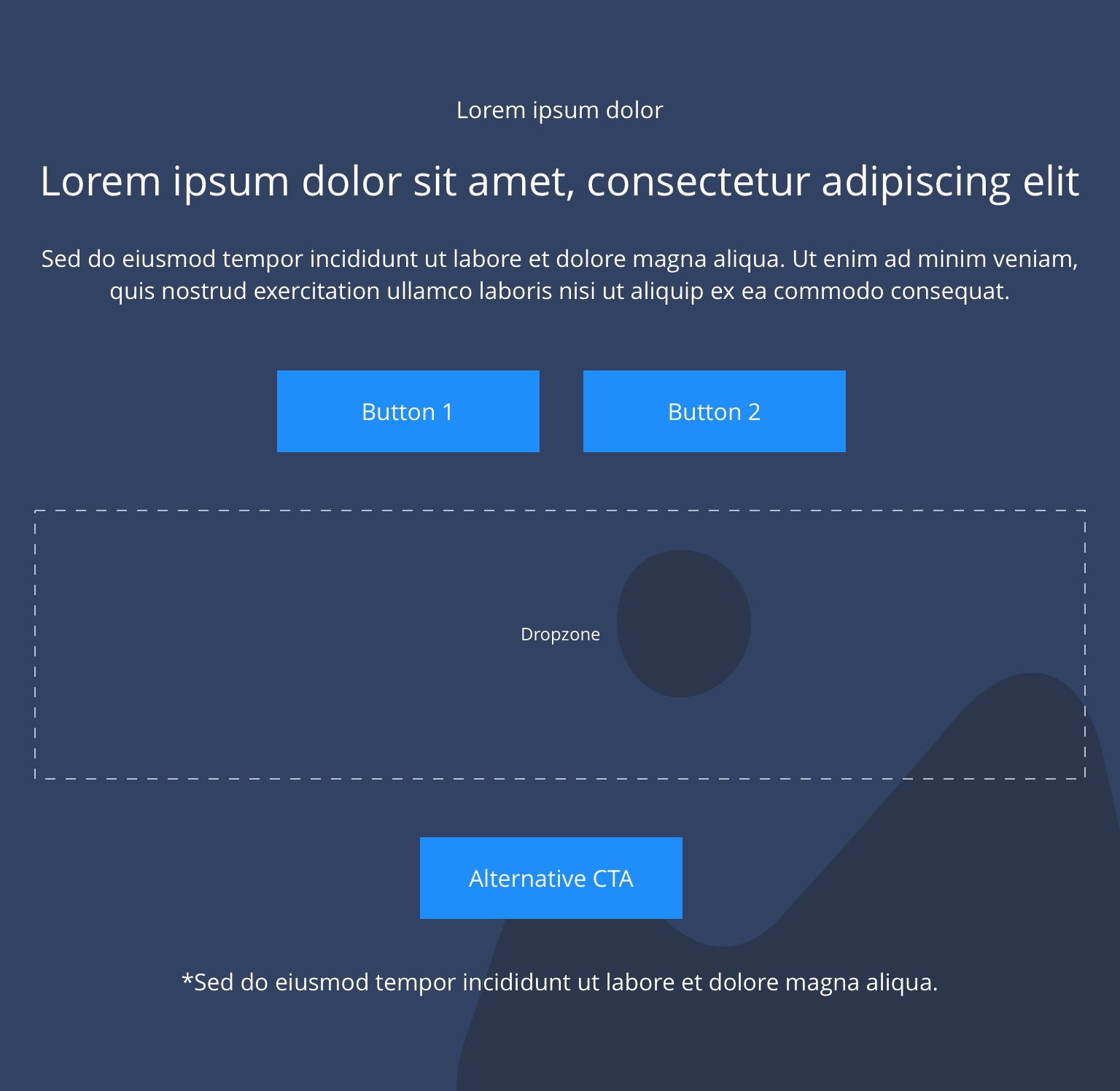
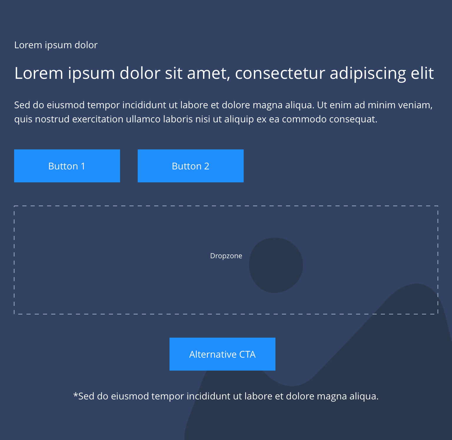
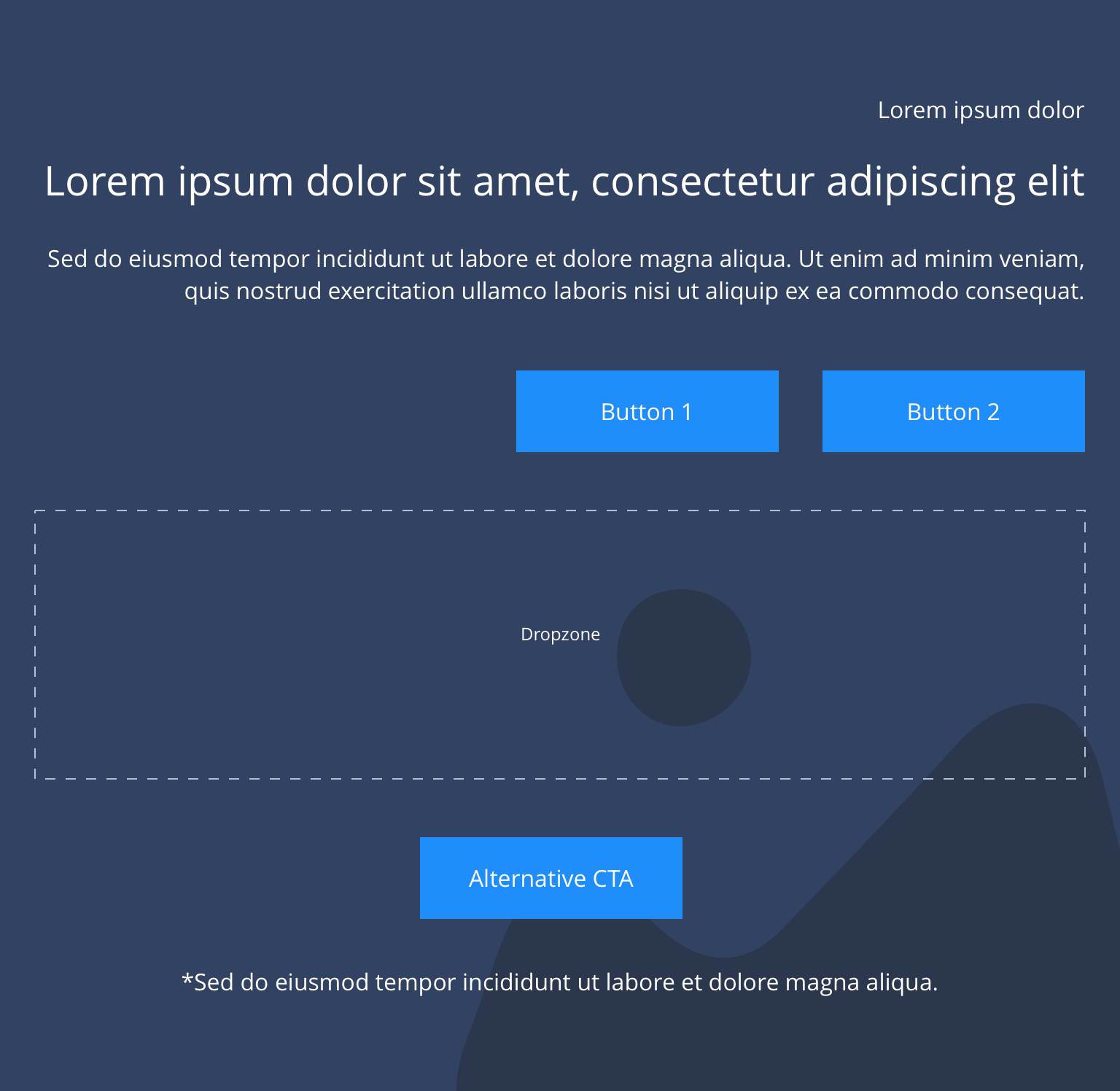
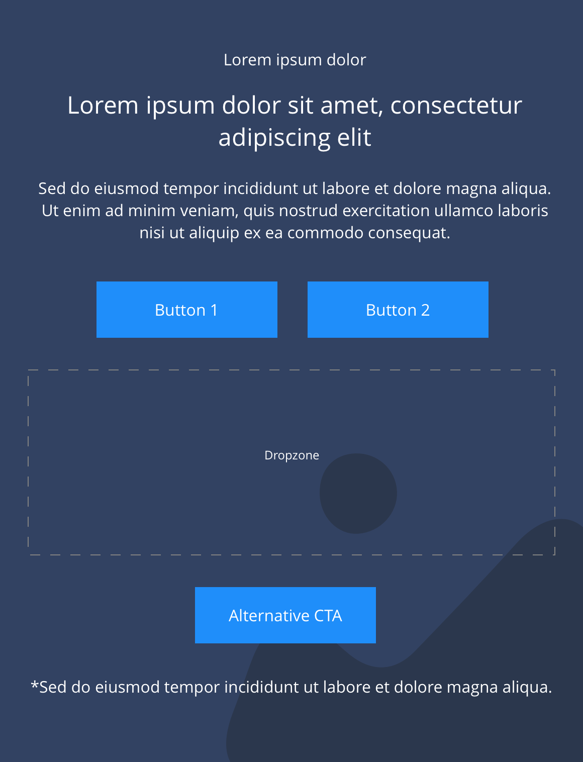
Responsive block dropzone spans 12 columns, within a container and the background image or colour is set to full width.
Desktop
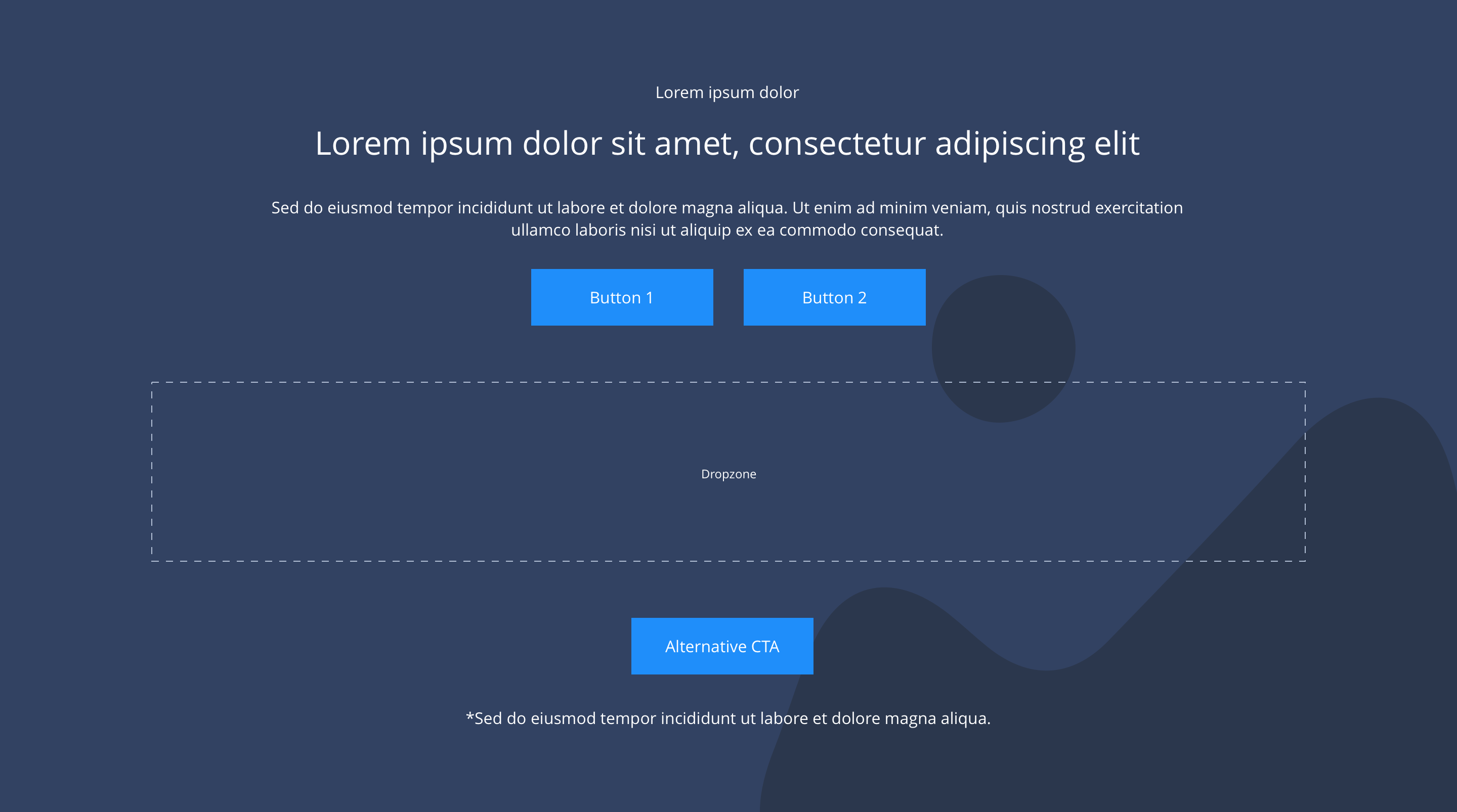
Centered
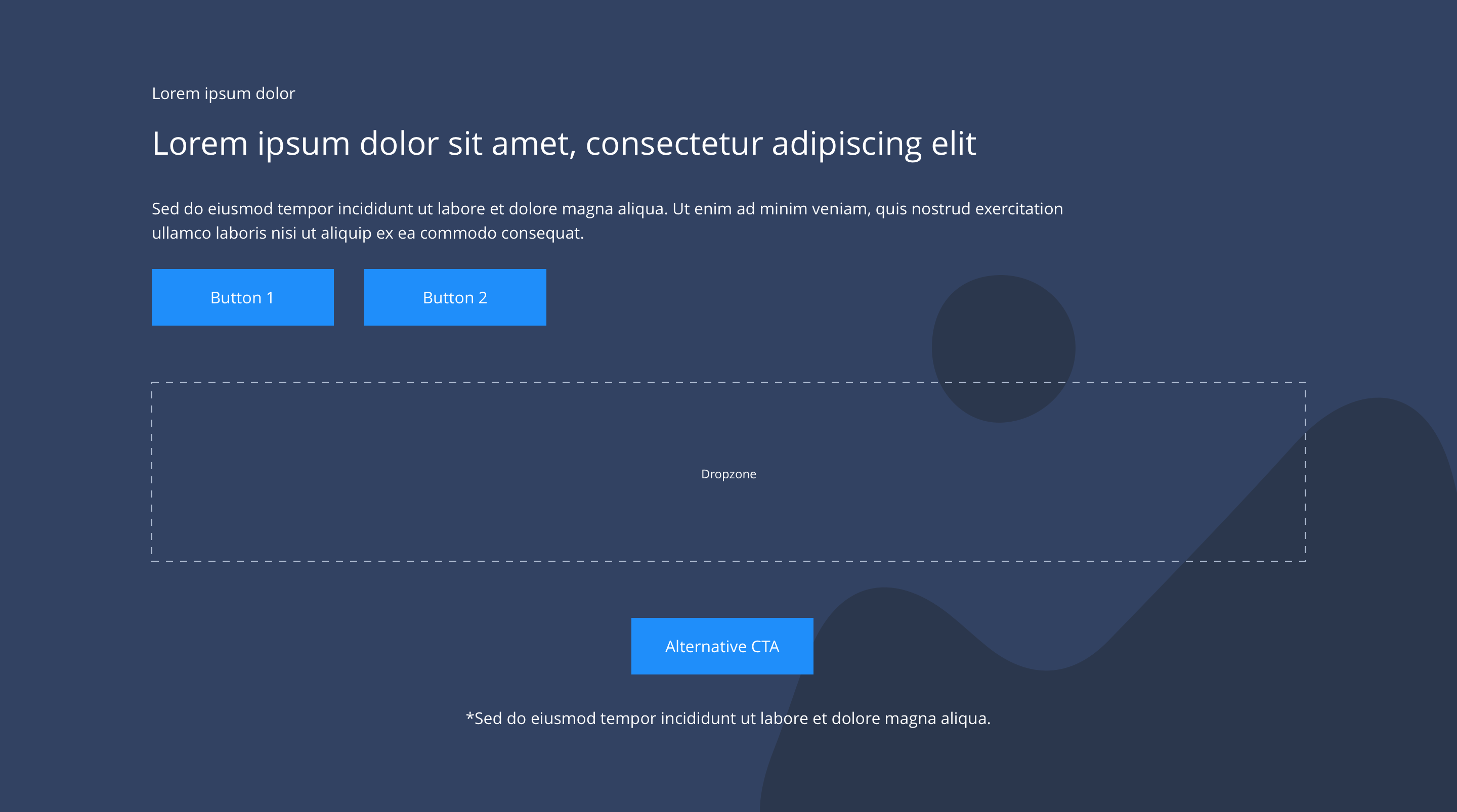
Left
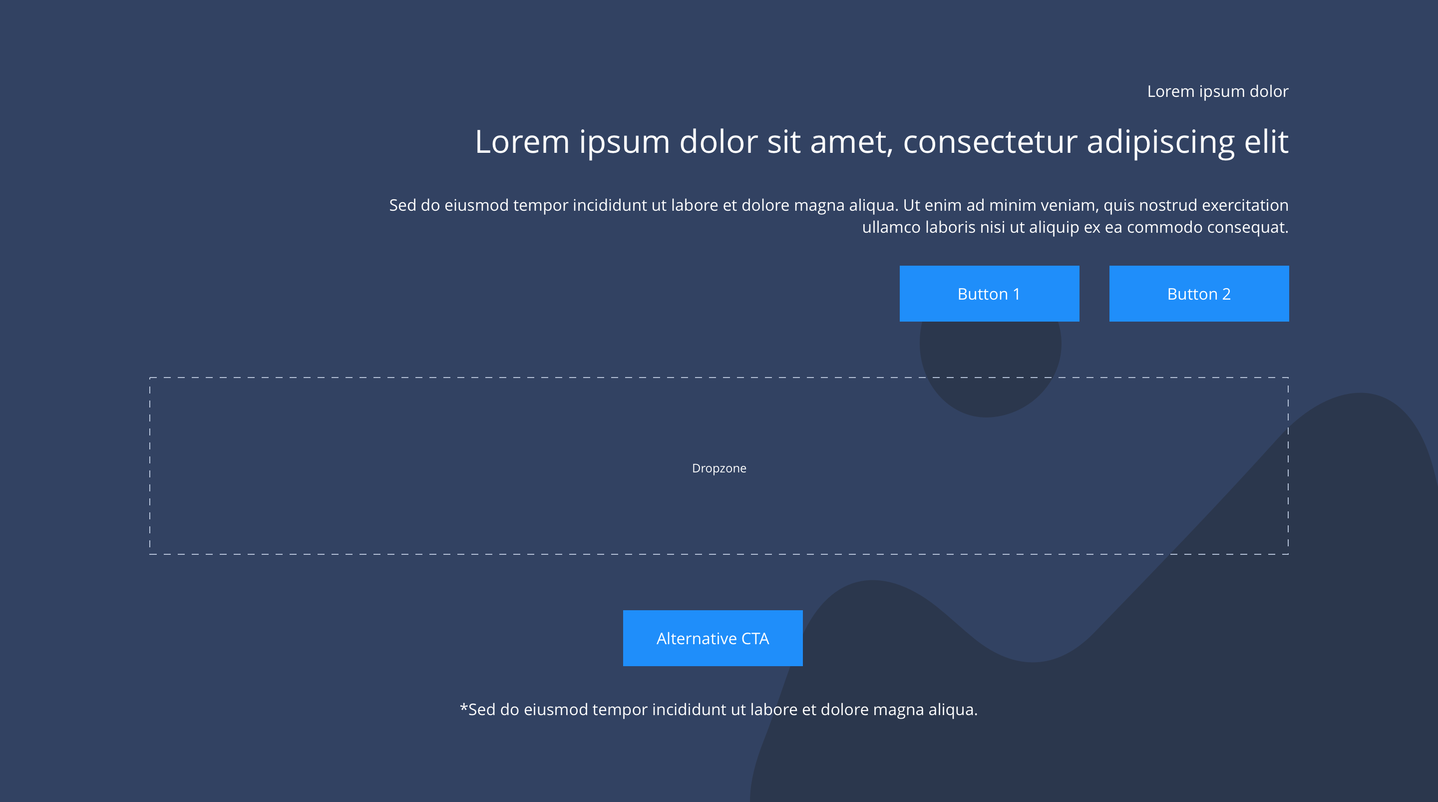
Right
Tablet
Centered
Left
Right
Mobile
Centered
Left
Right
This provides guidance on the build, layout and content options for this component.
Layout specification
| Component item | Requirement & purpose | Optional or mandatory | CMS options |
|---|---|---|---|
| Height | Expands based on size of content. | n/a | n/a |
| Width | Text spans 10 columns max on desktop. 12 columns on tablet and below.The container is set to full width.Content is constrained to the width of the grid. The content is full width by default but can be restricted to either 10 or 8 columns on desktop and tablet. The content is always full width on mobile. | Mandatory | 12, 10 or 8 column width.Select boxed or full width for dropzone. |
| Desktop background image | Allows user to set a background image. This is full width and set to cover. | Optional | Image uploader. |
| Desktop background image alignment | Allows control of background image alignment. | Optional | Vertically align top, centre or bottom.Horizontally align left, centre or right. |
| Mobile background image | Allows user to set a background image. This is full width and should be set to cover. | Optional | Image uploader. |
| Mobile background image alignment | Allows control of background image alignment. | Optional | Vertically align top, centre or bottom.Horizontally align left, centre or right. |
| Background image aria label | The aria-label allows us to specify a string to be used as the accessible label. | Optional | Text input field |
| Show/hide background image on mobile | Allows editor to hide background image on mobile breakpoint. | Optional | Show or hide. |
| Background colour | Allows user to set a background colour on the component. | Optional | Choose from colour palette. |
| Content alignment | Controls content horizontal alignment. | Optional | Left, centre or right. |
| Full border | Allows a full width border to be added to the component. | Optional | On/off. |
| Full border width | Sets the border width. | Optional | Add a px value. |
| Full border colour | Sets the border colour. | Optional | Choose from colour palette. |
| Dropzone width | The content within the dropzone can be constrained to the the box grid or set to full width. | Mandatory | Boxed width or full width. |
| Show/hide gutters | Allows control of spacing between blocks. NB - where gutters are turned off, drop shadows should not be used. | Mandatory | On/off. |
| Padding top and bottom | Allows control of the top and bottom spacing within this component. Set globally via the SGM. | Mandatory | Large, medium, small or none. |
| Margin bottom | Allows control of the spacing below the component. Set globally via the SGM. | Mandatory | Large, medium, small or none. |
| Pre-heading text | Allows user to set a pre-heading before H1. | Optional | Text input. |
| Pre-heading text colour | Sets pre-heading colour. | Optional | Choose from colour palette. |
| Heading text | Sets heading text. | Optional | Text input. |
| Heading element | Sets H2, H3, H4 or H5 on component. | Optional | Select heading element. |
| Heading style | Allows user to choose where more then one type of heading style may be present (i.e. multiple H2's). | Optional | Select heading style. |
| Heading colour | Sets heading colour. | Optional | Choose from colour palette. |
| Paragraph text | Sets paragraph content. | Optional | Text input. |
| Paragraph style | Sets paragraph style. | Optional | Paragraph style select. |
| Paragraph colour | Sets paragraph colour. | Optional | Choose from colour palette. |
| WYSIWYG | Allows user to format text where additional styles may be required. | Optional | WYSIWYG. |
| Link 1 (above dropzone) | Allows user to link to a URL or launch a modal. | Optional | Link text input.Link style select.Link URL input.Target select: Same window or open in new.Modal ID input. |
| Link 2 (above dropzone) | Allows user to link to a URL or launch a modal. | Optional | Link text input.Link style select.Link URL input.Target select: Same window or open in new.Modal ID input. |
| Alternative CTA (below dropzone) | Allows user to link to a URL or launch a modal. | Optional | Link text input.Link style select.Link URL input.Target select: Same window or open in new.Modal ID input. |
| Footnote text and colour | Sets footnote content and colour. | Optional | Text input.Choose from colour palette. |
Interaction
These are the interactive aspects of the component.
| Interaction |
|---|
| Link 1 links to a defined page or can launch a modal. |
| Link 2 links to a defined page or can launch a modal. |
| Alternative CTA links to a defined page or can launch a modal. |
Animation
For each link there will be option to add button animation. Animation configuration option will be following
| Select animation | Allow user to select animation from the drop-down list. | Optional | Select list |
|---|---|---|---|
| Duration | Set how long in seconds the animation will take to run | Required | Numeric Input |
| Delay | Set a start delay on the animation in seconds | Optional | Numeric Input |
| Iteration | Set the number of times the animation should run | Optional | Numeric Input (Maximum two) |
| offset | Set the animation to start at a specific offset before or after the element has entered the view port | Optional | Numeric Input (Pixel) |
These are the Style Guide Manager settings that are specific to this component. For global settings see the Style Guide Manager section.
| Property | Requirement & purpose | Default | SGM override |
|---|---|---|---|
| Margin above drop zone | Sets the site wide margin above the drop zone | Desktop - 24px Tablet - 24px Mobile - 24px | Desktop Tablet Mobile |
| Margin below drop zone | Sets the site wide margin below the drop zone | Desktop - 32px Tablet - 32px Mobile - 32px | Desktop Tablet Mobile |
General usage dos and don'ts
| ✅ Dos | ❌ Don'ts |
|---|---|
| Ensure the text is legible. | Do not use a background image that makes the text hard to read. |
| Only use Responsive Blocks within the Responsive Block Container. | |
| Read our guidance on imagery. | |
| Read our guidance on the use of videos. | |
| Read our guidance on the use of WYSIWYGs. |