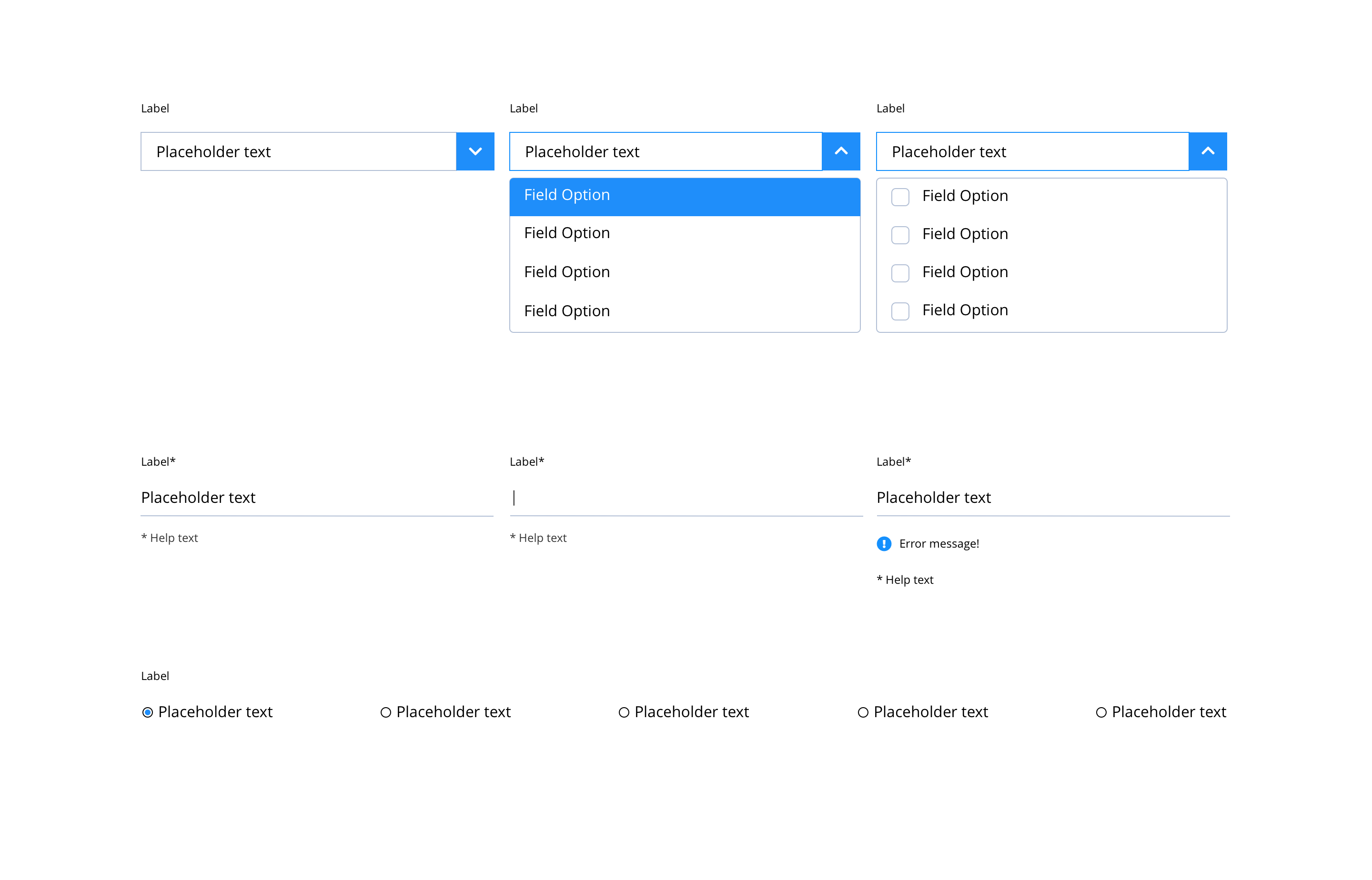
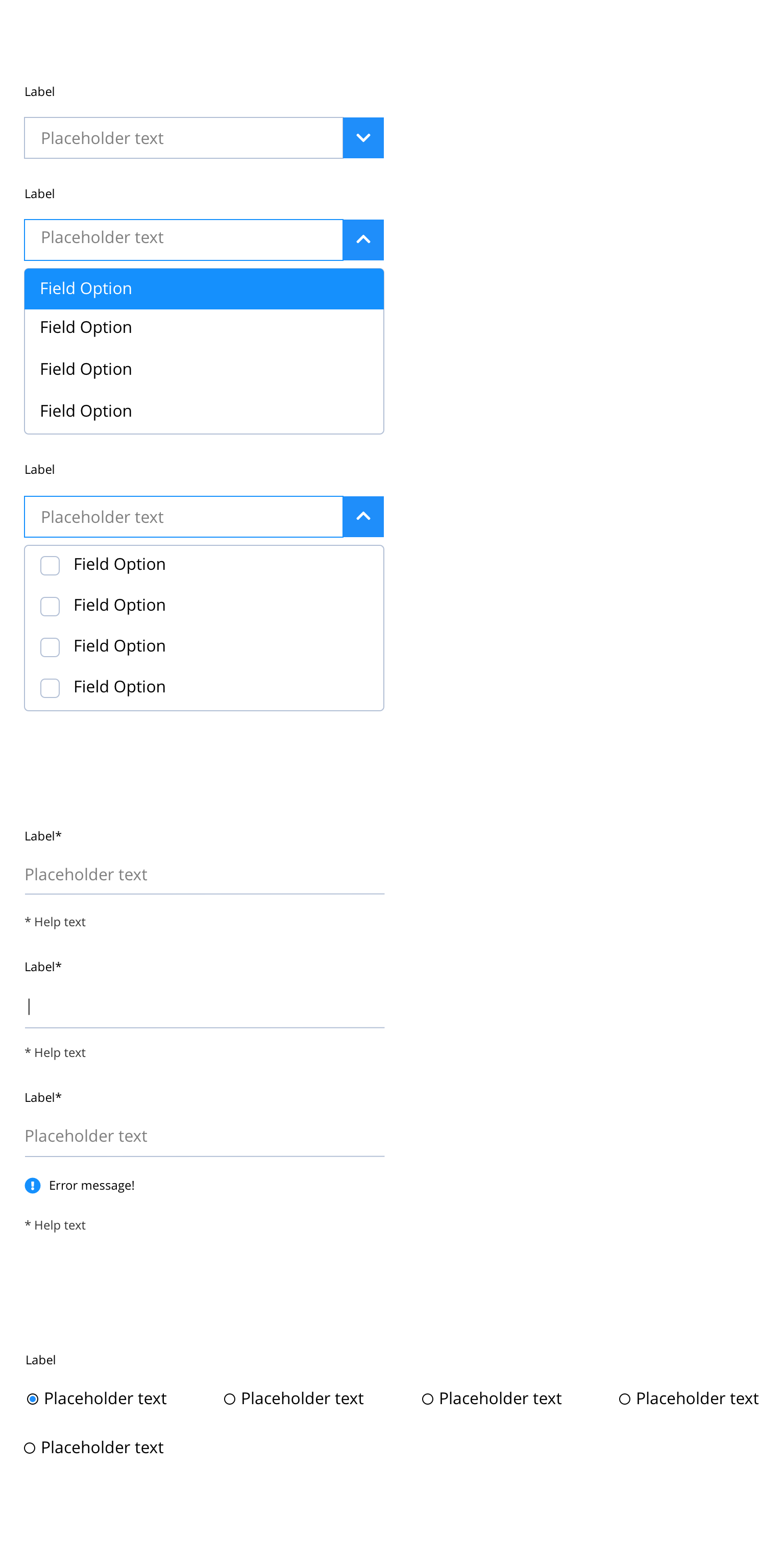
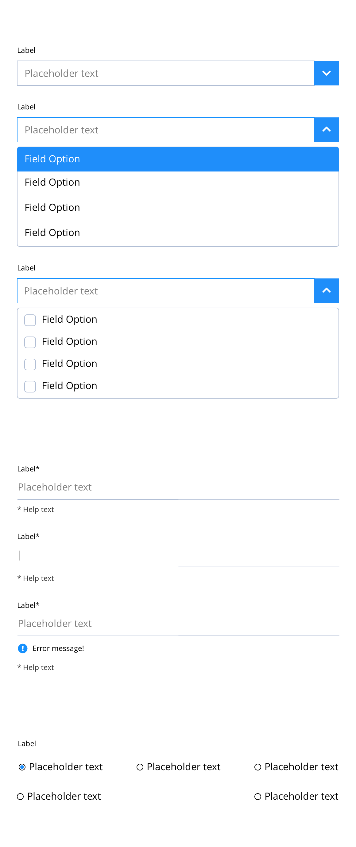
Input fields and dropdown menu
Input fields have multiple states that can be defined: Default, Active and Error. Drop-down menus also have hover states. Labels for each field also need to be defined, along with any options for the drop-down menus. The label and drop-down menu options are defined in the script. The examples on this page show the default colours and design for each of these states.
- Overview
- Specification
- Style Guide Manager
- Examples in-situ
- Usage
Specification
This provides guidance on the build, layout and content options for this component.
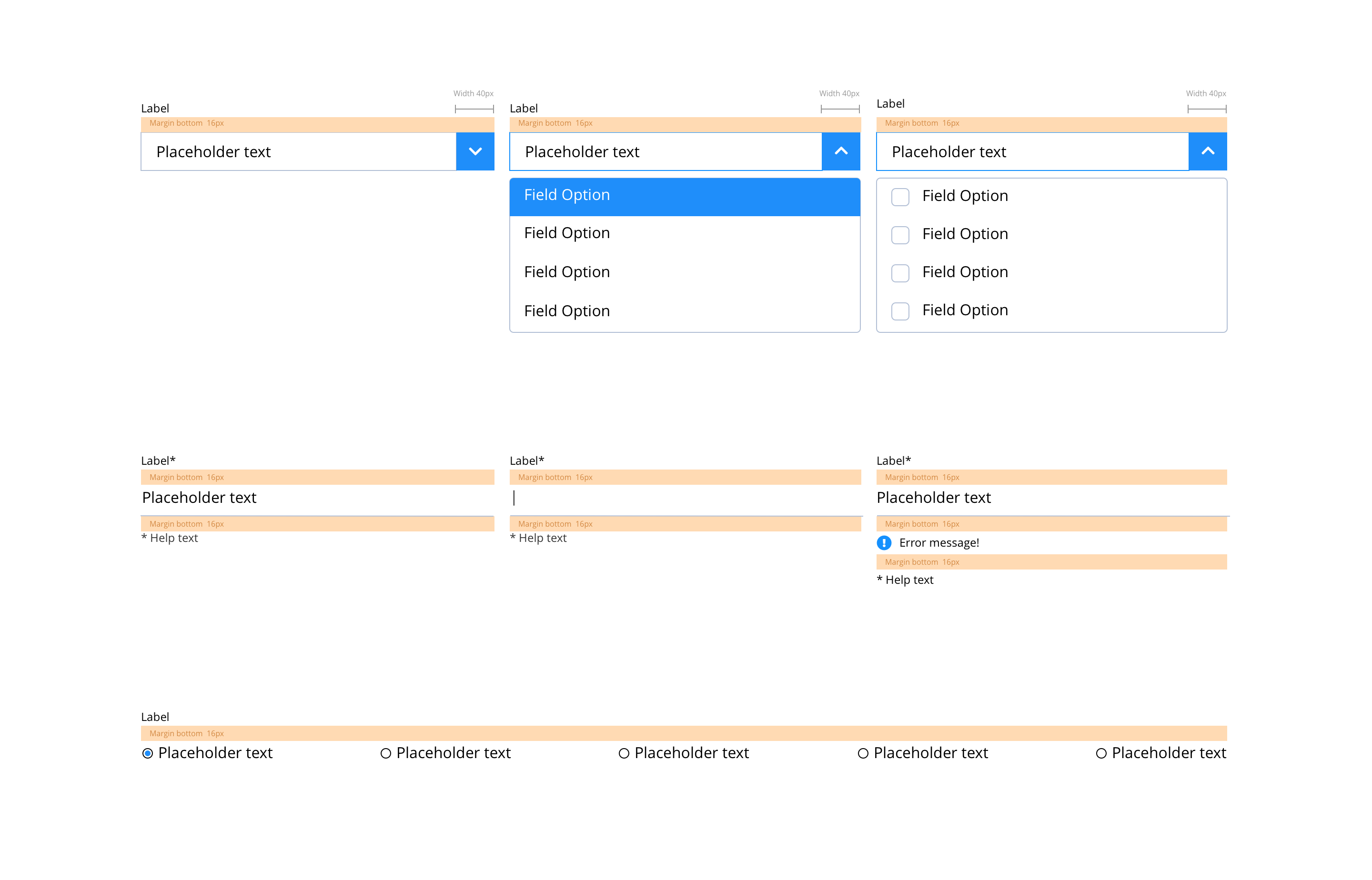
Layout specification
| Component item | Requirement & purpose | Optional or mandatory | CMS options |
|---|---|---|---|
| Margin | Sets spacing between checkbox and label and also below checkbox items. Default set at 16px. | n/a | n/a |
| Text label | Sets styling of labels. Same as default paragraph style. | n/a | n/a |
| Placeholder text | Sets styling of placeholder text. Same as default paragraph style. | n/a | n/a |
| Help text | Sets styling of help text. Same as small paragraph style. | n/a | n/a |
| HTML select | Sets styling of HTML select. Same as default paragraph style. | n/a | n/a |
| Selected background colour | Sets colour of background on the selected item in the dropdown. | Mandatory | n/a |
| HTML options | Sets styling of other options in the select list. Same as default paragraph style. | n/a | n/a |
| Select dropdown icon and background colour | Sets icon and background colour in the dropdown menu. | Mandatory | n/a |
Interaction
These are the interactive aspects of the component.
| Interaction |
|---|
| Clicking the form dropdown expands the select list and rotates the arrow icon. |
| Hovering over an item in the select list displays the selected background colour. |
These are the Style Guide Manager settings that are specific to this component. For global settings see the Style Guide Manager section.
| Property | Requirement & purpose | Default | SGM override |
|---|---|---|---|
| Accent colour | Sets the site wide accent colour of the input fields and dropdown menu. | Black | Choose from colour palette. |
| Accent contrast colour | Sets the site wide accent contrast colour of the input fields and dropdown menu. | White | Choose from colour palette. |
| Border colour | Sets the site wide border colour for the input fields and dropdown menu. | Grey | Choose from colour palette. |
| Text colour | Sets the site text colour input fields and dropdown menu. | Black | Choose from colour palette. |
No current design examples.
General usage dos and don'ts
| ✅ Do's | ❌ Don'ts |
|---|---|
| Accessibility Use labels that identify the purpose of the input field, such as “name” or “username.” Options in drop-downs should be clear. Note that placeholder text is not sufficient since it disappears once the user has begun entering text. | Do not use a background image that makes the text hard to read. |
| Data collection Data collection must be managed in compliance with Bayer Data Privacy requirements as provided by the Data Privacy Team. Data collection must align to the CH Data Privacy Statement. Details of the data collection strategy need to be outlined in the manuscript with details around field function, field title, box example text (optional) and selection lists, including any dependencies that build (e.g., Brand repopulates to show sub-brands, requirements for validating entry and required/optional fields). In certain cases additional requirements might be tied to the backend data collection tool. Please consult the Bayer project team for more information. |