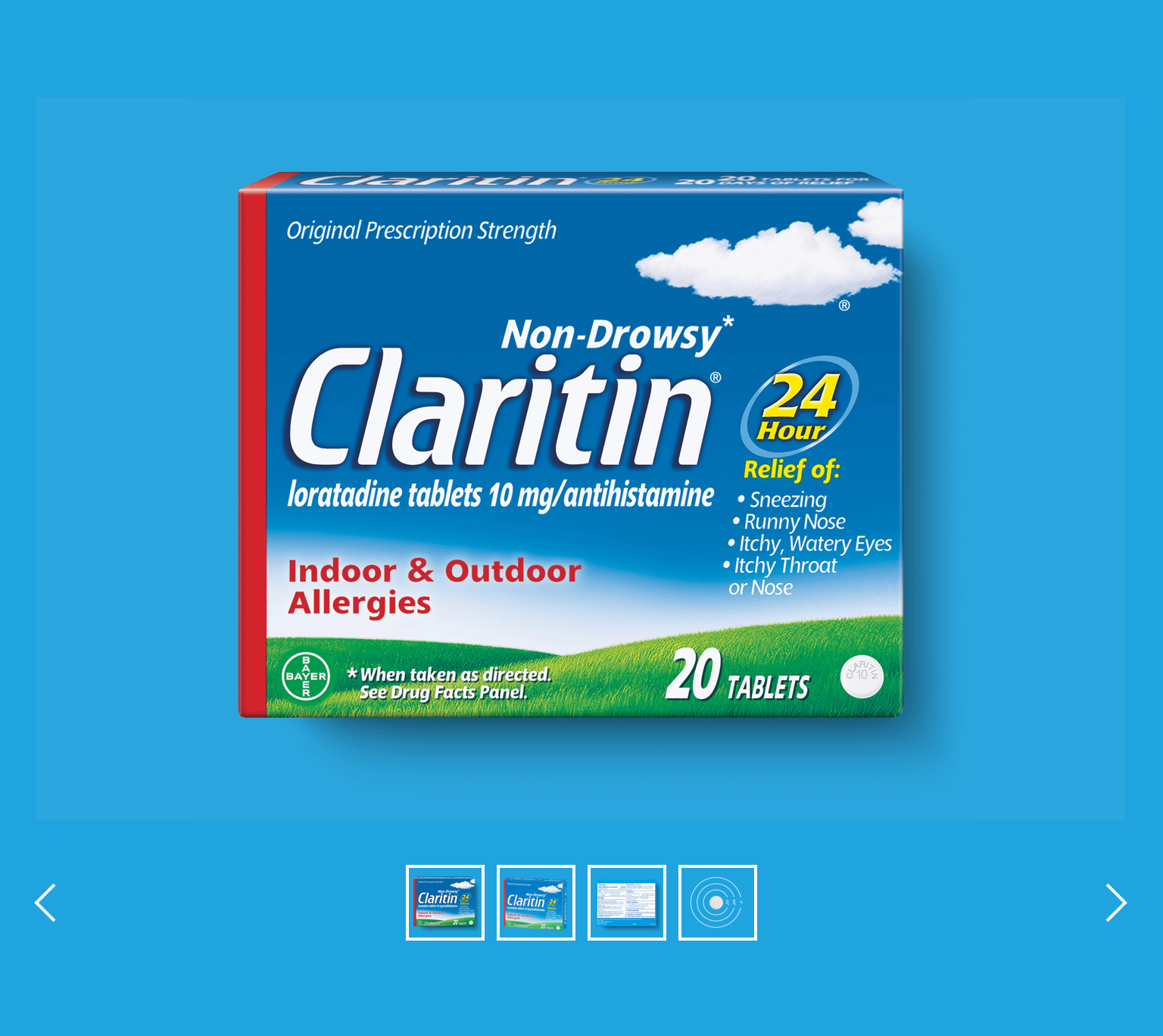
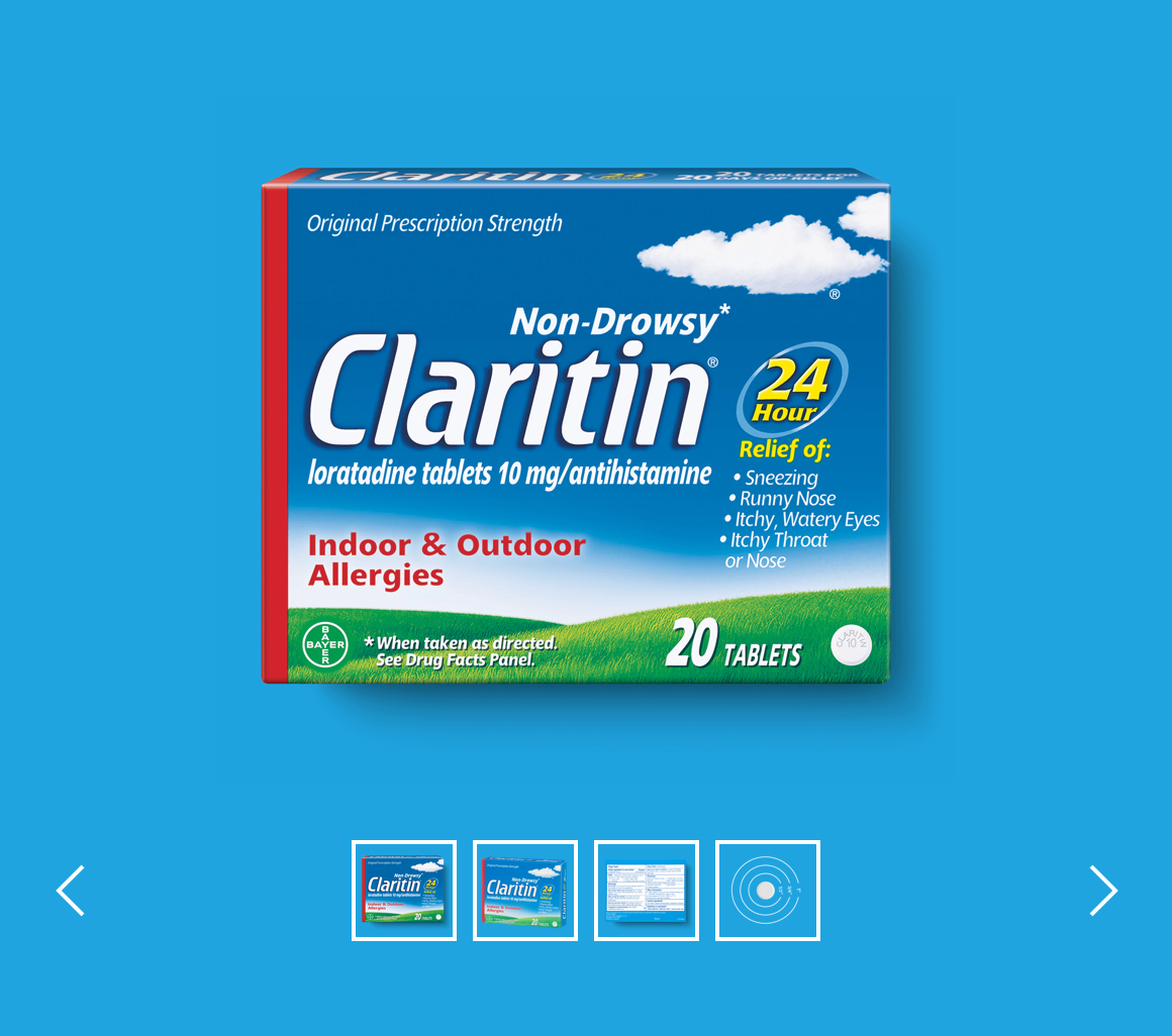
Image gallery
The Image gallery allows the user to browse through a collection of images and videos. Thumbnails are presented in a carousel, and the user can also zoom when hovering over the image.
This image gallery is utilised in the “Product Detail” content type.
- Overview
- Specification
- Style Guide Manager
- Examples in-situ
- Usage
Specification
This provides guidance on the layout requirements for this component.

Layout specification
The image gallery can only be configured in the Style Guide Manager.
| Component item | Requirement & purpose | Optional or mandatory | CMS options |
|---|---|---|---|
| n/a | n/a | n/a | n/a |
These are the Style Guide Manager settings that are specific to this component. For global settings see the Style Guide Manager section.
| Property | Requirement & purpose | Default | SGM override |
|---|---|---|---|
| Background colour | Sets the site wide background colour for the image gallery. | Grey | Choose from a defined colour palette. |
| Slider navigation colour | Sets the site wide slider navigation colour for the image gallery. | Black | Choose from a defined colour palette. |

General usage dos and don'ts
| ✅ Dos | ❌ Don'ts |
|---|---|
| Read our guidance on imagery. | |
| We recommend using a maximum of 4 images within the image gallery. | |
| JPEG should be chosen for larger photos or illustrations: it will give you good results in terms of colours and clarity with a relatively small file size or use a PNG if you want to preserve background transparency. | |
| Images should be cropped to minimise "dead" space and focus on the image in the screen. | |
| The standard function for the component is that the image library will expand from left to right with the first image on the left not including an arrow. Once there is a scroll to the right, the left arrow will be added to support scroll back to image 1. |