Other global components
There are a number of global components that can be used across the system within forms. The styling and functionality for these should be developed at a brand level as their usage may vary. All form elements will require development.
- Radio buttons
- Checkboxes
- Switches
- Slider
- Process bar
- Style Guide Manager
- Usage
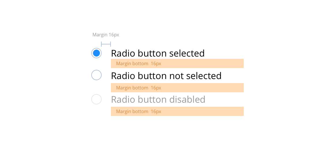
Radio buttons specification
Radio buttons are for use when a user must select only one option. In instances where multiple selections are allowed you should use the checkbox.
Radio buttons can sit either to the left or the right of the label. Add the disabled attribute (50% opacity) on a radio button to prevent user input and trigger a slightly different look.
Layout specification
| Component item | Requirement & purpose | Optional or mandatory | CMS options |
|---|---|---|---|
| Font size | Sets size of label text. Follows default paragraph settings. | n/a | n/a |
| Margin | Sets spacing between radio button and label and also below radio button items. Default set at 16px. | n/a | n/a |
| Active check colour | Sets the colour of the circle in the active state. | Mandatory | n/a |
| Border colour | Sets the colour of the circle border. | Mandatory | n/a |
| Disabled border and background colour | Sets the colour of the disabled border and the background. This should be set to 40% opacity of the standard border and background colours. | n/a | n/a |
| Label colour | Sets colour of label next to radio item. | Mandatory | n/a |
| Label colour disabled | Sets colour of disabled label next to radio item. This should be set to 40% opacity of the standard label colour. | n/a | n/a |
Interaction
These are the interactive aspects of the component.
| Interaction |
|---|
| Clicking a radio button selects it and deselects others. |
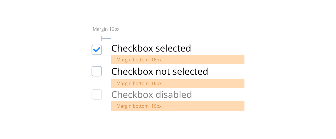
Checkboxes specification
Checkboxes are used for a list of options where the user may select multiple options, including all or none.
They can sit either to the left or the right of the label. Add the disabled attribute (50% opacity) on a checkbox to prevent user input and trigger a slightly different look.
Layout specification
| Component item | Requirement & purpose | Optional or mandatory | CMS options |
|---|---|---|---|
| Font size | Sets size of label text. Follows default paragraph settings. | n/a | n/a |
| Margin | Sets spacing between radio button and label and also below radio button items. Default set at 16px. | n/a | n/a |
| Active checkbox colour | Sets the colour of the active checkbox. | Mandatory | n/a |
| Border colour | Sets the colour of the checkbox border. | Mandatory | n/a |
| Disabled border and background colour | Sets the colour of the disabled border and the background. This should be set to 40% opacity of the standard border and background colours. | n/a | n/a |
| Label colour | Sets the colour of the label next to the checkbox. | Mandatory | n/a |
| Label colour disabled | Sets colour of disabled label next to checkbox. This should be set to 40% opacity of the standard label colour. | n/a | n/a |
Interaction
These are the interactive aspects of the component.
| Interaction |
|---|
| Clicking a checkbox toggles between selecting and unselecting it. |
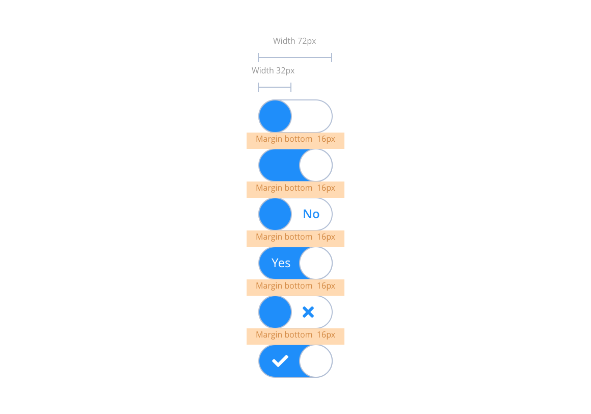
Switches specification
Switches or toggles allow users to toggle between two different states. i.e. On/Off or Yes/No. These are very simple toggle switches ideal for use in settings or preference screens. The switch can be blank, with an icon or contain a simple string for example; yes/no, on/off etc. Please note: These switches are a fixed width. They are not for use with long text strings.
Layout specification
| Component item | Requirement & purpose | Optional or mandatory | CMS options |
|---|---|---|---|
| Margin | Sets spacing between Toggle switches. Default set at 16px. | n/a | n/a |
| Off state background colour | Sets the background colour of the on state. | Mandatory | n/a |
| On state background colour | Sets the background colour of the on state. | Mandatory | n/a |
| On and Off state foreground colour | Sets the foreground colour on both states. This should be white #FFFFFF by default, with the background indicating the On/Off states. | n/a | n/a |
| Off state text colour | Sets the text colour on the off state. | Mandatory | n/a |
| On state text colour | Sets the text colour on the on state. | Mandatory | n/a |
Interaction
These are the interactive aspects of the component.
| Interaction |
|---|
| Clicking a switch toggles between the on/off states. |
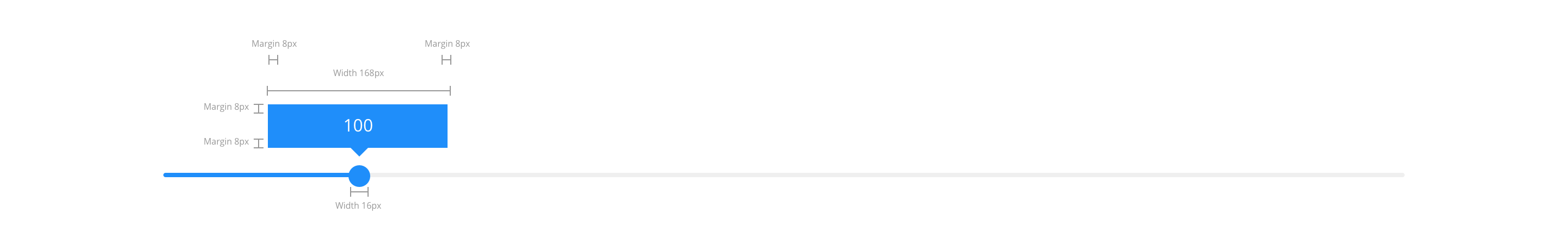
Slider specification
The specification for this will vary depending on the requirements.
Layout specification
| Component item | Requirement & purpose | Optional or mandatory | CMS options |
|---|---|---|---|
| n/a | n/a | n/a | n/a |
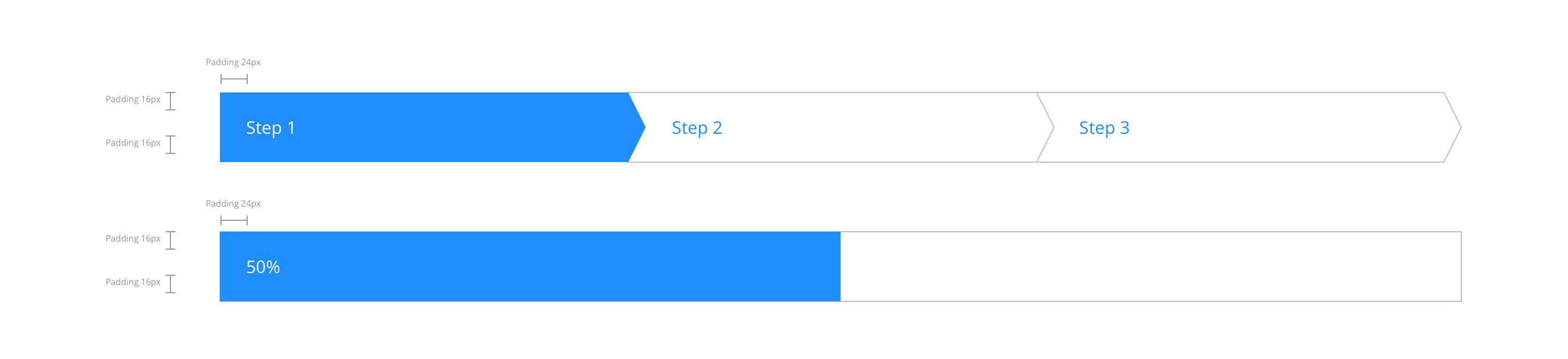
Process bar specification
The specification for this will vary depending on the requirements.
Layout specification
| Component item | Requirement & purpose | Optional or mandatory | CMS options |
|---|---|---|---|
| n/a | n/a | n/a | n/a |
No current Style Guide Manager settings. For global settings see the Style Guide Manager section.
General usage dos and don'ts
| ✅ Do's | ❌ Don'ts |
|---|---|
| Ensure the text is legible. | Do not use a background image that makes the text hard to read. |
| Be sure to create a colour strategy that clearly defines colour(s) that can be used for all actionable items. |